
Did you know that, as per a Salesforce study, 63% of business leaders describe their organizations as data-driven, yet of those, nearly two-thirds still struggle to drive decisions from data?
This is exactly why a KPI dashboard matters: to represent that data in a single executive view for actionable insights. But building it from scratch in Tableau takes weeks that teams just don't have. That's where ready-to-use Tableau KPI dashboard examples come to the rescue, giving you a strong starting point instead of a blank canvas.
Below are 8 handpicked Tableau KPI dashboard templates, each catering to the most requested usecases on executive level. Complimentary 30+ free to explore Tableau dashboard options are also available for dozens of other business functions.
Table of Contents
- 8 Tableau KPI Dashboard Examples
- Tableau KPI Dashboard Templates- Quick Comparison
- What Is a Tableau KPI Dashboard?
- What KPIs Does a Tableau KPI Dashboard Track?
- Types of Tableau KPI Dashboards
- How to Design a Tableau KPI Dashboard
- Free to Explore 30+ Tableau KPI Dashboard Templates
8 Tableau KPI Dashboard Examples
All eight examples below serve crucial executive-level use cases, and use a different visual approach (KPI cards, trend lines, bullet charts, RAG status indicators). They are available on Mokkup to download, export, edit, and share. If you've been looking for Tableau dashboard templates free download options, these eight examples below are a strong place to explore:
1. KPI Performance Monitor Dashboard
Leadership has a talent for asking for everything in one place and actually meaning it. The KPI Performance Monitor Dashboard on Mokkup is what BI analysts pull up when that request lands. It puts 6-12 mixed-department metrics, including target vs actual, revenue, net profit margin, and project status, into one view, where the on-track, at-risk, and off-track counts are the first things you see. The setup that makes this worth coming back to every week is the parameter action layer: viewers toggle between departments or time periods on their own, without anyone in analytics rebuilding anything underneath.
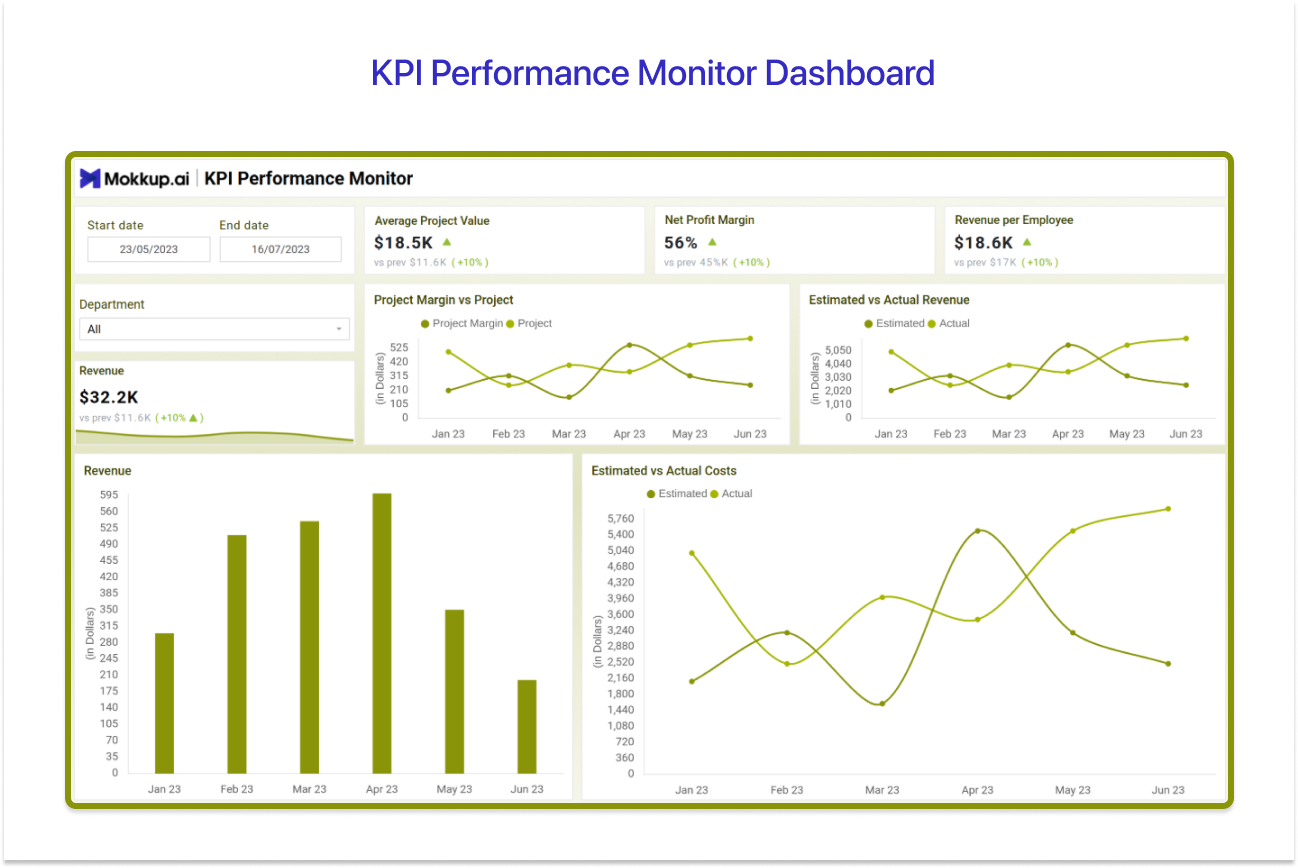
Best For: This Tableau KPI dashboard is built for BI analysts running weekly leadership reviews who need a single monitoring pane across mixed departments without toggling between workbooks.
Pros: Parameter actions let viewers change the department or time cut themselves. When a leader reviews department performance, that flexibility is the difference between a useful dashboard and one that creates more work.
Cons: Threshold logic past 12 KPIs needs a separate calculated field per metric. Manageable at first, less so when the KPI set inevitably expands.
Get the KPI Performance Monitor Dashboard Template on Mokkup →
2. Marketing KPI Dashboard
Marketing teams run into the same problem every week: spend lives in Google Ads, traffic is in Analytics, and pipeline attribution is somewhere in the CRM. The Digital Marketing KPI Dashboard pulls all of it into one canvas. Crucial KPIs it covers include total spend, sales revenue, website traffic, conversion rate, CTR, and cost per acquisition across the top, with a timeline chart that overlays spend against revenue so the relationship between budget and return is visible without running a separate analysis.
What makes the layout genuinely useful in a live review is the channel-type filter: switching between organic, paid, and referral recalculates every KPI card and the engagement heatmap simultaneously, so the key marketing question gets answered in the room almost instantly.
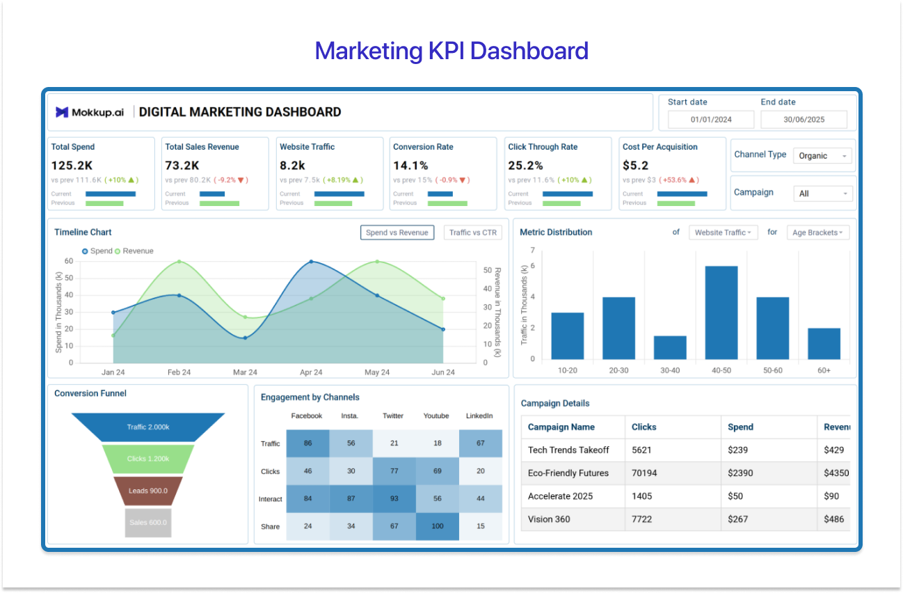
Best for: Marketing managers and growth leads who need channel-level or campaign-level spend, conversion, and revenue attribution in one view without toggling between ad platforms and analytics tools.
Pros: The engagement heatmap breaks down traffic, clicks, interest, and shares by channel in one grid. A cross-channel comparison that normally takes a spreadsheet to assemble is just a filter change.
Cons: Teams relying on last-click CRM data may see conversion numbers that don't match what the paid team is reporting, and that conversation will happen mid-review.
Get the Marketing KPI Dashboard Template on Mokkup →
3. Sales Performance Analytics Dashboard
Quota attainment reporting in Tableau breaks faster than most people expect. The second you try comparing per-rep actuals against individual targets, row-level filters start collapsing the aggregations, and the figures stop making sense. Mokkup's Tableau Sales dashboard on Performance Analytics is built around the correct approach from the start. It handles per-rep vs individual quota comparisons cleanly across quota attainment, pipeline coverage ratio, win rate, average deal size, sales cycle length, and revenue per rep at both rep and team level. Sales ops teams that have tried building this from scratch know how easily you get the aggregation logic wrong the first time.
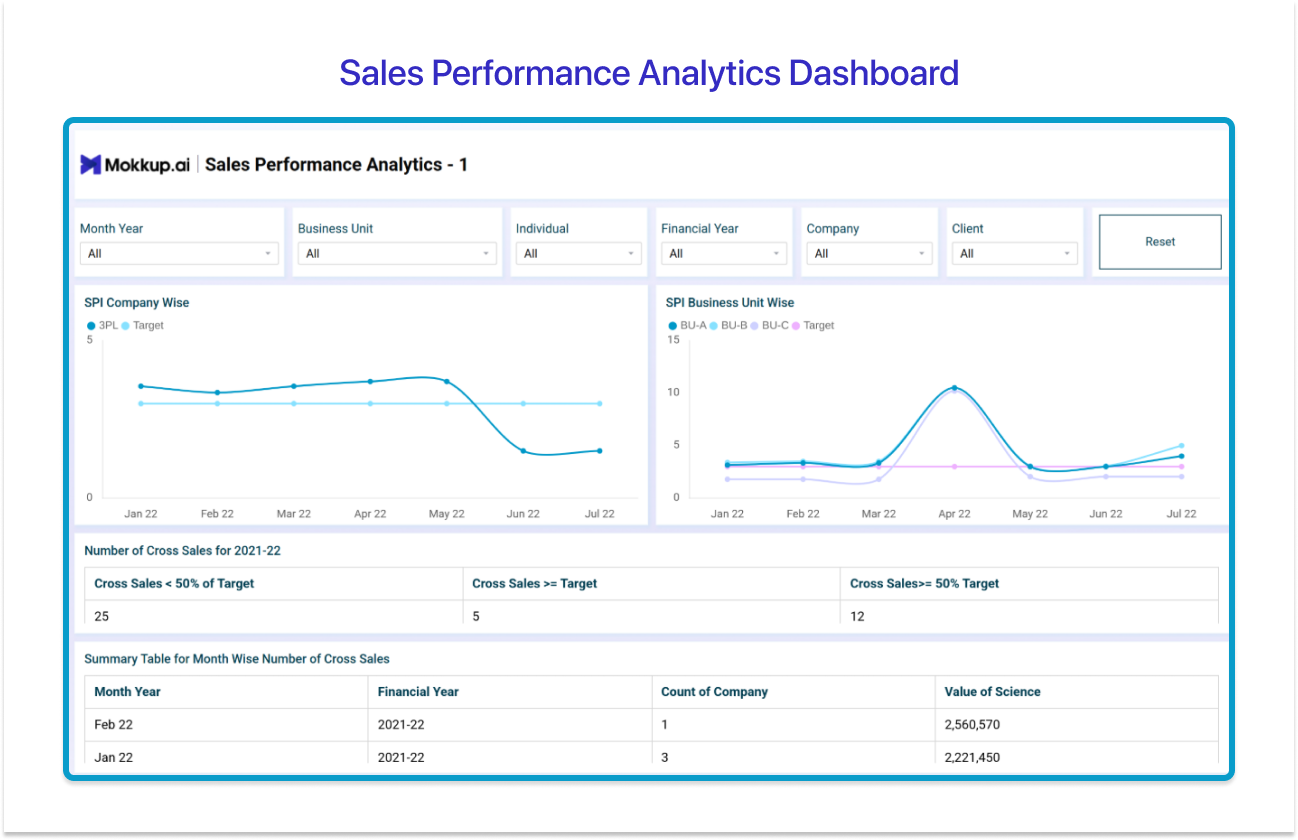
Best for: Sales ops and RevOps teams are who reach for this, specifically those tracking rep-level and team-level quota attainment side by side, with pipeline health and win rate alongside.
Pros: Rep-level and team-level quota attainment sit side by side on the same view, so no filter changes are needed to compare an individual's number against the team aggregate. That's the layout question sales ops always gets asked mid-review.
Cons: With a large sales team, individual rep labels may start overlapping before you hit 20 names, which is exactly when the side-by-side comparison, the layout is built around, becomes harder to read.
Get the Sales Performance Analytics Dashboard Template on Mokkup →
4. Financial Overview KPI Dashboard
When a CFO says "single view of financial performance," they're not asking for everything. They want the P&L story told monthly, budget variance right there, nothing buried three clicks deep. The Financial Overview KPI Dashboard for Tableau, available on Mokkup, is what finance teams hand off when that request comes through. It trends in cash flow metrics, balance sheet metrics, P&L numbers, etc., all in one pane, so the relationship between them is visible without clicking between views. Finance teams who've built this from scratch in Tableau know that such a setup looks straightforward on paper and still eats a surprising amount of time across a multi-period close.
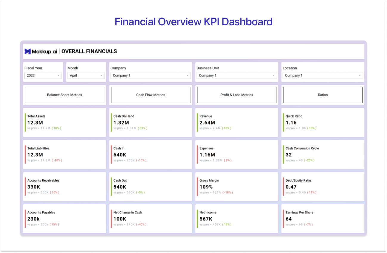
Best for: Finance teams and CFOs wanting the full P&L picture without secondary tab navigation
Pros: Dual-axis charts in the third screen put revenue bars and margin trend lines on the same sheet without secondary axis workarounds. For a CFO audience, the layout signals that someone thought about the output before building it.
Cons: Mixed currency and percentage fields may need custom number format strings per measure.
Get the Financial Overview KPI Dashboard Template on Mokkup →
5. HR Performance Management Dashboard
When teams need a KPI dashboard for employee performance, HR data is the first problem they run into, but it lives in too many places at once. Headcount and attrition could be in the HRIS, performance ratings in a separate platform, and time-to-hire in the ATS. Thus, this Tableau KPI dashboard example for HR teams pulls all of it into one working view. It tracks headcount by department, voluntary attrition rate, average performance rating, overtime hours, absenteeism rate, and employee rating together. This Tableau business KPI dashboard’s action setup is what makes it actually usable in a live review: filters drill from the department-level KPI view straight down to individual employee detail without loading a second data source.
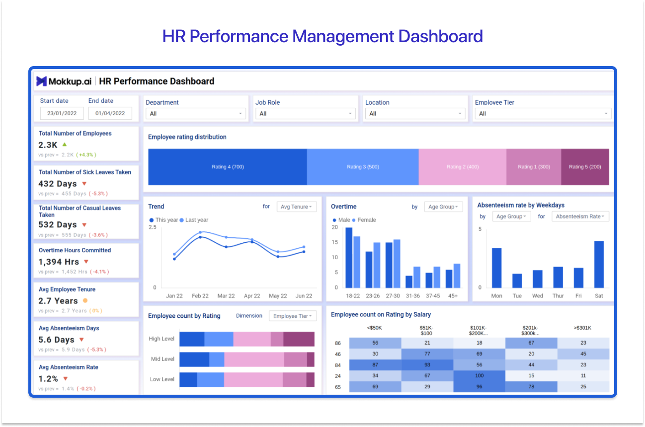
Best for: HR directors and people analytics teams reach for this the most. Any corporate team looking for a Tableau key performance indicator dashboard with employee headcount, attrition risk, and performance distribution by department in one place.
Pros: Dashboard actions filter from department totals down to individual employee details without switching data sources. Fast enough to handle the follow-up questions that come up in every live review.
Cons: Sensitive HR data requires row-level security configured in Tableau Server or Cloud before publishing broadly.
Get the HR Performance Management Dashboard Template on Mokkup →
6. Production Line Operations KPI Dashboard
Most operations KPI dashboards that fail are the ones that try to show everything on one canvas. It becomes noise, and nobody acts on it. The Production Line Operations Tableau KPI dashboard template on Mokkup is built around a different instinct: six numbers that actually move plant performance. Production volume, total downtown, quality defect rate, scrap rate, equipment utilization, and more. When multiple facilities are in scope, the filled map layer does something a data table never can. It shows you geographically where the scrap rate is below threshold, which changes how fast the right conversation starts.
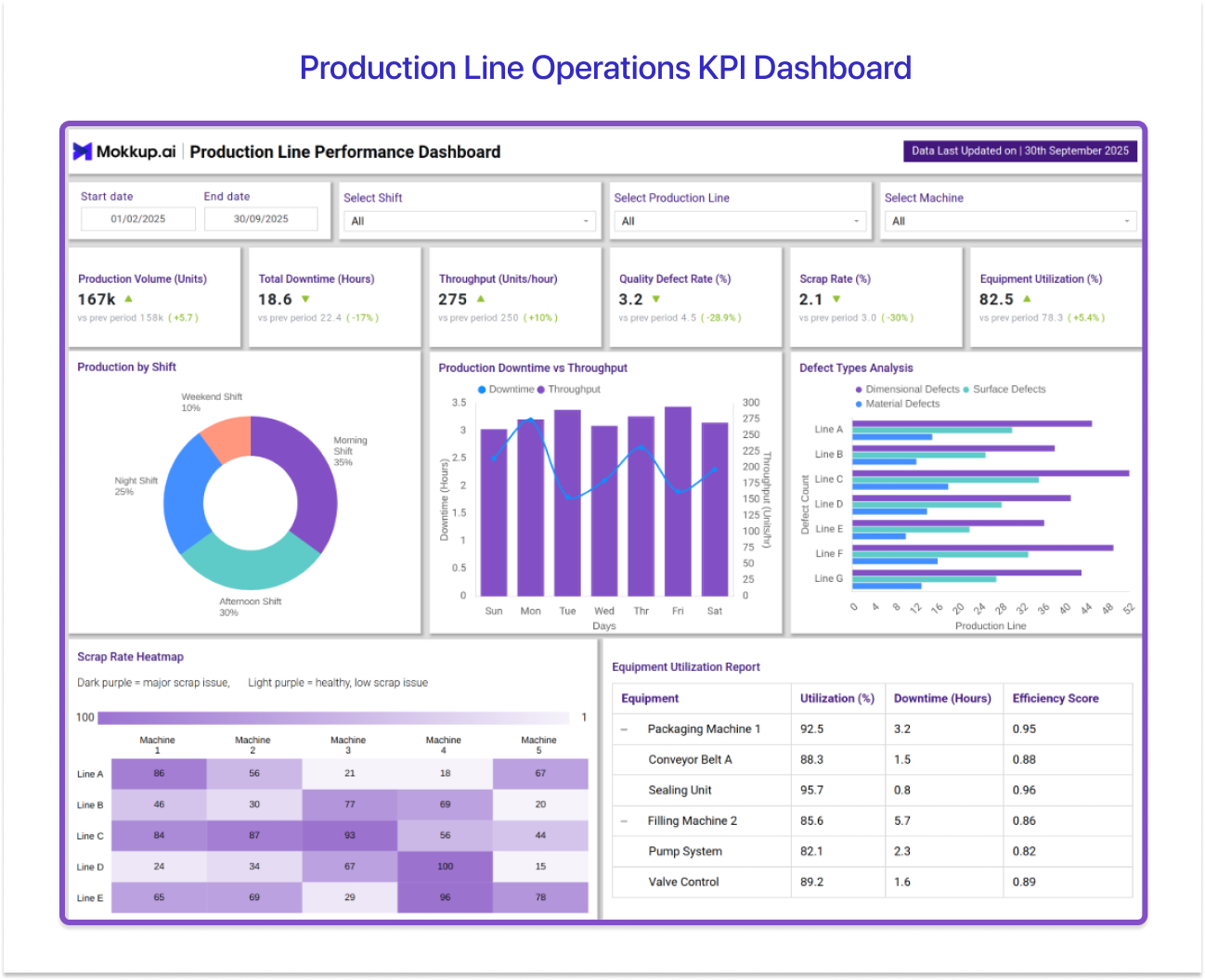
Best for: Tableau KPI tracking for operations managers and plant engineers. Anyone who needs throughput, downtime, and quality KPIs across multiple production lines visible together is the ideal user.
Pros: The filled map layer gives plant-by-plant OEE geographic context when multiple facilities share the same data schema. For multi-site reviews, it adds spatial orientation that raw tables simply don't.
Cons: The Defect Types Analysis chart breaks down by defect category per production line, but with 7+ lines visible, the horizontal bars compress, and defect type labels become hard to distinguish at a glance.
Get the Production Line Operations KPI Dashboard Template on Mokkup →
7. Board of Directors Executive KPI Overview
Another very important Tableau KPI dashboard example to have handy is a Board of Directors Executive KPI overview. Thirty minutes, mixed financial literacy, and a dense workbook of a boardroom will lose its agenda if the view is not designed for them. The Board of Directors Executive KPI Overview on Mokkup is built for that specific constraint. Net revenue, EBITDA, net profit, market share, and strategic initiative completion are sequenced through Tableau's story points in a single narrative flow. C-suite teams preparing quarterly business reviews with this Tableau KPI dashboard template save the a day or more in pre-meeting prep.
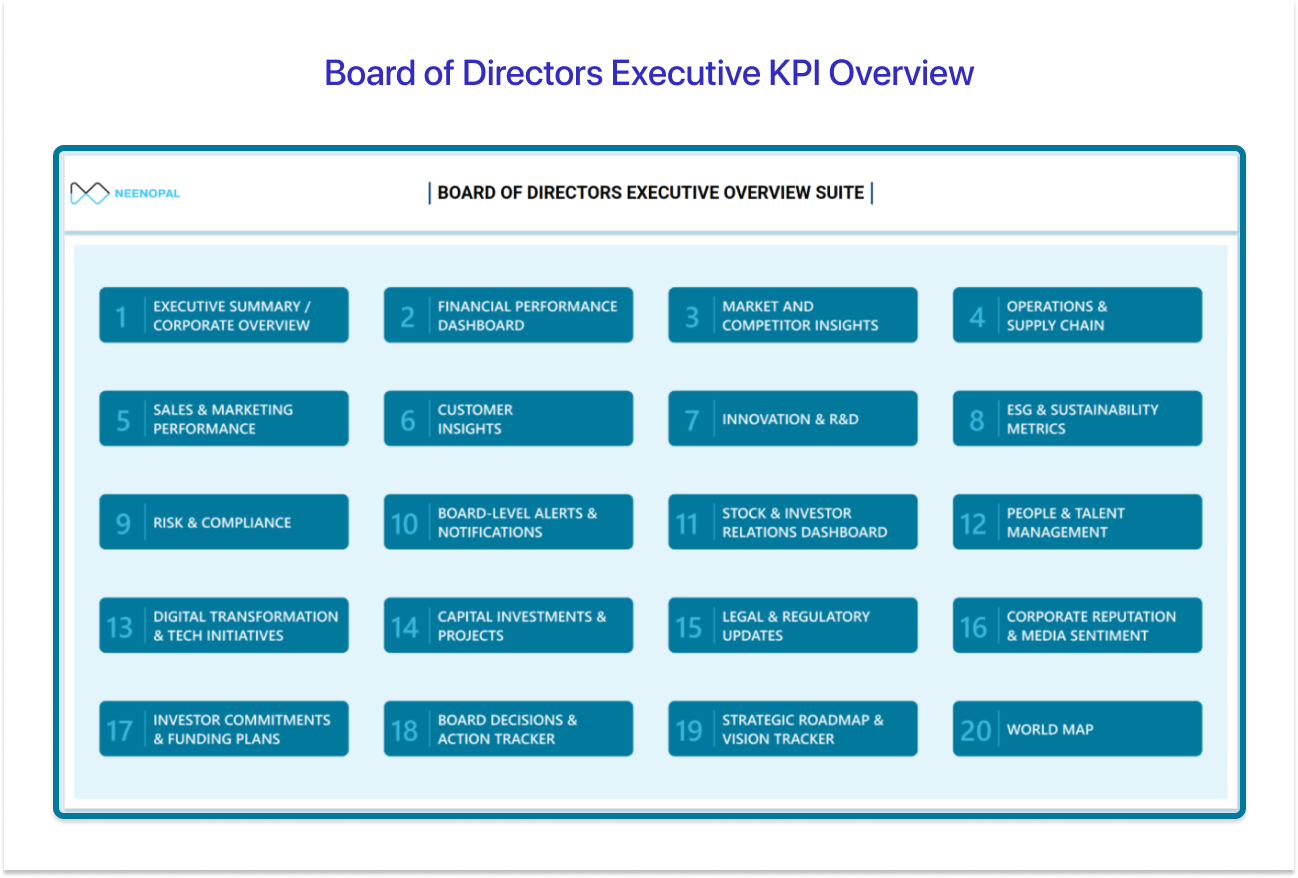
Best for: This is the layout C-suite leaders and board secretariats reach for when they need a quarterly business review package that combines financial, operational, and people KPIs in one presentation-ready view.
Pros: Story points sequence the KPI narrative for board consumption without a parallel PowerPoint build.
Cons: Story point layouts lock at design resolution. 4K boardroom displays or tablet viewing may require a separate device-specific layout.
Get the Board of Directors Executive KPI Overview Template on Mokkup →
8. Productivity and Workforce KPI Dashboard
Operatonal excellence always sounds like a simple calculation until you try to build it. Headcount is in the HRIS. Task and billable hours data are in the project management tool. They rarely share a clean join key, which is why most teams give up and maintain it in a spreadsheet instead. This Tableau KPI dashboard example on Productivity and Workforce KPI solves this directly. It tracks smart KPI & metrics like Kaizen Index, housekeeping standards, operational excellence, lean savings, and more in a single view that helps offer critical insights to boost productivity.

Best for: Team leads and operations heads tracking task completion rates, and workload distribution, are who this Tableau KPI metrics dashboard is designed for
Pros: Each metric pane pairs a trend chart with a summary table directly below it. The visual pattern and the underlying numbers are visible together without any clicking.
Cons: The summary table columns are narrow, making the table harder to read without zooming in.
Get the Productivity and Workforce KPI Dashboard Template on Mokkup→
Tableau KPI Dashboard Templates- Quick Comparison
Use this table to quickly pick the dashboard that matches your role and the question you’re trying to answer.
|
Dashboard |
The question it answers |
Pick this when… |
|
KPI Performance Monitor |
"Are we on track across the business this week?" |
You run weekly leadership reviews and need RAG status across mixed departments without opening separate workbooks |
|
Marketing KPI |
"Which channel is actually converting spend into pipeline?" |
Spend, traffic, and attribution each live in a different platform, and you need them reconciled in one view |
|
Sales Performance Analytics |
"Who's hitting quota, and is the pipeline healthy enough to hit next quarter's?" |
You need rep-level and team-level quota attainment side-by-side without filter changes |
|
Financial Overview |
"What's the P&L story this month, and where's the variance?" |
Your CFO needs cash flow, margin, and budget variance without navigating between tabs |
|
HR Performance Management |
"Where are the people risks by department?" |
You need headcount, attrition, and performance ratings together, drillable to the individual level in the same view |
|
Production Line Operations |
"Which line is dragging down overall output, and where is it?" |
You're monitoring multiple facilities and need geographic context to spot the outlier fast |
|
Board of Directors Executive KPI |
"Are we executing on strategy this quarter?" |
You're building a QBR and need a narrative flow, not a workbook that the board has to navigate themselves |
|
Productivity and Workforce |
"Are teams delivering output efficiently against operational targets?" |
Kaizen index, lean savings, and task completion live in separate tools and never get reviewed together |

What Is a Tableau KPI Dashboard?
A Tableau KPI dashboard is an interactive workbook built in Tableau Desktop or Tableau Online that pulls KPIs from finance, sales, HR, and operations into one live-connected view. It gives actionable insights without anyone having to toggle between multiple tools to get there.
A KPI dashboard in Tableau is a monitoring layer. It doesn't tell you what happened, but how it has affected your tracking KPIs. For example, with a KPI dashboard, you read RAG indicators and trend direction, not drilling into transaction rows. The moment a Tableau key performance indicator dashboard tries to answer too many questions at once, it stops answering any of them well. That's the design principle all good Tableau KPI dashboard examples follow.
What KPIs Does a Tableau KPI Dashboard Track?
Before you start creating a Tableau KPI dashboard template with data or connecting a single table, you need to know which KPIs it needs to track. The Tableau KPI metrics you pick will be the basis of the questions your stakeholders keep asking out loud in meetings. Tableau dashboards are built around two core KPI categories, and knowing which ones belong on yours is the first step towards building a Tableau KPI dashboard with real impact.
Business & Financial KPIs
- Revenue vs. Target: Think of this as the scoreboard. It shows how much your business has earned versus how much you planned to earn, so leadership can see in seconds whether the business is ahead, behind, or exactly where it should be.
- Gross Margin %: This tells you how much money you actually keep after covering the cost of what you sell.
- EBITDA: After deducting axes, loan interest, and accounting adjustments, what's left is EBITDA. It's a clean read on how profitable the core business really is. Finance teams love it because it makes comparisons across time periods and companies much fairer.
- Budget: The gap between what you planned to spend and what you actually spent. Catch it early on a dashboard and you can course-correct.
- Cash Flow: Revenue looks great on paper, but cash flow tells you whether the money has actually landed in the bank. It's the KPI that keeps companies from going broke while technically being profitable.
- Quota Attainment: For sales teams, this is the number that matters most. It shows what percentage of reps hit their target, so you can spot whether it's a top-performer carrying the team or a quota that was set too high to begin with.
Operational & People KPIs
- OEE (Overall Equipment Effectiveness): This is the gold standard for manufacturing performance. It tells you how much of your available production capacity you're actually using well.
- Cycle Time: It's the time period between "we started this" and "we finished this". Shorter cycle times usually mean a more efficient operation.
- Defect Rate: Out of everything you produce or deliver, the defect rate is how much of it comes back wrong. Even a small defect rate can eat into margins fast, so this one belongs on the Tableau KPI dashboards as well.
- Headcount: It means exactly how many people are in the business, broken down by team, location, or role.
- Time-to-Hire: The number of days between opening a role and getting a signed offer. A long time-to-hire often means losing candidates to faster-moving competitors.
- Output per FTE: When you divide your total output (revenue, units, tickets closed) by the number of full-time equivalents producing it, you get Output per Full-time Equivalent or Output per FTE.
Types of Tableau KPI Dashboards
Most BI teams treat the KPI dashboard in Tableau as one thing. But due to different audiences and expectations, all Tableau KPI dashboard examples come down to three different types.
Strategic and Executive KPI Dashboards
An exec usually has thirty seconds or less per slide to get actionable insights. The layout has to do the work by avoiding hunting, filtering, and complex navigation. Strategic and Executive KPI dashboards are built on that idea. They focus on giving the most crucial KPIs in the most visually convenient way possible. Built for board-level views in monthly or quarterly reviews, they consolidate 10–15 metrics across finance, operations, and people into a single screen. Examples 1 and 7 are the clearest Tableau KPI dashboard examples of this type.
Operational and Departmental KPI Dashboards
HR leads open these before their first coffee. Ops managers pull them up at shift change. Workforce planners have them open in a second tab before every headcount conversation. These types of Tableau KPI dashboard examples are used as day-to-day monitoring tools used by teams. They are useful for catching performance gaps early, before they escalate. Examples 5, 6, and 8 fall here.
Revenue and Growth KPI Dashboards
Finance and RevOps dashboards built to track pipeline, actuals, and margin across multiple source systems simultaneously. They answer one question on a loop: are we growing at the right rate, and at what cost? Period-over-period comparisons and LOD calculations keep the numbers consistent across filters. Examples 2, 3, and 4 fit this Tableau KPI dashboard type.
How to Design a Tableau KPI Dashboard
The build-first mistake follows a predictable pattern. The developer connects the data, builds the Tableau workbook over two weeks, and presents it to the exec. The exec asks why the layout is different from what they imagined, or why the date filter works this way. The build restarts. It happens on nearly every first-time Tableau KPI dashboard project planning with a new stakeholder. If the layout conversation happens before any data connection work starts, this rework is avoidable.
The wireframe-first approach is the fix. Lock the design, get approval, then build.
Step 1: Define the KPI set and audience. Every metric the dashboard must show goes on a list. That one step determines layout, refresh cadence, and whether security scoping belongs in the spec. If required, confirm the right KPIs with the stakeholders to have an aligned vision about the dashboard from the start. Hard cap at 12 KPIs per view to avoid overwhelming the viewers.
Step 2: Open a Mokkup KPI dashboard template. Start from one of the Tableau KPI dashboard examples covered above if you don’t want to upload sample data. Each Tableau dashboard template free download option on Mokkup opens directly in the browser, with no installation needed before you start adjusting the layout. If you have a sample data file, upload it to Mokkup's Convo AI, which reads column headers and data types and builds the wireframe around your actual data structure, not generic placeholder fields.
Step 3: Get layout sign-off before writing a calculated field. Share the Tableau KPI dashboard template wireframe link with the stakeholders. Collect feedback on KPI placement, grouping, and filter logic at the design stage. This is where the expensive revision cycles actually get cut as the changes are relatively easy to implement.
Step 4: Export to Tableau with the Semantic Layer. This is where the Mokkup export differs from a Figma file or a PowerPoint sketch. It lets you export a .twbx that has a dataset already inside it. Calculated fields, measures, and formulas are all pre-wired. Point it at Tableau Desktop, pull in the live source, and go straight to validation. The manual rebuild that usually adds two days to a new KPI dashboard build is already done before you even open Tableau.
Step 5: Connect live data and publish. Point the workbook at the live source. Check KPI calculations against what the approved wireframe specified. Then publish to Tableau Server or Cloud, whichever the team is running.
→ Browse free Tableau KPI dashboard templates on Mokkup
Free to Explore 30+ Tableau KPI Dashboard Templates
The eight Tableau KPI dashboard examples in this guide are the layouts teams reach for most often, but they're a fraction of what's in Mokkup's template library. Thirty-plus paid as well as free Tableau KPI dashboard wireframe templates on Mokkup cover almost every real-world use case.
With our revolutionary Tableau export that comes with the dataset, calculated fields, and formulas already pre-wired, you don't spend the first two days manually recreating field logic that should have been settled at the wireframe stage. Every Tableau KPI dashboard template in the library is editable in the browser, shareable via link, and ready to export the moment stakeholder sign-off lands. Pick the layout that fits your use case, adjust it to your actual KPI set, upload a data file to Convo AI if you want the wireframe built around your columns, and go from approved design to live Tableau KPI tracking faster than starting with an empty workbook.
Frequently Asked Questions
An interactive Tableau workbook pulling KPIs from finance, sales, HR, and operations into one view. The Tableau KPI dashboard examples in this guide cover the most common executive and operational layouts.
Depends entirely on who's reading it. Exec-level dashboard includes business-specific KPIs like revenue vs target, EBITDA, headcount, NPS, and more. Sales teams want quota attainment, pipeline coverage, time-to-hire, and performance distribution by department. Thus, it's important to sort out the KPI list with the stakeholder before the first build.
The export is a .twbx with a dataset, calculated fields, measures, and formulas, all pre-configured before you open Tableau. This means you only need to drop a sample dataset into Convo AI, describe what the Tableau business KPI dashboard needs to do, and Mokkup reads the column names and data types and wires the field logic into the export automatically. What you open in Tableau Desktop already has the KPI calculations built in.
Yes, CRM, ERP, HRIS, finance, all pulled into one workbook via cross-database joins or data blending. For large multi-source builds, run everything through Tableau Prep first. Clean, union, shape before it hits the viz layer to keep the dashboard fast and the calculations stable.
Prompt it. Wireframe it with Mokkup.ai.
