
Starting a Tableau dashboard from scratch can be tough, especially when unsure how to organize your data or what to show first. That’s why using ready-made dashboard templates can be a big help. They give you a clean layout, so you can focus more on your data and less time figuring out the design.
For example, a KPI summary template can quickly show essential numbers like total sales or customer sign-ups. Or try a regional sales map to see which areas are doing well. In this blog, we’ll look at some of the best Tableau dashboard templates you can use today, with ideas for how they fit into different projects.
Table of Contents
- Why Use Tableau Dashboard Templates?
- Types of Tableau Templates Available
- Top Free Tableau Dashboard Templates
- Premium Tableau Dashboard Templates Worth Exploring
- UI/UX Best Practices in Tableau Dashboards
- Customizing Tableau Templates to Match Your Brand
- Where to Find Reliable Tableau Templates
Why Use Tableau Dashboard Templates?
Using Tableau dashboard templates can smooth your workflow. Instead of spending hours deciding on layouts, colors, and chart types, you can begin with a pre-built structure that already follows solid design principles. This is extremely useful when working under tight deadlines or developing dashboards for many teams.
Here's why using Tableau dashboard templates is a wise decision:
- Saves Time: Get a head start with pre-designed layouts so you can focus on data, not formatting.
- Reduces Guesswork: Templates follow tried-and-tested structures, so you don’t have to wonder what goes where.
- Ensures Consistency: Maintaining a consistent look and feel across reports and dashboards benefits teams.
- Improves Clarity: Good templates highlight the most critical metrics, allowing users to quickly identify insights.
- Perfect for Beginners: If you're new to Tableau, templates provide a useful starting point.
Tools like Mokkup take it further by letting you wireframe your dashboards before you connect the data. They also offer pre-built templates that can be edited visually and exported directly into Tableau or Power BI formats, making the process faster and more collaborative.
Templates are more than simply shortcuts; they're intelligent tools for creating better dashboards faster. Once you've found one that meets your needs, customizing it is simple and effective.
Types of Tableau Templates Available
Tableau templates exist in various shapes and sizes, depending on the data type you're working with and the narrative you want to tell. From quick executive summaries to comprehensive trend analysis, there is a template for practically every use situation.
Dashboard customization usually falls into three main types, each serving a different purpose (Source):
- Operational Dashboards: These are used to monitor real-time business activities. They pull data from various sources and include a wide range of metrics to give a live snapshot of daily operations. For example, a logistics company might use an operational dashboard to track real-time delivery status, fleet movement, and delays.
- Analytical Dashboards: Focused on historical data, these dashboards help spot patterns and trends over time. Analysts often use them to create in-depth reports and suggest improvements based on past performance. For example, a retail brand could use an analytical dashboard to study sales trends over the last year and understand which products performed best by season.
- Strategic Dashboards: These are designed to track progress against key performance indicators (KPIs). They help teams stay aligned with business goals and guide long-term decision-making. Example: A company’s leadership team might use a strategic dashboard to monitor revenue targets, profit margins, and customer growth against quarterly goals.
Each type of dashboard plays a unique role in helping teams understand their data better. Choosing the right one depends on whether you’re tracking live updates, researching past trends, or aligning with long-term goals.
Top Free Tableau Dashboard Templates
If you're just getting started or working on a tight budget, there are plenty of free Tableau dashboard templates available online. These templates can save you time, spark design ideas, and help you deliver clean, professional-looking dashboards without writing everything from scratch. You can edit the Mokkup dashboard templates and export them in Tableau files.
Here are some popular free Tableau dashboard templates to explore:
1. E-commerce Sales Forecasting
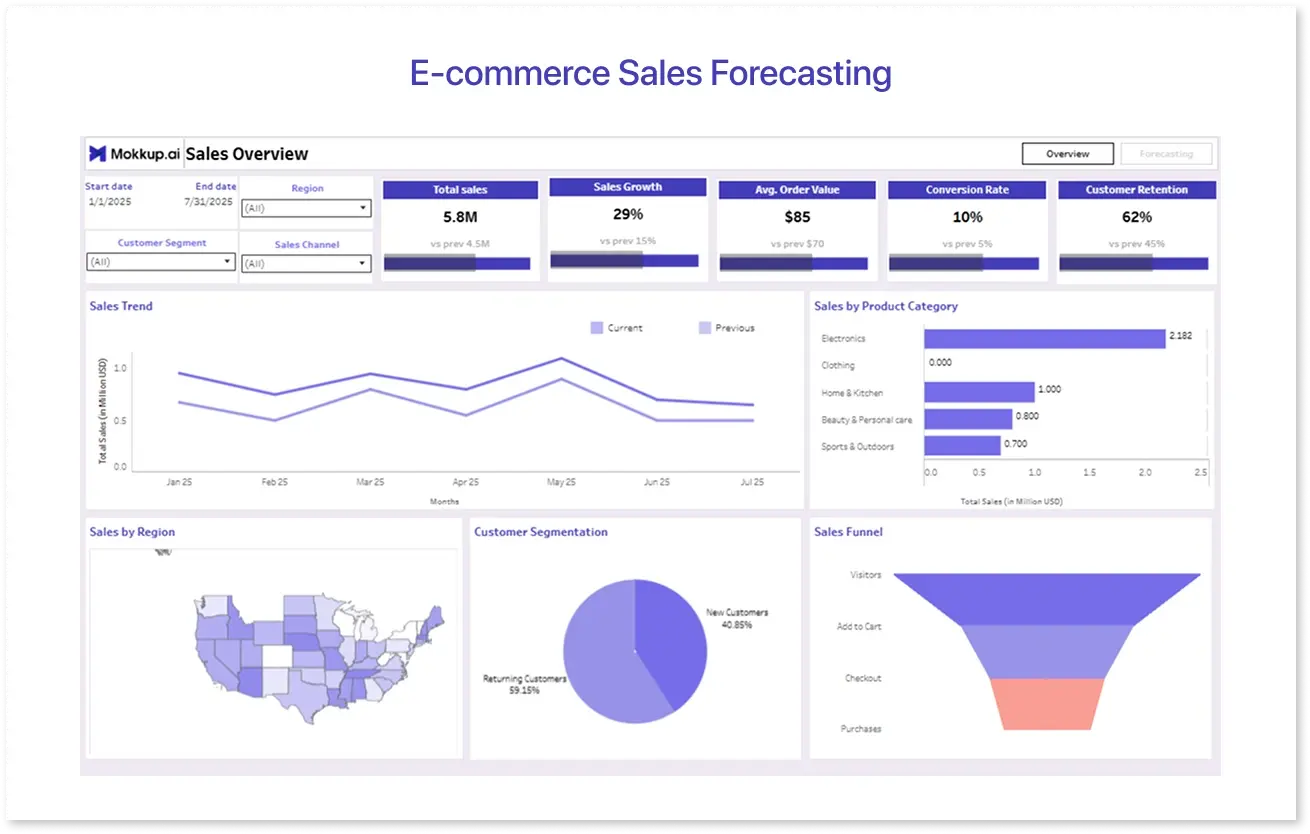
The eCommerce Sales Forecasting dashboard template is a practical, ready-to-use layout designed for online businesses. It blends historical performance with future estimates to assist eCommerce teams in forecasting future sales, making it easier to manage inventory, organize promotions, and handle peak seasons. The intuitive components include forecasted line charts, category breakdowns, and long-term revenue trends.
This template streamlines the forecasting process.
- Clear Visuals: Expect clear graphics that compare past sales to expectations.
- Flexible Filters: For more detailed information, drill down by product, region, or date range.
- KPI Highlights: Key metrics such as projected revenue, forecast accuracy, and sales growth are front and center.
- Seasonality Awareness: Compare patterns throughout different periods to plan wisely.
Whether preparing for peak sales periods or adjusting to shifting demand, this dashboard wireframe keeps you ahead. It's a helpful template to turn past data into confident future decisions.
2. Sales and Stock Levels Overview
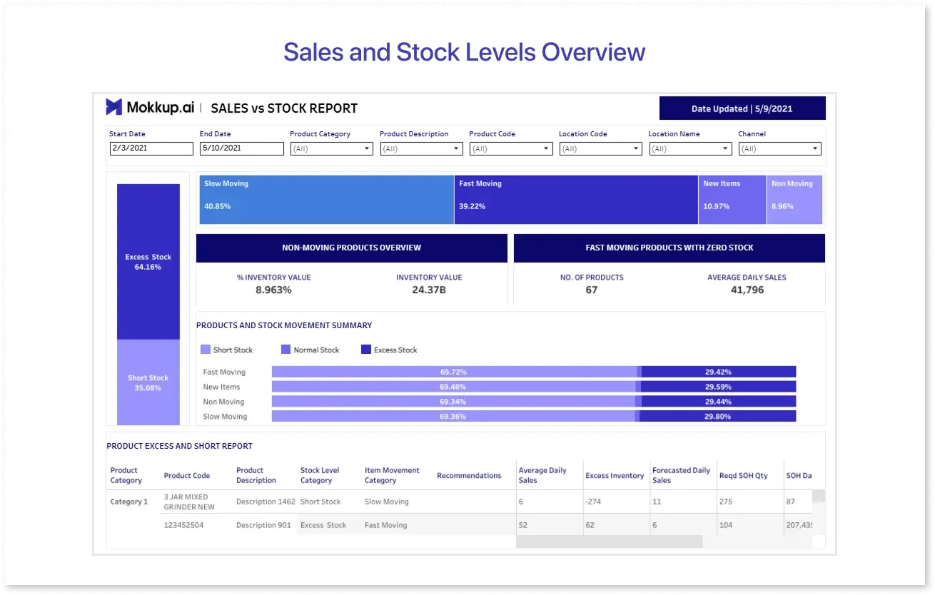
The Inventory Sales vs Stock dashboard template allows businesses to quickly monitor what's in stock, what's selling well, and what's falling behind. It presents crucial indicators such as current stock levels, sales trends, inventory value, and turnover in a clear, interactive format. This dashboard is ideal for inventory or supply chain teams that require real-time information before making decisions.
Why does this dashboard template stand out?
- High-Demand Versus Slow-Moving Items: Easily identify which SKUs are flying off shelves and collecting dust.
- Stock Valuation Insights: Consider the overall inventory value and the cost of replacing stock when goods fall below safe levels.
- Turnover Tracking: Determine how rapidly inventory moves. It is ideal for finding bottlenecks and improving reorder cycles.
This template is helpful for anyone looking to balance supply and demand, reduce dead stock, and keep inventory aligned with sales, without starting from scratch.
3. E-commerce Cohort Analysis
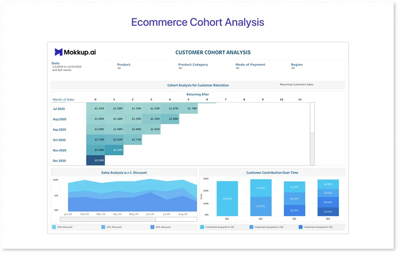
This eCommerce cohort Analysis dashboard template was created to help e-commerce organizations track how customer behavior changes over time. It divides customers into cohorts depending on when they initially made a purchase and then visualizes their return activity over the following weeks or months.
What makes this template useful?
- Cohort Heatmap: Demonstrates client retention patterns by highlighting how many consumers from each cohort returned in subsequent periods.
- Sales vs. Discount Trends: A line chart shows how various discount levels affect sales over time.
- Customer Contribution Over Time: Stacked bar charts show how different cohorts contribute to overall sales over quarters.
This type of analysis is critical for strengthening retention efforts, optimizing discounts, and determining long-term customer worth. These free Tableau templates are a great way to start without building from scratch. If you want more advanced features and polished designs, let’s explore some premium options next.
Premium Tableau Dashboard Templates Worth Exploring
If you're ready to take things to the next level, Mokkup Pro provides a selection of professionally created Premium Tableau dashboard templates that combine functionality with a slick visual style. These templates go above and beyond the fundamentals, making them suitable for teams looking for polished dashboards without spending hours on style or structure.
1. HR Recruitment Dashboard
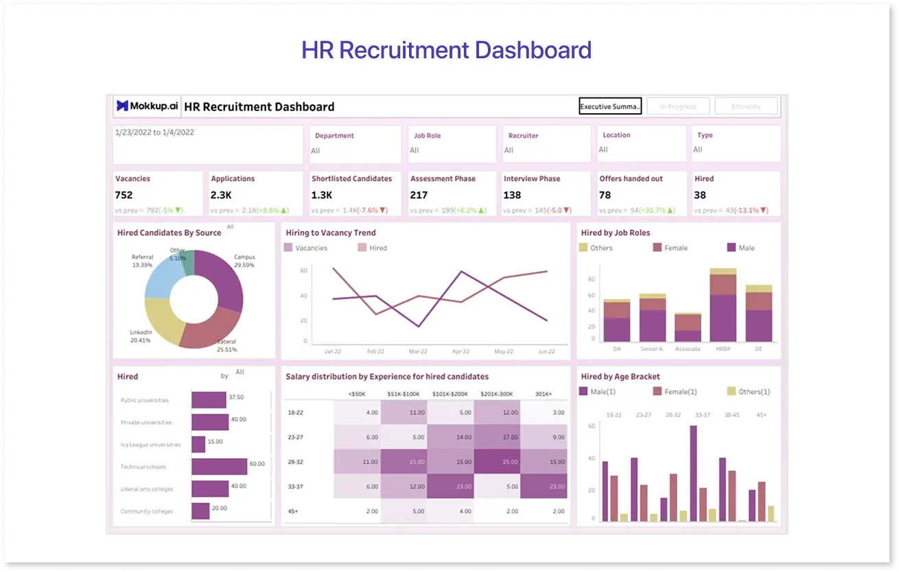
This HR Recruitment dashboard template, designed for HR teams and talent acquisition experts, provides a high-level perspective of the whole hiring process, from applications to final offers. It monitors recruitment performance across departments, job titles, recruiters, and locations.
The key features of this dashboard template:
- Comprehensive Filters: Drill down by department, job role, recruiter, and more for focused analysis.
- Pipeline Clarity: Track stages such as applications, shortlisting, assessments, interviews, offers, and hiring.
- Diversity Insights: Include visual breakdowns of recruiting by gender, age range, and educational background.
- Salary & Experience Mapping: Heatmaps help you comprehend the compensation distribution based on experience level.
- Source Effectiveness: Determine which channels (referrals, LinkedIn, campus, etc.) attract the most candidates.
This template makes recruitment analysis more innovative and strategic. It is excellent for quarterly hiring reviews or ongoing HR optimization.
2. Marketing Funnel Dashboard
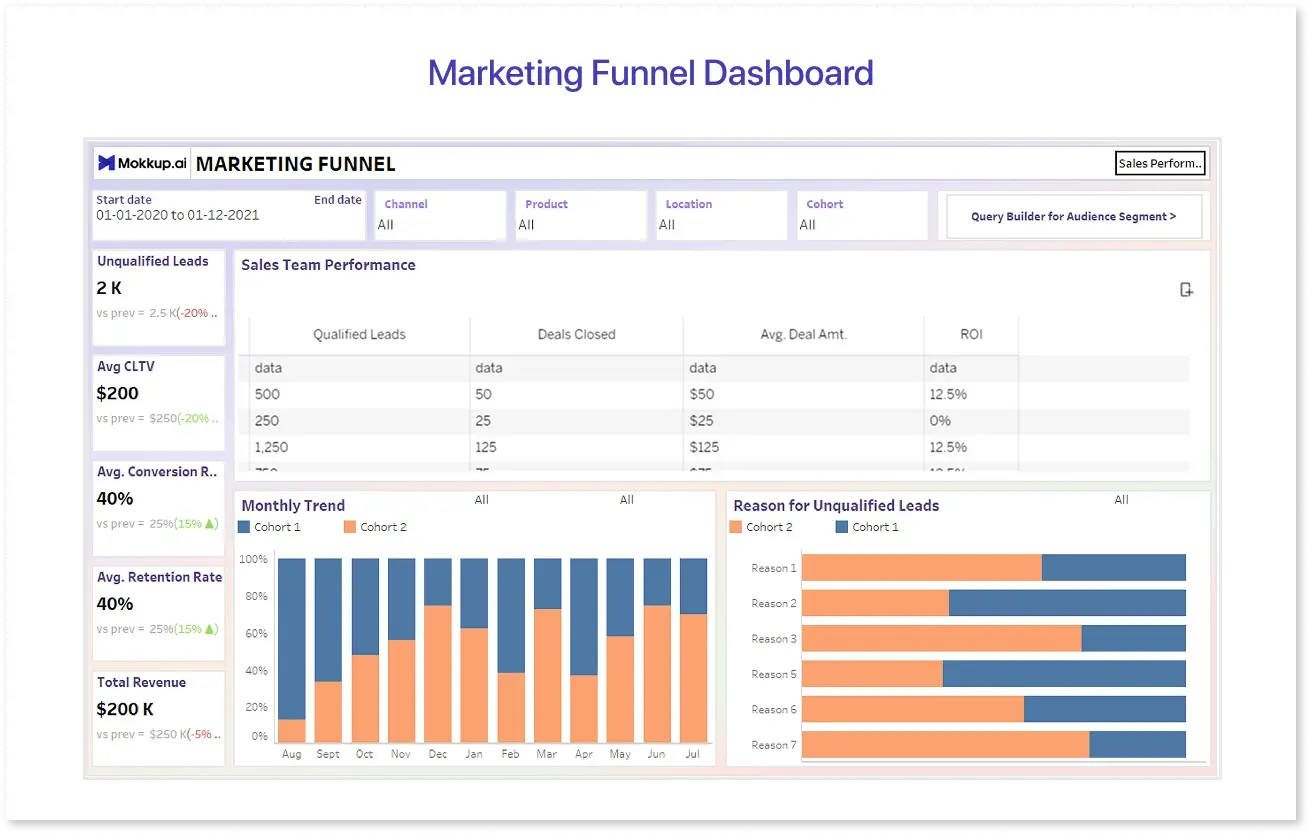
This Marketing Funnel dashboard template is intended for marketing and growth teams that want to track the process from lead generation to deal closure. It provides a bird's-eye perspective of performance across channels such as paid search, social, and email, making optimizing campaigns and tracking ROI easier.
Highlights of this dashboard template:
- Funnel Breakdown: See how each stage, Leads Generated, Marketing Qualified Leads (MQLs), Sales Qualified Leads (SQLs), and Deals Closed, changes over time.
- Cost and Efficiency Metrics: Monitor Average CAC, Cost per Lead, and Average Deal Value.
- ROI Analysis: Identify the top-performing channels and regions using interactive tables and bar charts.
- Regional Performance: You can see where your marketing performs best with top-five and segmented views.
- Time-Based Filters: Filter by date, product, cohort, or channel to tailor the insights.
Ideal for performance marketers and campaign managers aiming to optimize every stage of the acquisition pipeline.
3. Procurement Inventory Dashboard
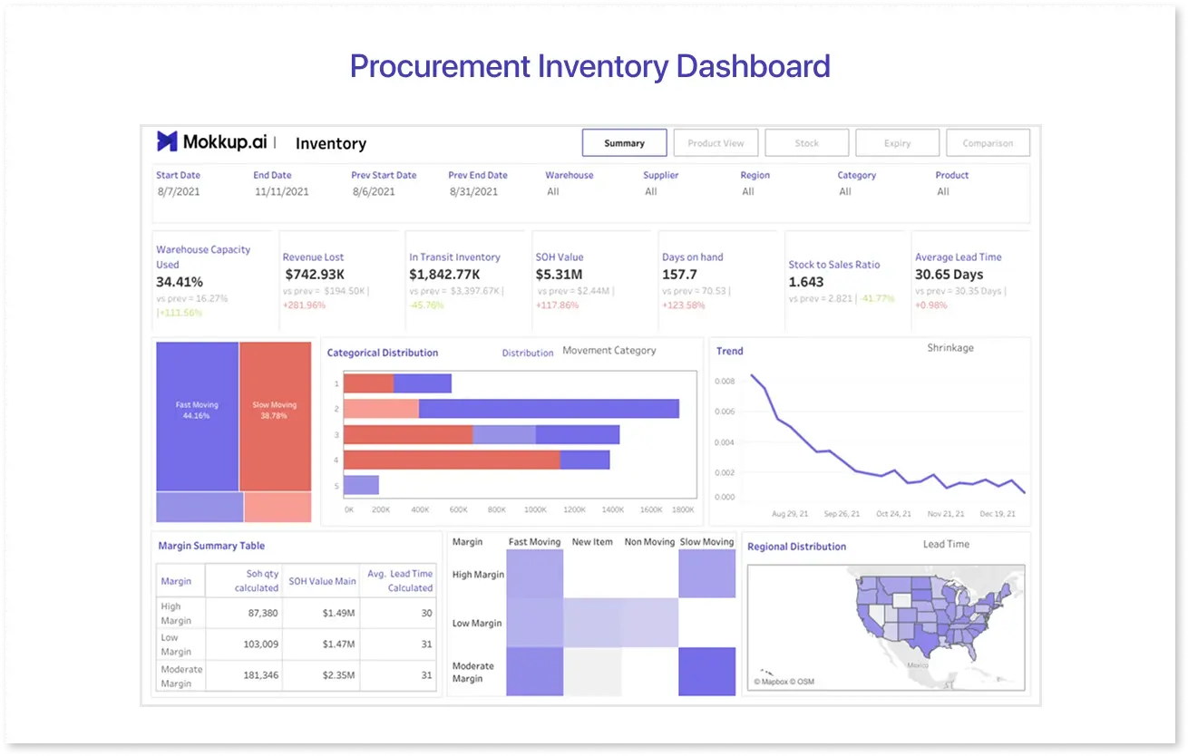
This Procurement Inventory dashboard template, designed for supply chain and procurement teams, provides a complete picture of inventory performance. It assists teams in identifying bottlenecks, reducing lead times, and minimizing stockouts or overstocking issues.
The core components of this dashboard include:
- Key Inventory Metrics: Evaluate SOH (Stock on Hand) value, revenue lost, days on hand, lead time, and stock-to-sales ratio at a glance.
- Inventory Classification: Gain insight into product movement by comparing fast-moving and slow-moving distributions.
- Trend Tracking: Monitor inventory shrinkage patterns over time to improve loss prevention.
- Margin-Focused Views: Divide inventory into three categories (high, moderate, and low) and correlate with movement and value.
- Regional Distribution: Visualize lead time performance by area to uncover inefficiencies in the supply chain.
This dashboard template is ideal for operations and procurement managers who want to maximize inventory turnover and increase planning accuracy.
UI/UX Best Practices in Tableau Dashboards
Creating an effective Tableau dashboard is about crafting an experience, not just facts. These UI/UX best practices ensure users can easily explore and interpret insights.
1. Keep it Clean and Simple:
Avoid clutter. Use white space wisely, limit the number of visualizations per view, and ensure every element has a specific purpose.
2. Use Consistent Design Elements:
Maintain a consistent font style, color scheme, and iconography. Consistency enhances reading and lends the dashboard a polished, professional appearance.
3. Prioritize Key Information (Visual Hierarchy):
Use size, bold fonts, and positioning to highlight the most critical KPIs or charts. Guide the user's gaze from top left to bottom right.
4. Use Color Intentionally:
Instead of decorating, use color to emphasize changes, trends, or anomalies. Stick to 2-3 main shades and use them meaningfully (for example, green for growth, red for decline).
5. Enable Intuitive Interactivity:
Use clearly defined and user-friendly filters, parameters, and tooltips. Avoid giving users too many dropdowns or options.
6. Design for the User's Context:
Understand who will use the dashboard. Executives may require high-level information, while analysts may require more in-depth analysis. Adjust the layout and complexity accordingly.
7. Mobile-Responsive Layouts:
If users view dashboards via tablets or phones, create responsive layouts with Tableau's Device Designer to optimize for smaller screens.
8. Use Descriptive Titles and Labels:
Avoid obscure labeling. Clear titles, axis labels, and legends help users immediately understand what they're looking at, without second-guessing.
9. Incorporate Feedback Loops:
Test early. To ensure usability and functionality, allow users to engage with prototypes or wireframes (for example, at Mokkup.ai) before final development.
10. Limit Scroll and Click Depth:
Avoid lengthy scrolling or many clicks to reach essential information. Dashboards should provide value at a single glance or interaction.
By sticking to these UI/UX best practices, you can ensure that your Tableau UI dashboards are data-rich but also user-friendly and practical. A well-designed dashboard does more than just display statistics; it tells a story viewers can easily understand and act on.
Customizing Tableau Templates to Match Your Brand
Customizing Tableau dashboard templates to fit your brand increases trust and guarantees a consistent user experience. A standard template can be transformed into a clean, professional, and brand-aligned dashboard with a few easy changes, such as fonts, colors, and layout.
Here are some best practices for branding your Tableau templates:
- Use Brand Colors: Select the "Edit Colors" option to apply your official brand palette to charts, filters, and highlights.
- Set Custom Fonts: Replace default fonts with your brand-approved typefaces via Tableau's formatting options or dashboard containers.
- Add Logos and Icons: Use image objects to insert your company’s logo or relevant branded icons for subtle reinforcement.
- Align Language and Terminology: Rename sheet titles, tooltips, and filters to match your organization’s tone, style, or product language.
- Customize Tooltips and Legends: Use branded language and formatting in tooltips to provide a consistent narrative and better user engagement.
- Establish a Template Style Guide: Create a reusable internal reference guide that outlines your Tableau dashboard styling guidelines.
Consistent branding throughout your dashboards enhances visual attractiveness, confirms your organization's identity, and increases user adoption. A little polish may go a long way toward transforming raw data into a customized storytelling experience.
Where to Find Reliable Tableau Templates
Finding high-quality Tableau templates can help you save time, improve design, and accelerate the dashboard production process. Whether you need templates for sales, marketing, finance, or human resources, there are various reliable sources to choose from.
Here are some of the best places to find reliable Tableau templates:
- Tableau Public Gallery: Tableau Public is a community-driven platform where professionals share free, downloadable dashboards across industries.
- Mokkup.ai: Mokkup provides customizable wireframes and pre-built templates that can be exported directly into Tableau or Power BI, allowing for faster design and client approvals.
- Tableau Exchange (formerly Tableau Accelerators): Tableau Exchange is a curated collection of industry-specific dashboards built by Tableau and partners for quick deployment.
- GitHub & Data Viz Communities: Open-source contributors often share templates and code for unique use cases and creative designs.
- Third-Party Marketplaces: Websites like Etsy, Gumroad, or specialized analytics blogs sometimes charge for premium dashboard templates.
Using these sources ensures you're starting with built-in best practices, allowing you to focus more on insights and less on layout.
Conclusion
Tableau templates make dashboard creation faster and more efficient, whether you're tracking KPIs, forecasting, or evaluating trends. With the appropriate design and little tweaking, you can transform any template into a polished, branded tool that communicates insights clearly and effectively.
Frequently Asked Questions
Yes! Using Tableau's formatting and image tools, you can change colors, fonts, logos, and layout styles to align the dashboard with your brand identity.
Absolutely. Many free templates on platforms like Tableau Public or Mokkup.ai are created by professionals and follow best practices. They're great starting points for various industries and use cases.
Start by identifying the purpose: operational, analytical, or strategic. Then choose a template that fits your industry and includes relevant KPIs, filters, and charts for your audience.
Prompt it. Wireframe it with Mokkup.ai.
