
What is an HR Performance Management Dashboard?
An HR Performance Management Dashboard is a centralized tool that enables HR teams and business leaders to visualize workforce data in real-time. It helps track employee productivity, attendance, engagement, and performance ratings using visual metrics.
With this Performance Review Dashboard, managers can monitor trends, compare performance across departments, and identify areas for improvement. It simplifies HR reporting and enables data-driven decisions through intuitive visuals. This type of dashboard is particularly useful for HR analytics teams seeking a Comprehensive HR dashboard for performance tracking. It highlights actionable metrics and provides in-depth insights into workforce trends.
How to Create a HR Performance Management Dashboard
You don’t need to build your report from scratch—just start with a ready-to-use dashboard template from Mokkup. Add in your data and export it however you like. Here’s how to do it:
1. Create or Log in to Your Mokkup Account
Start by signing up on Mokkup.ai using your email. If you already have an account, just log in, and you’ll be good to go.
2. Choose and Customize Your Dashboard Template
Find the HR Performance Management Dashboard template in the Templates section. Use the drag-and-drop editor to adjust KPIs, edit filters, or add elements based on your data.
3. Export to Your BI Tool
Once your dashboard wireframe is ready, use the BI Tool Export feature to send it directly to Power BI or Tableau for further analysis and enhancements. You can also download the dashboard as a PDF, PNG, or JPEG, embed it on a platform, or invite your team to collaborate.
Note: This is a Pro template. You’ll need a Pro subscription on Mokkup to use and customize this dashboard wireframe. Upgrade anytime to unlock full access.
HR Performance Management Dashboard Example
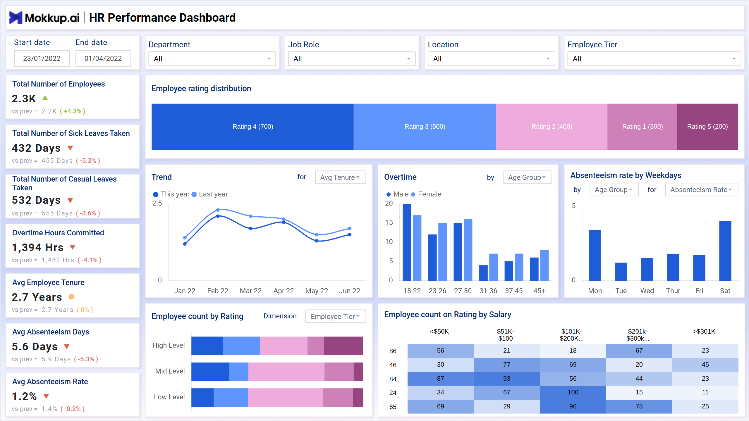
A strong example of an HR Performance Management Dashboard can be seen in the version developed by Mokkup.ai. This dashboard captures all the essential workforce KPIs and presents them through interactive visuals designed for quick interpretation.
The core of the dashboard focuses on employee rating distribution, represented using a doughnut chart that categorizes employees by performance levels. Each rating segment—from high performers to those requiring improvement is color-coded for easy distinction. A line chart effectively highlights yearly performance trends, enabling HR professionals to compare progress against past data.
Next, a column chart illustrates overtime hours segmented by gender and age group, making it easier to analyze how workload is distributed across demographics. A bar chart shows absenteeism rates by weekday, revealing patterns that might indicate attendance challenges. Additional visualizations, such as tree maps and stacked bars, display employee counts by performance rating and salary bracket, offering deeper insights into how compensation and performance are correlated.
How to Analyze Data in HR Performance Management Dashboards
The best HR dashboards for performance tracking enables data analysis in the following ways:
- Monitor Employee Trends: Compare metrics such as absenteeism, overtime, and performance year-over-year using trendline charts.
- Segment by Role or Department: Use filters to analyze data across different job roles/ responsibilities, locations, or employee tiers.
- Identify Productivity Patterns: Visualize performance ratings across age groups and salary brackets to understand engagement levels.
- Track Attendance Insights: Study absenteeism rates by weekdays to identify when attendance drops.
- Correlate Overtime with Performance: Analyze whether high overtime hours affect employee satisfaction or ratings.
- Assess Workforce Stability: Monitor average tenure and turnover indicators to measure organizational health.
Benefits of HR Performance Management Dashboards
The following are the benefits of the Employee Performance Dashboard:
- Centralized HR Data: Integrates employee data from multiple HR systems into a single, unified dashboard.
- Data-Driven Decisions: Visual Insights Enable HR Teams to Make Evidence-Based Workforce Strategies.
- Real-Time Monitoring: Live updates help identify issues such as rising absenteeism or overtime early.
- Improved Performance Reviews: Enhances employee evaluation transparency and consistency.
- Customizable Views: Filters for roles, departments, and locations allow personalized analytics.
- Time-Saving Reporting: Eliminates manual data compilation and speeds up HR reporting processes.
KPIs to Track in HR Performance Management Dashboards
The following KPIs are included in the HR Reporting Dashboard:
- Total Number of Employees: Measures workforce size and growth trends.
- Total Number of Sick Leaves Taken: Indicates employee well-being and health trends.
- Overtime Hours Committed: Tracks workload balance and potential burnout risks.
- Average Employee Tenure: Reflects retention levels and workforce stability.
- Average Absenteeism Rate: Helps assess consistency in attendance and productivity.
- Employee Count by Rating: Provides an overview of performance distribution across the organization.
- Employee Rating Distribution: Evaluates the spread of performance levels for strategic talent management.
Frequently Asked Questions
1. What makes an Employee Performance Dashboard effective?
A well-designed dashboard combines KPIs, interactive filters, and visual elements, such as bar and line charts, to simplify analysis and inform better HR decisions.
2. Can the HR dashboard be customized for specific departments?
Yes. Filters for job roles, departments, and locations enable easy tailoring of analytics to meet specific business needs.
3. How does the dashboard support performance reviews?
It provides transparent visibility into ratings, attendance, and productivity metrics, enabling data-backed performance evaluations.
4. Which visualizations are best for HR dashboards?
Column charts, bar charts, line charts, tree maps, and doughnut charts effectively display employee performance and attendance metrics.