Keeping track of finances should not feel complicated, yet many businesses still struggle to see where their money is coming from and where it is going. Cash flow issues, rising expenses, and unclear profitability often go unnoticed until they begin to impact day-to-day operations.
Around 30% of invoiced revenue becomes overdue for many businesses, and nearly half of finance leaders say they struggle to access reliable financial data when they need it. Without clear visibility into financial numbers, it becomes harder to manage cash, strengthen expense management, and plan for growth.
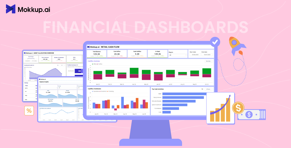
Financial dashboards help solve this by presenting key numbers in a single, clear view. Instead of switching between spreadsheets and reports, teams can quickly understand cash flow, expenses, and profitability at a glance. In this post, we’ll walk through three Mokkup.ai financial dashboard templates that show how dashboards support better financial performance reporting and decision-making.
Table Of Contents
- Why Financial Visibility Is Critical for Businesses
- Common Challenges in Financial Tracking
- What is a Financial Dashboard?
- Financial Dashboard Template Examples
- How Financial Dashboards Support Key Financial Areas
Why Financial Visibility Is Critical for Businesses
Clear financial visibility enables businesses to understand their current position and make informed decisions without relying on guesswork.
- Difficulty spotting cash shortages or surpluses early.
- Limited insight into rising costs and spending patterns.
- Delays in identifying changes through timely profitability analysis.
When financial data is easily reviewed and compared, teams can act more quickly and reduce financial risk.
Common Challenges in Financial Tracking
Managing finances across multiple financial reports makes it harder to see the whole picture and slows down decision-making.
- Cash flow, expenses, and revenue are tracked in separate tools.
- Manual reporting takes time and increases the chance of errors.
- Delayed insights that weaken financial performance reporting.
These challenges often lead businesses to seek a more structured and visual approach to tracking financial performance.
What is a Financial Dashboard?
A financial dashboard is a visual tool that allows you to track and review key financial metrics in one place. Instead of working through multiple spreadsheets or reports, dashboards present important numbers in an easy-to-understand format using charts, tables, and summaries.
These dashboards typically bring together data on cash flow, expense trends, and profitability, enabling teams to review business performance over a defined period. The goal is not deep accounting analysis, but clarity. A well-designed financial dashboard highlights what matters most and supports faster, more confident decisions.
What Makes a Financial Dashboard Effective
An effective financial dashboard prioritizes relevance over volume. It focuses on metrics that directly reflect business performance, such as cash inflows and outflows, major expense categories, and outcomes used for profitability analysis. This helps teams stay focused on what truly matters in terms of results.
Equally important is presentation. Clear visuals, logical metric grouping, and consistent layouts make it easier to compare performance over time. When dashboards are designed in this way, they become practical tools for ongoing financial performance reporting, rather than just static summaries.
The following sections showcase 5 Mokkup.ai financial dashboard template examples that apply these principles to clearly track cash flow, expenses, and profitability.

Financial Dashboard Template Examples
Seeing financial metrics in theory is one thing; however, actually applying them is another. Seeing them laid out clearly in a dashboard is what makes them truly useful. Mokkup offers a wide range of customizable dashboard templates that help turn raw numbers into structured views, making them easier to review, compare, and act on during regular financial check-ins.
Each template below focuses on a specific financial area, helping teams answer key questions such as how stable their cash position is, where money is being spent, and how profitable the business really is. Rather than overwhelming users with data, these templates highlight the metrics that matter most for day-to-day financial decisions.
The following examples show how Mokkup’s financial dashboards can bring clarity to cash flow, expenses, and profitability using simple, well-organized layouts.
1. Cash Flow Planner Template for Budgeting & Forecasting:
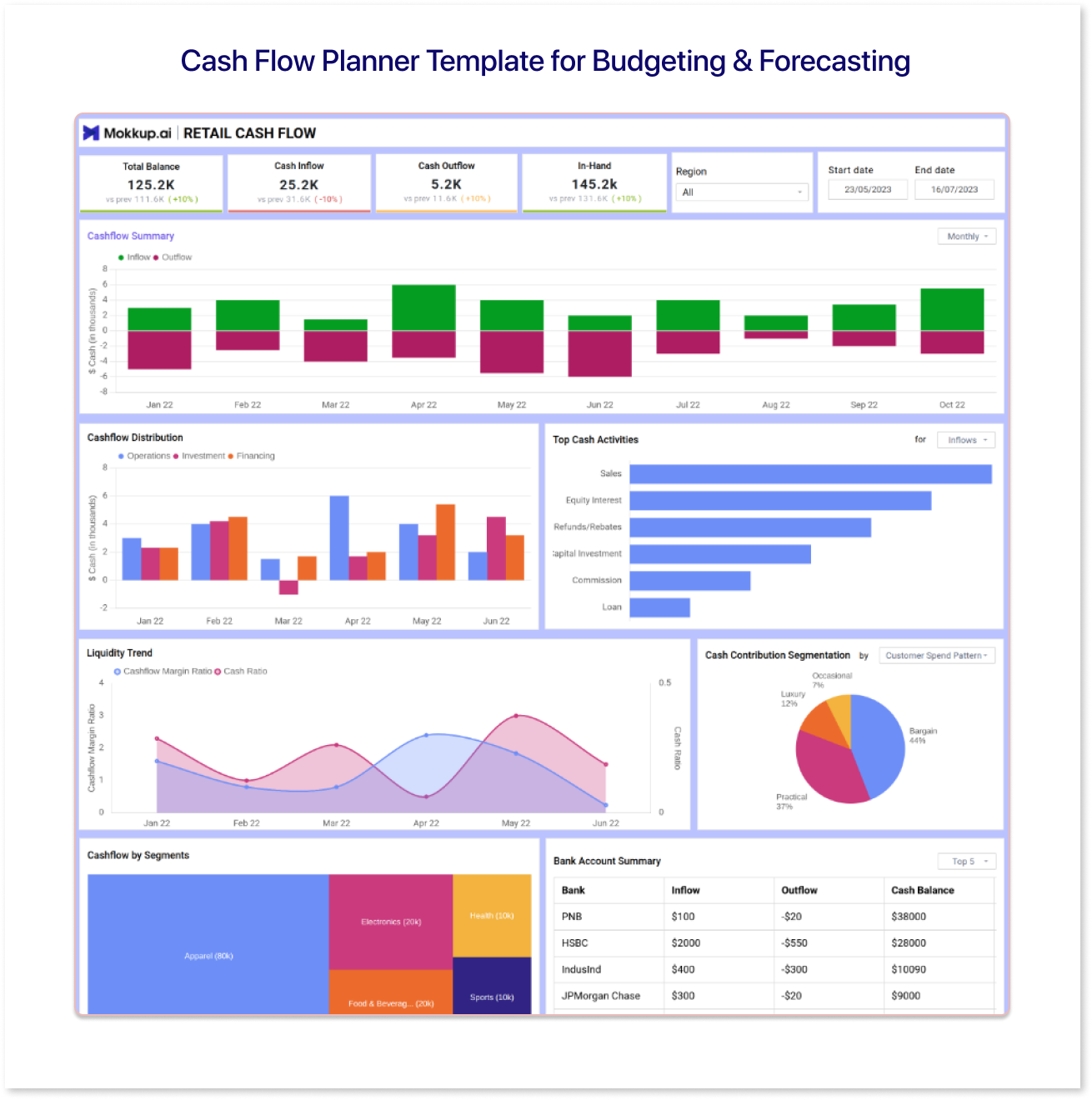
The Mokkup Cash Flow Planner Template is designed to help businesses plan and forecast cash movement over a defined period. It focuses on expected cash inflows and outflows, allowing teams to estimate future cash positions rather than track past transactions.
The template supports budgeting by organizing projected income and expenses in a clear, structured layout. This makes it easier to assess whether planned cash inflows are sufficient to cover upcoming costs and to understand how changes in assumptions may impact cash availability.
By using this cash flow planner dashboard template, teams can prepare for upcoming financial obligations, evaluate different scenarios, and make more informed short-term financial decisions without relying on complex spreadsheets.
2. Expense Insights Dashboard Template:
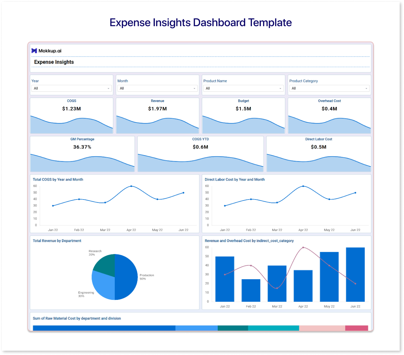
The Mokkup Expense Insights Dashboard Template supports effective expense management by consolidating spending data into a single, clear, and organized view. Instead of digging through piles of spreadsheets, this template presents key spending data in a clear, organized view.
It highlights expense categories and trends, allowing you to see where your money is going and how spending patterns change over time. By grouping and visualizing expenses, it becomes easier to compare actual costs with expected budgets and identify areas where spending exceeds planned amounts.
Using this dashboard template, teams can make more informed decisions about cost control, understand major expense drivers, and ensure that spending aligns with financial goals, all without spending hours building charts or reconciling multiple reports.
3. Portfolio Performance Dashboard Template:
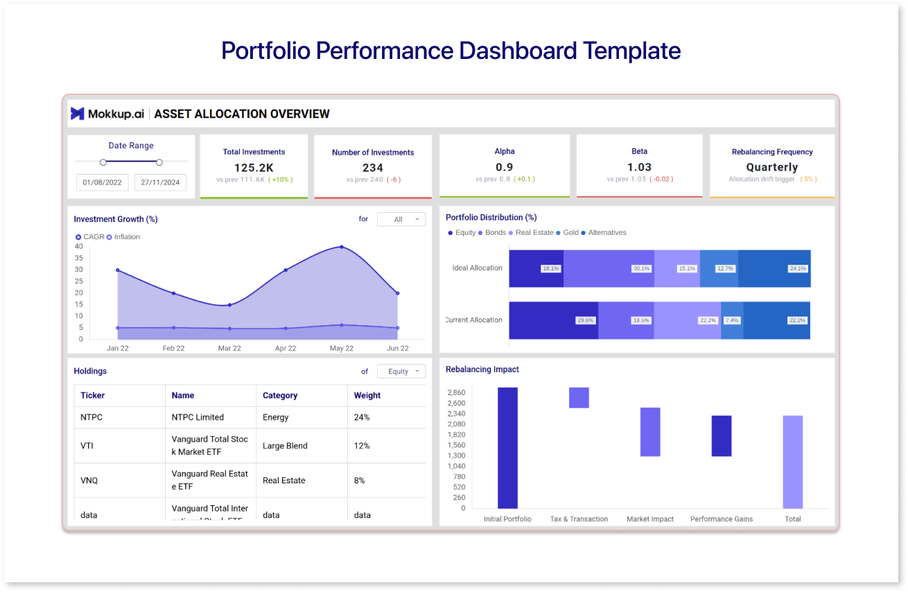
The Mokkup Portfolio Performance Dashboard Template supports broader financial performance reporting and profitability review. It combines revenue, costs, and performance indicators to show how different elements contribute to overall financial outcomes.
For businesses that rely on marketplace sales, insights from paid acquisition efforts often managed by an Amazon PPC agency can also be incorporated to better understand how ad spend influences overall profitability.
It highlights key performance metrics, making it easier to compare profit across time periods and identify areas of strength or weakness. By visualizing results alongside relevant cost components, the dashboard helps teams understand what drives profitability and where improvements can be made.
Using this profitability dashboard, businesses can gain better insights into how their financial performance evolves, make comparisons across periods or segments, and support strategic decisions with a clearer view of financial outcomes, all without piecing together scattered reports.
4. Invoice Management Dashboard Template:
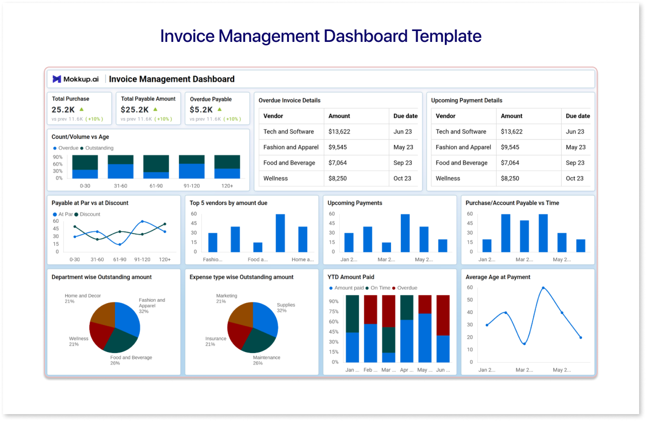
The Mokkup Invoice Management Dashboard Template is designed to help businesses track billing, payments, and outstanding invoices in one clear view. It focuses on improving visibility into receivables, making it easier to understand how invoicing impacts cash flow.
This template highlights key invoice metrics such as issued invoices, pending payments, overdue amounts, and payment status trends. By organizing billing data visually, teams can quickly identify delayed payments, monitor customer payment behavior, and reduce the risk of cash flow disruptions caused by unpaid invoices.
Using an invoice management dashboard supports better cash flow tracking by ensuring that revenue expected from invoices is actively monitored rather than assumed. It also helps finance teams follow up on overdue payments more efficiently and maintain healthier cash inflows without relying on manual invoice tracking.
5. Financial Summary & Analysis Dashboard Template:
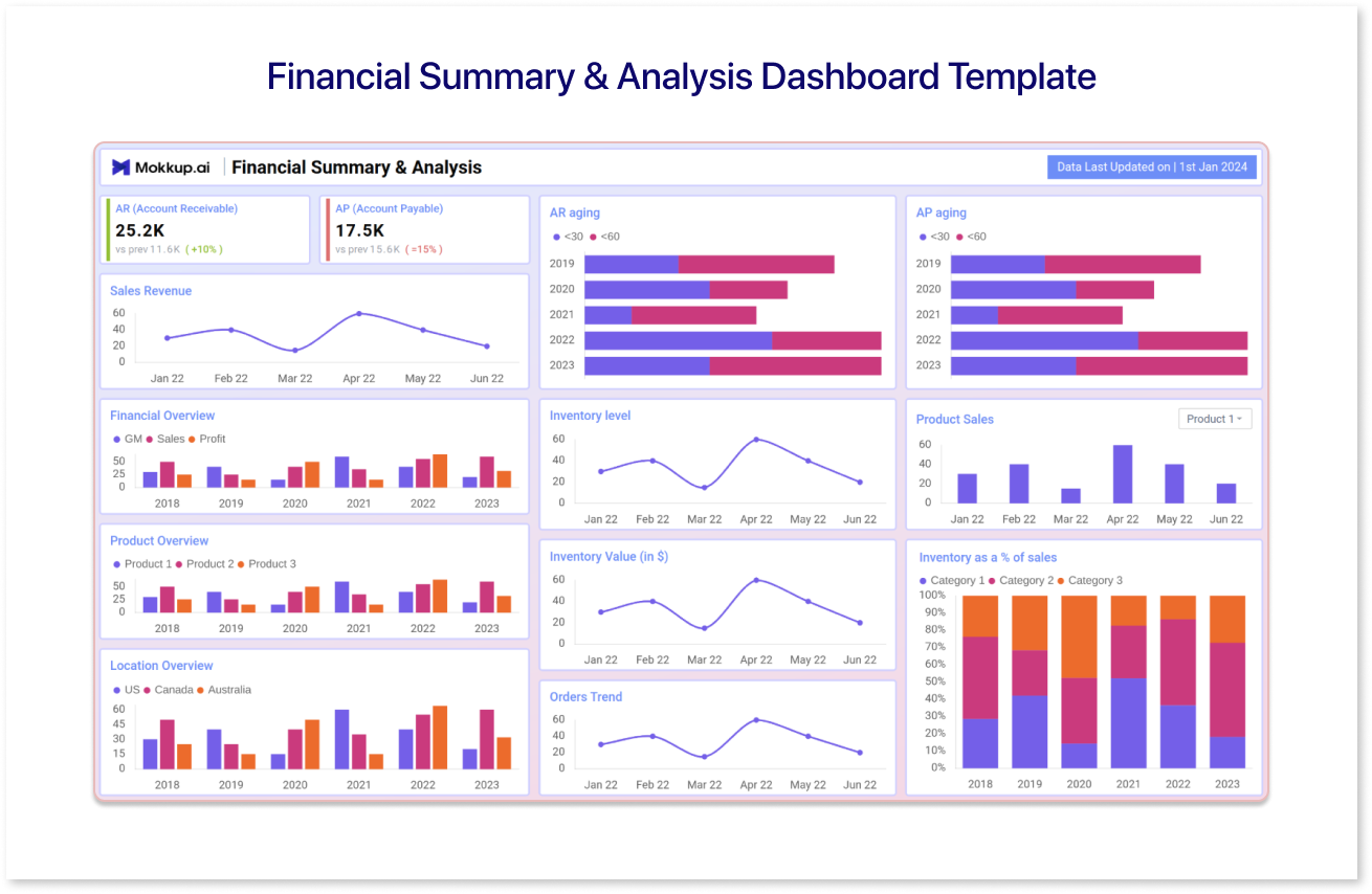
The Mokkup Financial Summary Analysis Dashboard Template provides businesses with a high-level view of their overall financial status in a single, organized layout. Instead of digging through multiple reports, this template brings key financial metrics together so teams can quickly assess performance and overall health.
It highlights a range of important financial indicators, including revenue totals, expense aggregates, cash positions, and selected performance ratios, making it easier to see how different aspects of the business are performing at a glance. By visually summarizing these numbers, the dashboard supports faster financial performance reporting and sharper profitability analysis.
By using these Mokkup financial dashboard templates, teams can gain clearer insights, make more informed decisions, and focus on the metrics that truly drive business performance.
How Financial Dashboards Support Key Financial Areas
Financial dashboards help businesses stay in control of their finances by organizing data around specific financial goals. Instead of reviewing long financial reports, teams can use financial dashboards to quickly understand cash flow, expenses, and overall financial performance through clear, visual summaries.
Each type of financial dashboard supports a specific area of financial analysis:
- Cash Flow Planning Dashboards: Cash flow dashboards support cash flow tracking by planning and forecasting inflows and outflows. They help teams prepare for upcoming payments, assess future cash positions, and reduce the risk of short-term cash gaps.
- Expense Management Dashboards: Expense dashboards provide structured visibility into spending patterns. By organizing expenses by category and time period, teams can track costs, compare budgets, and identify areas where spending may exceed expectations.
- Invoice Management Dashboards: Invoice dashboards connect billing activity directly to cash flow tracking. They display issued, pending, and overdue invoices in one place, helping teams monitor receivables, follow up on late payments, and improve cash collections.
- Portfolio Performance Dashboards: Portfolio performance dashboards help teams review financial performance across segments, projects, or investments. They support profitability analysis by showing how different components contribute to financial outcomes over time.
- Financial Summary and Analysis Dashboards: Financial summary dashboards provide a high-level view of the business’s financial position. By combining revenue, expenses, cash position, and key indicators, they support financial performance reporting and help stakeholders quickly assess overall results.
For example, a finance team planning the next quarter might use a cash flow dashboard to confirm whether expected income can cover planned expenses, review an expense dashboard to control costs, track invoices to ensure payments are received on time, and rely on a financial summary and analysis dashboard to evaluate overall performance before finalizing plans.
Together, these financial dashboards create a complete picture of financial health. By combining detailed views with high-level analysis, businesses can move from tracking individual numbers to making informed, data-driven financial decisions.
Conclusion
Financial dashboards make it easier to understand and manage key financial areas without relying on scattered reports or manual analysis. By organizing data around cash flow, expenses, and performance, dashboards help teams gain clearer insights and make more informed decisions.
With customizable templates, businesses can focus on the metrics that matter most and adapt dashboards as their financial needs evolve. Whether the goal is to plan cash availability, monitor spending, or review performance, financial dashboards provide a practical and structured way to maintain financial clarity.
Frequently Asked Questions
A financial dashboard provides a clear and structured view of key financial metrics in one place. It helps businesses review cash flow, expenses, and performance more easily without relying on multiple reports or spreadsheets.
Dashboard templates offer a ready-made structure for tracking financial data. They save time, ensure consistency in reporting, and allow teams to focus on insights rather than building dashboards from scratch.
Yes. Most financial dashboard templates can be customized to align with business objectives, reporting periods, and key performance indicators. This flexibility enables teams to adjust dashboards as financial priorities evolve.
Prompt it. Wireframe it with Mokkup.ai.
