Even after spending a significant portion of your BI budget on building dashboards, you see that your numbers are not making sense. This is something that you might be noticing when your created dashboards are not used in the organization. More often, KPI dashboards fail because they are built without a clear planning framework, leaving teams with dashboards that look impressive but rarely influence action.
By understanding “what is a KPI dashboard” from a strategic rather than just a visual perspective, you can begin to identify the "data gaps" before construction begins.
Read the blog to explore the 4-step KPI dashboard planning framework, which explains how the KPI dashboard requirements-gathering, wireframing, and prototyping stages create dashboards that deliver value to stakeholders.
Table of Contents
- Why Most KPI Dashboards Fail (The Planning Gap)
- The 4-Step KPI Dashboard Planning Framework
- Conclusion: The ROI of a Planning-First Framework
Why Most KPI Dashboards Fail (The Planning Gap)
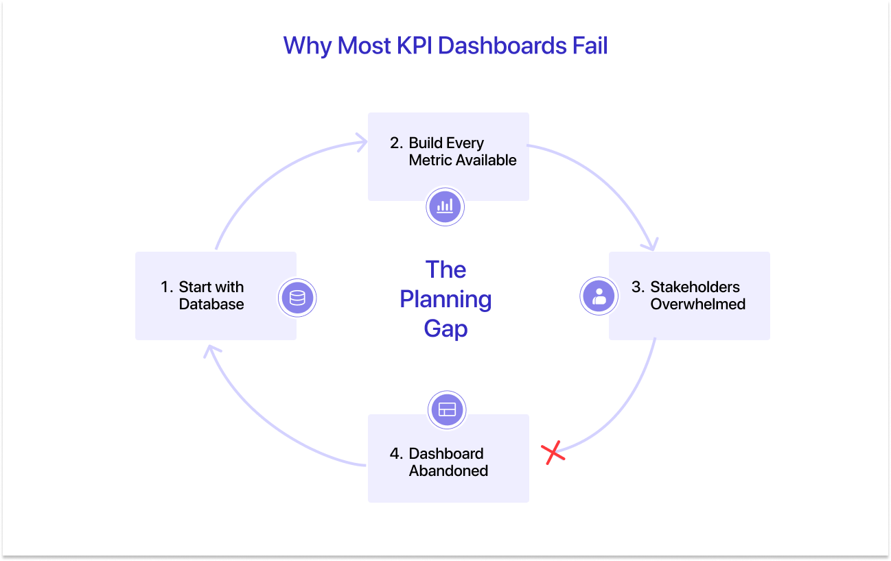
You just created one chart, and your dashboard is already abandoned. You know why?
Here is how: you explored databases, decided on charts and filters, and pulled everything that needed to be measured. Turns out you are making your dashboard live with 40-50 metrics that might not be relevant to your goal of tracking.
According to Gartner, nearly 85% of business intelligence and analytics projects fail to deliver their intended value. Clearly, the culprit isn’t the numbers, metrics, or charts; it is the planning framework. An effective KPI dashboard can clarify which decisions are driven by data by establishing a direct link to business goals, performance indicators, and operational actions within a structured performance management framework.
That’s where the planning gap is ruining your dashboard usage. It is the dangerous space between what the data can show and what the business actually needs to see. Dashboards built without a structured planning process suffer from three chronic problems:
- Metric Overload: Too many key performance indicators dilute focus and obscure the metrics that actually drive decisions.
- Misaligned Ownership: Dashboards display data that no one person feels responsible for acting on.
- Technical Debt: Building directly from raw data without a visual blueprint leads to expensive rework when stakeholders inevitably say, "This isn't what I meant."
The solution isn’t the charts or the data; it is the better dashboard planning framework. Before you dive into the process of the KPI dashboard planning framework, understand three things:
- Role of your audience: Know if your dashboard audience is a generalist, analyst, or executive, and know if the KPIs are matching their requirements.
- Context of your dashboard: You need to know how your KPI planning template will be used by the audience. The purpose is to deliver accurate information without frustration.
- Provide consumable insights: Here, we are talking about the data hierarchy. You have very little time to get the audience's attention. Therefore, pay attention to what needs to display the important items first to lock the users in before they abandon.
The 4-Step KPI Dashboard Planning Framework
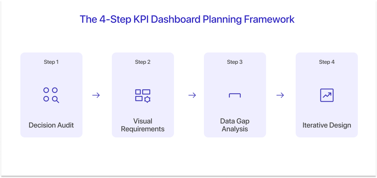
Designing a KPI dashboard that delivers measurable results is a systematic process. Here is a KPI dashboard planning framework that allows you to create a KPI dashboard for business intelligence:
Step 1: Conduct a Decision Audit (Identifying High-Impact KPIs)
The first step in planning a KPI dashboard is not selecting metrics. It’s figuring out what data driven decisions the dashboard is driving to develop a dashboard that truly delivers the meaning.
Moving Beyond Vanity Metrics to Actionable KPIs
Moving past vanity metrics to actionable KPIs matters more than most teams expect. At a glance, vanity metrics can look impressive but trigger no action. Website visits, total users, and gross revenue are examples of metrics that feel meaningful but rarely tell a decision-maker what to do next. Actionable KPIs, by contrast, are specific, time-bound, and clearly tied to a business lever someone can pull.
Hence, dashboards should prioritize actionable KPIs that directly influence operational or strategic choices, such as customer acquisition cost, lead conversion rate, inventory turnover, and customer lifetime value. These indicators are tied to real business actions.
The "So What?" Test: Mapping Data to Business Actions
A useful method for identifying meaningful KPIs is the “So What?” test. For every metric considered for the dashboard, teams should ask:
- What decision does this metric inform?
- What happens if the number changes?
- Who is in charge of answering?
This approach frames metrics through a simple semantic structure: the Metric (Subject), the trigger or condition attached to it (Predicate), and the business action that follows (Object).
Veteran Tip: Write out those semantic triples in a shared spreadsheet before the wireframing session starts. This becomes your single source of truth for metric justification and prevents scope creep throughout the project.
Step 2: Visual Requirements Gathering (Prototyping with Mokkup.ai)
Now that your key metrics are finalized, determining a visual structure or a tool is the next step in the KPI dashboard design process. This stage focuses on turning business requirements into a clear visual blueprint that stakeholders can review before any dashboard development begins. This process is commonly known as dashboard prototyping.
Why Wireframing is the Ultimate Requirements Document
Traditional BI requirement documents usually lean on long written descriptions of what a dashboard is supposed to contain. Unfortunately, written specifications rarely capture how stakeholders actually expect dashboards to look. Visual wireframes solve this problem. A KPI dashboard wireframe works as a visual requirements reference. Instead of interpreting written specs, stakeholders can see exactly what the dashboard is trying to show and how the information is organized:
- Which KPIs will appear on the dashboard
- How metrics are grouped into sections
- What visualization types will represent the data
- How users will navigate the dashboard
Starting with dashboard wireframes gives teams a chance to pressure-test the data visualization approach early, before development begins and before time goes into building a structure that later turns out not to support how people actually review the numbers.

How to Use Mokkup.ai to Secure Executive Buy-In
One of the biggest challenges during KPI dashboard requirements gathering is stakeholder alignment. Executives often struggle to interpret technical documentation or dashboard specifications. Visual prototypes make the conversation easier.
Using a tool like Mokkup.ai, BI teams can quickly present dashboard concepts that resemble real analytics interfaces. Stakeholders review the layout, react to what they’re seeing, and point out quickly whether the dashboard would actually help them make decisions. That tends to surface gaps early.
Instead of building first and untangling problems later, teams adjust the design before any data pipelines, integrations, or BI configurations get built. In practice, that’s where dashboard prototyping proves its value. It cuts down the usual back-and-forth during development, keeps stakeholders aligned on what the dashboard is meant to do, and makes it far more likely that the final dashboard supports real business decisions rather than just displaying data.
Step 3: Data Gap Analysis & Technical Feasibility
At this stage, the data analyst identifies whether the organization’s environment supports data. To make your dashboard alive, integrate real-time data regularly to reduce the data gap. Even well-planned dashboards may require data that does not currently exist, is incomplete, or is stored in incompatible systems.
Identifying "Missing Links" Between Vision and Reality
For each KPI in your dashboard, answer four questions. Does the data exist in our systems? Is it clean and reliable enough to display? Can it be delivered at the refresh frequency required? And who owns the data pipeline?
The answers usually fall into three buckets: Green KPIs, where the data is already available and behaves reliably; Amber KPIs, where the data technically exists but needs cleaning, transformation, or some modeling before it can be trusted; and Red KPIs, where the data simply isn’t there yet or can’t be pulled dependably. That classification feeds directly into the KPI dashboard requirements gathering document and, more importantly, sets realistic expectations with stakeholders before anyone starts building.
Managing Messy Data
Most organizations are dealing with some level of messy data. Rather than attempting to clean every dataset immediately, teams can use the dashboard wireframe as a prioritization framework.
The dashboard forces a decision about which metrics actually matter. Once that’s clear, data preparation stops being a broad cleanup exercise and instead focuses on the datasets needed to support those specific metrics.
Step 4: Iterative Design & The Path to Decision Intelligence
A KPI dashboard is rarely “finished.” It behaves more like a performance management framework that evolves as the business changes.
From Static Reporting to Proactive Decision Support
Many dashboards still focus on historical data. That’s useful, but it mostly supports looking backward. More mature dashboards start leaning into proactive decision intelligence. For example, a dashboard might go beyond displaying monthly revenue trends and instead flag unusual sales patterns or generate a forward-looking performance estimate. That kind of shift changes the role of the dashboard. It stops being a passive reporting layer and starts functioning more like an operational performance system.
Setting Thresholds: When Does a Key Metric Become a Warning?
Without defined thresholds, even a well-designed dashboard ends up as little more than a monitoring screen.
For each green and amber key performance indicator identified in the data gap analysis, define three threshold states: On Track (the metric sits within expected bounds), At Risk (the metric is trending toward a potential breach), and Action Required (the metric has crossed a defined boundary and a Semantic Triple response should be triggered). These thresholds should then be encoded into the dashboard’s conditional formatting during the build phase, following the color logic and visual hierarchy that stakeholders approved earlier in the wireframe.
Conclusion: The ROI of a Planning-First Framework
The four-step KPI dashboard planning framework: Decision Audit, Visual Requirements Gathering, Data Gap Analysis, and Iterative Design is not a bureaucratic overhead. It is the most direct path to dashboards that generate measurable business value.
The KPI dashboard best practices outlined in this framework share one common thread: they place the decision before the data. They ask, "What action must be possible?" before asking, "What data do we have?" This inversion from data-first to decision-first is what separates dashboard projects that get abandoned from dashboard programs that become the operational backbone of high-performing organizations.
Because when a KPI dashboard is built on a foundation of strategic intent rather than available data, it stops being a report and starts being a competitive advantage.
Frequently Asked Questions:
1. What is a KPI dashboard wireframe?
A KPI dashboard wireframe is a low-fidelity visual layout that shows how KPIs, charts, filters, and tables will be arranged on a dashboard. It acts as a blueprint for the final design, allowing teams to validate dashboard structure before development begins. Wireframes help ensure that the dashboard follows a clear data visualization strategy and metric hierarchy.
2. What tool can be used to create KPI dashboard wireframes?
A dashboard mockup tool such as Mokkup.ai can be used to create KPI dashboard wireframes quickly. These tools provide drag-and-drop components that resemble real dashboard elements, allowing BI teams to prototype layouts, test different KPI arrangements, and gather stakeholder feedback before development begins.
3. What should be included in a KPI planning template?
A KPI planning template should include business objectives, selected KPIs, metric definitions, data sources, and performance targets. It may also specify the recommended visualization types for each metric to support an effective data visualization strategy.
Prompt it. Wireframe it with Mokkup.ai.
