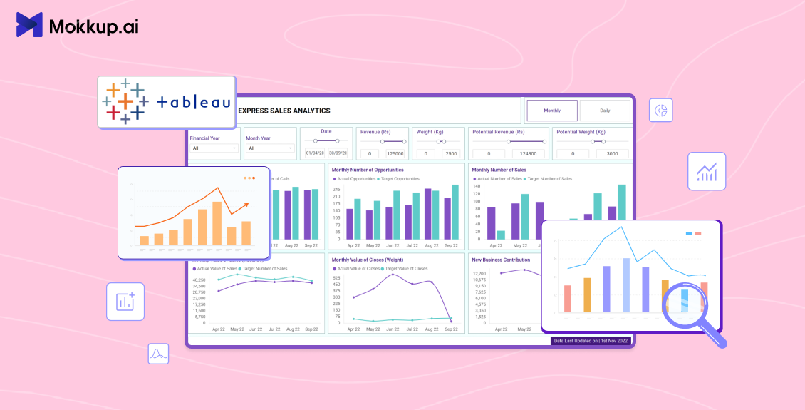
Every Tableau developer has a version of this story. You spend two days building a Tableau sales dashboard, and you watch your data source connect, fields on the marks card, and the layout looking sharp. You send the Tableau Online link. The stakeholder comes back with eleven requests, none of which were in the original brief. You rebuild. They come back with four more.
It is a process problem. It is not a people problem. It is a process problem. According to Salesforce's State of Sales report, 94% of sales leaders say AI agents are essential to growth, yet 51% say tech silos still hinder their AI efforts. That gap between ambition and execution is familiar. Most teams never agree on what the dashboard should look like before the developer starts building. That misalignment is where the rework lives.
This guide fixes that. Below you will find 8 hand-picked Tableau sales dashboard examples, including pipeline, rep performance, regional breakdowns, SaaS revenue, e-commerce, and lead funnel views with the exact KPIs each one tracks. Each example links to a free Mokkup wireframe template you can customize and export to Tableau before you write a single calculated field.
Table of Contents
- 8 Tableau Sales Dashboard Examples
- What Is a Tableau Sales Dashboard?
- Key KPIs Every Tableau Sales Dashboard Should Track
- Types of Tableau Sales Dashboards
- How to Design a Tableau Sales Dashboard
8 Tableau Sales Dashboard Examples
Here are 8 hand-picked Tableau sales dashboard examples from Mokkup’s template library, each covering a specific audience, use case, and KPI set. Every template is free to open, edit, and export to Tableau directly.
1. Sales Overview Dashboard
Also known as the Sales Performance Analytics Dashboard
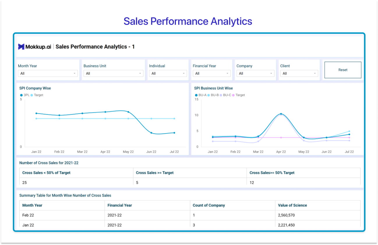
If your stakeholder wants a single-page view of total team performance filterable by business unit, individual rep, and financial year, this is the Tableau sales dashboard example to start with.
The layout opens with a full-width filter pane: Month Year, Business Unit, Individual, Financial Year, Company, and Client, all as dropdown slicers. Below that, two line charts sit side by side: SPI Company Wise (SPL vs Target trend line) and SPI Business Unit Wise (BU-A, BU-B, and BU-C tracked against Target). A three-column KPI band summarizes cross-sales performance, deals below 50% of target, at or above target, and at 50%+ attainment. The bottom section is a summary data table capturing month-wise cross-sales count and value by company.
This clean, filter-forward layout is built for a VP of sales or C-suite executive who needs to slice performance by unit or period without a separate workbook. The limitation: no rep-level drill-through without calculated fields, and the layout does not scale to complex multi-tier territory hierarchies without additional sheets.
- Best for: VP of Sales, C-suite, executive leadership
- Visual approach: Dual line charts, KPI summary cards, data table
- Choose this when: You need a single, shareable executive snapshot with flexible filtering but no deep drill-down.
→ Use the Sales Performance Analytics Dashboard template
2. Sales Pipeline Dashboard
Also known as the CRM Analytics Dashboard
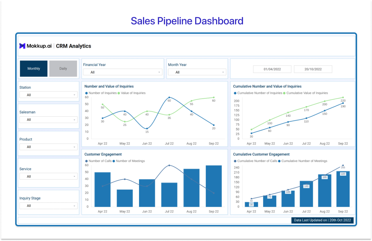
For sales managers and operations teams who live inside CRM data every day, this is the sales pipeline dashboard Tableau layout that gets the job done cleanly.
The design features a dark navy left sidebar with five filter dimensions — Station, Salesman, Product, Service, and Inquiry Stage, plus a Monthly/Daily toggle and Financial Year + Month Year selectors at the top. The main chart area holds four panels: Number and Value of Inquiries (dual-axis line chart), Cumulative Number and Value of Inquiries, Customer Engagement (bar+line combo tracking calls vs meetings), and Cumulative Customer Engagement. All four share a consistent April–September axis, making period-over-period reading immediate.
This Tableau sales dashboard template is purpose-built for tracking deal movement, stage health, inquiry volume, and customer touchpoint activity in a single view. The watch-out: stage totals depend on clean CRM field mapping, and coverage ratio calculations break down if deal stages are inconsistently coded at the source.
- Best for: Sales managers, sales ops teams, CRM analysts
- Visual approach: Dual-axis line charts, combo bar+line, sidebar filter panel
- Choose this when: You need to monitor pipeline health and customer engagement cadence together, segmented by product, service, or rep.
→ Use the CRM Analytics Dashboard template
3. Sales Rep Performance Dashboard
Also known as the Sales and Customer Service Analytics Dashboard
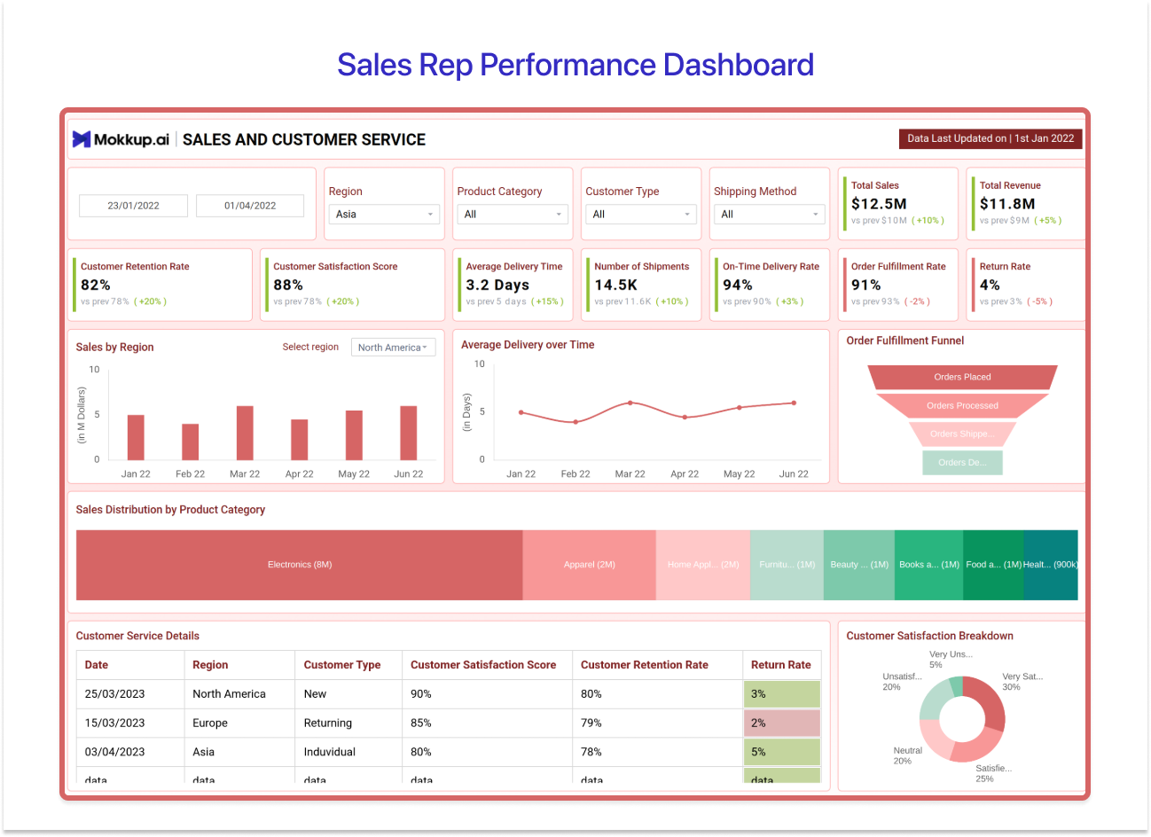
This is the Tableau sales dashboard example you reach for when sales output and service quality need to live on the same canvas.
The layout opens with a bold red header and a dense KPI banner carrying nine metrics with MoM delta indicators: Total Sales ($12.5M), Total Revenue ($11.8M), Customer Retention Rate, Customer Satisfaction Score (88%), Average Delivery Time (3.2 days), Number of Shipments (14.5K), On-Time Delivery Rate (91%), Order Fulfillment Rate (81%), and Return Rate (4%). Below the banner: a Sales by Region bar chart, an Average Delivery over Time line chart, and an Order Fulfillment Funnel. A horizontal stacked bar breaks down Sales Distribution by Product Category. The bottom has a Customer Service Details transaction table and a Customer Satisfaction Breakdown donut chart.
According to Nucleus Research, analytics delivers an average ROI of $13.01 for every $1 invested and dashboards that combine sales and service data in one view are exactly the kind of high-leverage asset that compounds that return.
- Best for: Frontline sales managers, customer success leads, ops teams
- Visual approach: KPI banner, bar chart, line chart, funnel, donut, data table
- Choose this when: You need to track both sales performance and service delivery quality side by side for the same team.
→ Use the Sales and Customer Service Analytics Dashboard template
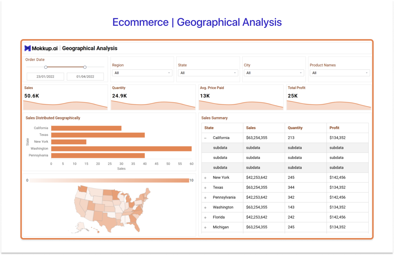
4. Regional Sales Dashboard
Also known as the Ecommerce Geographical Analysis Dashboard
Tableau’s mapping capabilities are one of its biggest advantages and this Tableau sales dashboard example puts that strength front and centre.
The layout opens with four top-line KPI cards with sparkline trends: Sales (50.6K), Quantity (24.9K), Average Price Paid (13K), and Total Profit (25K). A horizontal bar chart ranks states by sales volume (California, Texas, New York, Washington, and Pennsylvania lead). Directly below it, a filled US choropleth map renders the same geographic data as a heat map with a 0–10 intensity scale. A Sales Summary table shows State, Sales, Quantity, and profit with expandable rows for drill-down.
This sales dashboard Tableau layout is the natural choice for multi-region sales directors and territory managers. Tableau’s filled map layer renders territory heat maps without a custom shapefile. Limitation: the map is US state-coded by default, international territories require a custom geocoding layer or shapefile.
- Best for: Sales directors, territory managers, regional ops teams
- Visual approach: KPI cards with sparklines, horizontal bar, US filled choropleth map, drill-down table
- Choose this when: Revenue varies significantly by geography, and stakeholders need to see which territories are over- or under-performing at a glance.
→ Use the Ecommerce Geographical Analysis Dashboard template
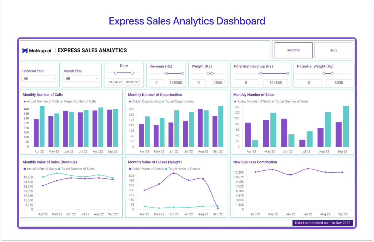
5. Express Sales Analytics Dashboard
Also known as the Express Sales Analytics Dashboard
When the brief is “give me everything, actuals, targets, trends on one screen, and make it fast to load,” this is the Tableau sales dashboard example that fits.
The layout uses a crisp purple-blue colour scheme with a 3×2 chart grid. Six bar-plus-line combo charts populate the main canvas: Monthly Number of Calls (Actual vs Target), Monthly Number of Opportunities, Monthly Number of Sales, Monthly Value of Sales/Revenue, Monthly Value of Closes by Weight, and New Business Contribution. Slider-based filters at the top allow range-based filtering by Revenue, Weight, Potential Revenue, and Potential Weight, making this one of the more parametric Tableau sales report examples in the library.
The lean data model keeps Tableau Online load times fast, and the compact layout embeds cleanly inside a dashboard container. Trade-off: no parameter-driven drill-down, and the fixed layout does not adapt well to responsive mobile views in Tableau Cloud.
- Best for: Sales ops, RevOps teams, senior sales managers
- Visual approach: 3×2 grid of bar+line combo charts, slider-based parameter filters
- Choose this when: You need a high-density, fast-loading executive summary covering actuals vs targets across multiple sales activity dimensions at once.
→ Use the Express Sales Analytics Dashboard template
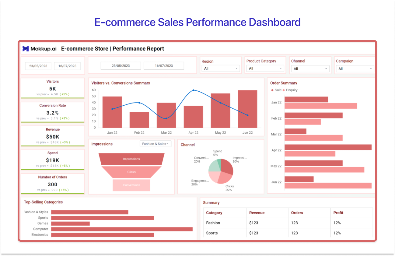
6. E-commerce Sales Performance Dashboard
Also known as the E-commerce Store Performance Report Dashboard
For DTC and online retail teams using sales dashboard Tableau workflows, this template bridges the gap between e-commerce platform data and CRM analytics in a single view.
The layout uses a warm coral-red palette and opens with five KPI cards: Visitors (5K), Conversion Rate (3.2%), Revenue ($50K), Spend ($19K), and Number of Orders (300), all with MoM delta indicators. The main chart area holds a Visitors vs. Conversions Summary bar+line combo, an Impressions funnel (Impressions → Clicks → Conversions), and a Channel breakdown pie chart. The right panel shows an Order Summary grouped bar chart. At the bottom: a Top-Selling Categories horizontal bar and a Summary table (Category, Revenue, Orders, Profit).
Tableau’s cross-database join blends e-commerce platform and CRM data natively without a pre-built warehouse. Caveat: reliable live data connections typically require Tableau Bridge or a data warehouse layer for e-commerce source systems at scale.
- Best for: E-commerce managers, DTC sales teams, digital marketing ops
- Visual approach: KPI cards, bar+line combo, funnel chart, pie chart, grouped bar, summary table
- Choose this when: You’re blending online store metrics with CRM or ad spend data to get a full-funnel picture.
→ Use the E-commerce Store Performance Report Dashboard template
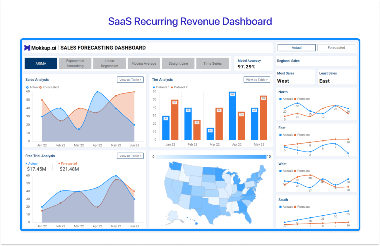
7. SaaS Recurring Revenue Dashboard
Also known as the SaaS Sales Forecasting Dashboard
This is the most analytically sophisticated of the Tableau sales dashboard examples in this list, the right choice for SaaS founders, RevOps leaders, and subscription businesses tracking MRR, ARR, and multi-model forecast accuracy.
The template opens with six forecasting model tabs: ARIMA, Exponential Smoothing, Linear Regression, Moving Average, Straight Line, and Time Series. A model accuracy score sits top-right (97.29% in the preview). An actual/forecasted toggle switches views. The main canvas holds Sales Analysis (area chart: Actual vs Forecasted), Tier Analysis (grouped bar), Free Trial Analysis (area: Actual $17.45M vs Forecasted $21.48M), and a US choropleth map for regional distribution. Regional mini-charts break down North, East, West, and South individually.
Level of Detail (LOD) expressions lock MRR calculations at the subscription grain regardless of which filters a viewer applies, this is non-negotiable for accurate recurring revenue reporting. The complexity is also the trade-off: six forecasting models require parameter actions and calculated fields that are not beginner-friendly to configure from scratch in Tableau Desktop.
- Best for: SaaS founders, RevOps leads, subscription business sales leaders
- Visual approach: Multi-model forecast tabs, area charts, grouped bar, US choropleth, regional mini-charts
- Choose this when: You need to compare actual vs forecasted MRR/ARR across multiple predictive models and break it down by tier and region.
→ Use the SaaS Sales Forecasting Dashboard template
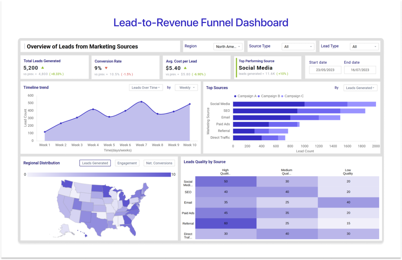
8. Lead-to-Revenue Funnel Dashboard
Also known as the Lead Generation Report Template
This Tableau sales dashboard example is built for one job: finding exactly where leads drop off between the first marketing touch and closed-won revenue.
The layout opens with four headline KPI cards: Total Leads Generated (5,200), Conversion Rate (9%), Average Cost per Lead ($5.40), and Top-Performing Source (Social Media, 11.6K leads, +10% MoM). A Timeline Trend area chart tracks weekly lead volume over 10 weeks. A Top Sources horizontal bar chart ranks channels by lead count: social media, SEO, email, paid ads, referral, and direct traffic. A regional distribution US choropleth map shows lead volume by state. The Leads Quality by Source heat-map table scores each channel across High, Medium, and Low Quality leads.
This is one of the strongest Tableau sales report examples for aligning demand gen and sales ops around shared pipeline data. Tableau’s data blending connects CRM and marketing automation in one view without a pre-built unified data model. Watch out: funnel stage calculations require consistent field naming across both systems.
- Best for: Demand gen teams, sales ops, RevOps, marketing-sales alignment leads
- Visual approach: KPI cards, area chart trend, horizontal bar, US choropleth, heatmap quality table
- Choose this when: You need to identify funnel drop-off points and attribute revenue to the right lead sources across marketing and sales data.
→ Use the Lead Generation Report Template

What Is a Tableau Sales Dashboard?
A Tableau sales dashboard is an interactive visualization built in Tableau Desktop or Tableau Online that consolidates CRM, revenue, and pipeline data into real-time KPI views for sales teams and leadership. It leverages Tableau’s VizQL engine and makes cards to connect live data sources, such as Salesforce, HubSpot, SQL databases, and spreadsheets, and renders revenue metrics, deal stage counts, and team performance indicators on a single, filterable canvas.
Unlike static Tableau sales report examples exported as PDFs, a Tableau sales dashboard supports dashboard actions, parameters, and filter panes that let users slice by region, time period, rep, or product line without switching workbooks. Published via Tableau Server or Tableau Online, these dashboards provide sales managers and executives with a real-time view of business performance.
Key KPIs Every Tableau Sales Dashboard Should Track
Before you drag a single field onto the marks card, you need to know what you’re measuring. The best Tableau sales KPI dashboards are built around two clusters of metrics: revenue outcomes and pipeline activity.
Revenue KPIs
- Total Revenue: The single number every exec wants at a glance; built as a fixed KPI card using a SUM([Revenue]) measure on a text mark.
- Month-over-month growth reveals acceleration or slowdown, built using a table calculation comparing current vs prior period revenue.
- YTD vs Target shows whether the team is on pace; a bullet chart or progress bar gives instant visual scanning.
- Average Deal Size signals deal quality, not just volume; it's critical for spotting if reps are discounting heavily to hit quota.
- Revenue by Product or Region turns the aggregate into actionable segments; a filled map or stacked bar in any sales dashboard Tableau layout handles this cleanly.
Pipeline and Activity KPIs
- Pipeline Value and Coverage Ratio: Total open deal value vs quota; a 3x coverage ratio is the typical benchmark in B2B sales.
- Win Rate: Percentage of opportunities closed-won; benchmarking against industry data surfaces coaching priorities fast.
- Deal Velocity: How quickly deals move through the pipeline; slow velocity often points to a qualification gap, not a closing gap.
- Lead-to-Close Rate: End-to-end funnel efficiency; use a funnel chart in Tableau to visualize stage-by-stage drop-off.
- Sales Cycle Length: Average days from first touch to close; longer cycles inflate pipeline value without driving revenue.
- Open Deals by Stage: Distribution across pipeline stages; a stacked bar in any Tableau sales dashboard template handles this intuitively.
Types of Tableau Sales Dashboards

Not every Tableau sales dashboard example fits every team. The 8 templates above fall into three distinct types, and knowing which category you’re building for saves hours of rework.
1. Operational Sales Dashboards
Operational dashboards are the daily-use tools for reps and frontline managers. They need a high data refresh rate in Tableau Online or Tableau Server, and stay tightly focused on pipeline activity and deal movement. Examples 2 (Sales Pipeline / CRM Analytics), 3 (Sales Rep Performance / Sales and Customer Service Analytics), and 8 (Lead-to-Revenue Funnel / Lead Generation Report) are all operational Tableau sales dashboard examples.
2. Executive Sales Dashboards
Executive dashboards are the CFO and VP of Sales view. The design philosophy is scan-first: revenue totals, quota attainment, and forecast accuracy on one or two Tableau sheets, with no deep filter structures. Examples 1 (Sales Overview / Sales Performance Analytics) and 5 (Express Sales Analytics) fit this type best. These are somewhat similar to admin dashboards that typically serve as a guiding force for managerial people to monitor and control various aspects of business.
3. Analytical Sales Dashboards
Analytical dashboards are built for the “why”: why did revenue move that way? Where are the regional variances? What does the model say about the next quarter? This is where Tableau’s LOD calculations, parameters, and forecasting earn their keep. Examples 4 (Regional Sales / E-commerce Geographical Analysis), 6 (E-commerce Sales Performance), and 7 (SaaS Recurring Revenue / SaaS Sales Forecasting) belong in this category.
How to Design a Tableau Sales Dashboard (The Wireframe-First Approach)
Here is a scenario every Tableau developer knows. You spend three days building a Tableau sales dashboard: connecting live data, pulling fields onto the marks card, and iterating on chart types. You present it to the stakeholder. They like two charts and ask you to redo five others. Back to the marks card.
The fix is simple: wireframe first, build second. Here is the step-by-step workflow using Mokkup:
Step 1: Choose your dashboard type
Use the 8 Tableau sales dashboard examples above to decide whether you are building an operational, executive, or analytical view. That choice determines which KPI cluster and chart types belong on the canvas before you open Tableau.
Step 2: Open a free Mokkup template and customise the layout
Pick one of the 40+ sales templates and drag-drop charts, KPI cards, and filter panes into your preferred arrangement. Want to move faster? Upload a sample dataset to Mokkup’s Convo AI, it reads your column names and data types and auto-generates a wireframe layout structured around your real data. No prompt engineering needed.
Step 3: Share the wireframe and collect stakeholder sign-off
Send the Mokkup link, gather feedback, and agree on the layout before you open Tableau Desktop. This single step eliminates the most expensive revision cycle in dashboard development, the one that happens after you’ve already built everything.
Step 4: Export directly to Tableau, with the Semantic Layer included
This is where Mokkup does something that a Figma mockup or PowerPoint sketch simply cannot. The exported .twbx file is not just a layout wireframe, it carries the dataset, all calculated fields, measures, and formulas already pre-configured inside the workbook. You open it in Tableau Desktop, connect your real data source, and skip the manual rebuild step that typically adds days to a project. This semantic layer export is a Tableau-exclusive feature (Power BI support is coming soon), and it is the reason wireframing in Mokkup is a fundamentally different experience from wireframing in any other tool.
Explore All 40+ Free Tableau Sales Dashboard Templates
The 8 Tableau sales dashboard examples above are the featured highlights, but Mokkup’s library goes much further. There are 40+ sales-related wireframe templates covering every Tableau sales dashboard use case: direct sales performance, e-commerce, SaaS recurring revenue, CRM and pipeline analytics, retail, lead funnel analysis, and KPI scorecards.
The right Tableau sales dashboard example depends on two things: your audience and the question you need answered. Revenue health calls for Examples 1 or 5. Pipeline health and funnel performance call for Examples 2, 3, or 8. Regional and analytical views belong to Examples 4, 6, and 7.
All 8 Tableau sales dashboard examples covered here are free to open and edit in Mokkup. And unlike static TWBX files, every Mokkup export includes the semantic layer with calculated fields and formulas pre-built, so your team goes from wireframe to live Tableau sales dashboard without the manual rebuild step that usually costs days.
Frequently Asked Questions
A Tableau sales dashboard should include 5–7 KPIs covering revenue performance, pipeline health, and team activity. Total revenue, quota attainment, win rate, pipeline value, and average deal size form a reliable baseline. Beyond that, exact measures depend on the audience; an executive view prioritizes revenue totals and forecast accuracy, while a frontline manager’s Tableau sales KPI dashboard needs rep-level pipeline activity, deal velocity, and stage conversion rates. Use Tableau’s dashboard actions and parameters to let viewers toggle between views without requiring separate workbooks for each audience segment.
The fastest path is the wireframe-first approach: map out KPI placement and agree on the layout with stakeholders before opening Tableau Desktop. Mokkup’s free Tableau sales dashboard templates give you a pre-built starting layout you can edit and export directly to Tableau. With the Mokkup Semantic Layer, the exported .twbx already contains the dataset, calculated fields, and formulas pre-configured, so developers skip the manual rebuild step entirely and move straight to connecting the real data source.
The five KPIs that appear in virtually every Tableau sales KPI dashboard are total revenue vs target, pipeline value and coverage ratio, win rate, average deal size, and sales cycle length. SaaS businesses add MRR and churn rate. Rep-level dashboards benefit from quota attainment per rep and activity counts. Use LOD calculations in Tableau Desktop to lock these KPIs at the correct aggregation level regardless of which filters the dashboard viewer applies.
Yes, Mokkup.ai offers 40+ free Tableau sales dashboard templates you can open in your browser, customize with AI, and export to Tableau in one click. Unlike a static TWBX download, the Mokkup export includes the semantic layer dataset, calculated fields, and pre-built formulas inside the file, so developers can connect the real data source and go live without rebuilding dashboard logic from scratch. Available on a free plan, no credit card required.
A Tableau dashboard combines multiple views onto one canvas for monitoring and comparison, the correct format for all Tableau sales dashboard examples in this guide. A Tableau story sequences dashboards or sheets into a guided narrative using the story points panel. For day-to-day sales tracking and pipeline monitoring, always build a dashboard. Use a story when you need to walk leadership through a quarterly business review or demonstrate a multi-step trend narrative in a boardroom setting.
Prompt it. Wireframe it with Mokkup.ai.
