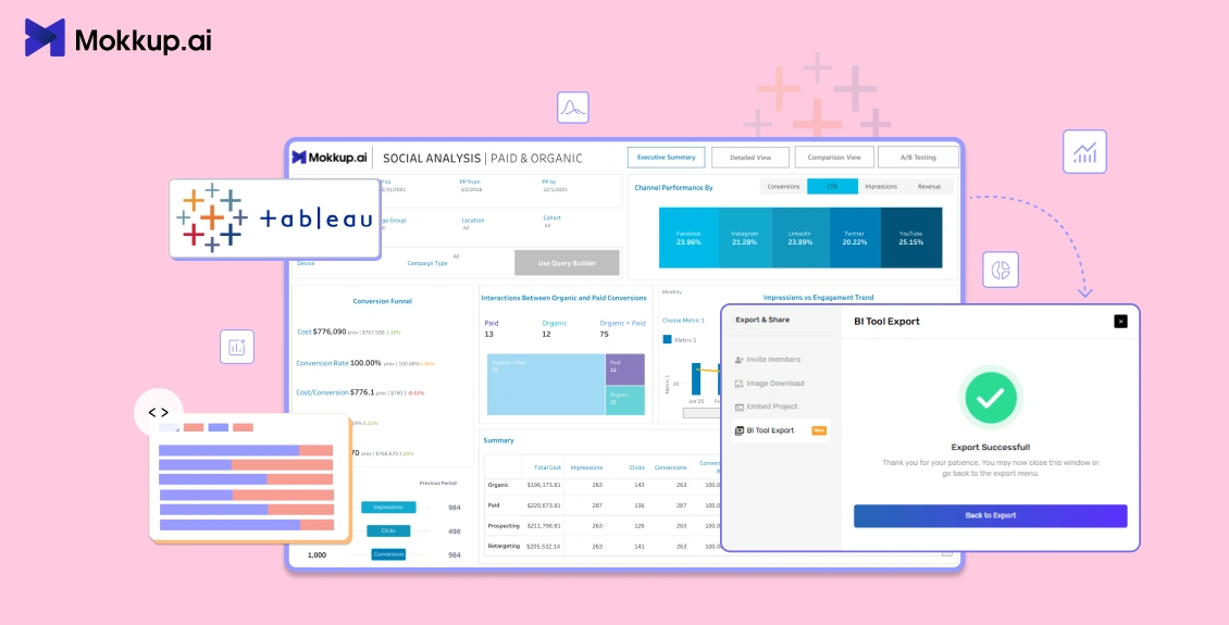
Designing a BI dashboard already feels like a lot. You map out the layout, figure out the KPIs, organize the data, and finally get the wireframe approved. Then comes development, and suddenly the team has to rebuild the same formulas, metrics, and calculated fields all over again inside Tableau. That disconnect between design and development slows down more teams than people realize. Even Tableau has pointed out that data preparation and structuring are some of the biggest bottlenecks in analytics workflows.
The latest Mokkup Tableau export removes that extra layer of work. Instead of exporting just a visual wireframe, the Tableau workbook now carries the datasets, formulas, metrics, and calculated fields already configured inside it. Developers can connect the real data source and move directly into validation and publishing instead of recreating dashboard logic from scratch.
Even better, Mokkup’s Convo AI can generate an entire dashboard wireframe from a natural language conversation, then export it to Tableau with the semantic structure already built in. The result is a much faster path from wireframe to live dashboard.
Table of Contents
- The Problem with Traditional Tableau Exports
- Introducing the Semantic/Convo Layer
- How It Works: Step-by-Step
- What This Saves You on Every Dashboard Project
- Power BI Semantic Export: Also Available Now
The Problem with Traditional Tableau Exports
For the last several years, a Tableau dashboard wireframe export from Mokkup has done a respectable job of carrying the design across: layout intact, chart structures correct, and mock data populated so reviewers can see something realistic. But the moment a developer opened the .twbx to wire it to live data, the layer cake began.
Every chart type handled mock fields differently, which meant Tableau developers had to spend time replacing dimensions, measures, calculated fields, and chart logic individually. A line chart worked differently from a donut chart. A Sankey diagram required a different replacement process than a funnel chart. Gauge charts, KPI cards, and treemaps all introduced their own quirks.
This created a frustrating disconnect between dashboard design and dashboard development.
One of the biggest reasons dashboard projects slow down is inconsistency. When data models, calculated fields, and metric definitions aren’t clearly standardized from the start, developers often have to spend extra time validating logic and rebuilding parts of the dashboard during implementation. Tableau’s support resources also emphasize how defining these elements early makes development far more efficient and reduces unnecessary rework later in the process.
Replacing Mock Fields Chart by Chart: Why It Took So Long
The challenge with the earlier Mokkup Tableau export wasn’t just replacing one dataset. It was replacing the logic behind 15+ different visualization types. Axis-based charts like line, bar, and area charts require developers to manually swap dimensions and measures in Rows and Columns shelves. Combo charts required separate handling for bars and lines. Histograms needed new bins created from actual data. Then came the advanced visuals.
Waterfall chart often rely on custom formulas that have to be rebuilt to match the actual business data before the visualization will work. Sankey charts often broke when the data source changed, forcing developers to remove and re-add fields just to get them working again. KPI cards required freshly calculated metrics. Funnel charts depended on hardcoded calculation logic. Gauge charts involved additional calculated fields just to display values correctly.
Without the ability to export wireframe to Tableau with data baked in, every dashboard project started from a half-built foundation. Even experienced Tableau developers know how time-consuming this process can become across a large dashboard project. The old workflow worked, but it added unnecessary manual effort at almost every step.

Introducing Convo AI and the Mokkup Semantic Layer
Mokkup.ai’s improved workflow is built around two new features that work together but do very different jobs.
Convo AI is the front door: you describe the dashboard you want in plain language and optionally upload a data file. Convo AI reads the headers of that file and lays the wireframe out around them, including charts, KPI cards, and field placements all aligned to your uploaded data.
The Mokkup Semantic Layer takes it a step further. When you export that wireframe to Tableau with data, it takes the same file you uploaded in Convo AI and bakes the dataset, measures, and formulas right into the resulting .twbx file. The output is no longer a layout-plus-mock-data file. It is a working analytical model in the form of a Tableau template with calculated fields, measures, and a dataset already attached, ready for the developer to point at the real warehouse and validate.
Importantly, Mokkup only reads the metadata of the uploaded file. The underlying rows are never accessed, so your sensitive data stays secure.
What's Pre-Built in Your Exported Tableau File
Concretely, here is what the Mokkup semantic layer ships inside every export:
- All required metrics and measures are defined and named.
- All calculated fields and formulas are already configured against the dataset you uploaded during wireframing.
- The uploaded dataset itself is attached to the workbook as the active data source.
Thus, with the renewed Mokkup Tableau export, you do not need to manually create any calculated fields. The YoY growth measure, the gauge value formula, and the waterfall logic are all already there, wired to fields, and producing values the moment the workbook opens.
How It Works: Step-by-Step
Going from a simple wireframe to a working Tableau template with calculated fields takes just four steps. Here's exactly what happens at each stage of the Tableau dashboard wireframe export, and what you'll need to have ready before you start.
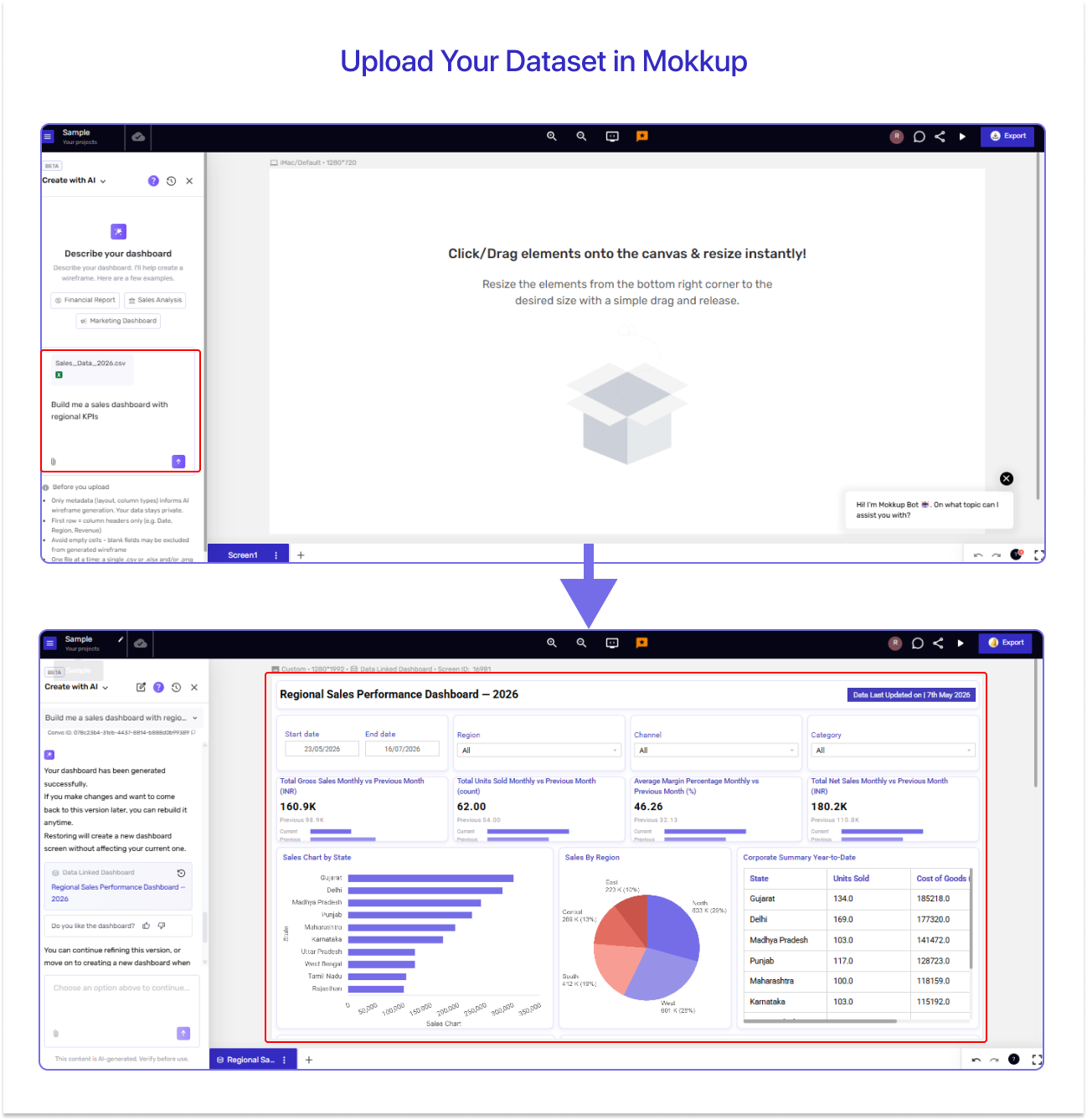
Step 1 — Upload Your Dataset in Mokkup
As you start designing the wireframe, upload your dataset to into the Convo AI box. We'd recommend using a sample dataset that mirrors the structure of your real source rather than the production data itself. As a data visualization tool, Mokkup only reads the metadata (column names, data types, formulas), so a sample is all it needs. What matters is that the column names and data types stay consistent with your real data source. That way, it interprets your file correctly and delivers a pre-configured Tableau export with the required metrics, measures, formulas, and the underlying dataset already wired into the wireframe.
Step 2 — Export to Tableau
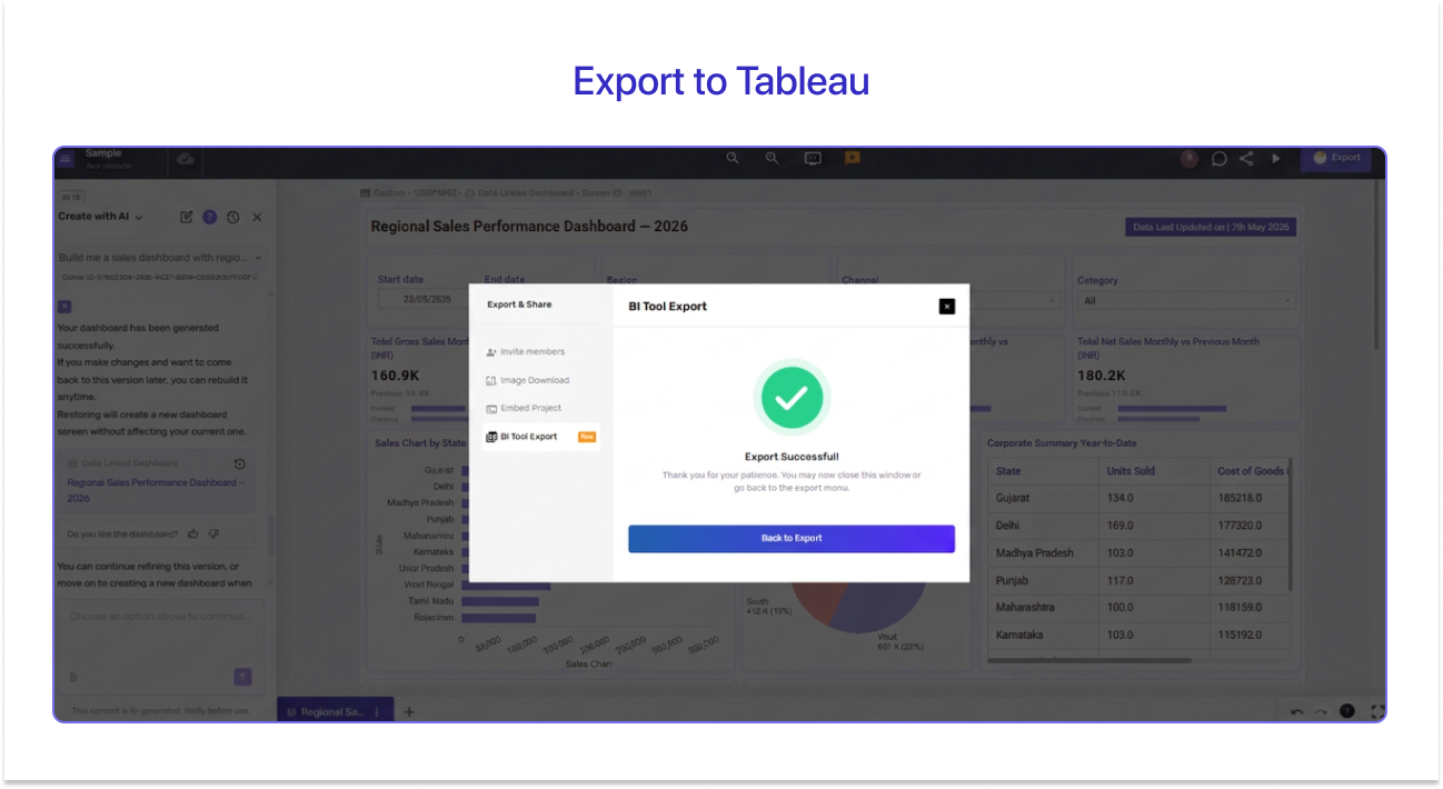
With one click, export your wireframe to Tableau. The export produces a .twbx containing the full dashboard layout, all chart structures, every formula, and calculated field defined during wireframing, and the uploaded dataset is already attached as the active data source.
Step 3 — Open, Review, and Connect Your Real Data Source
Open the file in Tableau Desktop. If Tableau asks you to approve an extension (for charts like Sankey), accept it, then connect your data source. Since you wireframed with a sample dataset in Mokkup, swap it for your real data source now.
Step 4 — Verify and Publish
Run a quick visual check to make sure everything looks right. Match the colors to your design specifications by using the color codes from the Mokkup wireframe.Once you're happy with the result, publish to Tableau Cloud or share it with your team.
What This Saves You on Every Dashboard Project
The biggest benefit of the Semantic/Convo Layer is not just speed. It’s reduced rework.
Before this feature, Tableau developers often had to do the following:
- Replace the mock fields chart by chart
- Rebuild calculated fields manually
- Reconfigure KPI logic
- Debug visualization errors
- Reconnect datasets repeatedly
- Rebuild measures after stakeholder changes
Now, the Mokkup Tableau export with data and formulas makes it much simpler:
- Upload your dataset to Mokkup
- Export the Tableau workbook
- Connect the real data source
- Verify visuals
- Publish
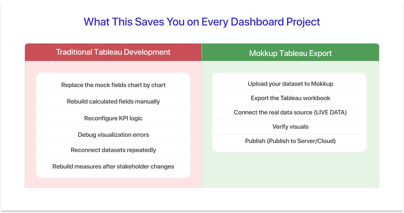
That difference matters on real projects. Especially when:
- Stakeholders change requirements mid-build
- Dashboards contain complex calculations
- Multiple developers collaborate on delivery
- Teams work under tight reporting deadlines
The fewer manual rebuild steps involved, the lower the chance of introducing inconsistencies or errors.
Indeed, 80% of analytics teams spend a significant amount of time on preparation and maintenance work rather than actual analysis. Reducing repetitive configuration work can meaningfully improve dashboard delivery efficiency.
For teams building dashboards at scale, this creates a smoother path from idea to implementation.
Power BI Semantic Export: Also Available Now
The Mokkup Semantic Layer launched for Tableau first, and Power BI support is now live as well. The same pre-wired measures and DAX-equivalent calculations are baked directly into your exported .pbix file, so Power BI teams get the same head start Tableau teams already have.
Wireframe. Export. Connect. Go Live.
That's the loop the semantic/convo layer makes possible, without the manual rebuild that used to sit between steps two and three.
Try the new Mokkup Tableau export today and feel the difference on your next dashboard project. For step-by-step, chart-level guidance, our help center guide walks through every visualization type in detail.

Frequently Asked Questions
They are two different features that work together. Convo AI is the natural language conversation layer where you describe the dashboard you want and optionally upload a data file, and Convo AI builds the wireframe around your real columns. The Mokkup Semantic Layer takes that same uploaded file and pre-configures your Tableau wireframe export file with the dataset attached and every metric, measure, and calculated field already wired up, so a developer does not need to rebuild these fields in Tableau. Mokkup never reads the actual rows of your file, so your sensitive data stays secure.
Currently, the Mokkup Semantic Layer is available for all Mokkup chart types except Bubble, Scatter, and Double Donut charts. For these three, the standard mock-field replacement process applies.
The uploaded dataset for Mokkup Tableau export needs to be a CSV (.csv) or Excel (.xlsx) file. You can upload one file per message, and only one table or sheet is processed per upload.
A blank export is almost always a date range alignment issue. Adjust the date range filter in Tableau Desktop to match the data in your connected source, and the visuals will render correctly.
Yes, the Semantic/Convo Layer feature is available on the free Mokkup plan. Free-plan users receive 6 AI coins to use for AI-powered prompts and exports. If users need additional usage, they can purchase credits and convert them into AI coins to continue generating AI-driven wireframes and semantic Tableau exports.
Prompt it. Wireframe it with Mokkup.ai.
