
A KPI dashboard template can fail when it focuses on layout instead of business decisions. Without proper dashboard stakeholder alignment, teams may build dashboards that look complete but do not support real actions. This is one of the most common BI project failure reasons in many organizations.
Many teams look for a KPI dashboard template when they need to create a dashboard quickly. Templates appear to be the fastest way to get started. Download a layout, enter the data, and the dashboard should be ready.
However, this approach rarely produces the expected results. Research suggests that up to 75% of business intelligence initiatives fail because stakeholders are not involved early in the design process. Dashboard projects usually fail for reasons other than technology. In many cases, the real issue is poor dashboard stakeholder alignment. When decision-makers are not involved early, the final dashboard often fails to meet executive dashboard requirements.
KPI dashboards are not just collections of charts. Their real purpose is to help teams review performance and make informed decisions. When these decision needs are not clearly defined, templates can create the impression that the dashboard structure is already complete.
Common Reasons KPI Dashboard Templates Fail
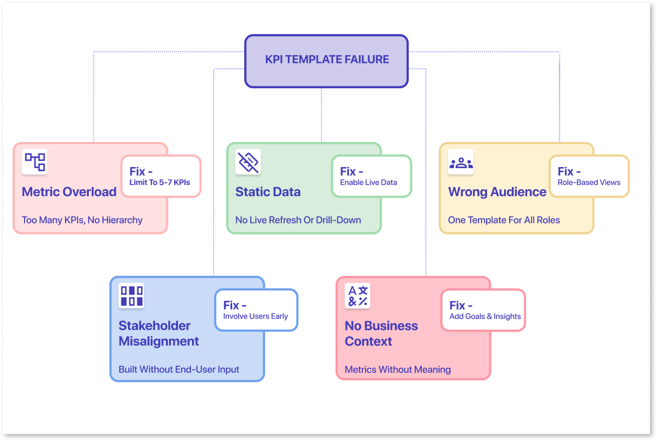
KPI dashboard templates often fail because they prioritize layout over decision-making. Without proper dashboard stakeholder alignment, teams may build dashboards that look polished but do not meet executive dashboard requirements or support real business decisions.
Several common issues contribute to this problem.
1. Lack of Decision-Focused Goals:
Many dashboards are created without defining the exact decisions they should support. When the goal is unclear, the dashboard may present data but fail to guide meaningful action.
2. Inconsistent KPI Definitions Across Teams:
Different departments may define the same KPI in different ways. Without agreement on these definitions, dashboards can create confusion and reduce trust in the reported metrics.
3. Too Many Metrics in One Dashboard:
Templates often encourage teams to display many KPIs at once. When too many metrics appear on a single screen, it becomes difficult for leaders to identify the most important insights.
4. Late Stakeholder Feedback:
When stakeholders review dashboards only after development begins, they often request major changes. These late adjustments increase development effort and delay delivery.
5. Lack of Business Context:
Dashboards often present metrics without explaining why they matter. When KPIs are not linked to business goals or outcomes, they become numbers without meaning. This makes it difficult for decision-makers to understand what action to take, even if the data is accurate.
Together, these issues show why relying only on a KPI dashboard template rarely leads to a dashboard that truly supports business decisions.
Table of Contents
- The “Static Template” Fallacy: Why Downloads Aren’t Real Solutions
- 3 Hidden Costs of Skipping the Alignment Phase
- Prototyping: The Missing Link in Dashboard Development
- Static KPI Templates vs Interactive Dashboard Wireframes
- How to Use a “Planning-First” Template to Drive Dashboard Adoption
The “Static Template” Fallacy: Why Downloads Aren’t Real Solutions
Static templates are made to work in many situations, so they rarely fit one organization perfectly. Most KPI dashboard templates come with fixed layouts in tools like Excel, PowerPoint, or PDF. They assume your metrics and data will fit the template.
In reality, business data rarely works that way. Different teams track different metrics and use different definitions. They also have different reporting priorities. When teams try to fit their data into a template, they often face several problems:
- Important metrics may not have a place in the layout.
- The template may highlight metrics that are not relevant to the business.
- Stakeholders might view the information differently than the dashboard designer intended.
Because templates look structured and complete, they can hide requirement gaps early in the process. The dashboard may appear finished, but the key questions have not been fully discussed.
As a result, feedback often comes after development has already started. By then, changing layouts, metrics, or calculations becomes more time-consuming and expensive. This is why templates often delay progress rather than accelerate it.
3 Hidden Costs of Skipping the Alignment Phase
When teams skip stakeholder alignment and start building dashboards from templates, problems usually appear later. At first, the process may seem faster, but without early discussions, it often leads to confusion, redesign, and delays.
Here are three common issues teams face when alignment is missing.
1. The Data-Reality Gap (Where Messy Data Meets Rigid Layouts)
Templates are usually designed around clean, well-structured data. Real business data rarely looks like that.
Different teams may define the same metric differently. Data may also come from many systems, and some fields may be missing or inconsistent. When teams use a fixed template, they often try to force their data to fit the layout.
This creates what many analysts experience as the data-reality gap. For example, a template may expect clear monthly revenue numbers or standard sales categories. In reality, the data may need cleaning or combining from different sources before it can be used.
If this problem appears late in the project, developers may have to change the dashboard layout or rebuild parts of the data model. What looked like a quick start turns into additional work.
2. The “I’ll Know It When I See It” Trap
Another challenge comes from how stakeholders communicate requirements. Many decision makers cannot clearly explain the dashboard they want at the start. Instead, they react after seeing something. They often say, “I will know the right dashboard when I see it.”
If the team builds the full dashboard before showing it to stakeholders, feedback usually comes very late. At that point stakeholders may request major changes such as:
- Adding new KPIs
- Reorganizing the layout
- Changing how metrics are calculated
- Replacing entire charts
These requests are not unusual. They are simply part of how people refine their thinking. The problem is that without early visual drafts, feedback only happens after development work has already been done.
3. Rework After Development
When requirements change after development starts, teams often have to redo parts of the dashboard. This creates extra work that could have been avoided.
Common examples include:
- Rebuilding visuals to include new metrics
- Modifying data models to support different calculations
- Teams may also need to change the layout to match stakeholder preferences.
Over time, these changes make the dashboard harder to maintain and update. Instead of a stable reporting tool, the project turns into a cycle of constant revisions.
This is why skipping alignment rarely saves time. The effort simply shifts from the planning stage to the development stage, where changes are more complex and expensive.
Prototyping: The Missing Link in Dashboard Development
To avoid these problems, many teams now follow a planning-first approach when building dashboards. Instead of starting with a static template or going straight to tools like Power BI or Tableau, they first create a simple visual draft of the dashboard. This process is often called dashboard wireframing.
A wireframe is a rough visual layout that shows:
- Which KPIs will appear on the dashboard
- Where charts and tables will be placed
- How information will be grouped to support decisions.
At this stage, the focus is not on connecting data or building complex visuals. The goal is simply to show what the dashboard might look like. This makes it easier for stakeholders to give feedback early. Instead of talking about ideas, they can react to something they can see.
For example, a stakeholder might quickly notice that:
- An important KPI is missing
- Two charts should be grouped together
- The layout does not reflect how they review performance
Making these changes during the planning stage is much easier than changing a finished dashboard later. Wireframing helps teams move from a blank screen to a clear dashboard plan. It turns business needs into a simple structure before developers start working with data and visualization tools.
Many teams now use a dedicated KPI dashboard wireframe tool such as Mokkup.ai to create these early layouts. These tools help analysts and stakeholders work together on the dashboard design before any data work begins. Visual prototypes help teams reduce requirement gaps, align expectations, and start development with more clarity.

Static KPI Templates vs Interactive Dashboard Wireframes
The difference between static templates and dashboard wireframes becomes clearer when we compare how they support dashboard planning and stakeholder alignment.
|
Comparison Factor |
Static KPI Templates |
Interactive Dashboard Wireframes |
|
Layout flexibility |
Fixed layout that is difficult to change |
Flexible layout that can be adjusted easily |
|
KPI selection |
Predefined metrics that may not match business needs |
KPIs defined with stakeholders during planning |
|
Stakeholder feedback |
Feedback usually comes after the dashboard is built |
Feedback happens early during the design stage |
|
Handling real data |
Often assumes clean and structured data |
Designed around real and sometimes messy data |
|
Risk of rework |
Higher risk of redesign and post-build changes |
Lower risk because requirements are clear earlier |
How to Use a “Planning-First” Template to Drive Dashboard Adoption
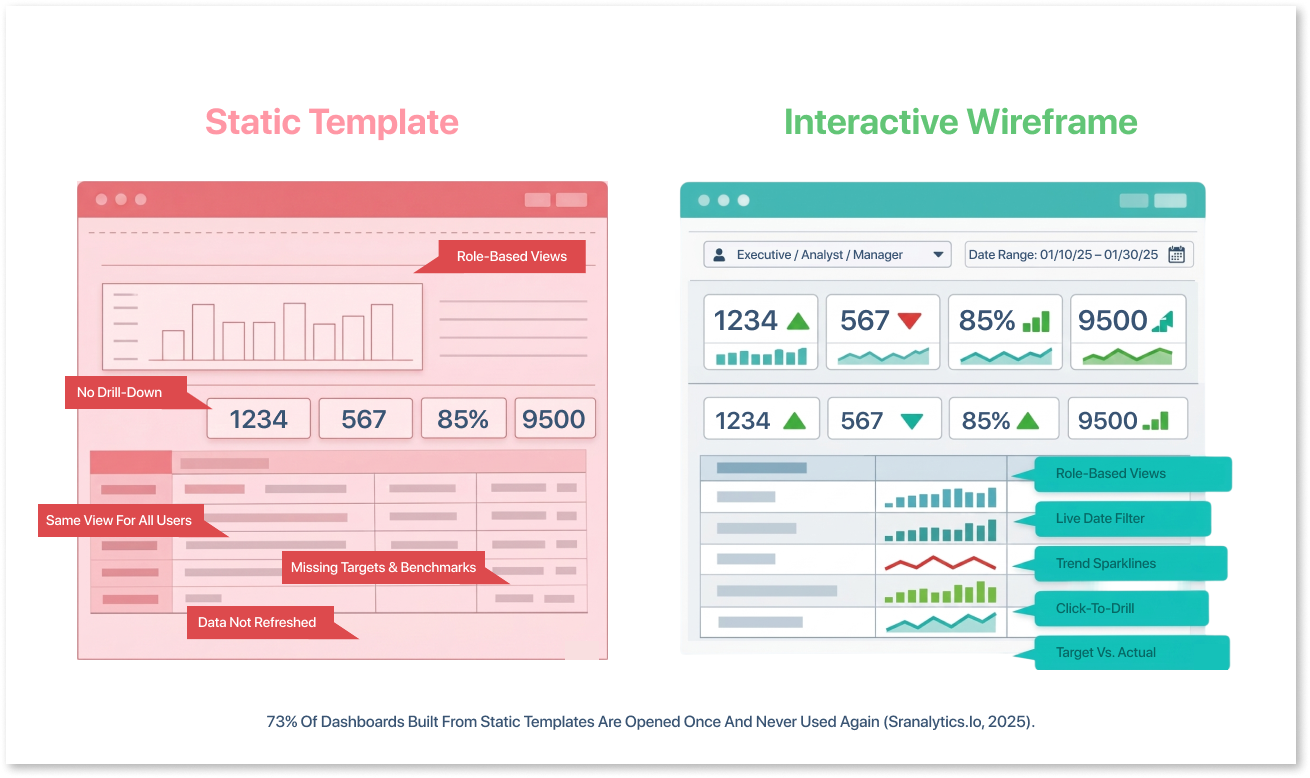
A planning-first approach helps teams move beyond generic templates and focus on dashboards that match real business needs. Instead of starting with a finished layout, teams begin with a flexible draft that stakeholders can review and refine together.
This process ensures the dashboard structure is aligned before development begins, which significantly improves the chances that the final dashboard will actually be used.
1. Moving from Static Sheets to Interactive Wireframes
Traditional templates are usually static files. Once the layout is downloaded, teams try to adapt their metrics and data to fit the structure.
A better approach is to start with interactive wireframes that represent the dashboard visually but remain easy to adjust. These wireframes act as a collaborative workspace where analysts, managers, and executives can review the design together.
At this stage, teams can discuss questions such as:
- Which KPIs matter most for decision-making?
- How should metrics be grouped on the screen?
- Which charts communicate trends most clearly?
Because the dashboard is still in draft form, changes can be made quickly without affecting data pipelines or reporting tools.
Many teams use a dashboard wireframing tool like Mokkup to create these layouts. A dedicated wireframing environment allows analysts to experiment with dashboard structures, collect stakeholder feedback, and finalize the design before moving into full development.
This step helps turn vague requirements into clear visual specifications.
2. Securing Executive Sign-off Before the Data Is Cleaned
Another advantage of prototyping is that it allows teams to confirm expectations before investing time in data preparation.
Data cleaning, transformation, and modeling often represent the most time-consuming part of a dashboard project. If requirements change after this work begins, teams may have to rebuild parts of the pipeline.
By sharing wireframes early, executives can review the proposed dashboard and confirm that it answers the right business questions. They can also request adjustments while the design is still flexible. Once stakeholders approve the layout and KPIs, the team can move into data preparation and development with much greater confidence.
This simple step often makes the difference between dashboards that are technically complete and dashboards that teams actually use. Early planning and stakeholder involvement are key dashboard adoption strategies that help ensure long-term success.
Conclusion
The appeal of KPI dashboard templates is easy to understand. They promise a quick starting point for teams that need to deliver dashboards under tight deadlines. However, templates rarely solve the most important challenge in dashboard development: aligning stakeholders around what the dashboard should actually show.
When teams skip this alignment phase, they often encounter requirement gaps, late feedback, and costly rework. What looked like a shortcut at the beginning becomes a longer and more complicated process.
A planning-first approach offers a more reliable path. By creating visual prototypes and gathering stakeholder feedback early, teams can define the dashboard structure before investing time in development.
Tools like Mokkup.ai make this process easier by providing a dedicated environment for dashboard wireframing and collaboration. Instead of forcing business needs into a rigid template, teams can design dashboards that truly reflect how decisions are made.
In the long run, the goal is not simply to build dashboards faster. It is to build dashboards that teams trust, understand, and actually use.

Frequently Asked Questions
A KPI dashboard template is a predefined layout used to track key performance indicators. It usually includes charts, tables, and metrics that help teams monitor performance in one place.
KPI dashboard templates often fail because they focus on layout instead of business needs. Without stakeholder alignment, templates can hide requirement gaps and lead to dashboards that do not support real decisions. Visual prototyping and dashboard wireframing help teams define metrics and layouts before development begins.
Dashboard wireframing is the process of creating a simple visual layout of a dashboard before building it. It helps teams decide which KPIs to include and how information should be organized.
Stakeholder alignment ensures that the dashboard reflects the metrics and insights decision-makers need. When stakeholders review and approve the design early, teams can avoid confusion, rework, and delays later in the project.
Prompt it. Wireframe it with Mokkup.ai.
