
When Anthropic Labs launched Claude Design in April 2026, the BI community noticed within hours. A general-purpose AI design tool that turns a plain-language prompt into a polished, interactive UI mockup is exactly the kind of thing a Power BI developer or Tableau practitioner stops scrolling for, so much so that Figma's stock fell over 7% the same day. We tested Claude Design dashboard wireframing on the work we do every day, wireframing BI dashboards before they get built, and the picture became more nuanced.
This review is for solo BI practitioners and Power BI developers who want an honest answer to one question: Does Claude Design BI dashboard wireframing fit into a BI dashboard wireframing workflow, or does the gap between a general UI design tool and a BI delivery tool still require a specialist? It's also for anyone googling Claude Design alternatives after the launch and trying to figure out whether "Claude Design for Power BI" is actually a category yet. The short version: Claude Design is a capable design product, but it isn't built for Power BI or Tableau, and for teams who need to ship dashboards, that distinction matters.
Table of Contents
- What Is Claude Design? (The April 2026 Launch, Explained)
- We Tested Claude Design for BI Dashboard Wireframing
- Where Claude Design Falls Short for BI Dashboard Wireframing
- What a Purpose-Built BI Wireframing Tool Does Differently
- Claude Design vs. Mokkup: Side-by-Side Comparison
- When Should You Use Claude Design for Dashboard Work?
What Is Claude Design? (The April 2026 Launch, Explained)
Claude Design is Anthropic Labs' generative design product, released on April 17, 2026, and powered by Claude Opus 4.7, the company's most capable vision model. TechCrunch described it as a tool for "creating quick visuals," while VentureBeat framed it as a direct challenger to Figma. The pitch: Describe what you want in natural language, and Claude Design produces a visual artifact, a prototype, slide, wireframe, or interactive mockup.
For BI practitioners, the appeal is obvious. Dashboard wireframing has always lived in an awkward in-between space: too structured for a whiteboard, too rough for Power BI, and too niche for most general design tools. The question of whether it's a serious option for Claude Design BI dashboard wireframing comes down to whether "general" is good enough for BI.
Claude Design vs. Claude AI: What's the Difference?
It's worth clearing this up early because the names blur together. Claude is Anthropic's conversational AI assistant, the chatbot you talk to. Claude Design is a separate product from Anthropic Labs, focused on generating visual output: wireframes, mockups, prototypes, slides, and interactive UIs from natural-language prompts. They share a brand and a foundation model, but you reach Claude Design through its own interface, and it produces design artifacts rather than text replies.
What Can Claude Design Actually Create?
Claude Design's output range is broad: interactive prototypes, static wireframes, presentation slides, one-pagers, marketing visuals, and exploratory UI concepts. The fidelity is high outputs look designed, not sketched. The next question, and the one this review hinges on, is what happens when you point that capability at the Claude Design dashboard wireframing for a Power BI or Tableau workflow.
We Tested Claude Design for BI Dashboard Wireframing
The hands-on test for Claude Design BI dashboard wireframing is different from how anyone would test, say, Microsoft Copilot inside Power BI. The question here is not "can it generate a dashboard?" — it can, and it does, in seconds. The question is what it produces, what that output assumes about the downstream workflow, and what gap it creates between an approved wireframe and a shippable Power BI build. The test is a real prompt, documented output, and then the honest downstream consequence: what a BI developer actually receives when they take the wireframe back to Power BI to build.
The Prompt We Used
We kept the prompt deliberately representative of a real BI request — clear, specific, named BI tool, and three named metrics:
"Create an HR dashboard wireframe for Power BI showing headcount, attrition rate, and department breakdown."
Nothing about visual style, nothing about layout preferences. The kind of one-liner a developer might type to kick off a wireframe before stakeholder review.
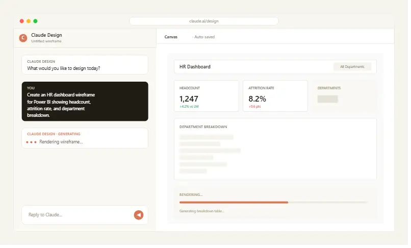
Claude Design accepted the prompt without follow-up questions and began rendering the wireframe on the canvas within seconds.
What Claude Design Produced
The output was polished. Claude Design returned an interactive dashboard mockup with a clear header, three top-line metric tiles for headcount, attrition rate, and department count, a larger chart area in the middle, and a breakdown table at the bottom. Spacing was clean, typography was considered, and the prototype responded to clicks. As a piece of general UI design, it would pass review at most product teams. As the Claude Design dashboard wireframing output was handed to a Power BI developer, it raised more questions than it answered.
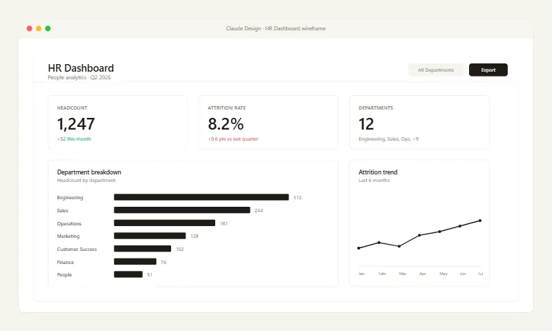
The layout logic was sound at a surface level; the most important numbers sat top-left, supporting visuals followed below, and the page read in a natural F-pattern that mirrored established dashboard design conventions. For a stakeholder who has never seen the dashboard before, the wireframe communicates intent.
That said, four gaps appeared the moment a Power BI developer looked at it. The KPI tiles were generic UI cards with no resemblance to Power BI's KPI visual conventions — large numbers in rounded rectangles rather than the structured KPI card with target, indicator, and trendline. The central visual was a flat bar chart with no slicer or filter affordance attached, where any real Power BI dashboard at this complexity would have a slicer panel running down one side. The breakdown table at the bottom was a UI table clean, but not a Power BI matrix, with no expand/collapse behavior, no hierarchy, and no totals row. And there was nothing in the wireframe that indicated which Power BI dataset the dashboard was supposed to query, because Claude Design has no concept of a connected data model.
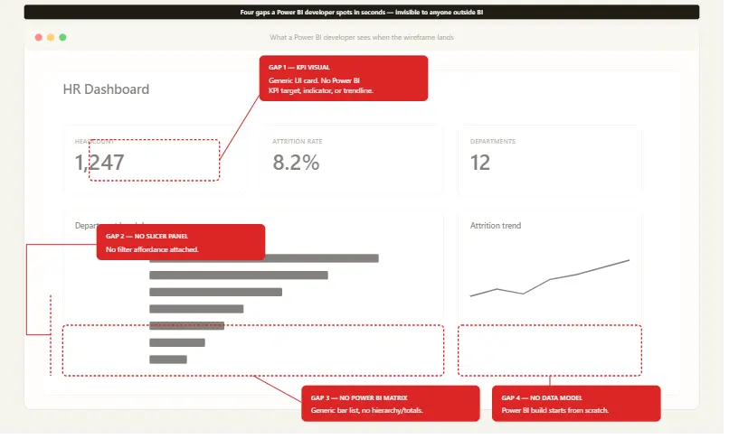
None of this is a failure of Claude Design as a design tool. The output is internally consistent, the visual quality is real, and the layout would brief a designer well. But the gap between what a BI developer needs and what Claude Design produces is significant, and none of it is visible until the wireframe is handed back across the team for the Power BI build to begin.
For a side-by-side reference on what an HR attrition dashboard with the same three metrics, including headcount, attrition rate, and department breakdown — looks like when it's wireframed in a Power BI-native tool, here is the Mokkup HR Attrition Dashboard template. Same scope as the Claude Design test, but built from Power BI KPI cards, a department slicer, and a matrix-style breakdown, the kind of BI-native components Claude Design dashboard wireframing doesn't yet produce.
What BI Users Will Notice Immediately
What BI practitioners will notice within seconds is that the wireframe is not a Power BI dashboard. The KPI tiles don't look like Power BI KPI cards. There's no slicer panel, no matrix visual, no filter pane, no field list. The chart in the middle is a generic bar chart with no analog to Power BI's visual library. The breakdown table is a generic UI table, not a Power BI matrix.
The output looks like a dashboard but isn't a Power BI dashboard. A developer receiving it has a reference image, not a head start; the actual Power BI build still begins from a blank canvas. That's the moment Claude Design's positioning in Claude Design dashboard wireframing becomes clear: it's a general design tool that happens to do dashboards, not a BI tool that happens to use AI.
Where Claude Design Falls Short for BI Dashboard Wireframing
Four specific gaps make Claude Design BI dashboard wireframing a poor fit for a Power BI or Tableau delivery workflow. Each is a real workflow break, not a minor friction.
No BI Component Library
Claude Design's component vocabulary is the vocabulary of general UI design: cards, buttons, headers, and generic charts. It doesn't know what a Power BI slicer looks like, what a matrix visual is, how a Tableau filter panel behaves, or what the conventions of an embedded Power BI report are. Ask Claude Design to wireframe a BI screen, and you get a UI mockup wearing the costume of a dashboard, not a mockup built from real BI components.
This matters because BI wireframes are a communication tool between the designer, developer, and stakeholder. A wireframe built from generic UI primitives quietly creates ambiguity; the stakeholder approves a shape that the developer then has to interpret into the actual BI component vocabulary. Rework starts at the handoff.
No Export to Power BI or Tableau
Claude Design outputs interactive prototypes, HTML, and visual mockups. There is no export to Power BI .pbix or .pbit template, no export to Tableau .twbx packaged workbook, no path from the wireframe into the BI tool the dashboard will live in. The wireframe becomes a reference image from which the developer rebuilds from scratch. That's the single biggest problem with Claude Design dashboard wireframing for production BI work.
For a single dashboard, that's an evening of rework. For a team shipping ten dashboards a quarter, it's a structural cost. The whole point of an AI wireframing step is to compress the build cycle, but if the wireframe doesn't carry into the BI tool, the cycle hasn't compressed. It's just acquired a new pre-step.
No Stakeholder Shareable Wireframe Link
BI dashboards almost always go through a stakeholder review before development begins. The business owner needs to see the layout, react to it, suggest a change, and sign off. That loop is the whole reason wireframing exists in BI workflows, and it's where Claude Design BI dashboard wireframing quietly breaks down.
Claude Design's output isn't designed around that loop. Sharing a screenshot in Slack or pasting an image into Confluence is not the same as a live, commentable wireframe link a stakeholder can open, click, and react to. The absence of a built-in sharing-and-feedback workflow means a step that should take a day becomes a back-and-forth that takes a week.
Built for Web and App UI, Not BI Dashboards
This is the structural point underneath the three gaps above. Claude Design was built for product teams designing web applications, marketing pages, and mobile UI. That universe has different conventions than BI: different component libraries, different layout grammar, and different delivery environments. A Power BI dashboard lives inside a Power BI workspace, embedded in Teams, or published to a Power BI app. A Tableau dashboard lives in Tableau Server or Tableau Cloud. The downstream environment shapes the upstream wireframe.
Claude Design doesn't bridge that gap because it wasn't designed to. That's not a flaw — it's a scope decision. But it does mean teams trying to use Claude Design for BI dashboard wireframing are using a tool outside its intended use case.
What a Purpose-Built BI Wireframing Tool Does Differently
A wireframing tool built specifically for Power BI and Tableau looks different from a general AI design tool in four concrete ways. Mokkup was built around exactly the gaps Claude Design dashboard wireframing leaves open.
BI-Native Components Out of the Box
Mokkup's component library is built for Power BI and Tableau. KPI tiles look like Power BI KPI cards because they're modeled on them. Slicers look like slicers. The matrix visual looks like a matrix visual. Chart types map directly to the visuals available in the BI tool, the dashboard will be built in. The result: a wireframe that communicates a layout in the same visual vocabulary the developer and the BI tool will use, built from BI-native components.
For stakeholders, the wireframe looks like the dashboard they'll eventually see. For developers, it's a build target, not a translation exercise.
One-Click Export to Power BI and Tableau
A Mokkup wireframe exports directly into a Power BI or Tableau starting template. Not a reference image, but a usable template that the developer opens and continues from. It's the single biggest time-saver in the BI delivery workflow, because it removes the manual rebuild step by keeping the wireframing-to-build flow in place.
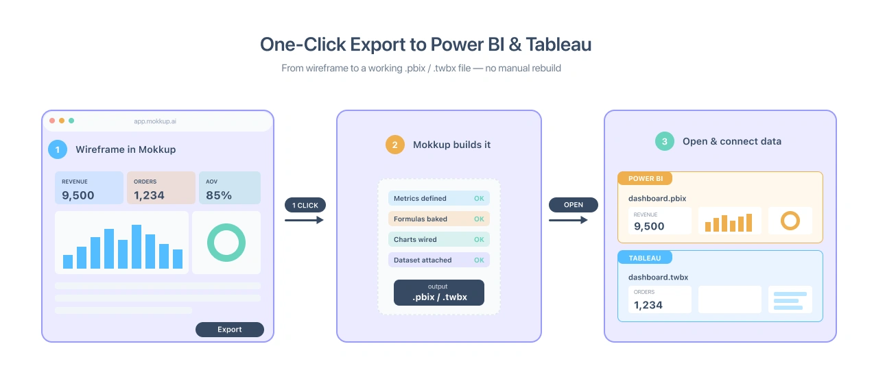
If you're evaluating tools right now, this is the test to run: does the wireframe come out as a file you can open in Power BI or Tableau or as a screenshot you have to rebuild from? Start dashboard wireframing for free.
Built for Stakeholder Sign-Off
Mokkup is designed around the review-and-approve loop. Wireframes have shareable links. Stakeholders can open them in a browser, add comments, and suggest changes. The fidelity is high enough that a non-technical business owner can react to the layout without a translation layer.
That single feature changes the politics of dashboard delivery. The "we built what you asked for, but it's not what you wanted" cycle gets compressed into a feedback loop that happens before any Power BI work begins.
AI Prompt Generation, BI-Aware
Mokkup includes an AI dashboard generator that produces wireframes from natural-language prompts, like Claude Design, but with one critical difference: it understands BI layout conventions. A prompt like "HR dashboard for Power BI" produces a wireframe built from BI-native components, KPI cards, slicers, the right chart types, and the right grid, so the wireframe it generates is something the developer can take straight into the build. This is what a BI-aware version of the Claude Design dashboard wireframing would actually look like.

Claude Design vs. Mokkup: Side-by-Side Comparison
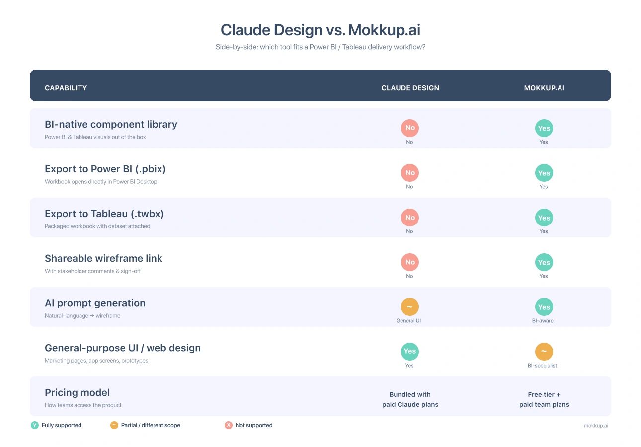
The pattern is consistent. For general UI design, Claude Design is a more capable tool. For Claude Design BI dashboard wireframing, the workflow ends in a published Power BI or Tableau dashboard. Mokkup covers the steps that actually move the work forward.
When Should You Use Claude Design for Dashboard Work?
To keep this review fair, there are real situations where Claude Design is the right tool, even for someone working on BI projects. That’s where Claude Design dashboard wireframing genuinely adds value.
Early-stage layout ideation. At the back-of-envelope stage, exploring two or three radically different directions before committing to a BI structure, Claude Design's speed and visual range are useful. Generate five wireframes in fifteen minutes, pick a direction, then move it into a BI-native tool for delivery.
Cross-functional design sprints. When BI sits inside a broader product or marketing initiative, and you need a visual artifact that a non-BI audience can react to, Claude Design's polish helps.
Concept exploration with non-technical stakeholders. The cost of a Claude Design wireframe is so low that it's useful as a thinking artifact, serving as a way to surface preferences before a structured Claude Design BI dashboard wireframing process gives way to a real BI build.
In all three cases, Claude Design is the upstream tool. It informs the BI wireframing step. It doesn't replace it.
Conclusion
Claude Design is a capable AI design tool. The April 2026 launch was earned, the output is polished, the prompt-to-visual loop is fast, and for general UI work, it's a real addition to the toolkit. But evaluated specifically as Claude Design dashboard wireframing for Power BI and Tableau, the limits show.
The missing BI component library, the absent export pipeline into Power BI and Tableau, and the lack of a stakeholder sign-off workflow aren't minor inconveniences a Power BI team can route around. There are workflow-breaking gaps in Claude Design BI dashboard wireframing today. For BI practitioners shipping dashboards and for anyone weighing Claude Design alternatives for serious BI delivery, the right tool is the one built for the job.
Start dashboard wireframing for free — or try the AI dashboard generator and see what a BI-aware AI wireframe looks like.
Frequently Asked Questions
Claude Design can generate a dashboard-style UI mockup from a prompt, but it does not export to Power BI and does not use BI-native components. The output of the Claude Design dashboard wireframing is a general UI mockup that requires manual recreation inside Power BI by a developer.
Per Anthropic's launch announcement, Claude Design is available in research preview for Claude Pro, Max, Team, and Enterprise subscribers. It is not available on the free Claude tier. Pricing follows the broader Claude subscription model rather than being a standalone product.
Mokkup.ai is the best BI-focused tool that can be used for dashboard wireframing to export dashboards directly into Power BI platforms with the same data and formulas. It is built around BI use cases with Power BI-native components, .pbix export support, shareable wireframe links, and an AI dashboard generator designed for reporting layouts. General design tools like Claude work better for web and app UI design, especially where BI-specific structure and reporting patterns matter less.
Claude Design and Figma serve overlapping general UI design use cases, but neither is purpose-built for BI dashboards. Both produce visual artifacts that a BI developer still has to rebuild inside Power BI or Tableau. For Claude Design dashboard wireframing specifically, and for Power BI and Tableau wireframing in general, a BI-native tool fills the gap both leave open.
The strongest Claude Design alternatives for BI work are tools built specifically for BI dashboard wireframing with native Power BI and Tableau components, direct export to .pbix and .twbx, and a stakeholder review loop. Mokkup.ai is the purpose-built option in this category.
Claude Design launched on April 17, 2026, as a product from Anthropic Labs. At launch, it was made available to paid Claude subscribers as part of the broader Claude product family.
Prompt it. Wireframe it with Mokkup.ai.
