![How to Create a Power BI Dashboard Wireframe in 30 Minutes [With Free Template]](https://mokkupai.s3.ap-south-1.amazonaws.com/files/assets/blogs/cover-images/990.png?rels=u3zd75oj3r)
You have been asked to build a Power BI sales dashboard. You open Power BI Desktop. And immediately face the question no one told you to answer first: what exactly are you building, and has anyone agreed on that? This is where most BI projects go wrong. Not during the build, but in what happens before it.
Wireframing your Power BI dashboard before you start building solves this. It helps your team agree on what the dashboard should look like before anyone touches Power BI. Here is how to wireframe a Power BI dashboard in 30 minutes, including a free dashboard wireframe template you can start with today.
Table of Contents
- Why Wireframe a Power BI Dashboard Before Building It?
- What You Need Before You Start (5 Minutes)
- The 30-Minute Wireframe Process Using Mokkup
- Power BI Dashboard Wireframe Best Practices (From 75 Plus BI Projects)
- Get the Free Power BI Dashboard Wireframe Template
Why Wireframe a Power BI Dashboard Before Building It?
1. The Real Cost of Skipping the Wireframe
A BI developer spends two weeks building a Power BI sales dashboard. The stakeholders see it for the first time at the review meeting. Within ten minutes, they ask for a different layout, a new set of KPI cards, and a chart type that was never discussed. The rework takes another week. The entire situation was avoidable.
This is not a rare scenario. It is the default outcome when teams skip wireframing. Across more than 75 Power BI dashboard projects at NeenOpal, wireframing before building reduces BI implementation time by 60%. That is not a design theory. That is project economics. That is project economics. You can read more about how NeenOpal built Mokkup and the thinking behind it.
The time cost of a wireframe is 30 minutes. The time cost of skipping one is measured in days. You can also read our Power BI automation guide to understand how planning upfront connects to faster delivery across the full BI workflow.
2. What a Power BI Dashboard Wireframe Actually Is
A wireframe is simply a layout plan. Anyone can create one, no design skills needed. A Power BI dashboard wireframe is a layout agreement. It shows:
- Which KPIs appear on the dashboard and where
- Which chart types are used for each metric
- Where the filter panel sits
- Which visuals have drill-through, and where they navigate to
Think of it as a simple document that answers one question, what are we building, before anyone opens Power BI Desktop. It is a communication tool, not a design task. Many BI developers assume wireframing is not their responsibility, but it is an important part of how to design a Power BI dashboard the right way.

What You Need Before You Start (5 Minutes)
1. Define Your Dashboard Goal and Audience
Before choosing a single chart type, answer two questions:
- What is the one question this dashboard must answer?
- Who will read it every day?
These two answers determine everything else. A dashboard built for a CFO looks different from one built for a regional operations manager. The CFO needs summary numbers and trend lines. The operations manager needs granular filters, drill-through paths, and daily refresh data.
Common mistakes to avoid at this stage:
- Building a dashboard for "everyone" produces a dashboard no one uses.
- Skipping the audience question leads to the wrong level of detail.
- Not defining the primary question leads to too many KPIs and a cluttered layout.
Write down one sentence: "This dashboard helps [audience] answer [specific question] on a [daily/weekly/monthly] basis." Everything in your wireframe flows from that sentence.
2. List Your KPIs and Data Sources
Limit your primary dashboard view to 5 to 8 metrics. This is not an arbitrary rule. Power BI's canvas has finite space, the human eye has a limited attention span, and mobile rendering breaks down when too many visuals compete for space.
For each KPI, fill in this simple table before opening any wireframing tool:
|
Metric Name |
Source Table |
Calculation Type |
|
Total Revenue |
Sales_Fact |
SUM |
|
Month on Month Growth |
Sales_Fact |
Calculated Measure |
|
Units Sold |
Orders_Fact |
COUNT |
This table becomes your data foundation for the wireframe step. It also prevents the classic post-build problem where a stakeholder asks for a metric that was never mapped to a source table in the Power BI data model.
The 30-Minute Wireframe Process Using Mokkup
This is the core section. The steps below cover the full wireframing process using AI-powered dashboard wireframing tool, built specifically for Power BI and Tableau teams. Over 110,000 users across 60 countries use Mokkup AI for Power BI dashboard planning before the build starts.
Step 1: Define Your Dashboard Goal and Audience
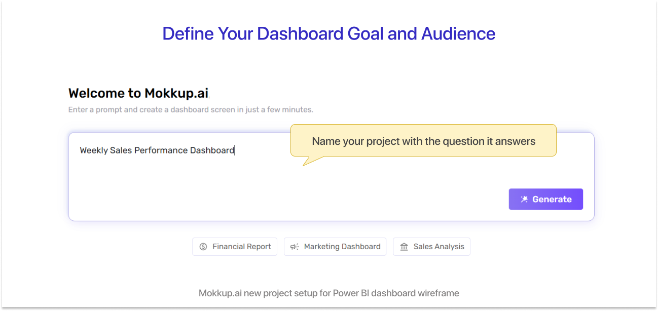
Before opening any tool, write down the one question this dashboard must answer and who will read it daily. This is not a step you can skip. Every decision you make in the wireframe, from which KPIs to show to how many filters to include, depends on who the audience is and what decision they need to make.
Ask yourself:
- Is the primary reader a CFO, an operations manager, or a regional director?
- Does this dashboard need to answer one question or several?
- How often will it be reviewed: daily, weekly, or monthly?
Write one sentence before moving on: "This dashboard helps [audience] answer [specific question] on a [daily/weekly/monthly] basis." That sentence is your brief for the entire wireframe.
Step 2: List Your KPIs and Data Sources
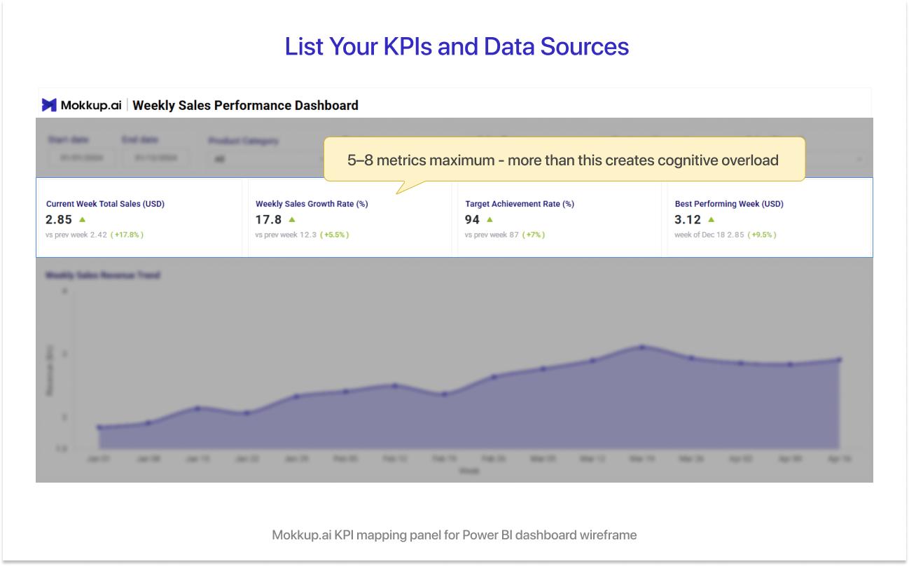
Identify the 5 to 8 metrics the dashboard must display and map each to its data source in Power BI.
Use this simple format for each metric:
|
Metric Name |
Source Table |
Calculation Type |
|
Total Revenue |
Sales_Fact |
SUM |
|
Month on Month Growth |
Sales_Fact |
Calculated Measure |
|
Units Sold |
Orders_Fact |
COUNT |
Keeping this list to 5 to 8 metrics is deliberate. More than 8 primary KPIs creates cognitive overload on the canvas and breaks mobile rendering. This way, every metric in your wireframe has a confirmed data source before the build starts, and there are no surprises later.
Step 3: Choose a Layout Structure
Open Mokkup in a new tab. It is free to start and has Power BI wireframe templates ready to go. You have two options to begin:
- Start From a Template: Mokkup offers 650+ pre-built layout templates designed for Power BI dashboards. Browse by category and select the one closest to your use case.
- Start From a Blank Canvas: If your dashboard has a unique structure, start blank and build from scratch using drag-and-drop elements.
Two layout patterns work well for most Power BI dashboards:
- Header KPIs Plus 3-Column Chart Body: Best for executive dashboards where summary numbers are the priority.
- Left Filter Panel Plus Full-Width Chart Canvas: Best for operational dashboards where filtering by region, date, or product line is a daily action.
Choose your layout before placing any elements. Changing the layout midway through the wireframe forces you to reposition everything.
Step 4: Place KPI Cards and Primary Chart
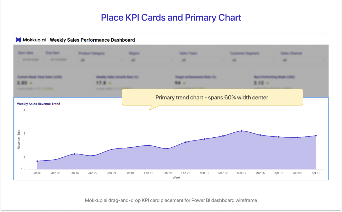
Once your layout is set, place your KPI card elements first. Mokkup has pre-built KPI card widgets that replicate Power BI's native card visual exactly. No design adjustments needed.
Follow these placement rules:
- The most important single number goes top-left. This is where the eye lands first on any dashboard.
- Place your primary trend chart (a line chart or bar chart) in the centre-top position.
- Keep the top row exclusively for KPI cards. Do not mix charts and cards in the header zone.
Label each KPI card with the metric name from your table in Step 2. At this stage, the exact numbers do not matter. What matters is that every stakeholder can see which metric sits where.
Step 5: Add Filters and Slicers
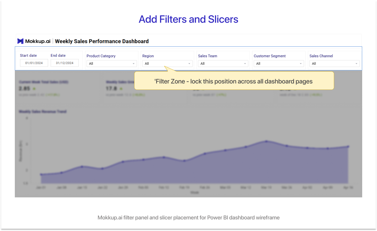
Every Power BI dashboard needs a filter zone. Define it clearly in the wireframe so stakeholders agree on it before the build. Standard filter zone options:
- Top-Right Bar: works for dashboards with two or three filters
- Left Sidebar Panel: works for operational dashboards with five or more filters
Common slicers to include:
- Date range slicer
- Region or geography dropdown
- Product line or category toggle
- Business unit selector
One rule to follow: every filter you place in the wireframe must already have a corresponding field in the Power BI data model. This prevents the expensive situation where a stakeholder asks for a new filter at the review meeting that does not exist in the data source.
Step 6: Map Drill-Through Paths
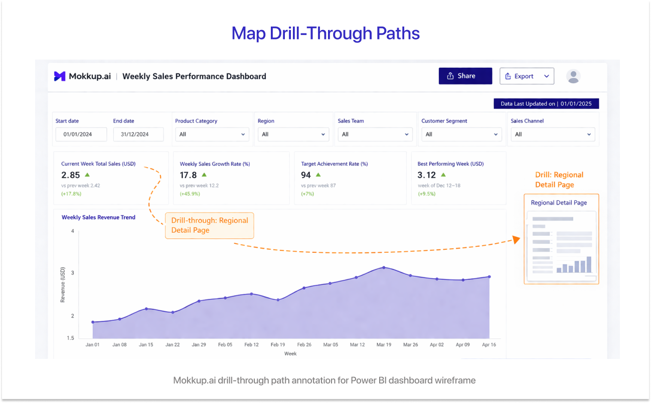
Drill-through is one of the most powerful features in Power BI. It is also one of the most argued-about in post-build reviews. Use Mokkup's text label or annotation feature to mark drill-through paths directly on the wireframe. For example:
- "Regional revenue bar chart navigates to Regional Detail page"
- "Product category card navigates to Product Breakdown page"
When stakeholders see these paths in the wireframe, they sign off on the navigation before it is built. This single step eliminates one of the most expensive rework scenarios in Power BI, which is redesigning navigation after the model and visuals are already complete.
Step 7: Get Stakeholder Sign-Off on the Wireframe
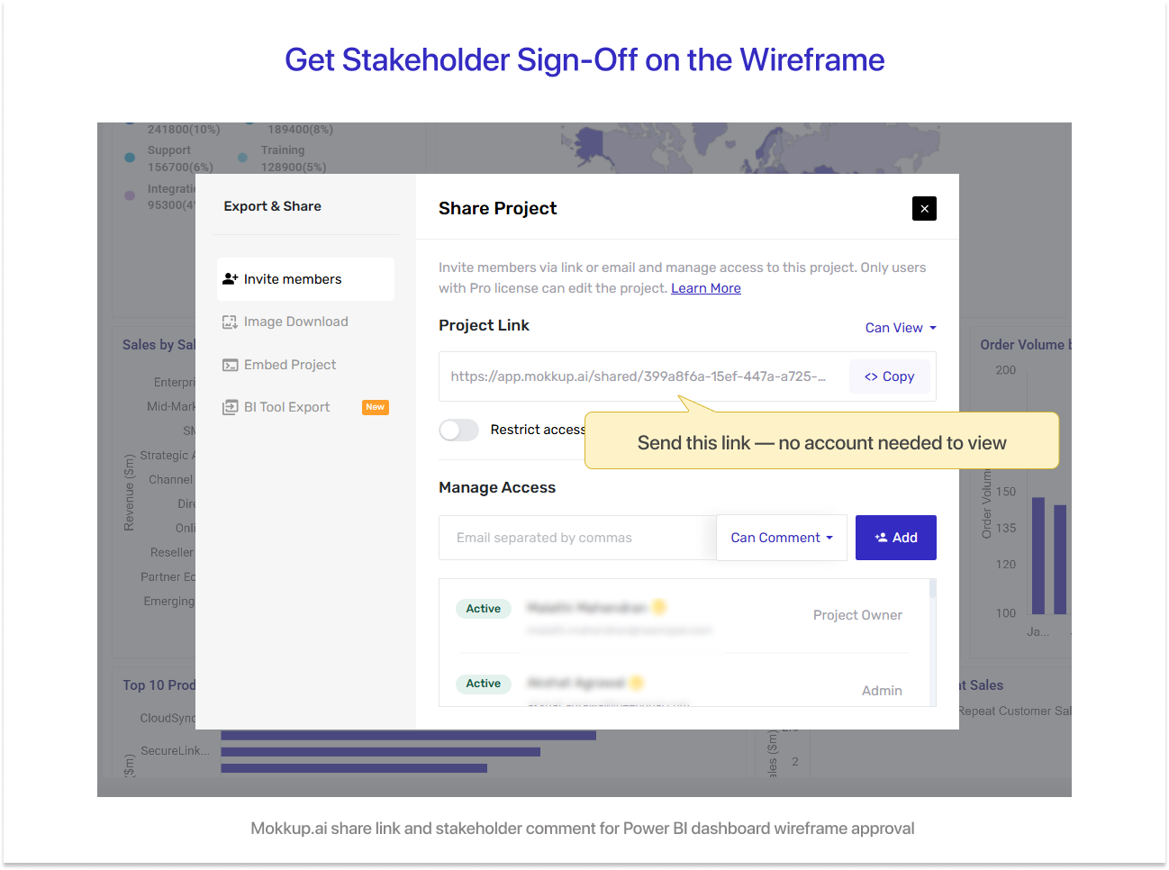
This step is where wireframing pays for itself. Copy the Mokkup shareable link and send it to your stakeholders. When you share it, ask one specific question: "Does this layout show the metrics you need to make the decision this dashboard supports?"
Do not ask "what do you think?" That question invites scope creep. Ask whether the layout answers the business question you defined in Step 1.
Mokkup allows stakeholders to leave comments directly on the wireframe. Use this feature to:
- Resolve metric disputes before they become DAX problems.
- Confirm chart type choices before building visuals.
- Lock the layout before a single Power BI visual is created.
Teams using Mokkup for stakeholder approval reduce feedback cycles by 80%. All the layout and metric disputes that typically surface during a Power BI review meeting get resolved at the wireframe stage instead.
Step 8: Export to Power BI
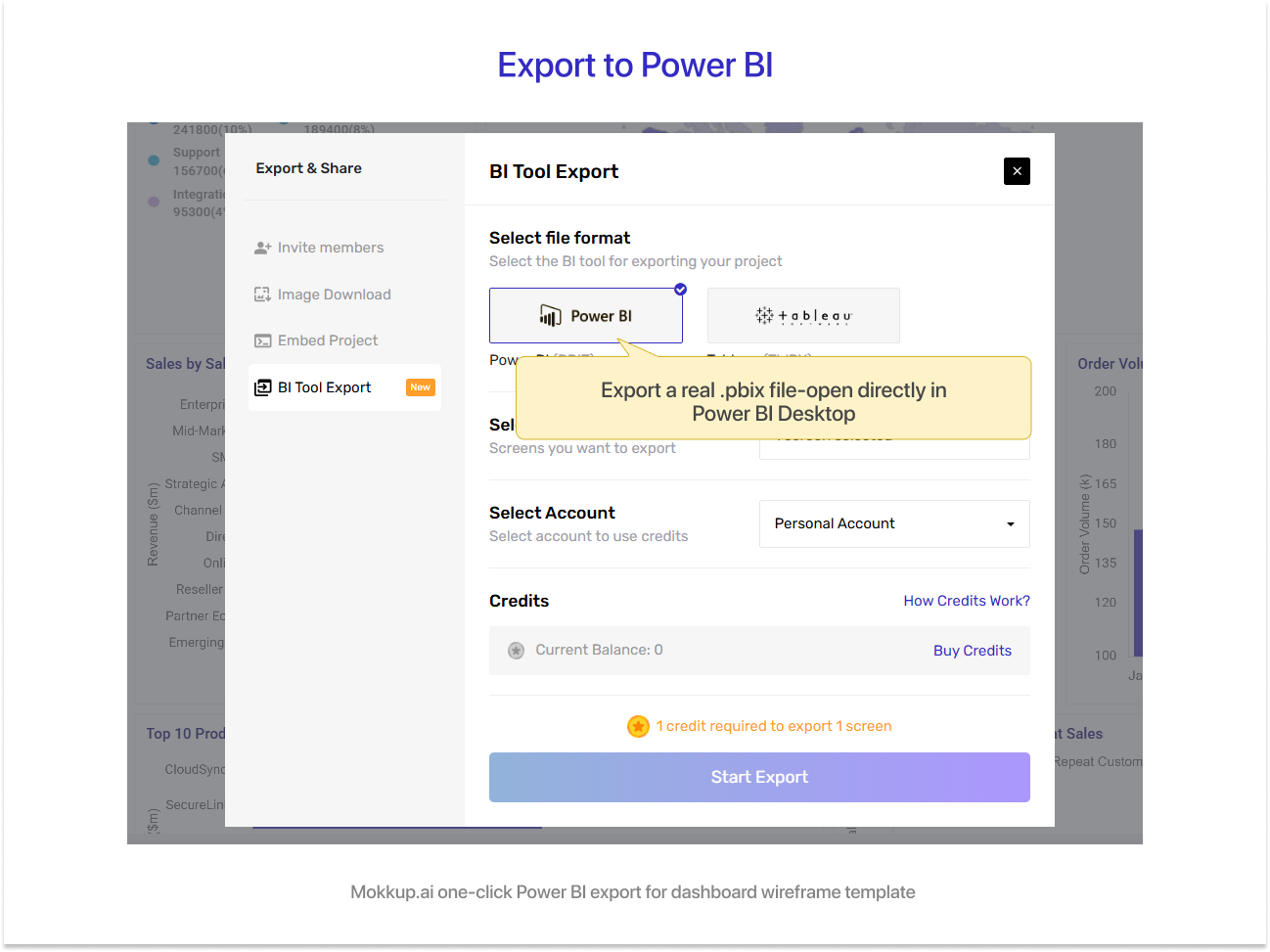
Once stakeholders have signed off, click the one-click Power BI export in Mokkup. This generates a .pbix template file with the layout you designed and dummy data already placed in the correct positions.
Open the file in Power BI Desktop. The layout is pre-built. Your job is to:
- Connect the real data sources to replace the dummy data
- Add your DAX measures to the existing card and chart placeholders
- Apply your corporate theme and colour palette
You are not rebuilding the layout from scratch. You are filling in a structure that has already been approved. The difference in build speed is significant.
Power BI Dashboard Wireframe Best Practices (From 75 Plus BI Projects)
Across more than 75 Power BI implementations, NeenOpal has seen the same mistakes appear repeatedly. Following these Power BI dashboard design best practices will save you time and rework. You can also explore BI consulting services if you need expert support on your next dashboard project.
1. The 5-to-8 KPI Rule
More than 8 primary KPIs on a single dashboard view creates cognitive overload. Users stop reading the dashboard and start ignoring it. Adoption drops.
The wireframe stage is where this gets enforced. It is far easier to remove a KPI card from a wireframe than to remove a built visual from a Power BI report that stakeholders have already seen.
If you have more than 8 metrics that genuinely need to be visible, consider:
- A summary view with the top 5 to 8 KPIs.
- Secondary pages or drill-through pages for the remaining metrics.
- A tooltip or pop-out detail for supporting numbers.
2. Mobile vs Desktop Layout Decisions
Power BI has a separate mobile layout editor. If your dashboard will be viewed on phones or tablets, you need to wireframe both the desktop and mobile views. Retrofitting a mobile layout after the desktop build is complete takes significantly longer than planning it upfront. In Mokkup, you can wireframe both views in the same project file.
Decide during the wireframe stage whether mobile is a requirement. If your stakeholders review dashboards on their phones, the answer is yes.
3. Colour and Theme Decisions Belong in the Wireframe
Do not leave colour decisions to the build phase. Resolve these in the wireframe:
- Corporate colour palette for chart series.
- Conditional formatting colours for KPI cards (green for positive, red for negative).
- Background and border colours for the canvas.
Mokkup supports theme application at the wireframe stage. When the build starts, there is no ambiguity about colours. The developer applies the theme and moves on.
Get the Free Power BI Dashboard Wireframe Template
1. What the Free Template Includes
Mokkup offers a variety of ready-to-use dashboard templates that you can access for free. If you pick a pre-built template, you will see a canvas that already has the core layout structured for you. If you prefer to start from scratch, you will get a blank canvas.
Either way, the left panel gives you access to all the elements you need, including headers, filters, KPI cards, buttons, and chart types such as column charts, bar charts, line charts, and area charts. Everything is drag-and-drop.
Webinar Analysis:
Take the Webinar Analysis template on Mokkup, for instance. It is built for teams that need to monitor webinar performance across registrations, attendance, engagement, and conversions, all in one place.
The template comes pre-structured with:
- A filter bar at the top with date range pickers and dropdown slicers for Lead Source, Webinar Name, and Webinar Host
- A KPI card row showing five metrics per page, each with a previous period comparison and a percentage change indicator
- Chart zones for trend lines, bar charts, stacked bars, and attendance visuals, depending on the page
- Data tables in the lower section for granular breakdowns by source, medium, and webinar type
- Multiple pages in one file, so you can wireframe the full dashboard flow before the build starts
You do not need to build any of this from scratch. Open the template, swap the labels to match your metrics, and you are ready to share with stakeholders.
2. How to Customize It for Your Use Case
Customizing the template takes under 15 minutes for a standard dashboard. This is also where you can use it as a Power BI dashboard prototype to test your layout with stakeholders before committing to the build. Here is what to do:
- Swap the KPI card labels to match the metrics from your table in Section 2.
- Change chart types by dragging a new chart element from the Mokkup sidebar.
- Apply your corporate colour theme using the theme settings.
- Add or remove slicer placeholders in the filter panel to match your data model.
- Update the drill-through path annotations to match your intended navigation.
Once customised, click the one-click Power BI export. You will have a .pbix template file ready to open in Power BI Desktop in under 15 minutes.
Conclusion
Wireframing is not a design task. It is a communication task. A 30-minute wireframe in Mokkup.ai that has stakeholder sign-off is worth more than a pixel-perfect Power BI dashboard that no one agreed on. Start with the template. Run the stakeholder session. Then build. In that order.
Need help designing your Power BI dashboard from end to end? Talk to our BI team and let us handle the build for you.
Frequently Asked Questions
Start by defining your dashboard goal and listing your 5 to 8 KPIs. Then open Mokkup.ai, choose a layout template, place your KPI cards and charts using drag-and-drop, add your filter zones, and annotate drill-through paths. Share the wireframe link with stakeholders for sign-off before exporting to Power BI with one click. The full process takes 30 minutes.
A dashboard wireframe is a layout agreement that shows which KPIs, chart types, and filters will appear on a dashboard and where they will be placed. It is created before any development begins. It is different from a design mockup because it focuses on structure and content, not visual polish. No design skills are required to create one.
Yes. Mokkup provides free Power BI wireframe templates. You can preview templates without an account. A free Mokkup account lets you edit, customise, and export to Power BI at no cost.
Prototyping and wireframing a Power BI dashboard follow the same process. Open Mokkup.ai, select a Power BI layout template, place your KPIs and charts, define your filters, and mark your drill-through paths. Export the result as a .pbix file and open it in Power BI Desktop to begin connecting your data sources.
Mokkup is built specifically for Power BI and Tableau dashboard wireframing. It includes 650+ pre-built templates, drag-and-drop elements that replicate native Power BI visuals, and a one-click export to Power BI Desktop. Tools like PowerPoint and Figma do not offer Power BI-specific export, which means you still have to rebuild the layout inside Power BI after creating the wireframe elsewhere.
Prompt it. Wireframe it with Mokkup.ai.
