
Dashboards Vs. Wireframes
Dashboards and wireframes serve different purposes in the design and data analysis process. Wireframes are visual guides used in the early stages to plan and lay out the structure of a dashboard. They help define what information will be displayed and how it will be organized. On the other hand, dashboards are interactive tools that display real-time data, allowing users to analyze and make decisions based on up-to-date information. While wireframes are all about planning and design, dashboards are about interacting with data. Understanding both helps ensure that your final dashboard is both well-designed and functional.
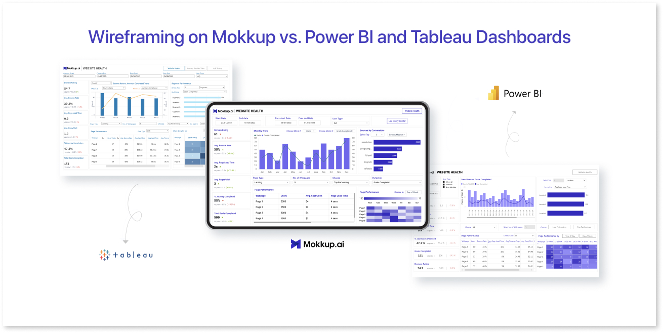
Table of Contents
- What is Wireframing, and How Does It Help Stakeholders?
- Difference Between Tableau and Power BI
- How to Use Wireframes to Enhance BI Dashboards?
- Benefits of BI Dashboards for Business Intelligence
What is Wireframing, and How Does It Help Stakeholders?
Wireframing is a visual representation of a product's interface, focusing on layout, structure, content hierarchy, color, and imagery. In the context of dashboards, wireframes serve as a skeletal structure, outlining the placement of key metrics, charts, and elements. It’s basically a low-fidelity visual guide used to lay out a dashboard's basic structure and elements.
Summarizing the content above, wireframes provide iterative value to stakeholders because:

1) Alignment on Goals:
Wireframes help stakeholders align on the dashboard's primary objectives by focusing on core elements, ensuring that it meets the desired business outcomes.
2) Early Feedback:
By reviewing wireframes, stakeholders can give early feedback on the metrics, KPIs & visualization used, ensuring that their requirements and expectations are met before development starts.
3) Collaboration and Communication:
Wireframes serve as a common language between designers, developers, and stakeholders, helping to facilitate collaboration and communication throughout the design process. By providing a clear visual representation of the design, wireframes can help ensure that everyone is on the same page and working towards a shared vision.
4) Cost and Time Efficiency:
Identifying potential issues early in the design phase can save time and resources by preventing costly development mistakes and reducing the need for extensive revisions.
Difference Between Tableau and Power BI
|
Feature |
Tableau |
Power BI |
|
Platform Overview |
Leading data visualization platform known for rich, highly customizable visuals and advanced analytics capabilities. |
Cloud-based BI platform from Microsoft; tightly integrated across the Microsoft ecosystem (Azure, Excel, Teams, etc.). |
|
Ease of Use |
Intuitive drag‑and‑drop interface, but a steeper learning curve when you get into advanced modeling and design. |
User‑friendly interface; especially approachable for organizations already using Microsoft tools. |
|
Visualization & Customization |
Broad chart library, deep formatting control, and flexible layout options for building complex, visually stunning dashboards. |
Fast build experience for interactive dashboards; supports custom visuals but is often used for standardized, business-ready reporting. |
|
Natural Language / Quick Insights |
Includes natural language querying (e.g., ask questions in plain English to explore data). |
Provides guided analytics experiences; strengths increase when paired with Microsoft services (e.g., Excel, semantic models). |
|
Data Integration |
Connects to a wide range of data sources across on‑premises, cloud, databases, files, and APIs. |
Excellent native integration with Microsoft products (Azure, Excel, SQL Server) plus a variety of external data sources. |
|
Community & Resources |
Very active global community, forums, user groups, and extensive third‑party resources and add‑ons. |
Large user base supported by Microsoft documentation, partner network, and the broader Microsoft community ecosystem. |
|
Performance |
Strong with large datasets; may become resource‑intensive depending on extract/architecture choices. |
Good performance, and often optimized when deployed within Microsoft Azure and related managed services. |
|
Using for Wireframes / Mockups |
Technically possible to “mock up” dashboards, but setup effort and required product knowledge slow early design iterations; not ideal for quick conceptual wireframes. |
Same challenge: you can build demo dashboards, but the workflow is heavier than needed for low‑fidelity mockups—especially for non‑experts. |
How to Use Wireframes to Enhance BI Dashboards?
Wireframes play a crucial role in enhancing BI dashboards by offering a visual blueprint before diving into full-scale development. They help map out the structure and flow of data, ensuring that the dashboard serves the needs of its users without overwhelming them with unnecessary elements.
Mokkup.ai is an ideal platform for enhancing your BI dashboard design process. It is a cloud-based dashboard wireframing tool that simplifies the wireframing process by providing pre-built charts, KPIs, and their variations, allowing users to build wireframes in minutes. With customizable templates, drag-and-drop features & custom themes, users can create wireframes that can be used to seamlessly translate into BI dashboards. Mokkup.ai has no learning curve—users can master it in no time, making it ideal for non-designers and professionals at any skill level. Its live demo feature lets you visualize how the pre-built templates & elements look in BI tools like Power BI dashboard and Tableau, providing a hands-on preview.
How Mokkup.ai Enhances BI Dashboards:
Mokkup.ai stands out as the premier choice for creating wireframes that align stakeholders during BI dashboard development. Its robust library templates, drag-and-drop functionality, and focus on industry-standard KPIs make it easy to design clear, effective wireframes. These wireframes provide a shared vision for teams, minimizing miscommunication and streamlining the process, ensuring faster development and smoother collaboration from start to finish.
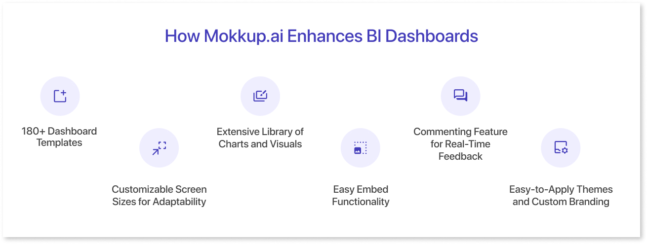
1. 180+ Dashboard Templates Built on Industry Standards
Mokkup.ai offers over 180 dashboard templates, meticulously designed based on thorough research and industry-standard KPIs. These templates offer a comprehensive guide to choosing the right metrics and how to effectively display them, making Mokkup a one-stop solution for both design and learning. The drag-and-drop functionality further simplifies the process, enabling users to create wireframes quickly without any coding skills. This approach not only accelerates dashboard creation but also empowers both beginners and advanced users with the right online dashboard creator and knowledge.
2. Extensive Library of Charts and Visuals
Mokkup.ai offers an extensive library of charts and visual elements designed specifically with BI tools in mind. Users can easily drag and drop various chart types—from simple bar charts to complex heatmaps—into their wireframes, selecting the most appropriate visuals to represent their data. These elements are crafted to seamlessly replicate in popular BI tools like Power BI and Tableau, ensuring that the wireframes translate smoothly into fully functional dashboards.
3. Commenting Feature for Real-Time Feedback
The commenting feature lets team members leave feedback or suggestions directly on the dashboard wireframes. This feature streamlines communication and ensures that updates or adjustments can be made efficiently, fostering collaboration between designers, stakeholders, and decision-makers during development.
4. Easy-to-Apply Themes and Custom Branding
Mokkup.ai allows users to easily apply pre-designed themes to wireframes, providing a consistent look and feel across the dashboard. Additionally, users can create and implement custom themes that match their company’s branding colors and guidelines. This flexibility ensures that dashboards serve functional purposes and maintain a professional, branded appearance.
5. Customizable Screen Sizes for Adaptability
Mokkup.ai allows users to create wireframes in multiple screen sizes, helping them visualize and refine layouts for various devices such as desktops, tablets, and mobiles. This feature ensures that developers gain a clear understanding of how to adapt the design for different screen sizes, streamlining the process of customizing dashboards for optimal display across all platforms.
Thus, incorporating Mokkup.ai into your BI dashboard development process simplifies design, enhances communication, and ensures that the final product meets user requirements, all while saving time and resources.
Benefits of BI Dashboards for Business Intelligence
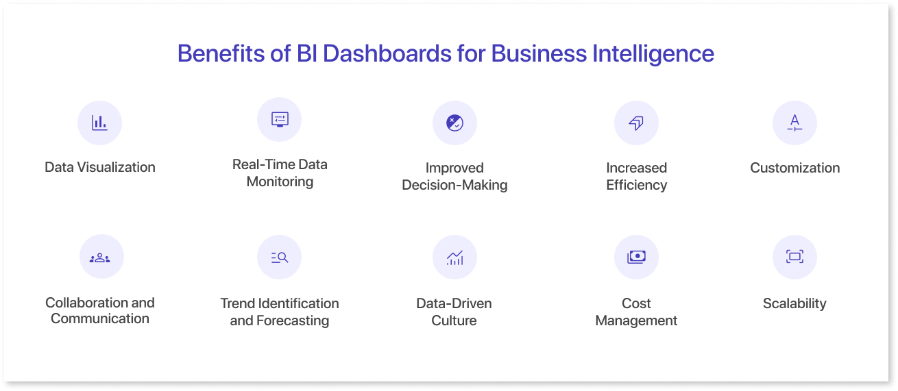
- Data Visualization: BI dashboards transform complex data into easily digestible visuals like charts and graphs, making it easier for businesses to identify trends and insights.
- Real-Time Data Monitoring: Dashboards provide real-time data updates, ensuring that decision-makers have the most current information to act upon.
- Improved Decision-Making: By centralizing critical metrics in one place, BI dashboards empower users to make informed decisions quickly based on accurate and up-to-date information.
- Increased Efficiency: Automated data collection and reporting reduce manual data entry and analysis, allowing teams to focus on strategic activities.
- Customization: Dashboards can be tailored to the specific needs of different teams or departments, ensuring relevant insights for various business functions.
- Collaboration and Communication: BI dashboards foster better communication by offering a shared view of key performance indicators (KPIs) across teams, ensuring alignment on goals and progress.
- Trend Identification and Forecasting: Dashboards help businesses track historical data, recognize patterns, and make data-driven predictions, improving long-term planning and strategy.
- Data-Driven Culture: Implementing BI dashboards promotes a culture of using data to guide decisions, encouraging employees to rely on facts rather than assumptions.
- Cost Management: Dashboards track expenses and revenues in real-time, helping businesses manage costs and optimize resources effectively.
- Scalability: As businesses grow, dashboards can easily integrate more data sources and scale with increasing data volumes, ensuring the organization continues to leverage insights effectively.
Summing Up
In conclusion, wireframing with Mokkup offers a streamlined way to visualize and plan dashboards before development, catering to both designers and non-designers. While Power BI and Tableau excel at data integration and advanced analytics, Mokkup focuses on the early design stage, helping teams create user-friendly dashboard mockups that align with business goals. By using Mokkup alongside BI tools, businesses can ensure a cohesive, efficient workflow from wireframe to fully functional dashboard.
Frequently Asked Questions
Yes. Mokkup is designed for quick wireframing and prototyping without requiring technical skills, while Tableau is a full BI tool meant for final dashboards, not early-stage design.
Wireframing is creating a visual blueprint of the dashboard layout and KPIs without connecting real data. Building a dashboard involves implementing the design with live data and calculations in BI tools like Tableau or Power BI.
Yes. Mokkup allows exporting wireframes as templates for Tableau or Power BI, so developers can implement them easily without starting from scratch.
Several AI-driven tools exist, but Mokkup.ai stands out for generating wireframes from text prompts and offering export options for Tableau and Power BI.
Wireframing speeds up development, helps finalize design and KPI placement, reduces rework, and ensures all stakeholders approve the layout before coding in BI tools.
Prompt it. Wireframe it with Mokkup.ai.
