Visualizing data can be difficult without dashboards, which often is the primary reason businesses seek to develop dashboards for analysis. A survey by Dresner Advisory Services stated that 70–80% of organizations rely on dashboards for monitoring key metrics and making data-driven decisions.
Likewise, a well-designed dashboard can help the audience comprehend information and how it is intended to be communicated. Dashboard UI is critical in user onboarding as it is the first thing the user notices while landing on a dashboard.
If you don't know how to design your dashboard from the user's perspective, which can be tricky, then this blog is for you. Explore this blog to learn about Dashboard UI examples and best practices for designing a fully functional dashboard that derives business value.
Table of Contents
- Understanding Dashboard UI
- Why is Dashboard UI Important?
- Top 10 Dashboard UI Design Best Practices
- Dashboard UI Examples and Ideas
- How Can Mokkup Help You in Dashboard Design Development?
Understanding Dashboard UI
A dashboard UI is concerned with designing a data page that makes information easy to scan. It is pivotal in influencing user behavior and boosting retention rates with an actionable data presentation. Designers can create an engaging dashboard with the help of design principles that mainly focus on simplicity, user-centered design, and contextual data that drives a certain action.
A good dashboard design consists of the following:
- Relevant Key Performance Indicators (KPIs) to monitor the performance of specific areas.
- Use of charts, graphs, and tables to represent data in a visually engaging way.
- It follows up with a visual hierarchy in which the dashboard guides the user with the right information by highlighting the data points that matter.
A modern dashboard UI captures users' immediate attention and does not exaggerate the design with overwhelming elements. Indeed, it requires tricks handled by UX/UI designers to be done correctly.
Why is Dashboard UI Important?
A well-designed dashboard UI simplifies complex data, converting it into clear and actionable insights that are simple to interpret. This is especially important in corporate settings, where timely and precise judgments are critical.
An effective dashboard emphasizes the most important KPIs, avoids overwhelming the viewer, and ensures the data is useful and simple to understand. Visual elements like charts, graphs, and color schemes should foster understanding rather than distraction or confusion.
In simple terms, a dashboard's effectiveness is determined by the data displayed and how that data is graphically structured and delivered. A good design makes it easier for team members to find the information they want, leading to better decision-making and collaboration. On the other hand, a poorly designed dashboard can cause confusion, lead to misinterpretation, and ultimately hinder the team's ability to act on the data.
Top 10 Dashboard UI Design Best Practices
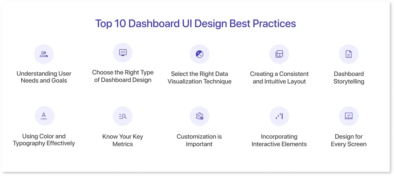
There is no single approach to designing dashboard UI UX, but following the best practices of the dashboard UI can make a difference when you want to serve the purpose of the audience. Here are 10 dashboard UI best practices for building excellent user-friendly dashboards.
1. Understanding User Needs and Goals
To create the best dashboard UI, designers must first understand their users' needs and goals. This means understanding the users' roles, responsibilities, and skill sets to create a well-tailored dashboard. Designers should focus on the target audience and their preferred visual design. They should also consider the kind of actions they are likely to take based on the insights gained from the dashboard. This will ensure that the dashboards are intuitive, informative, actionable, and tailored to end-users.
2. Choose the Right Type of Dashboard Design
After clearing the doubts regarding the purpose of a dashboard, you need to choose the dashboard design that aligns with your goal. There are four main kinds of business intelligence dashboards:
- Strategic dashboards for visualizing the tracking the trends that bring long-term impact.
- Operational dashboards are used to monitor the time-sensitive data that critically occurs.
- Tactical dashboards are used to show the progress towards the specific goal.
- Analytical dashboards are usually good for forecasting sales trends and patterns.
3. Select the Right Data Visualization Technique
Choosing the right data visualization technique depends upon the data type being analyzed and displayed: numerical, logical, or temporal. Tables, charts, and graphs can be used according to the user's perspective and the complexity of the data to be presented. You can experiment with different kinds of charts, such as comparison, composition, distribution, and relationship charts.
4. Creating a Consistent and Intuitive Layout
The most important idea is to create a consistent and intuitive layout. Using visual cues such as font size, color contrast, and white space helps users navigate content easily, increasing engagement and satisfaction. Map out an intuitive flow that allows users to complete tasks effortlessly. This helps them improve the user experience and facilitate more effective communication with their target audience.
5. Dashboard Storytelling
Even after you are clear on the layout and the data visualization type, you need to develop a story that helps users interpret information in the way it is intended to be interpreted. Data storytelling gives a clear structure to the KPIs, wherein surface-level information is displayed in the beginning, and in-depth insights are translated later with a narrower perspective.
6. Using Color and Typography Effectively
When it comes to effective design, using color and typography can make or break the success of a project. The choice of color in data visualization can evoke specific emotions and convey messages to an audience. It's important to choose colors that align with the project goals. Typography should be chosen carefully, considering readability and consistency in font choices and sizes. The key is to balance color and typography elements when using them effectively. Too much or too little can distract attention from the intended message and enhance visual appeal.
7. Know Your Key Metrics
Your dashboard design is incomplete without relevant data points. It can be possible to use key performance indicators (KPIs) that appropriately align with the business area or a brand. For that, you would also require audience research to select the best KPI that aligns with the user goals, whether it's refining a strategy or measuring success.
8. Customization is Important
The dashboard UI design needs to be customizable according to the needs of the target audience. This flexibility depicts how the dashboard serves the needs of diverse audiences with a malleable interface that can make the customers “feel home” while interacting with the data. For instance, the drag-and-drop capability and color palette are ways to go personal.
9. Incorporating Interactive Elements for User Engagement
Interactive elements integration creates a personalized experience that encourages them to actively participate and contribute their knowledge or opinions. Integrating feedback mechanisms into web design can improve user satisfaction and brand loyalty, as well as generate leads. It allows users to express their thoughts in real-time. Businesses must balance functionality and simplicity when including interactive elements for user engagement to ensure a successful user experience.
10. Design for Every Screen
Interactive content is bringing 66% of mobile data traffic, especially when visually loaded dashboards are utilized. Clearly, a good mobile experience plays a central role in enhancing the UI design dashboard capability. This means that your dashboard needs to work smoothly on multiple screens, be they mobile or desktop.
Dashboard UI Examples and Ideas
Effective dashboard UI design requires a broad set of data visualization tools and UI kits. These resources can accurately reflect trends and meaningful insights. A careful choice of chart types can help display data with clarity and precision. Here are some prominent examples of dashboard design examples from Mokkup.ai:
1. HR Recruitment Dashboard
This HR recruitment dashboard displays numerous data points related to candidate sourcing, job roles, and hiring trends in a subtle color combination. The KPIs are very relevant and consistently provide a context to the HR managers.
2. Express Sales Analytics
The choice of chart types and color combination in this interactive express sales analytics dashboard is worth considering. This dashboard wireframe serves the user's needs by identifying critical sales trends.
3. Invoice Management Dashboard
The invoice management dashboard showcases various chart types and graphs with relevant metrics related to payments. Mockup understands the significance of customization and allows tailoring the dashboard according to different business requirements.
4. Revenue Insights Dashboard
This revenue insights dashboard has an intuitive and consistent layout. It is divided into three sections: MRR, customer trend, and CAC trend. Various datasets are appropriately measured to tell a useful data story.
How Can Mokkup Help You in Dashboard Design Development?
Mockup.ai is a useful designing tool to build your BI dashboard from scratch or from the prebuilt components. The easy drag-and-drop capabilities will speed up dashboard development so that you are far from reaching the productivity goals.
The collaboration feature of Mokkup allows you to give team members access to edit, share, or comment on the product, directly impacting team efficiency. Finally, it can help you reduce your work in Power BI since our dashboards can be exported to your Power BI to streamline the workflow like a pro.
Conclusion
It is essential to empower users with effective dashboard User Interface (UI) design. We can achieve this by ensuring that the UI is easy to navigate and may or may not be cloud-based. Besides, it should be simple to understand and provide clear and concise data visualization. It should also communicate key insights and trends on time. Designing an effective dashboard requires careful consideration of user needs, stakeholder goals, and technical requirements to improve efficiency.
Frequently Asked Questions
Choosing the right visualization depends upon the type of data and story you want to tell through data. You can start by exploring user needs and defining your goals for effectively conveying insights.
Yes, different users, like executives, strategists, and analysts, require customized dashboards to get personalized insights tailored to their respective roles.
To make your dashboard mobile-friendly, you need to focus on a responsive layout and optimized performance to enhance the dashboard's mobile experience.
Prompt it. Wireframe it with Mokkup.ai.
