
Welcome to our comprehensive guide on the top 10 principles of dashboard wireframe UI design! Dashboard wireframes serve as the blueprint for creating intuitive and visually appealing user interfaces that effectively convey information. In this article, we'll explore essential design principles that ensure your dashboard wireframes not only look great but also function seamlessly. From understanding user needs to selecting the right color theory and typography, we'll cover everything you need to know to create compelling dashboard wireframes. Let's dive in and discover how to elevate your UI design skills and create exceptional dashboard wireframes that delight users.
Table of Contents
- What is a Dashboard Wireframe?
- What are the Key Characteristics & Components of Dashboard Wireframes?
- Different Types of Dashboard Designs
- Top 10 UI Design Principles for Dashboard Wireframe
What is a Dashboard Wireframe?
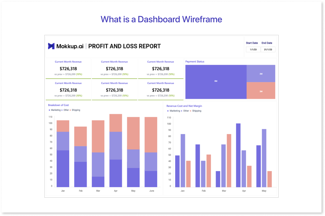
A dashboard wireframe is a visual representation or blueprint of a digital dashboard's user interface (UI) design. It serves as the initial stage in the design process, outlining the layout, structure, and key components of the dashboard without incorporating detailed graphics or finalized design elements.
Dashboard wireframes focus on functionality and usability, providing a clear framework for organizing information and interactions. They typically include placeholders for various elements such as charts, graphs, tables, navigation menus, and other widgets.
By creating a dashboard wireframe, designers can map out the overall user experience, test different layout options, and gather feedback from stakeholders before proceeding to the more detailed design stages. This helps streamline the development process and ensures that the final dashboard effectively meets its users' needs.
What are the Key Characteristics & Components of Dashboard Wireframes?
1. Characteristics
Exceptional mock dashboards prioritize simplicity and design focus. They convey information swiftly and efficiently, fostering user-friendly experiences. Take, for instance, our dashboard wireframe design tailored for an e-commerce platform. It boasts clear organization and polished presentation and employs various data visualization elements for effective information dissemination.
Some key characteristics of good dashboards are:
- Simplifies complex information
- Offers a sleek user interface
- Presents relevant data clearly and effectively
- Ensures essential KPIs are visible at a glance
- Establishes visual hierarchy and prioritizes data effectively
- Utilizes data visualization techniques for aesthetically pleasing data representation.
These fundamental characteristics apply universally to all dashboards and are the building blocks for creating user-friendly and functional dashboard design experiences.
2. Components
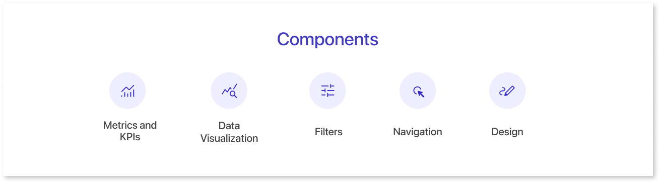
Depending on their intended purpose, various dashboards prioritize different components. Nevertheless, there are certain elements that are indispensable for an optimal user experience across all dashboards. These components are crucial in enhancing the overall dashboard UI design. They include:
- Metrics and KPIs: Every dashboard focuses on specific metrics or Key Performance Indicators (KPIs) crucial to its users. The dashboard's users determine these metrics, and the necessary data is processed and presented accordingly.
- Data Visualization: Dashboards rely on visual displays to convey information effectively. They utilize various data visualization techniques such as charts, graphs, and maps to present information in a graphical format, which enhances usability.
- Filters: Conditional data analysis is a primary objective for dashboard users. Decision-makers often prefer to analyze data trends for specific time periods or areas of operation to derive meaningful insights. Filters facilitate this conditional analysis, thereby enhancing the dashboard UX design.
- Navigation: Proper navigation is a fundamental component of dashboard responsive design. It ensures that dashboards are user-friendly, intuitive, and accessible. Without clear and well-defined navigation, users may encounter difficulties in accessing the desired data efficiently.
- Design: Effective dashboard design includes layout, color scheme, spacing, and text hierarchy. A well-structured layout organizes components logically, while cohesive colors aid data categorization. Spacing reduces clutter, improving readability, and text hierarchy highlights critical insights, ensuring user-friendly, intuitive dashboards.
Different Types of Dashboard Designs
Dashboards come in different types to match the goals of different users. Picking the right type of dashboard is key to getting the right results. Things like who will use it, their problems, and goals decide which dashboard is best.
There are three main types of dashboard designs: operational, analytical, and strategic. They're all about analyzing and keeping an eye on data to help organizations grow.
1. Operational Dashboard Design
- Operational dashboards show up-to-date info to help users make quick decisions.
- They're updated a lot and always show the current situation.
- These dashboards keep an eye on real-time performance numbers and goals.
- For example, an inventory dashboard provides comprehensive insights into inventory levels, order fulfillment metrics, and transportation logistics, supporting timely decision-making and optimizing supply chain operations.
- Usually, business people and managers use them to track progress and keep everyone informed.
2. Analytical Dashboard Design
- Analytical dashboards look at lots of data to find patterns and trends and make predictions.
- They compare data from before and aren't updated as often.
- Business or data experts often use them to understand what's happening in a company and how to improve.
- An example of is Google Analytics 4 dashboard tailored for goal setting and trend analysis might include features such as advanced segmentation to uncover insights, trend analysis graphs displaying recent performance trends, and goal tracking metrics to monitor progress towards key objectives.
3. Strategic Dashboard Design
- Strategic dashboards help companies plan for the long term.
- They keep track of how well a company is doing against its goals.
- By watching these key numbers and making plans, they focus on making big changes across the whole company.
- These dashboards get updated regularly, but not as often as operational ones.
- A project management dashboard example tailored for top-level managers could feature easy-to-understand charts displaying key performance indicators (KPIs) such as project progress, budget utilization, resource allocation, and milestone achievements, facilitating monthly, quarterly, or yearly reviews to address significant issues and ensure alignment with the company's overarching goals.
Top 10 UI Design Principles for Dashboard Wireframe
Dashboards help organizations by using data to improve their performance. Well-designed dashboards are easy to use and understand, simplifying data analysis and decision-making. Let’s take Mokkup’s Website health template as an example to understand the principles better.
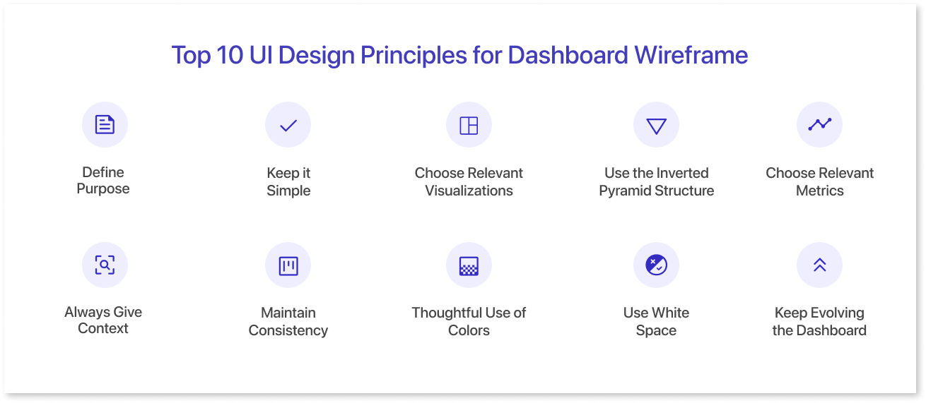
Here are ten principles for creating effective dashboard wireframes, using our dashboard as an example:
1. Define Purpose:
- Clearly understand the dashboard's purpose in designing it effectively for user needs.
- The purpose of this template is to display metrics at a glance.
- It provides an overview of the website's performance across different areas, including domain rating, traffic, bounce rate, page load time, pages per visit, and goal Completion.
2. Keep it Simple:
- Prioritize simplicity in design to ensure a user-friendly and lasting result.
- The template adheres to this principle by using a clean and uncluttered layout.
- The information is presented in a clear and concise manner, making it easy for users to understand.
3. Choose Relevant Visualizations:
- Select appropriate visualization techniques based on the data and audience, such as line charts, bar charts, pie charts, etc.
- The template uses a variety of visualizations, including charts, graphs, and tables, to display website health data.
- For instance, a bar chart is used to show Domain Rating, a line graph represents Average Bounce Rate over time, and a table displays Top Performing Pages by Goal Completions.
4. Use the Inverted Pyramid Structure:
- Prioritize information hierarchy, placing important details at the top for better user understanding.
- Mokkup’s template follows this principle by placing the most important information at the top of the dashboard, such as Domain Rating, Monthly Visits, and Average Bounce Rate. Less critical information, such as Users by Day of Week, is placed towards the bottom.
5. Choose Relevant Metrics:
- Carefully select metrics based on the target audience and their informational needs.
- The metrics chosen for this template are relevant to website health and user needs.
- These include Domain Rating, Traffic, Bounce Rate, Page Load Time, Pages per Visit, and Goal Completions.
6. Always Give Context:
- Provide context for better user comprehension, even for obvious elements.
- This template provides context for the data being displayed.
- For example, the Domain Rating chart shows the current and previous ratings, giving users a quick understanding of how the website's ranking has changed.
7. Maintain Consistency:
- Ensure consistent labeling, accessibility, formatting, and structuring for a smooth user experience.
- Mokkup’s template maintains consistent labeling, formatting, and structuring throughout the dashboard.
- This makes it easy for users to scan and understand the information.
8. Thoughtful Use of Colors:
- Minimize the use of colors, sticking to a simple and consistent color scheme for a better user experience.
- This template uses a limited color scheme, with a primary color and a few accent colors.
- This helps to keep the dashboard visually clean and uncluttered.
9. Use White Space:
- Leverage whitespace to bring balance and clarity to the design, especially in data-rich dashboards.
- This website health template effectively uses white space to separate different sections of the dashboard and improve readability.
10. Keep Evolving the Dashboard:
- Continuously improve the UI dashboard by observing changes, gathering feedback, and making necessary adjustments to provide the best outcome.
- Mokkup’s template is a basic example, and it can be further improved by incorporating feedback like the ability to add specific KPIs and metrics relevant to their needs.
- The dashboard can also be personalized according to the user; this could involve pre-built color themes, the ability to create custom color schemes or the selection of different chart types for better data representation.
Conclusion
In conclusion, designing effective dashboards requires a balance between clarity, functionality, and user needs. By following these ten UI design principles, you can create wireframes that translate complex data into easily digestible insights. Remember, the purpose is to empower users, so prioritize user goals and provide context whenever possible.
For a jumpstart on your next dashboard project, consider Mokkup, a cloud-based wireframing tool. Mokkup offers pre-built templates, including marketing, sales, and many more categories, to streamline the design process. With its intuitive interface and focus on user-centered design, Mokkup helps you translate complex data into visually compelling mock dashboards, ready for further refinement and development.
Frequently Asked Questions
Wireframes outline the structure and layout without final visuals, while mockups include colors, typography, and design elements for a near-finished look.
Match the type to your goals: use operational dashboards for real-time monitoring, analytical dashboards for trends and insights, and strategic dashboards for long-term planning.
Key components are metrics/KPIs, data visualizations (charts/graphs), filters, navigation, and a well-structured design layout.
To highlight key data without clutter, stick to a simple, consistent palette with one or two primary colors and limited accents.
Understand each persona’s goals and workflows. Prioritize relevant metrics, adjust layout for usability, and provide role-specific filters and navigation.
Popular tools include Mokkup.ai, Figma, Adobe XD, and Sketch. Mokkup offers pre-built BI-focused templates to speed up design.
Prompt it. Wireframe it with Mokkup.ai.
