
A dashboard is more than just pretty visuals. It’s about functionality and clarity of information that delivers the value for the reader. Using a wireframe will validate the information flow and structure the different visual elements to optimize user experience. Businesses today are using wireframes as visual planning tools that reflect their growing demand. As per the Business Research Insights, the global wireframing software market was valued at US$5.55 billion in 2024, projecting to rise to US$17.08 billion by 2033, driven by a robust CAGR of 13.3%.
For non-designers, it might be challenging to communicate the data points through visuals that require advanced design skills. Fortunately, dashboard wireframing allows data analyst and developers to save their time in developing a full-fledged wireframe in no time with ready-to-use templates. Through this guide, we will walk you through the step-by-step wireframing process, best practices, and commonly made mistakes so that you can create impactful wireframes even if you have never designed before.
Table of Contents
- What Is a Wireframe?
- Benefits of Dashboard Wireframing for Non-Designers
- Essential Dashboard Wireframing Tools for Beginners
- Step-by-Step Dashboard Wireframing Process for Non-Designers
- Dashboard Wireframing Best Practices for Non-Designers
- Common Mistakes to Avoid
What Is a Wireframe?
A wireframe is a quick, low-fidelity structure of your data point or information that prioritizes the dashboard's visual format, including layout, fonts, filters, graphs, charts, and KPIs. It shows:
- Hierarchy: It defines what the user should see first (KPIs), second (trends), and then (diagnostics).
- Layout: It determines the cards, filters, and dashboard navigation.
- Interactions: It depicts how filters slice the view, what happens on hover, or the drill-through menu to dig into deeper analysis.
The wholesome wireframe ensured that the overall layout and structure aligned with the business goals and that better decisions were made by grasping the quick data summary.
Benefits of Dashboard Wireframing for Non-Designers
Wireframes are helpful for non-designers as they address the common design challenges. Here are a few benefits of wireframes that truly simplify the art of dashboard design:
- Structure Clarity: Wireframes clearly outline the dashboard's structure by defining where the charts, KPIs, and other visual elements will appear. This means the layout is precisely organized to avoid data clutter. Overall, it will help the analyst bring data-driven facts to the table.
- Communicating Ideas: Ideally, dashboard wireframes are used for communicating the complex data points in a visual format that is easy to understand. Data storytelling is a way to transform raw data into meaningful insights by highlighting key trends and fluctuations through charts and other visuals.
- Improved Feedback Mechanism: Developing a wireframe with a commenting feature can help businesses align stakeholder inputs. Some dashboarding tools have collaboration features that allow stakeholders to provide their feedback, and teams can iterate in the go, reducing the chances of rework later.
- Saves Development Time: Business analysts and developers can save time developing dashboards using readily available dashboard wireframes. They do not have to spend time designing dashboards, as the tool has already been responsible for creating dashboards that drive fast decisions.
Essential Dashboard Wireframing Tools for Beginners
Non-designers have multiple things on their plate. Developing wireframes shouldn’t be a task. If you are a beginner, you can use these best dashboard wireframing tools, which are easy to use and integrate into your routine workflow. Here is a wireframe tool guide for you:
- Mokkup: Mokkup.ai is designed to wireframe your dashboard projects with cloud-based accessibility. It is suitable for non-designers as it has drag–and-drop functionality for creating dashboards and an industry-specific library of pre-built templates to streamline the dashboard creation process. Real-time collaboration, BI export, and AI dashboard prompts features take the dashboarding experience to the next level.
- Figma: This is a beginner-friendly tool designed for design professionals to facilitate a collaborative workflow. It lacks built-in templates but provides a robust free plan. It provides comprehensive dashboard UI kits that allow teams to brainstorm ideas and iterate on wireframes together within a single interface.
- Balsamiq: This wireframing tool is known for its stretch-style interface, which makes wireframes feel approachable by encouraging iterations and feedback. It has drag-and-drop UI elements that allow users to create wireframes at the speed of the idea flow. It supports non-designer wireframing by providing a way to transform raw ideas into an actionable plan.
- Miro: This is an excellent platform for building a dashboard wireframe for beginners. Non-designers can stretch out wireframes using drag-and-drop widgets and pre-built templates. Multiple team members, such as designers, analysts, and stakeholders, can contribute simultaneously through real-time collaboration.
Step-by-Step Dashboard Wireframing Process for Non-Designers
Follow this practical process for easy dashboard prototyping, even if you do not have a design background:
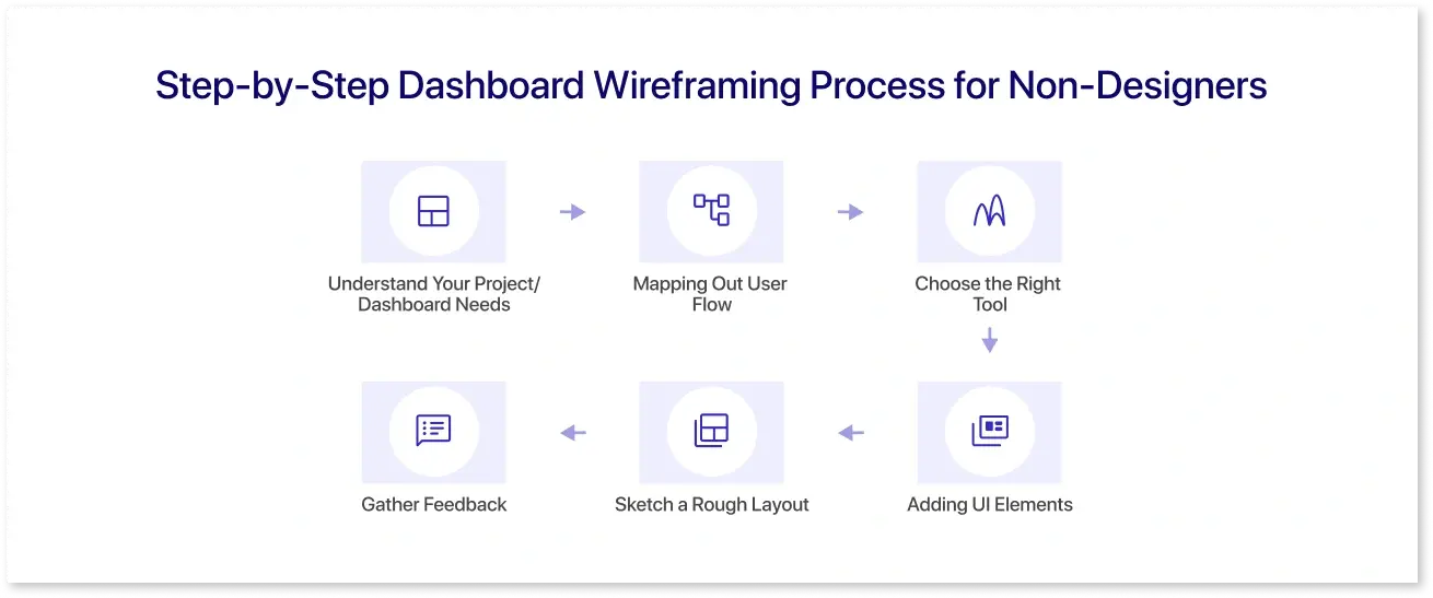
Step 1: Understand Your Project/ Dashboard Needs
Before you develop your wireframe, you need to define client goals and unstated user needs that ensure strategic alignment. Even in the dashboard mockup tutorial, you will see the importance of stating the dashboard objectives first. It needs to convey the meaning for the users, and therefore, knowing what they want by clarifying how the dashboard provides a value for them will make a big difference.
Step 2: Mapping Out User Flow
The next step is to guide the user through the wireframe journey. For that, list the key metrics that matter to your audience and identify the customer touch points that will encourage engagement. Most interactive dashboards follow a structural flow, wherein moving from one KPI to another seems seamless and logical. Design progressions should align with user expectations for a smoother experience.
Step 3: Choose the Right Tool
Using right tools in data visualization can make or break the deal. With the help of a comprehensive toolkit, you can transform your rough or concrete ideas into insightful information. Depending upon your project needs, you can choose the tool that enables faster iterations, improves collaboration, and provides version controls for creating a holistic dashboard wireframe that actually aligns with business goals.
Step 4: Adding UI Elements
At this stage, think of essential components of a wireframe like charts, graphs, filters, navigation elements, annotations, and KPIs that are placed in a hierarchy to make sense for the business. For non-designers, this does not mean knowing what needs to be placed, but instead arranging the blocks according to your needs. Consider the UI elements as content placeholders to determine what goes where. With the help of the best dashboard templates provided by wireframing tools, you can focus on mapping the flow rather than designing it from scratch.
Step 5: Sketch a Rough Layout
Placement of the UI elements is an essential logical process, and it is indeed the next step for wireframing. You need to understand which metrics should be placed at the top and which ones should be placed at the bottom for organized visibility. Don't get stuck into the details; roughly identify the flow and shape the navigation layout that resonates with the end user.
Step 6: Gather Feedback
Lastly, you need to share your dashboards with internal teams and stakeholders to get their input. Their feedback can help you iterate on your wireframe, improve the layout, and fine-tune your designed dashboard before proceeding further. This step embodies the essence of teamwork and provides a precise direction towards the development of a data visualization dashboard.
Dashboard Wireframing Best Practices for Non-Designers
As per the McKinsey Report, Companies that excel at design practices (including rapid iteration via wireframes/prototypes) achieve 32% higher revenue growth and 56% higher shareholder returns over five years than peers. Here are the best practices you can apply in wireframe design to move forward with the best approach.
- Simplicity is the Key: Your wireframe needs to be simple. It requires relevant visuals, limited fonts, and colors that actually evoke subtleness. This means you must know color schemes and palettes that encourage a positive experience. Avoid using too many charts and graphics, as they might overwhelm the user.
- Maintain Design Consistency: Dashboards should not confuse users. A logical layout or structure, with the right fonts, can deliver the information users need. You can abide by dashboard design principles to make your complex data easy to understand.
- Usability Focus: Always consider the end-user of the wireframe dashboard. A sales manager may need quick performance KPIs, while an analyst may want deeper drill-downs. Tailoring the wireframe to the audience ensures usability.
- Label Clearly: While developing a wireframe, you need to label each UI element for chart titles, axis labels, and filters so developers and stakeholders know what each element represents. Such clear labels prevent misinterpretation and drive decisions that create a business impact.
- Ask for Feedback: Wireframes are communication tools instead of a design process. Non-designers should get feedback from the teams to see if their ideas are coming across well. If not, they can be changed early to avoid big issues later.
Common Mistakes to Avoid
Non-designers can make the following mistakes while designing dashboards, even with the best intentions:
- Overlooking User Needs: If the dashboard is designed without understanding how it will be used, it will misplace the priorities. Always align the wireframe with the audience’s needs and decision-making process, and keep the accessibility standards intact.
- No Hierarchy: You are probably making a mistake if you assign all your UI components in the KPI dashboard the same level of importance. With an unorganized structure, users struggle to find information that matters to them. It can even distract the user from the end goal.
- Neglecting Responsive Design: Prioritizing device compatibility augments seamless user experience and boosts SEO significantly. A rigid, one-size layout can cause issues. Consider flexibility when placing elements to ensure accuracy and functionality. With specific dimensions, wireframes should be responsive to multiple screens and devices.
- Over-complicated Visuals: Overemphasizing the visual elements in the dashboard wireframing process can distract the user from the main aspect. Cramming too many charts, metrics, or filters into a single view makes the dashboard overwhelming. A cluttered wireframe leads to poor usability and lost focus.
Conclusion
Wireframing is not just for designers. It can be used by other professionals, such as data analysts, project managers, and data engineers, to develop dashboard wireframes from ready-to-use templates. Dashboard Wireframing tools act as a thinking tool for bridging the gap between raw data and actual insights. With the use of a structured process, you can cut through the noise and create dashboards that are developed after minimal revisions that users can trust. Tools like Mookup.ai make this easier with AI-powered templates that let anyone quickly create and export dashboard wireframes.
Frequently Asked Questions
A wireframe’s detail depends on the project phase. Start with low-fidelity sketches by placing the boxes, labels, and notes about interactions. And then, add chart types and sample labels only after the structure feels right.
Yes, there are dashboard wireframing tools that you can use to create your desired wireframe. Mockup’s ready-made templates and AI generation feature can help you develop a dashboard quickly.
Large numeric cards with tiny sparklines can work for KPIs. For trends, line charts for time, bars for ranked comparisons, stacked bars for mix/segment share, and heatmaps for dense matrices can be used.
Yes. Mokkup is built for non-designers, so even beginners can create clean dashboard wireframes without any design background.
Yes, you can find many dashboard mockup tutorial resources online that guide you through wireframing dashboards with layouts, charts, and navigation best practices.
Prompt it. Wireframe it with Mokkup.ai.
