What is a BI Dashboard?
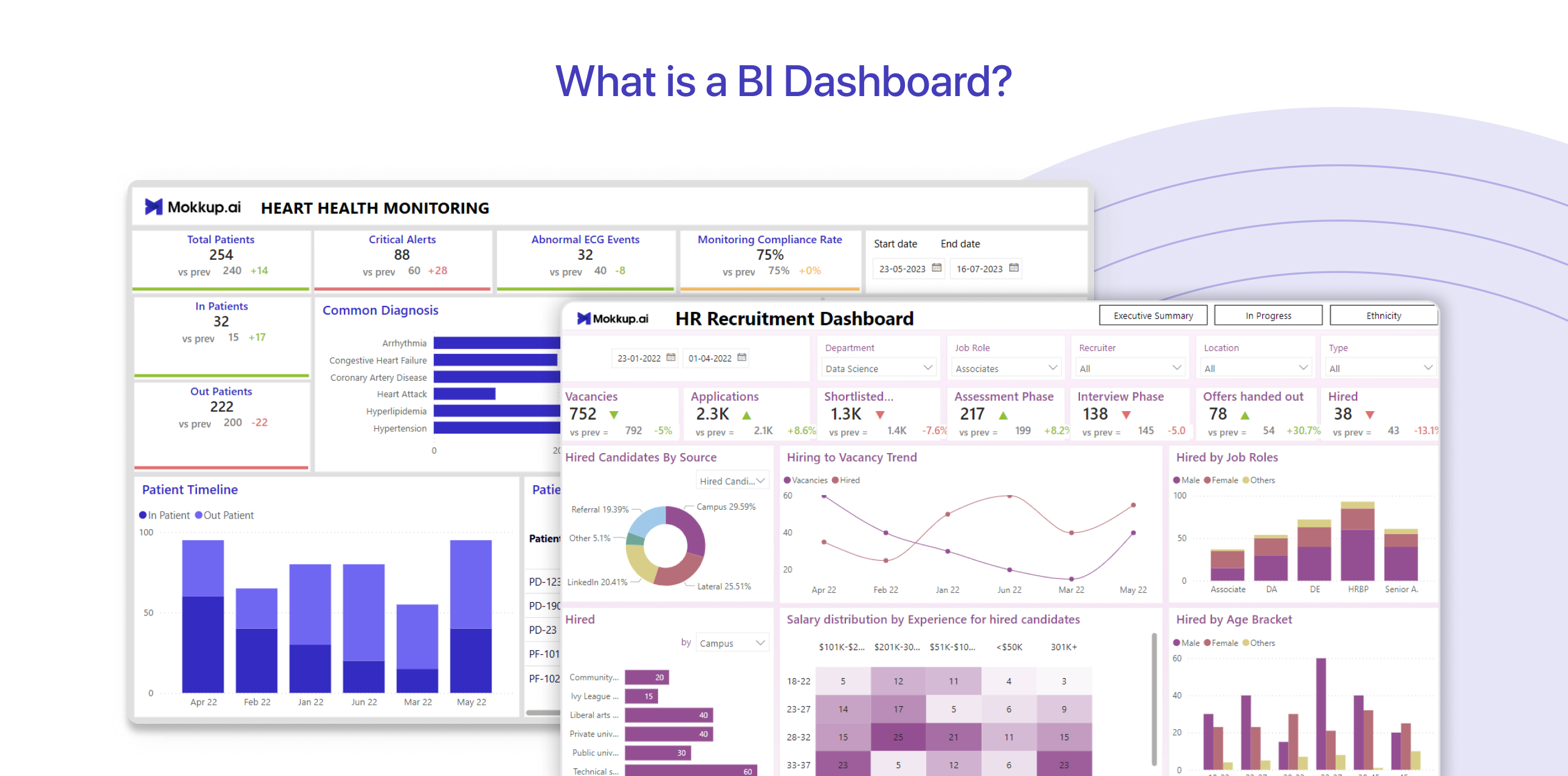
A Business Intelligence (BI) dashboard is a tool for analyzing and understanding data. It presents important information, such as sales numbers or performance metrics, in an easy-to-read format with charts, graphs, and tables.
BI dashboards are essential because they make it easier to analyze data and make smart decisions based on facts, not guesses.
Building a BI dashboard can be a challenge, especially when you’re short on time. Creating something that doesn't just look good but works brilliantly and meets your needs often takes days or weeks.
Table of Contents
- What is the Use of BI Dashboards?
- The Key Element of a Value BI Dashboard
- Difference Between BI Dashboards vs BI Reports
- How to Create BI Dashboards?
- Benefits of Well Designed BI Dashboards with Mokkup
- What Makes Mokkup Stand Out?
- Examples of Analytics Implemented
What is the Use of BI Dashboards?
A BI dashboard is not just a collection of charts and graphs—it’s a central hub that transforms raw data into actionable insights. By presenting complex data in an easy-to-understand format, a BI dashboard empowers businesses to make informed decisions efficiently. Here’s why a BI dashboard is essential:
1. Faster Decision-Making
In today’s fast-paced business environment, waiting for traditional reports can cost you opportunities. BI dashboards provide real-time data updates, giving you instant insights into your operations.
Whether it's tracking sales, monitoring inventory, or reviewing performance metrics, these dashboards help you act quickly on emerging issues or opportunities. For example, you can immediately address a sudden dip in sales or respond to market demands without delays.
2. Spotting Trends and Anticipating Risks
BI dashboards make it easy to identify patterns and trends within your data. Whether you’re monitoring seasonal customer behaviors or tracking product performance, dashboards provide the insights needed to forecast future scenarios.
By recognizing these trends early, you can proactively prepare for risks or seize opportunities. For instance, dashboards can alert you to potential supply chain disruptions or shifts in consumer preferences, allowing you to adjust strategies before problems escalate.
3. Measuring the Impact of Decisions
Every business decision has consequences, and BI dashboards allow you to see those effects clearly. Whether you’ve implemented a new marketing strategy or adjusted pricing, dashboards track the outcomes in real time. This enables you to identify what’s working and refine what isn’t.
For example, if a marketing campaign boosts website traffic but not sales, dashboards can help you pinpoint where the strategy falls short.
4. Enhancing Team Collaboration
A BI dashboard consolidates information from multiple sources into one unified view, making it accessible to all stakeholders. This encourages data-driven discussions and ensures everyone is aligned on priorities and goals.
With features like shared dashboards or reports, teams can collaborate more effectively, reducing miscommunication and improving results.
5. Boosting Operational Efficiency
Manual data analysis is time-consuming and prone to errors. BI dashboards automate this process, providing accurate and up-to-date information with just a few clicks.
This saves time for your team and ensures that decisions are based on reliable data, not assumptions.
The Key Element of a Value BI Dashboard
The key element of a value-driven BI dashboard is clarity. A well-designed BI dashboard goes beyond just displaying data—it transforms raw information into actionable insights. It allows decision-makers to track performance, identify trends, and respond to changes swiftly. It prioritizes relevant KPIs, ensuring that insights are not buried under unnecessary details. Interactive elements, such as filters and drill-down options, enhance usability by allowing users to explore data from different perspectives
In today’s data-driven world, having an intuitive and effective dashboard is essential for staying ahead of the competition. But creating such dashboards starts with a solid foundation: a well-thought-out wireframe. Additionally, a clean layout with consistent color schemes and data visualizations helps maintain focus. Ultimately, a value-driven dashboard in BI empowers decision-makers with actionable insights, improving efficiency and strategic planning.
Difference Between BI Dashboards vs BI Reports
Business intelligence (BI) tools help organizations analyze and visualize data, but not all BI outputs serve the same purpose. Dashboards in Business intelligence provide a high-level overview of key metrics, while BI reports deliver detailed insights for deeper analysis. Understanding their differences can help you choose the right tool for tracking performance, identifying trends, and making data-driven decisions.
|
Feature |
BI Dashboards |
BI Reports |
|
Purpose |
Provides an overview of key metrics and insights at a glance |
Presents detailed analysis and historical data for in-depth decision-making |
|
Data Updates |
Typically, real-time or frequently updated |
Usually, static or scheduled updates |
|
Interactivity |
Interactive, allowing users to drill down and explore |
Primarily static, with limited interaction |
|
Format |
Visual, with business intelligence charts, graphs, and KPIs |
Tabular or narrative, often with extensive text and numbers |
|
Use Case |
Quick performance monitoring, executive decision-making |
Comprehensive reporting, compliance, and historical analysis |
How to Create BI Dashboards?
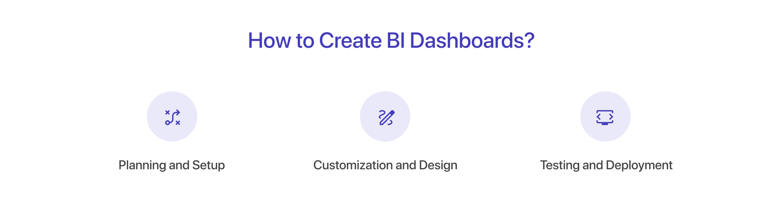
Step 1: Planning and Setup
1. Define your purpose:
- Decide what you want your dashboard to do, like tracking sales or improving efficiency.
- Identify who will use it and what data they need.
2. Consolidate your data:
- Collect data from all sources in one place.
- Make sure the data is clean and ready to use.
3. Choose a mokkup template:
- Browse Mokkup’s library for a template that fits your industry and goals.
- Customize the template to match your brand’s style.
Step 2: Customization and Design
1. Design the wireframe:
- Use Mokkup’s drag-and-drop tools to arrange key metrics and charts.
- Add interactive features like filters and drop-down menus for better usability.
2. Incorporate advanced features:
- Highlight trends with diagnostic analytics.
- Use predictive analytics to forecast future results.
Step 3: Testing and Deployment
1. Test the dashboard:
- Ensure it looks consistent, works smoothly, and meets user needs.
- Share it with stakeholders for feedback and make improvements.
2. Deploy and automate reporting:
- Publish the dashboard for your team or clients.
- Set up automated updates to keep the data fresh and accurate.
Benefits of Well Designed BI Dashboards with Mokkup
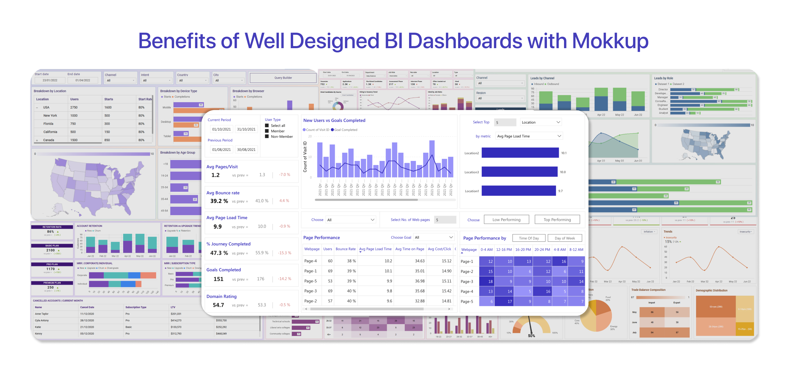
If you’re looking for an efficient way to design Business intelligence dashboards, Mokkup is the perfect solution. Here’s what makes it stand out:
1. Easy to Use With Drag & Drop Features
Mokkup is designed for everyone, not just professional designers. With its drag-and-drop feature, you can create professional-grade dashboard wireframes in minutes—no design skills required and no steep learning curve.
2. Pre-built Dashboard templates save time
Why spend hours designing from scratch? Mokkup provides pre-built, industry-standard templates, allowing you to focus on your data rather than the design process.
3. Unlimited Customization
With over 180 customizable templates for industries such as marketing, sales, finance, HR, and more, Mokkup offers the flexibility to meet any business requirement.
4. Consistency and Security
All wireframes are built to meet User Acceptance Testing (UAT) standards, ensuring consistency, security, and reliability in your designs.
5. Seamless Teamwork
Share your designs effortlessly using a simple URL. Mokkup’s interactive comment feature streamlines feedback collection, making teamwork smooth and efficient.
What Makes Mokkup Stand Out?
Whether you are a beginner or an expert, Mokkup offers a seamless way to design professional dashboard wireframes without requiring in-depth design skills. Here's what sets it apart:
1. Cloud-Based Dashboard Wireframing Made Simple:
Mokkup.ai is a powerful yet intuitive platform for creating dashboard wireframes without an in-house design team. Its cloud-based nature ensures accessibility from anywhere, empowering users to streamline their design process efficiently.
2. Simplified Design Process:
Mokkup eliminates the need for an in-house design team, providing 180+ customizable templates and 20+ drag-and-drop elements that make dashboard design quick and effortless.
3. No Learning Curve – Get Started Instantly:
Mokkup is designed for non-designers, offering a user-friendly interface that takes less than 5 minutes to master. This simplicity ensures that even data professionals with no prior design experience can create professional-quality wireframes.
4. Enhanced Communication:
The platform fosters improved communication between stakeholders with its real-time commenting feature and seamless sharing functionality. These tools enable instant feedback, making teamwork more efficient.
5. Extensive Design Tools for Professional Results:
Mokkup offers a rich library of charts, visuals, and themes to create wireframes that align with brand design guidelines. The ability to customize screen sizes and add themes simplifies the process of tailoring designs to fit specific requirements.
6. Integration with Power BI and Tableau:
For data professionals, Mokkup now offers a BI tool export feature. This feature allows users to directly export designs to Power BI and Tableau, streamlining the transition from wireframes to functional dashboards. Please note that this feature is in the beta phase and may have some errors. If you face any issues while exporting, please contact our support team for assistance.
Who Benefits From Mokkup?
Mokkup is ideal for:
- Developers who need quick and easy dashboard wireframing.
- Project managers aligning teams with clear, visual plans.
- Business owners and stakeholders monitoring performance metrics.
- Marketing professionals tracking campaigns and ROI.
- Finance analysts creating detailed and actionable reports.
- Sales teams analyzing performance and managing pipelines.
- Operations teams optimizing workflows and efficiency.
- Customer insights teams planning strategies with data visuals.
- HR professionals tracking recruitment and employee performance.
- Logistics teams managing supply chains and inventory effectively.
Examples of Analytics Implemented
1. Descriptive Analytics:
We’ve developed operational dashboards that focus on past trends, such as business transactions, and identify patterns. These mock dashboards help businesses understand what happened and make decisions about future actions.
2. Predictive Analytics:
Our forecasting dashboard wireframes have been used to visualize existing data, supporting businesses in preparing for potential scenarios. We’ve also created credit churn analytics wireframe that analyzes credit histories to improve risk management and business security.
3. Diagnostic Analytics:
We help businesses identify design challenges, such as inefficient wireframe layouts or unclear presentations. By providing easy-to-use templates and customization options, we enable businesses to enhance their dashboard designs for better clarity and user experience.
Final Thoughts
In a data-driven world, a well-designed BI dashboard can make all the difference in how effectively businesses operate and make decisions. Wireframing is the foundation of a great dashboard, helping you create designs that prioritize usability, clarity, and functionality.
With Mokkup, designing dashboard wireframes becomes simple and efficient, allowing you to focus on what truly matters. Whether you’re a designer, developer, or business professional, Mokkup’s customizable templates and other features ensure you can create dashboard wireframes that drive insights and success.
Frequently Asked Questions
Connect data sources, select key metrics, and design visuals using a BI tool like Power BI or Tableau. Explore BI dashboard examples to structure your layout effectively.
They provide real-time insights, visual trends, and key performance indicators, helping businesses make informed decisions quickly.
Popular options include Power BI, Tableau, Looker, and Zoho Analytics, offering cost-effective solutions with easy-to-use features.
Yes, most BI tools support integrations with databases, cloud apps, and spreadsheets for a unified view of business data.
Q5.How do I choose the right BI dashboard software for my business?
Consider ease of use, integration options, customization features, and pricing. Reviewing sample business intelligence dashboards can help identify the best fit.
Prompt it. Wireframe it with Mokkup.ai.
