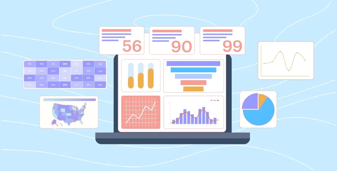
Dashboards really prove their value when it comes to communicating information in a visual form. Consider this: " Humans have an attention span of 8 seconds, which means you have 7 seconds to disperse your point across the audience,” according to a study by Microsoft.
Clearly, giving those seven seconds to the text alone would be a mistake, as dashboards can tell a data story by transforming raw data into an easy-to-understand format. They can empower users to have a clearer view of critical information so that they can act in a fraction of the time, which otherwise could lead them lost in the text storm.
This is why every marketer or manager relies on data dashboards to achieve a return on investment and richer user experiences. They are often deemed an essential tool for making information easier to understand for non-technical audiences by keeping the data visualization in place.
In this blog, we will take you through the definition of the dashboard, key elements, types, and examples to analyze how these intuitive visuals embody the fundamentals of data-driven decisions.
Table of Content
- What is a Dashboard, and why does it matter?
- What are the Different Types of Dashboards?
- Key Components of a Dashboard
- Best Practices for Dashboard Design
- Use Cases of Dashboards in Different Industries
- Common Mistakes While Designing A Dashboard
What is a Dashboard, and why does it matter?
A dashboard is an information management hub that visually represents real-time data linked from multiple sources. It presents high-level data into a single interface, informing business users to make data-driven decisions by looking at the core key metrics or KPIs. Dashboard data visualization is helpful for many business verticals and industries, helping them understand the why, what, where, and how behind a particular situation.
A well-defined dashboard wireframe can allow business users to create reports, monitor progress, and track goals in a visualized form. The dashboard purpose is to eliminate wasted hours on data collection and analysis, and reporting takes place within the blink of an eye.
Here are some benefits of creating dashboards:
- Trends identification has become easy.
- Gives a comprehensive view of the performance.
- Allows you to viability in campaigns and IT systems.
- Provides detailed reports with a single click.
- Perfect for measuring efficiency, outliers, and data correlations.
What are the Different Types of Dashboards?
Now that you have understood the meaning of the dashboard, the question of what type of dashboard to start with arises. Even though dashboards are customizable, there are four major categories of dashboards catering to unique audiences and business purposes:
1. Operational Dashboards
Operational dashboards are designed to track an organization's everyday workflow. They can frequently be updated in real time, giving a pulse of routine activities such as inventory levels and current sales performance. For example, Mokkup.ai’s Store Operations Dashboard perfectly measures store performance metrics to streamline inventory levels and expenses over time.
2. Analytical Dashboards
Unlike operational dashboards, analytical dashboards are deemed as low-code business intelligence tools, paving the way for undertaking data-driven decisions. It can facilitate a deeper view of complex datasets allowing analysts to derive meaningful insights and predict the trends based on historical data. For instance, Mokkup’s talent management dashboard provides a comprehensive view of skill gap analysis and succession planning per the identified trend.
3. Tactical Dashboards
These data dashboards focus on giving a detailed picture of process success or initiatives. For example, the dashboard used by hospitality organizations to track down revenue breakdowns, booking trends, revenue streams, and revenue loss can help them alter their financial decisions. This can be observed in Mokkup’s hospitality performance tracker, as shown below:
4. Strategic Dashboards
Strategic dashboards are designed to measure the KPIs related to the business's overall performance, including market positioning and financial health. Therefore, it includes metrics that emphasize long-term goals to make it aligned with the current position. An example of this dashboard is the digital marketing dashboard by Mokkup, which allows for measuring the effectiveness of campaigns by analyzing spending and Click-through rates (CTRs).
Key Components of a Dashboard
The dashboards are specialized analytical solutions for decision-makers that need to have the following must-have elements:
- Intuitive UI: While visualizing data through dashboards, you need to make sure that the layout is intuitive and has a simple interface to quickly comprehend the information. The layout needs to be decluttered and easy to navigate that will make a significant contribution in developing an interactive dashboard.
- KPIs: Of course, a good dashboard comprises essential KPIs, which are indeed the lifeblood of the dashboard. You can show different types of KPIs relevant to several industries that are directly linked to business objectives.
- Data Visualization Elements: Several kinds of visual formats, such as charts, graphs, tables, and heatmaps, can be used for dashboarding. You can examine the reasons for choosing each element and structure your dashboard to deliver the core idea of the topic to be addressed.
- Seamless Integration: To get an end-to-end view of your report, the dashboard must pull data from multiple systems. Likewise, if information is consolidated from numerous systems, it can depict the unified view of KPIs that helps understand the patterns and trends.
- Easy Sharing and Feedback: A good dashboard has a shareability option, allowing the cohesive tool to be shared with stakeholders. In addition, the feedback feature empowers users to make data-backed decisions.
Best Practices for Dashboard Design
A great dashboard will communicate the information at a glance. Want to know the secret behind effective data visualization? Here are the top best practices to consider:
1. Keep Your Audience in Mind
Identifying the clear objective of your dashboard is indeed the first step in starting the data visualization journey. For that, identify the key metrics you want to present within the report and know who the audience is. Thinking about their perspectives before the design phase can help you create a successful user-friendly dashboard that articulates the feasible returns.
2. Selecting The Right Type of Dashboard
As mentioned above, the dashboard needs to be designed for the specific user group and it needs to be actionable. It is possible when you have chosen the right kind of dashboard, from operational, analytical, strategic, and tactical, along with the chart types that are relevant to the information you want to convey.
3. Mobile Responsiveness
With digitization, it is important to ensure the dashboard's compatibility with multiple devices. Making your dashboard mobile-friendly is often a good practice to consider to ensure adaptability to different screen sizes. It is recommended to use a flexible grid system for precise reordering and resizing of the content in the report.
4. Use a Consistent Design and Layout
In dashboard design, consistency is the key. For developing a visually appealing dashboard, you need to add specific fonts, colors, and layout to establish a level of familiarity with the users. For fulfilling the interactivity purpose of the dashboard, the color and style you choose need to be in a consistent manner not to disturb the flow and structure of the entire dashboard.
5. Customization and Flexibility
There are ready-to-use dashboard templates available to serve various domains and business activities. However, it is always good to provide users with the option to customize the elements of the dashboard according to their business needs. A customizable interface gives a dashboard overview, including the most relevant KPIs, personalized workflows, and design elements that meet their branding needs.
6. Design for Speed
Designing a responsive and mobile-friendly dashboard is one of the most crucial design techniques for creating a positive user experience. Factually, 53% of visitors will abandon mobile sites if the load time is more than 3 seconds. Similarly, when your dashboard takes time to load, it might frustrate users and lead them to leave the site.
Use Cases of Dashboards in Different Industries
Considering the significance of present-day analytics, dashboards are designed for almost every other industry to get actionable data for improving business performance. Here are some dashboard examples according to different domains:
1. Marketing
Various marketing specialists use dashboards to measure campaign effectiveness, website traffic, engagement patterns, and social media trends. Also, marketing dashboards allow marketers to identify customer demographics and consumer trends to fine-tune the strategies for growth. Here is Mokkup.ai’s email marketing analysis dashboard that you should look at:
2. Healthcare
Healthcare organizations primarily utilize information dashboards to assess the effectiveness of clinical equipment, determine patient outcomes, and monitor the performance of clinical staff. For instance, the patient satisfaction analysis dashboard is a widely used tool in the healthcare industry, which emphasizes recording patient data to conclude patient satisfaction levels or well-being.
3. Education
For the education industry, dashboards like student performance monitoring or online learning dashboards attempt to give insights into institutional performance. You can measure student progress and even evaluate the effectiveness of the administrative department to identify enrollment trends and institutional efficiency.
4. Retail and E-commerce
Many retailers and eCommerce vendors use dashboards to visualize customer engagement, revenue streams, and seasonal trends. With dashboard data visualization, they can track and optimize inventory levels and track sales performance to make quick decisions at their end. For example, if retailers use Mokkupai’s e-commerce product insights dashboard, they can track multiple aspects of business by indicating the core key store metrics and KPIs.
5. Business and Finance
As a finance analyst or a strategic decision-maker, all you need is a holistic view of income, expenses, and profits. Just look at the Profit and Loss Dashboard of Mokkup.ai, where the key financial metrics are appropriately measured and give you insights of risk management and fraud detection in real-time.
Common Mistakes While Designing A Dashboard
In order to create an actionable dashboard, you need to avoid some common mistakes while designing a perfect dashboard. Here are some challenges that you might face:
- Too Much Information: If you are trying to make every user happy by designing dashboards and adding KPIs, leading cognitive overload. You cannot please everyone, and every user will prefer a specific dashboard that fits their goal. Therefore, a cluttered dashboard will only lead you to an unrealistic vision.
- Adding Unnecessary Decoration: You know you are doing wrong if you are adding irrelevant, tempting decorations to please users. This technique is less effective, as users prefer a dashboard with straightforward KPIs, which helps them grasp the essence of data in just a few seconds.
- Failing to Group Similar Metrics Together: While you are doing your best to tell your data story in a concise manner, you often forget to link the related metrics, which hampers the dashboard layout. Based on time, topics, or importance, you can group similar data into a category that enables users to find the key information quickly.
- Lack of Real-time Insights: It is obvious that your dashboard needs to be up-to-date, providing actionable insights. Most static dashboards do have real-time insights that remove the context from the data picture.
- Using a Distracting Color Scheme: Colors in data visualization are crucial not only for adding aesthetics but also for conveying meaning, as per color associations. You need to be careful while choosing colors, as they might confuse the audience and distract them from the topic.
Conclusion
Modern business owners know the significance of the dashboard, and they tend to empower their team to focus on the visualizations that matter. Perhaps dashboards need to be interactive, customizable, and flexible to fit the business's requirements. The dashboard you create needs to be actionable, giving the ability to transform digital insights into more strategic action.
Frequently Asked Questions
Excel dashboards provide a visual representation of data in the form of charts, tables, pivot tables, and other visual elements.
There are three layers of dashboards: the data layer (data collection and processing), the visualization layer (visualizing information through charts and graphs), and the interaction layer (user controls).
To add a KPI to a dashboard, you need to identify the KPI to be tracked, choose the tool to import data and select the appropriate visual element to interpret the data.
You can design dashboards for free using dashboard wireframe templates and visualization frameworks.
Prompt it. Wireframe it with Mokkup.ai.
