What is a Dashboard?
A dashboard is a visual tool used to display important data and insights in an easy-to-understand format. It brings together key metrics, trends, and information, often using charts, graphs, and tables, to help users quickly assess performance and make informed decisions. Dashboards are commonly used in business settings to track KPIs, monitor progress, and identify areas that need improvement, allowing users to access all relevant data in one place.
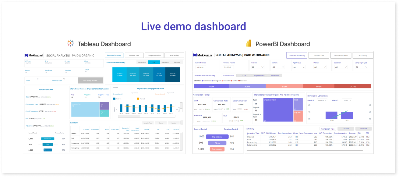
Table of Contents
- What Makes a Good Business Intelligence Dashboard?
- How can Mokkup.ai Speed Up the BI Dashboard Development Process?
- The 6 Must-Haves For Successful BI Dashboards
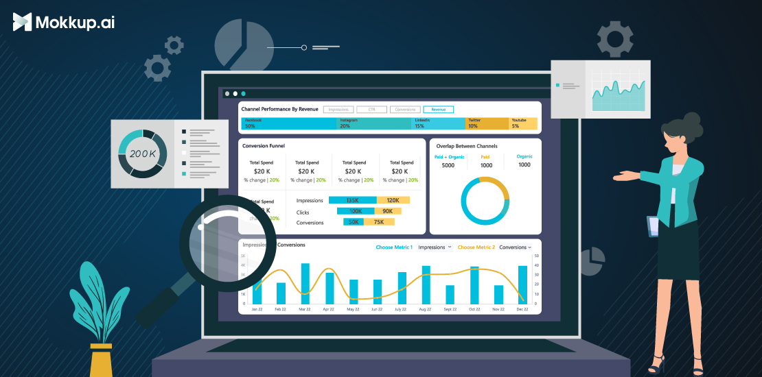
In this day and age, understanding data is the key to making the best decisions for any business. However, the amount of information that’s available at any time can be overwhelming, even for the most data-savvy person. One of the easiest ways to make data easy to understand for technical and non-technical audiences is to create a dashboard mockup that easily displays all of your data visualizations in one place.
What Makes a Good Business Intelligence Dashboard?
A business intelligence dashboard is a visual representation of data that analysts and decision-makers can use to help them make better choices. Data analysts use dashboard creators or analytics tools like Tableau or Power BI. They can be used to monitor key performance indicators (KPIs), track changes in key business data, and assess the overall performance of your BI solution.
A Business Intelligence (BI) dashboard is a dynamic data visualization tool that provides real-time insights and analysis by presenting key information in a visually appealing and interactive format. Unlike static presentations or Excel sheets, which offer limited interactivity and require manual data manipulation, BI dashboards offer a comprehensive view of business data, enabling users to explore and analyze information intuitively. With features such as drill-down, filtering, and dynamic visualizations, BI dashboards empower users to dive deeper into data, identify trends, and uncover actionable insights efficiently. They provide a consolidated and customizable view of business metrics, enabling stakeholders to make data-driven decisions quickly and effectively.
Business dashboard examples illustrate how various industries utilize BI dashboards to meet their specific needs. Below are the features of a good dashboard:
- User-Friendly Design
- Clear and Concise Visualization
- Relevant and Actionable Information
- Customizability and Interactivity
- Data Accuracy and Reliability
- Scalability and Performance
- Contextual Information and Insights
How can Mokkup.ai Speed Up the BI Dashboard Development Process?
Designing a BI dashboard using Mokkup.ai provides a structured way to plan and visualize key data points before building the final dashboard. The dashboard development process begins with wireframing, which is an essential step that allows users to focus on the layout, organization, and flow of information without the need for real-time data integration. This step helps ensure the dashboard is tailored to the specific needs of the business, whether tracking sales, analyzing financial data, or monitoring operational performance. With a wireframe, users can map out how various metrics will be displayed and make adjustments to the structure before finalizing the design.
Mokkup.ai offers a wide selection of pre-built BI dashboard templates, including options for marketing, sales, finance, and operations. These templates, categorized under different types of dashboards, provide a great starting point, helping to streamline the process of data visualization and analysis. Rather than forcing data into a one-size-fits-all layout, users can select a template that best suits their needs. They also give an overview of metrics that are being used industry-wide. These wireframes will help them streamline their data and analysis processes. By designing a dashboard wireframe, users can easily visualize how their final dashboard will appear, making it simple to communicate business logic for each chart. This approach also helps outline the backend structure for the dashboard based on the wireframe and chosen metrics, ensures KPIs and essential data are clearly displayed for stakeholders, and supports effective decision-making.
Remember that building a great dashboard is an iterative process. Continuously monitor and gather feedback on the dashboard's performance, make necessary improvements, and adapt it to changing business requirements over time.
The 6 Must-Haves for Successful BI Dashboards
Users of business intelligence (BI) tools, whether they are businesses or individuals, need good dashboards to get the most out of their data. Dashboard design is crucial in ensuring that a dashboard works well to help people make informed choices. A BI dashboard can provide useful information about your business.
When used effectively, a BI dashboard can help managers make better decisions and gain insights into how their company is performing.
1. Data Visualization
Data visualization is the first key part of a good BI screen. You can quickly and easily see how your company is doing and spot trends when you use data visualization. Some popular data visualization techniques include bar charts, pie charts, and line charts.
Let's take Mokkup’s sales template as an example to illustrate the impact of wireframing on dashboard design. In this template, there’s a bar chart showing a monthly increase in sales. Presenting data in this graphical format enables users to see patterns and trends quickly—for instance, tracking growth across months. The wireframe makes it easy to communicate business logic, such as why specific metrics are chosen for this bar chart, helping stakeholders understand which sales metrics are essential.
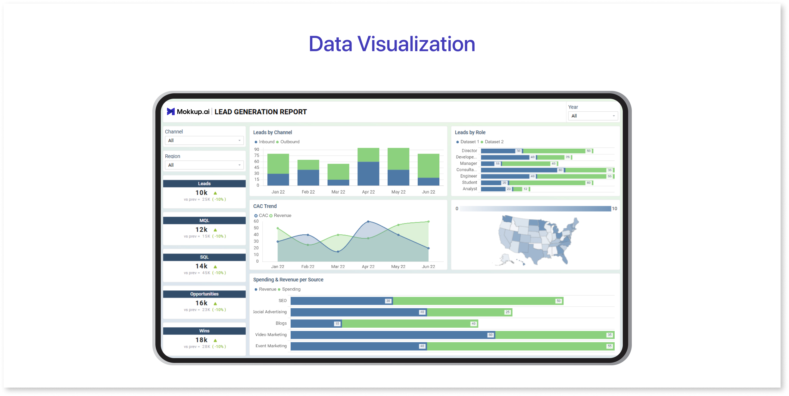
Through the wireframe, it becomes easy to define and communicate the business logic behind each chart—for example, identifying which metrics to track in the bar chart to reflect monthly growth. Additionally, having the wireframe clarifies how the backend should be structured to retrieve and display these metrics accurately.
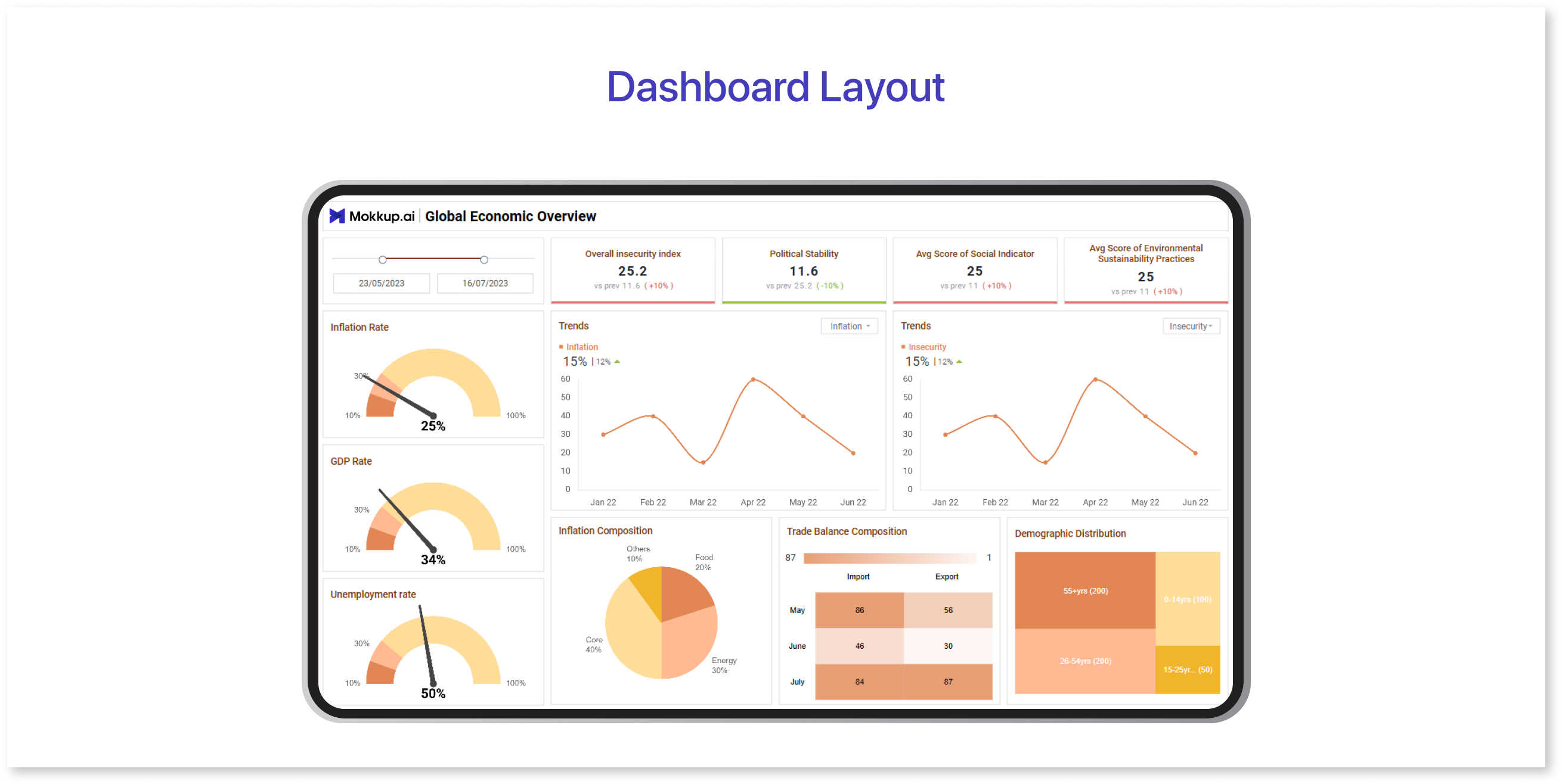
2. Dashboard Layout
Dashboard layout helps organize the information hierarchy of a dashboard. The layout must not be cluttered with visuals but have enough breathing space for the user to analyze and interpret the data. Organizing the data on the dashboard using tabular data, employing large fonts to enhance readability, and using icons to show key data points are all effective strategies for laying out the information.
Let’s use a Mokkup finance dashboard template to see how layout choices impact the information hierarchy and readability. In this finance dashboard, the layout prominently places key metrics—such as revenue, expenses, and profit margins—at the top using large fonts, making critical data points immediately noticeable. Below, a clean, uncluttered table organizes specific monthly figures, breaking down revenue sources and expenses. The table layout simplifies data organization, so users can quickly scan detailed figures without distraction.
3. Accentuate the Most Important Information
Dashboards are all about telling a story, and just as a journalist places the most essential information in the first paragraph of an article, your dashboard should begin by emphasizing the most pertinent insights. The inverted pyramid, a concept that coincidentally originated in journalism, is a useful method to adhere to. Put the most important and substantial information at the top, followed by essential details that provide additional context, and then background information that allows the reader to delve deeper.
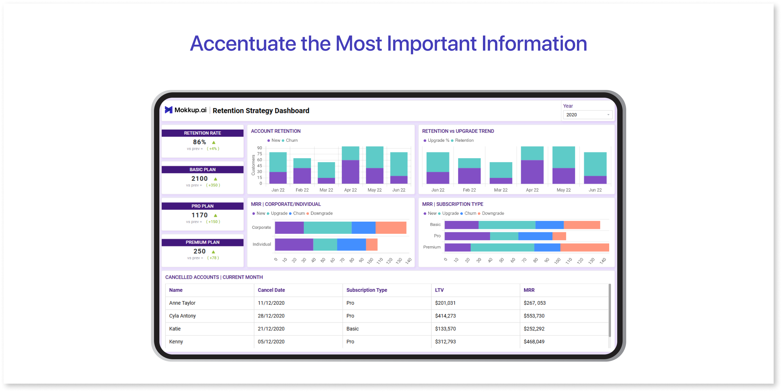
In this dashboard, key customer insights—such as customer satisfaction scores and engagement rates—are displayed at the very top. This immediate placement helps users focus on the most critical metrics first. Just below these main insights, additional data, like breakdowns by demographics or engagement over time, adds context, giving a more detailed look at the factors driving these metrics.
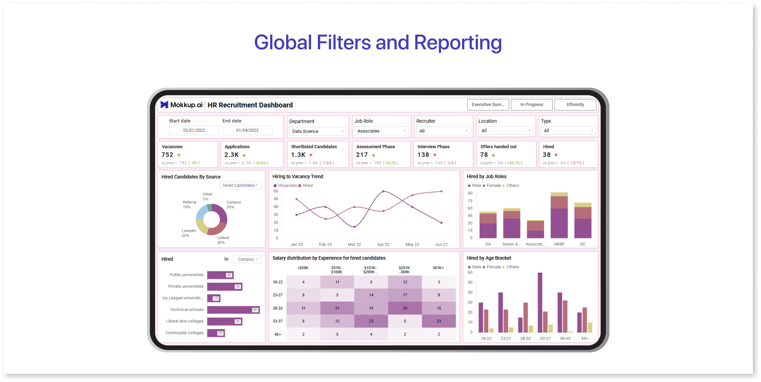
4. Global Filters and Reporting
Global filters and reports are the third most important part of a good BI dashboard. You can view data from different perspectives with global filters, while reporting allows you to see the results of your analysis in a clear and concise way.
In this HR dashboard, global filters enable users to view data by department, employee tenure, or location. For example, filtering by "Marketing Department" quickly tailors the dashboard to show metrics like employee retention, average tenure, and engagement scores specific to that team. This feature allows HR managers to assess departmental performance without sorting through unrelated data.
5. Sharing & Embedding Dashboards
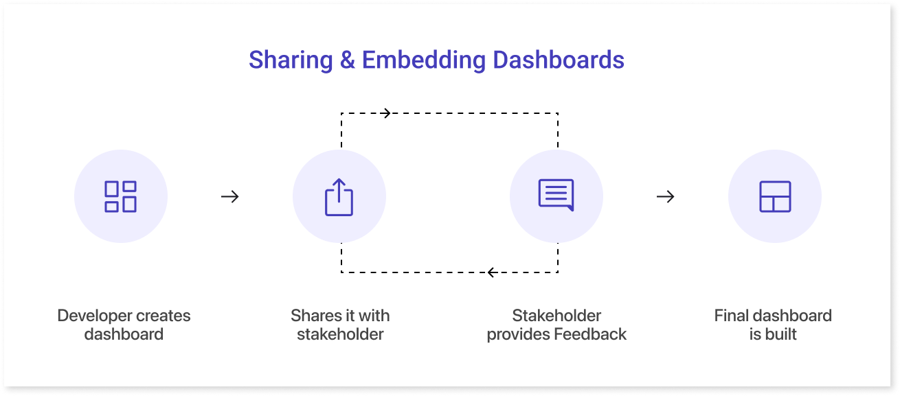
One of the most important aspects of BI screens is the ability to share and embed dashboards. Sharing dashboards helps keep everyone on the same page and makes it easier to track progress across teams. Not all vendors offer sharing and embedding options, so it’s important to choose the right one. The image above shows Mokkup’s sharing and embedding features.
6. Navigation Options
Navigation in a dashboard helps create a smooth user flow, guiding users through different sections in a logical order to make data analysis more intuitive.
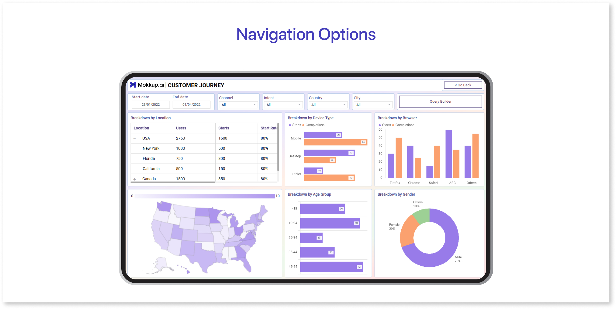
For example, in a customer journey dashboard for a SaaS product, the navigation is designed to help users follow a clear path from one stage of the customer journey to the next. The first section might display website analytics, showing metrics like traffic sources, bounce rates, and user engagement. This sets the stage by providing a high-level view of customer behavior on the site. Next, users can navigate to a section for conversion analysis, where they can view how many visitors took desired actions, such as signing up for a trial or making a purchase. This step naturally follows website analytics and helps users understand how site engagement translates into actual conversions.
Wrapping Up
Due to their versatility and customizability, dashboards have become essential tools for information management. Key features that make them indispensable include clear navigation, effective data organization, and the ability to filter and report data from different perspectives. They allow businesses and teams, regardless of industry or role, to make informed decisions quickly and efficiently.
By presenting data in a user-friendly layout and easily accessible filters and reports, dashboards help ensure that all stakeholders are aligned and can easily interpret the information. Whether you're tracking performance, customer behavior, or team progress, dashboards provide a powerful way to monitor key metrics and make data-driven decisions. A UI/UX design focused on user experience ensures that dashboards are intuitive, while a dashboard wireframe tool helps streamline the design process, making it easier to create functional, visually appealing dashboards.
Prompt it. Wireframe it with Mokkup.ai.
