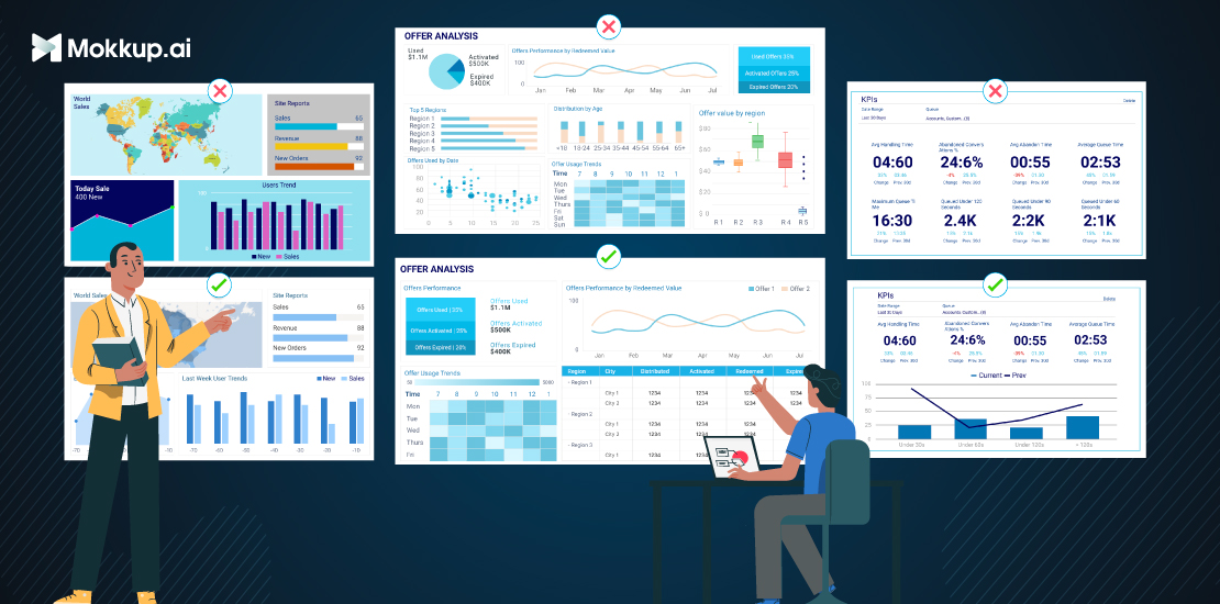
Dashboards serve as essential tools in data visualization, offering a comprehensive snapshot of key metrics and insights crucial for informed decision-making. They provide a visual representation of complex data sets, aiding in understanding trends, patterns, and outliers at a glance. However, despite their significance, poorly designed dashboards can hinder rather than facilitate effective data analysis.
Table of Contents
- Importance of Effective Dashboards
- Common Dashboard Mistakes
- Cluttered Interface
- Lack of User-Centric Design
- Overloading With Data
- Inadequate Data Visualization Techniques
- Lack of Clear Goals and Insights
- Strategies for Aligning Dashboard Design with Business Objectives
Importance of Effective Dashboards
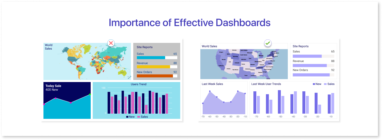
Effective dashboards are crucial tools for businesses because they help people understand data easily. Here's why they're so important:
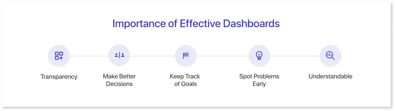
- Transparency: Dashboards gather important information from different places and show it in one spot. This helps everyone see the big picture without having to search through lots of data.
- Make Better Decisions: When people can see data clearly, they can make smarter decisions. Dashboards show things like sales numbers, customer feedback, and website visits, so bosses and managers can figure out what's working and what needs to change.
- Keep Track of Goals: Businesses usually have goals they want to reach, like selling a certain number of products or getting more customers. Dashboards show how close they are to reaching those goals, which helps everyone stay focused.
- Spot Problems Early: Dashboards show data in real-time, which means they can help catch problems before they become big issues. If sales suddenly drop or there's common errors with a product, dashboards can alert people so they can fix it fast.
- Understandable: Good dashboards are easy for anyone to use, even if they're not experts in data. They use simple charts and graphs to show information, making it easy for everyone in the company to understand.
Common Dashboard Mistakes
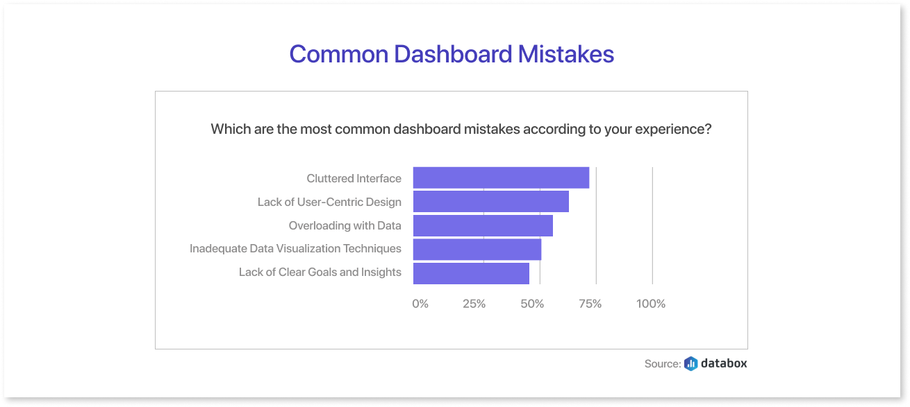
Cluttered Interface
Clutter happens when there's too much stuff on a dashboard, making it hard for people to find what they need. It's like trying to find your favorite toy in a messy room – frustrating and time-consuming!
Imagine if a dashboard showed every single piece of information at once – it would be like trying to drink water from a fire hose! Users can't focus on what's important, leading to confusion and frustration. Plus, it slows down decision-making because people have to sift through all the clutter to find what they need.
For example, a sales dashboard might cram in too many charts, graphs, and numbers, making it hard to see the most important metrics like sales trends or top-selling products. This overload of information can cause users to miss key insights and make poor decisions.
Strategies for Decluttering Dashboards
- Simplify Visuals: Use clean, uncluttered designs with plenty of white space to help information stand out.
- Prioritize Information: Highlight the most important metrics and data points, and remove anything that's not essential for decision-making.
- Group Similar Items: Organize related information together to reduce visual noise and make it easier for users to find what they need.
- Use Interactive Elements: Incorporate interactive features like filters or drill-downs to allow users to explore data in more detail without overwhelming the dashboard.
Lack of User-Centric Design
Designing a dashboard without considering the needs and preferences of its users is like planning a party without knowing what your guests like. It's essential to understand who will be using the dashboard, what information they need, and how they prefer to access and interact with it. By putting users at the center of the design process, businesses can create dashboards that are intuitive, useful, and enjoyable to use.
For instance, a dashboard might display information in a way that's hard to understand for its target audience, or it might lack customization options, forcing users to sift through irrelevant data.
Strategies for Designing User-Friendly Dashboards
- Conduct User Research: Start by understanding who will be using the dashboard and what they need from it. Gather feedback through surveys, interviews, or observation to identify user interface, preferences and pain points.
- Simplify Navigation: Design an intuitive navigation system that makes it easy for users to find the information they need. Use clear labels, logical grouping, and consistent layout to enhance usability.
- Personalize Content: Provide customization options that allow users to tailor the dashboard UI to their preferences. This could include customizable dashboards, user-specific settings, or the ability to save favorite views.
- Use Visual Hierarchy: Prioritize important information and make it stand out using visual cues such as color, size, or placement. Guide users' attention towards key insights and actions to streamline their experience.
- Test and Iterate: Continuously gather feedback from users and iterate on the design based on their input. Conduct usability testing to identify any usability issues and make improvements to enhance the overall user experience.
Overloading With Data
Avoiding poor design in a dashboard wireframe is crucial, and overloading users with excessive data is a common mistake to steer clear of. When users are bombarded with too much information, it can lead to information overload, confusion, and decision paralysis. Instead of aiding users in making sense of their data, it overwhelms them, making it arduous to identify important insights and take action.
For a good dashboard examples, imagine a sales dashboard crammed with dozens of charts, graphs, and tables. This inundation of data can make it challenging for users to focus on the key performance indicators (KPIs) they need to track. With an abundance of data vying for attention, critical insights can easily get lost in the noise, hindering effective decision-making. Try our variety of customizable templates that makes dashboard wireframing easier than before!
Techniques for Presenting Relevant Data Effectively
- Focus on Key Metrics: Identify the most important KPIs that users need to monitor and prioritize them on the dashboard.
- Use Visualizations Wisely: Choose the most appropriate data visualizations (such as charts, graphs, or tables) to convey information effectively. Avoid cluttering the dashboard with unnecessary visual elements that add little value to the user's understanding.
- Provide Context: Contextualize data by providing explanations, trends, and comparisons that help users interpret the information more easily. Use annotations, labels, and tooltips to add context to data points and clarify their significance.
- Offer Customization Options: Allow users to customize the dashboard to their preferences by selecting the data they want to see, adjusting the time frames, or filtering by relevant criteria. This empowers users to focus on the data that matters most to them.
- Implement Drill-Down Functionality: Enable users to drill down into specific data points for more detailed information when needed. This prevents the dashboard from becoming cluttered while still providing access to deeper insights.
Inadequate Data Visualization Techniques
Data visualization plays a crucial role in dashboards by transforming raw data into visual representations that are easy to understand and interpret. Instead of sifting through rows and columns of numbers, users can quickly grasp insights and trends through charts, graphs, and other graphical elements.
For instance, using inappropriate chart types, such as pie charts for displaying many categories or line charts for non-sequential data, can distort the message of the data and make it challenging for users to draw accurate conclusions. Overly complex or cluttered visualizations can overwhelm users, obscuring key insights and diminishing the effectiveness of the dashboard.
Strategies for Selecting Appropriate Visualization Methods
- Understand the Data: Gain a thorough understanding of the data being visualized, including its structure, relationships, and context. This understanding will guide the selection of suitable visualization techniques.
- Choose the Right Chart Type: Select visualization types that best represent the data and communicate its message clearly. Consider factors such as the data's distribution, trends, and comparisons when choosing chart types like bar charts, line charts, scatter plots, or heatmaps.
- Simplify and Clarify: Keep visualizations simple and focused to avoid overwhelming users. Remove unnecessary clutter and distractions to ensure that the main insights stand out prominently.
- Provide Context: Include titles, labels, and annotations to provide context and explain the significance of the data. Help users understand the purpose of the visualization and highlight key insights or trends.
- Ensure Consistency: Maintain consistency in design elements such as colors, fonts, and labeling across different visualizations. Consistency helps users navigate the dashboard more easily and enhances overall readability.
Lack of Clear Goals and Insights
Clear objectives serve as the guiding light for dashboard design, ensuring that it meets the needs and expectations of its users. Just like a roadmap helps travelers reach their destination, defining clear goals for dashboards helps businesses achieve their desired outcomes. These objectives provide focus, clarity, and direction, guiding decisions about what data to include, how to visualize it, and how to present insights effectively.
For example, a dashboard might include a hodgepodge of metrics and data points without a clear purpose or direction. This can overwhelm users and make it difficult for them to extract meaningful insights or take actionable steps based on the information presented. Similarly, dashboards that fail to align with the overarching goals and priorities of the business may miss the mark in terms of relevance and impact.
Strategies for Aligning Dashboard Design with Business Objectives
- Focus on Key Metrics: Prioritize the inclusion of metrics and data points that directly contribute to achieving the defined objectives. Avoid cluttering the dashboard with irrelevant or extraneous information that distracts from the main goals.
- Provide Actionable Insights: Design dashboards to provide actionable insights that enable users to make informed decisions and take meaningful actions. Highlight trends, patterns, and outliers that are relevant to achieving the desired outcomes.
- Regularly Review and Iterate: Continuously review and iterate on the dashboard design to ensure that it remains aligned with evolving business objectives and user needs. Solicit feedback from stakeholders and users, and make adjustments as necessary to optimize the dashboard's effectiveness.
Final Thoughts
Dashboards are essential for businesses, providing transparency, aiding decision-making, and enabling goal tracking. Yet, design mistakes can hamper their effectiveness. To optimize performance, follow the dashboard best practices. Experience the intuitive wireframing tools of Mokkup.ai and craft an impactful dashboards with ease.
Prompt it. Wireframe it with Mokkup.ai.
