
Psychology states that humans understand better with colors. When it comes to data visualization, the comprehension of raw data crosses a path of colors that defines how data is interpreted.
More than just aesthetic choices, color theory in data visualization is a prominent phenomenon that shapes how we perceive and engage with the data. With the right color palette, you can make your ideas pop and highlight critical insights for dissecting complex information.
Going forward, this blog will cover effective tips and best practices for choosing colors while visualizing data. Learn about different color palettes that orchestrate a visual symphony, making your map and area chart visually appealing and meaningfully effective.
Table of Contents
- Types of Data Visualization Color Palettes
- Top 10 Tips to Choose Colors in Data Visualization
- Impact of Color Theory in Data Visualization
Types of Data Visualization Color Palettes
The power of colors can make or break your data story. Poor choice of colors will create distractions and might mislead the interpretations. That’s when use of color in data visualization comes into play.
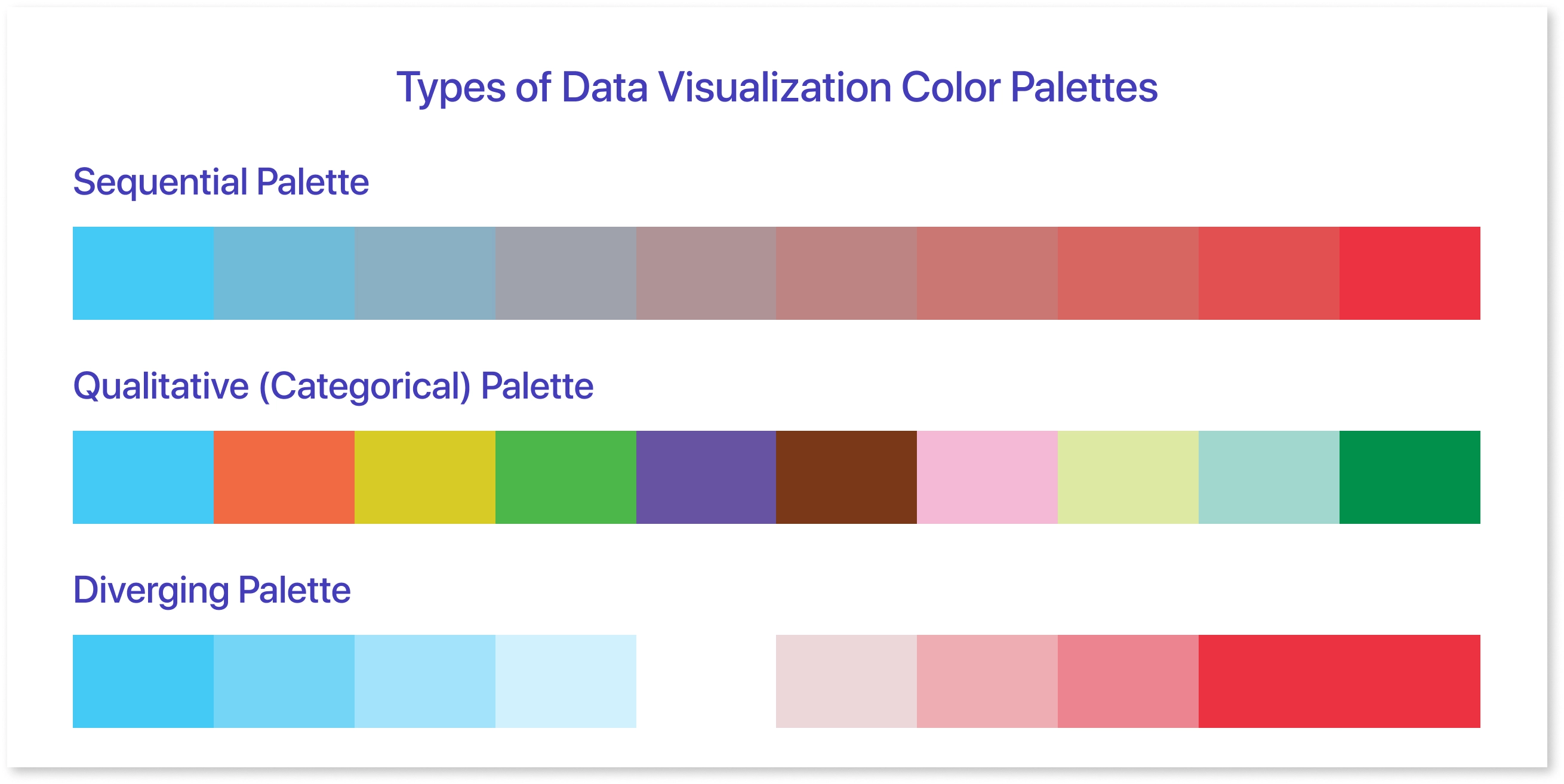
There are three common types of color palettes for developing information and engaging visualizations:
Sequential Palettes
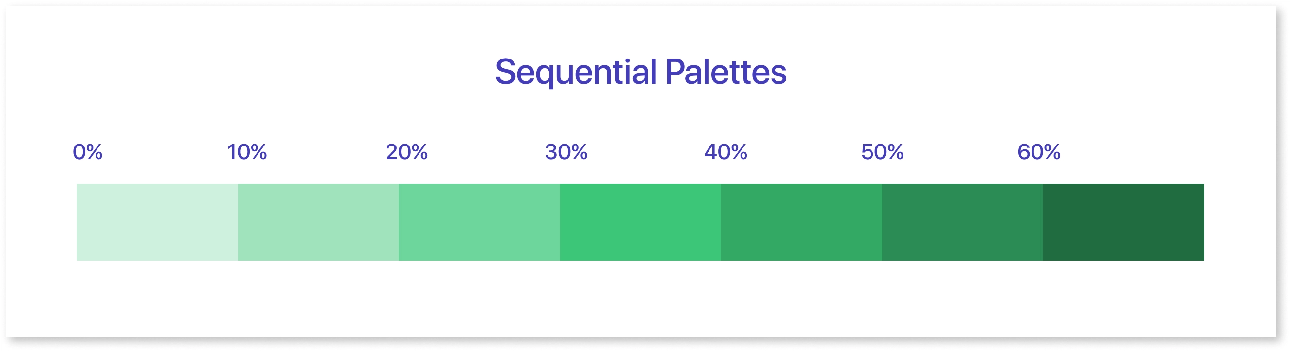
This palette elaborates data hierarchical steps where logical sequence is required. The progression of the color hues represents the numbers that are changing in a sequence. It is used for depicting data patterns or sequential data, like temperature variations or population density.
Further, while developing a heat map, it is okay to use a single hue whose lightness and darkness will simultaneously define lower and higher values.
Qualitative Palettes
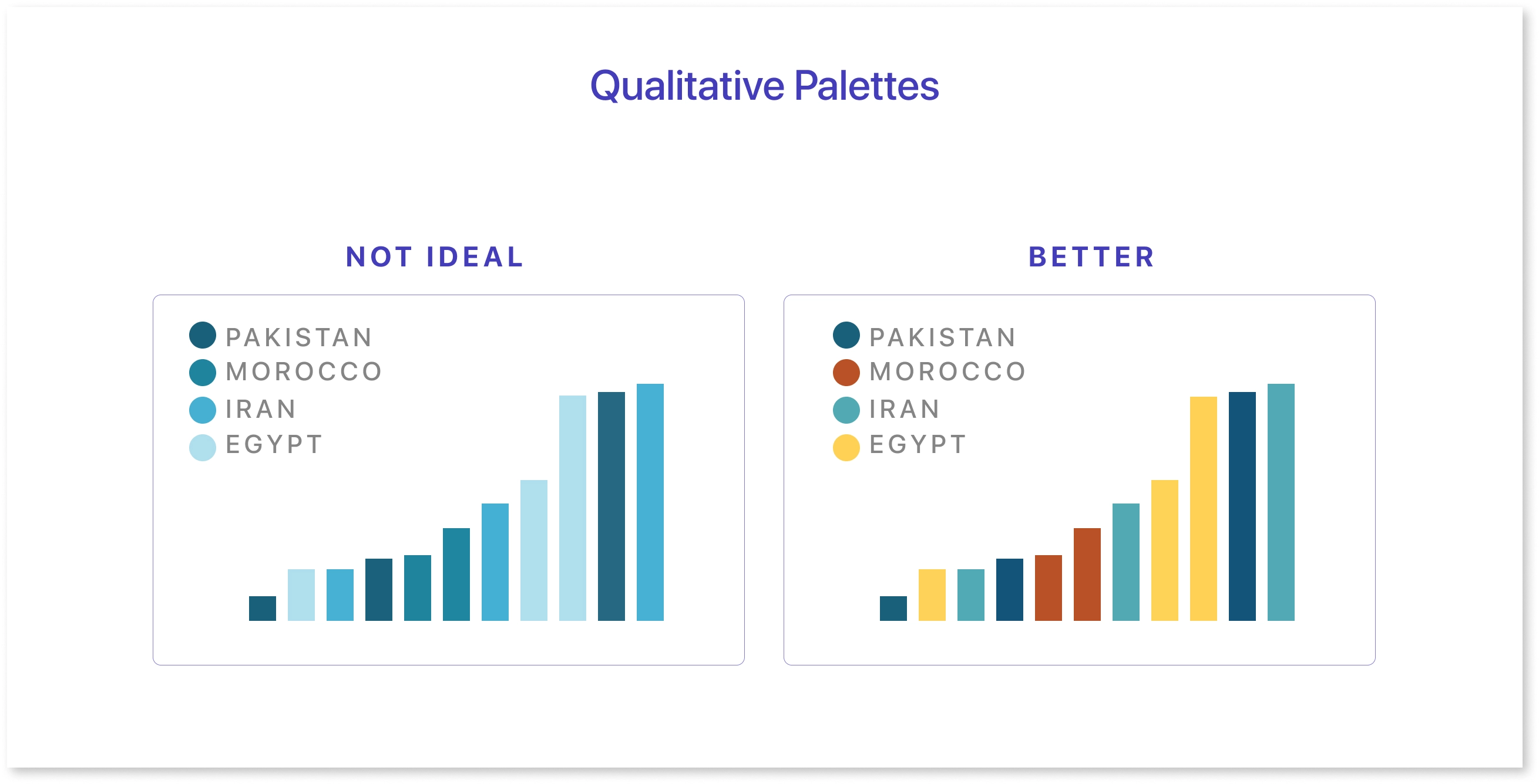
A qualitative palette, also known as a categorical palette, indicates information that does not involve an inherent order. It divides data based on categories, where they are labeled without any inherent order with the application of specific color. Here, colors are kept subtle and evenly saturated to avoid confusion and enhance visual distinction. This palette is accessible to a diverse audience and ideal for communicating non-sequential data like age groups, country divisions, or race.
Pro tip: Avoid using similar color hues to categorize information, as this might affect your presentation of data through bar charts.
Diverging Palettes
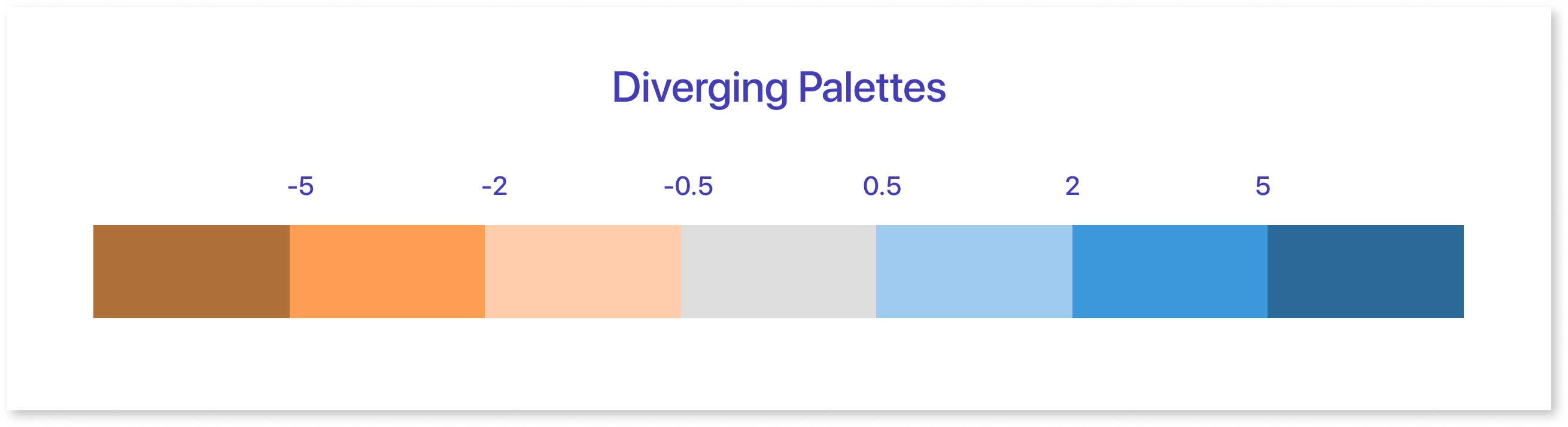
Now comes the diverging palettes, which emphasize the contrast that diverges from a midpoint. Highlighting the significance of the central point, the diverging palette defines the variations from that point.
This can be used as a combination of two sequential palettes with a mid-value zero where higher and lower values use logical color transitions. For example, through heatmaps, temperature deviations can be compared from the baseline to show differences.
Top 10 Tips to Choose Colors in Data Visualization
When used correctly, a color palette can be a valuable tool to take data visualization to a new level. But how do you use them?
Let’s take a data visualization example of Mokkup.ai’s dashboard wireframe to understand how it uses the right color strategy to drive the viewer’s attention.
Here are the top 10 tips that you can use while designing your visualizations with utmost clarity:
1. Not Excessive, But Strategic Use of Color
Color in data visualization can be a strategic technique for presenting data to users. Not just for aesthetics, colors are a functional tool to draw attention to significant points. For most of the data, you can use neutral colors, but if the details are complex, consider choosing color palettes that would also be readable by visually impaired audiences.
2. Be Consistent While Choosing Colors
While choosing colors in data visualization, be consistent. Go ahead with the colors that resonate with your brand, and ensure you have some relevant reason for your choice. The relationship between the category and color will help readers learn more about the information.For instance, the dashboard wireframes of Mokkup.ai contain colors that perfectly resonate with their brand voice.
3. Accessibility for Color Blind People
Color blindness can create confusion between similar shades, leading to an inability to process data. Majorly, there are three types of color blindness:
- Red-green color blindness: Also known as Deuteranomaly, it affects almost 6% of men, which is indicated by the sensitivity to green and red light and develops the inability to differentiate between red and green.
- Blue-yellow color blindness: This is called tritanopia, and it affects only 1 in 20 people. It leads to insufficiency in distinguishing between blue and yellow.
- Complete color blindness: This happens when a person is unable to see any color. It is rare, though.
When colors are strategically used, color-blind users can access all the pie charts and line charts. Using distinguishable colors will also improve the accessibility of the visuals used, as you can see in Mokkup.ai’s dashboard templates, which have inclusive palettes for diverse audiences.
4. Limit Color Variations
Since an abundance of colors will overwhelm readers, limiting the color variations is not a boring practice for improving accessibility. For better clarity, be strategic with a few colors to reveal key insights. Too many colors might lead viewers to spend additional time figuring out which category belongs to which color. Using limited bold and contrasting colors will embrace the crucial data sources and points and make them stand out, as seen in the dashboard template by Mokkup.ai.
5. Group Similar Data
You can consider grouping data by choosing the same for more than six values or categories. For that, different shades can also show slight variations in the data. The main way to create distinction is through the hues, which indeed reduce the cognitive load on the human brain. Also, it reinforces the relationship between two data points and develops nested data that can be grasped immediately.
6. Role of Background Color
The background color of the data visualization dashboard cannot be overlooked. Aim for a neutral background, which can be grey, white, or black. If other popping colors are used, they must contrast with the undertones. A black-and-white background shows formality and complements the data elements for an enriching visual experience. Similarly, a plain background, like in Mokkup.ai’s dashboard wireframe, will leverage your visual representation by letting your graphics and visuals pop out.
7. Use of Contrasting Colors to Show Comparison
Whenever you are showing a comparison between the two factors, it is advised to use contrasting colors to intuit the comprehension of information. Further, a light background with dark colors can highlight primary data points and vibrant hues for focusing on key risks. For example, if you include heatmaps, contamination risk can be indicated with red and light green backgrounds wherein high risks and low risks areas can be shown simultaneously.
8. Lightness to build gradients, not Just Hue
When experimenting with gradients, consider using two hues to avoid confusion. You can design with one dark and one light color and use them consistently. However, using rainbow hue gradients might create chaos in understanding. In Mokkup.ai’s wireframe dashboard, you can see the map chart consisting of two colors on the gradient, which can be an advantage for color-blind individuals as well.
9. Understand Data and Context
It is important to know the data and context while doing data visualization. Determine the type and structure of data to be presented and which kind of audience it resonates with. For example, gradient color schemes are useful in presenting numerical data like scores or risks. Aligning your color choices can make your visualization more intuitive and engaging.
10. Incorporate Culture Associations
Cultural preferences cannot be overlooked while designing dashboards. You need to know the cultural associations of the color, as they influence interpretation. For instance, in some cultures, red is associated with danger or a sense of urgency, and green is a go-ahead sign. Also, avoid using culturally ambiguous colors, as they are sensitive to them.
Impact of Color Theory in Data Visualization
In addition to the design, color impacts data visualization, allowing viewers to digest information quickly and in the most meaningful way. Here are some possible impacts on data visualization when colors are chosen wisely:
- Clarity and Distinction: Colors are deemed a catalyst for improved discernment of data points and product categories that matter. Vibrant and saturated colors make the category easy to distinguish, making complex data more approachable.
- Emotional Impact: Colors evoke emotional connections. Blue and green are related to peace and trust, while warm colors like orange and red exude excitement and urgency. This color theory can help designers develop the desired emotional tone.
- Data Accessibility: Color theory can address many accessibility concerns. Inclusive color palettes into the data visualization tools will ensure visualization is accessible to people with color vision issues. Alternate visual encodings, such as symbols and patterns, can also support accessibility.
- Reinforcing Hierarchy: The distinctive color groupings can represent visual hierarchical data such as rankings or progression. Creating visually appealing design and assigning colors in logical order gives the viewer an indication of hierarchy and draws attention to the crucial information.
Conclusion
In this blog, we have identified the importance of colors in data visualization and an overview of ways to strategically apply color code techniques to the visual elements. To summarize, color theory is not just about creating pretty patterns. Moreover, it is more about understanding the psychology behind the colors to draw the user's immediate attention. When depicting complex information or data, the types of color palettes will define your presentation and help in your journey to convey the numbers.
Frequently Asked Questions
Use a 60-30-10 rule for choosing a color palette wherein 60% will be the primary color, 30% secondary color, and accent color will be 10%.
Yellow, orange, red with blue are the complementary color combinations that are loved by data visualization designers.
Prompt it. Wireframe it with Mokkup.ai.
