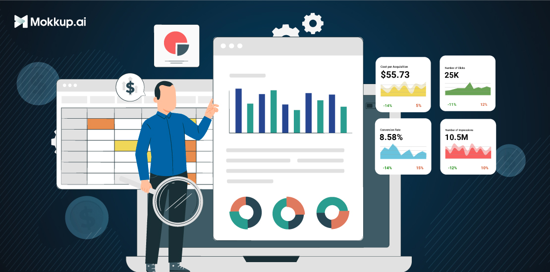
In the era of big data, the ability to pull meaningful insights from vast and complex datasets has become an invaluable skill. Data driven insights are key to informed decision-making, business optimization, and problem-solving in various fields. This process involves more than just gathering data; it encompasses techniques, tools, and strategies to uncover hidden patterns, trends, and valuable information within the data. This blog will delve into the fundamental steps and approaches for pulling data insights, shedding light on the art and science of transforming raw data into actionable knowledge.
Table of Contents
- Data Collection and Preparation
- Choosing the Right Data Analysis Tools
- Data Visualization Techniques
- Best Practices for Better Insights
Data Collection and Preparation
Data collection and preparation are essential steps in any data analysis project. Collecting relevant data and cleaning and preprocessing it properly ensures that your analysis is accurate and meaningful.
Importance of Collecting Relevant Data
Relevant data is directly related to the research question or hypothesis being tested. Collecting relevant data is important because it ensures that the analysis results are meaningful and accurate.
For example, if you are interested in studying the relationship between age and salary, you must collect data on both age and salary. You need to collect age data to draw conclusions about the relationship between age and salary.
In addition to being relevant, the data should also be complete and accurate. If the data isn’t complete and accurate, it can skew the analysis results.
How to Clean & Preprocess Data for Analysis
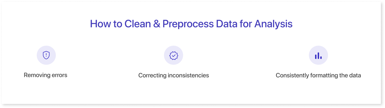
Data cleaning and preprocessing is the process of preparing data for analysis. This may involve removing errors, correcting inconsistencies, and consistently formatting the data.
There are a number of different data cleaning and preprocessing techniques that can be used, depending on the specific data set. Some common techniques include:
- Removing errors: This may involve removing rows or columns containing errors, such as missing or invalid values.
- Correcting inconsistencies: This may involve correcting spelling errors, formatting errors, or other inconsistencies in the data.
- Consistently formatting the data: This may involve converting all values to the same data type, such as numeric or string values.
Once the data has been cleaned and preprocessed, it is ready for analysis.
Choosing the Right Data Analysis Tools
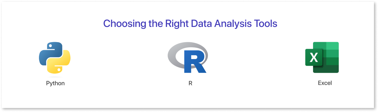
Various tools for data analysis are available, each with its own strengths and weaknesses. Choosing the right tools for your data and goals is important.
Here is a comparison of three popular data analysis tools: Python, R, and Excel:
|
Tool |
Strengths |
Weaknesses |
|
Python |
|
|
|
R |
|
|
|
Excel |
|
|
Data Visualization Techniques
Data visualization converts data into visual representations like charts, graphs, and maps. Data visualization can help us to understand and communicate data more effectively.
Many different data visualization techniques are available, each with its own strengths and weaknesses. The best data visualization technique will depend on the specific data and the story you are trying to tell.
Here are a few examples of popular data visualization techniques:
1. Simple Charts:
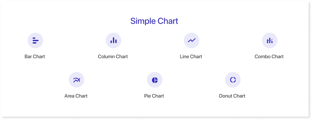
- Charts are good for comparing different categories of data or showing trends over time.
- Bar charts: Bar charts are used to compare different categories of data. Each bar represents a category, and the bar's height represents that category's value.
- Column Charts: Column Charts are easy to understand and can be used to compare different categories or show trends over time.
- Line charts: Line charts are used to show trends over time. Each point on the line represents a value at a specific time point.
- Pie charts: Pie charts are used to show the proportional relationships between different categories of data. Each slice of the pie represents a category, and the size of the slice represents the proportion of that category.
2. Mid Charts:
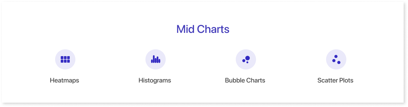
- Graphs are good for showing the relationship between two variables or the distribution of a single variable.
- Scatter plots: Scatter plots are used to show the relationship between two variables. Each point on the scatter plot represents a data point, and the position of the point on the x- and y-axis represents the values of the two variables.
- Histograms: Histograms are used to show the distribution of a single variable. The x-axis of a histogram represents the values of the variable, and the y-axis represents the number of data points at each value.
- Bubble Charts: Bubble Charts can be used to identify patterns and trends in data, and to compare different groups of data.
- Heatmaps: Heatmaps are good for showing data distribution across a two-dimensional space. These are used to show the distribution of data across a two-dimensional space.
3. Complex Charts:

- Sankey chart: A flow diagram that shows the flow of energy, materials, or money between different entities. It is useful for visualizing complex relationships and identifying bottlenecks.
- Dendrogram: A tree-like diagram that shows how different data points are related to each other. It is useful for hierarchical clustering and data analysis.
- Waterfall chart: A bar chart that shows how a value changes over time, taking into account both positive and negative contributions. It is useful for visualizing cumulative change and identifying the key factors that drive that change.
Best Practices for Better Insights
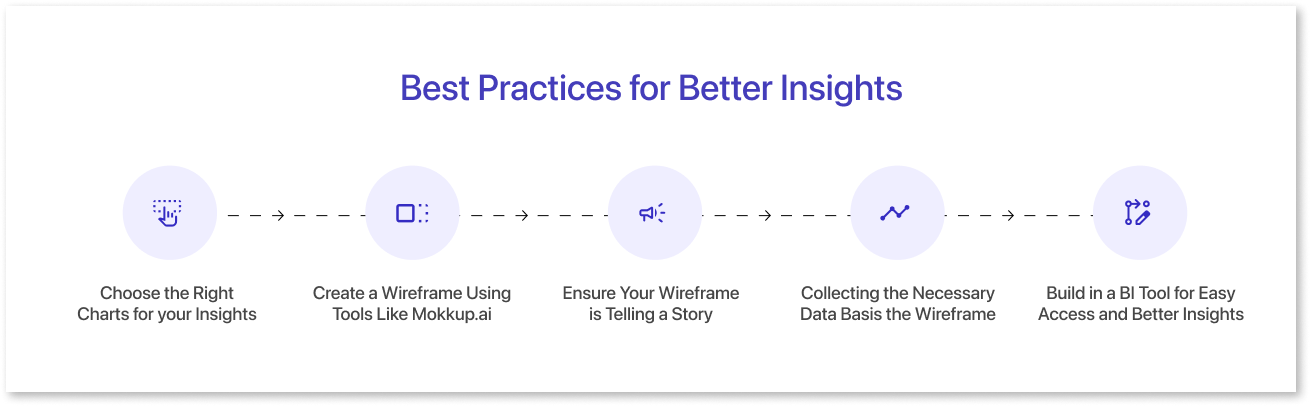
Choose the Right Charts for your Insights
Choosing the right chart for your insights is essential for communicating your data effectively. The wrong chart can confuse or mislead your data, while the right chart can help your audience understand your findings quickly and easily.
Here are a few tips for choosing the right chart for analyzing data for insights:
- Consider the type of data you have. Is your data categorical or numerical? Is it continuous or discrete? Different chart types are better suited for different types of data.
- Think about what you want to communicate. What is the main message you want to convey with your data? Choose a chart that will help you communicate your message clearly and concisely.
- Keep your audience in mind. Who is your target audience for your data visualization? Consider their level of technical expertise and familiarity with different charts.
Create a Wireframe Using Tools Like Mokkup.ai
Mokkup.ai, a dashboard wireframing tool, provides an intuitive platform for creating wireframes and utilizing charts, graphs, and heat maps to enhance visual representation and data communication in the dashboard development process. With Mokkup.ai, users can seamlessly add various chart types into their dashboard design prototypes, such as bar charts, line graphs, and pie charts. These charts can be easily customized to reflect dummy data, allowing data professionals and stakeholders to visualize how information will appear in the final product.
Moreover, Mokkup.ai offers the capability to add heat maps, which are invaluable for displaying data trends and patterns visually appealingly. Heat maps help users quickly grasp information by using color gradients to highlight variations and concentrations within datasets. Users/Data professionals can effectively use these heat maps to illustrate user interactions, geographical data, or any other data-driven insights.
Incorporating charts, graphs, and heat maps through Mokkup.ai streamlines the dashboard wireframing process, enhances user understanding, and aids in making data-driven decisions, making it an indispensable tool for data professionals and designers.
Ensure Your Wireframe is Telling a Story
Data storytelling is the process of visualizing data for insights clearly, concisely, and engagingly. It is an essential skill for anyone who wants to use data to make a difference.
Effective data storytelling is important because it can help us to:
- Understand data more deeply: When we tell a story with data, we are forced to think about the data in a new way. This can help us to identify patterns and trends that we might not have noticed otherwise.
- Make better decisions: Data can help us to make better decisions, but only if we can understand it and communicate it effectively. Data storytelling helps us communicate data insights in a clear and actionable way.
- Persuade others: Data can be a powerful tool for persuasion, but only if we can communicate it in an informative and engaging way. Data storytelling helps us create compelling, data-driven narratives that persuade others to take action.
Collecting the Necessary Data Basis the Wireframe
Collecting the necessary data to build the wireframe is a critical step in the early stages of any design or development project. It serves as the foundation upon which the entire project is built. To create an effective wireframe, one must gather essential information, such as user requirements, content assets, and functional specifications. This data forms the basis of the wireframe, providing a clear understanding of what needs to be included and how the interface should be structured. Without a solid data foundation, the wireframe may lack direction and fail to align with the project's objectives. Therefore, meticulous data collection is a vital preliminary step in the journey toward creating a successful and user-friendly digital product or application.
Build in a BI Tool for Easy Access and Better Insights
Integrating a built-in Business Intelligence (BI) tool into your organization's infrastructure is a strategic move that promises easy access to data and empowers decision-makers with richer insights. Such a tool is a powerful ally in today's data-driven world, enabling teams to gather, analyze, and visualize critical information effortlessly. By centralizing data within a dedicated Business Intelligence solution, organizations can streamline extracting valuable insights, eliminating the need for manual data manipulation. This saves time and reduces the potential for errors, ensuring that decisions are based on accurate and up-to-date information.
Conclusion
In conclusion, pulling data insights is a multifaceted process that involves data collection, preparation, analysis, and visualization. It requires combining technical skills, domain knowledge, and the right data analytics tools. By adopting a systematic approach, including defining clear objectives, selecting appropriate data sources, employing robust analytical techniques, and effectively communicating findings through visualizations, organizations, and individuals can harness the power of data to make informed decisions, drive innovation, and achieve their goals. Data insights are a guiding light in an increasingly data-driven world, empowering us to extract meaningful information from the vast sea of data surrounding us.
Prompt it. Wireframe it with Mokkup.ai.
