
It is true that "one picture says more than 1000 words." Dashboard design is the art of converting raw data into easily understandable insights and meaningful patterns.
Dashboard visualization is a distinctive and effective way to present data-based intelligence. This article explores the visual design principles for dashboards, which are the core components of every data visualization tool.
In this piece, we'll discuss some best practices for dashboard design and ways Mokkup can support you in implementing these key elements of user-friendly dashboard design.
Table of Contents
Adhering to best practices for designing intuitive dashboards is crucial for turning raw data into actionable insights. Start by understanding your audience's needs, focusing on key performance indicators (KPIs), and using wireframes to plan the layout. A clean, uncluttered design, consistent color usage, strategic audience polling, and easy navigation are key elements that enhance the overall user experience.
What Are The Most Common Dashboard Types?
Dashboard styles can differ significantly depending on how they are used. However, an interactive dashboard is made up of cards. Depending on the type of dashboard, it may include individual data, quick links or navigation, important information, graphs, and data tables.
The 5 main types of dashboards are:
1) Operational Dashboards
Operational dashboards are excellent for showing your users where they are in your program. They enable users to check what's happening quickly.
The most critical data should be displayed in the dashboard's upper left corner. This will make it easy for users to scan it. Dashboards may include a few diagrams but shouldn't show in-depth data views.
2) Analytical Dashboards
Analytical dashboards present users with critical data sets that are always compared to previous results. They should be data-driven, displaying as many relevant views as possible.
These dashboards should focus on essential account data and keep graphical components to a minimum. They help users identify issues more quickly and represent the user experience within your application.
3) Strategic Dashboards
Strategic dashboards offer significant benefits by providing a clear overview of an organization's key performance indicators (KPIs) and long-term goals. These dashboards help decision-makers focus on what's important by displaying real-time data and trends in an easily digestible format.
Strategic dashboards enable leaders to quickly identify areas of success and those needing improvement by visualizing performance against targets.
4) Marketing dashboards
Marketing dashboards offer significant benefits by providing a clear, visual overview of key marketing metrics. They help teams quickly understand campaign performance, track progress toward goals, and identify improvement areas.
They also save time by consolidating data from various sources into one easy-to-read interface, reducing the need for manual reporting.
5) KPI dashboards
KPI dashboards help businesses track and measure their key performance indicators (KPIs) in real-time. By presenting important data in an easy-to-read format, these dashboards make it simple to monitor progress toward goals.
With visual elements like charts and graphs, KPI dashboards make data easier to understand and analyze. This helps teams stay focused, identify trends, and take action to improve performance.
How Do You Create a User-Friendly Dashboard?
Have you thought how to apply ux principles to dashboard design? One can easily build application interfaces and dashboards that look great and are easy to use. By following the seven tips below, they can also give users reasonable access to essential data.
a) Know your key performance indicators (KPIs)
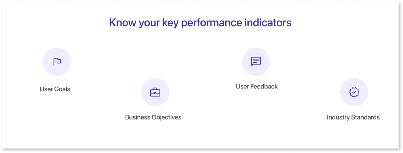
KPIs are key metrics that measure a business or organization's performance. They evaluate the success of a particular activity or objective and help organizations understand how well they are achieving their goals.
- Understand users' goals and relevant KPIs.
- Align KPIs with business objectives.
- Gather user feedback on important metrics.
- Research industry standards for relevant KPIs.
b) Use Wireframes
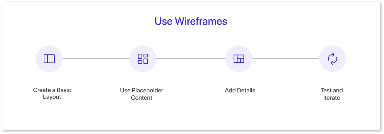
Wireframes are an essential tool in designing dashboards. They help you visualize the layout and functionality of your dashboard before you begin building it.
- Define the dashboard's purpose and user goals to guide information and features in your wireframe.
- Sketch a basic layout focusing on charts, tables, and navigation and use placeholder content to focus on layout and functionality.
- Add details such as specific data points, colors, and icons to enhance the wireframe.
- Test with users, gather feedback, and refine the design to meet their needs.
c) Keep everything light, clean, and straightforward
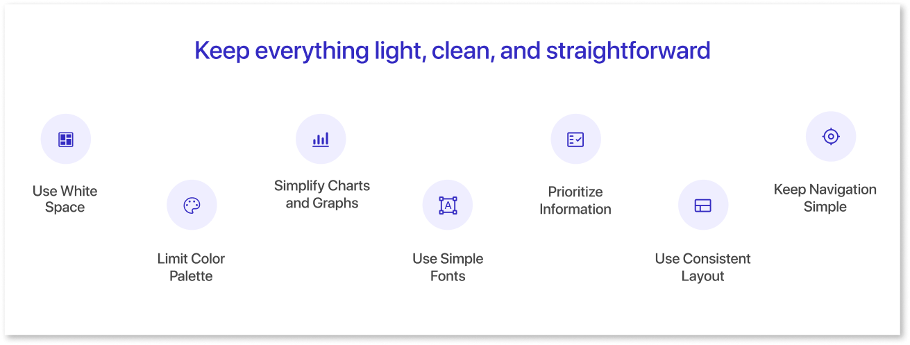
Simplicity is always best. The best user interfaces are simple; the best UIs are simple enough. A simple, user-friendly dashboard design can hide significant functionality with the proper usability strategy.
- White space keeps the dashboard clean and readable by separating sections and creating a clear hierarchy.
- A limited color palette ensures a cohesive design, using a neutral base and primary colors to highlight key information.
- Simplify charts and graphs with limited data points, clear labels, and user-friendly colors to avoid clutter.
- Choose simple, easy-to-read fonts that are legible on all devices, avoiding decorative or complex styles.
- Highlight essential details with clear headings, bold fonts, or larger sizes.
- Maintain a consistent format and design to aid navigation throughout the dashboard.
- Use clear labels and limit options for straightforward navigation guided by a logical information hierarchy.
By following these tips, you can maintain your dashboard in a simple structure, making it less complicated for customers.
d) Use colors to alert and notify users
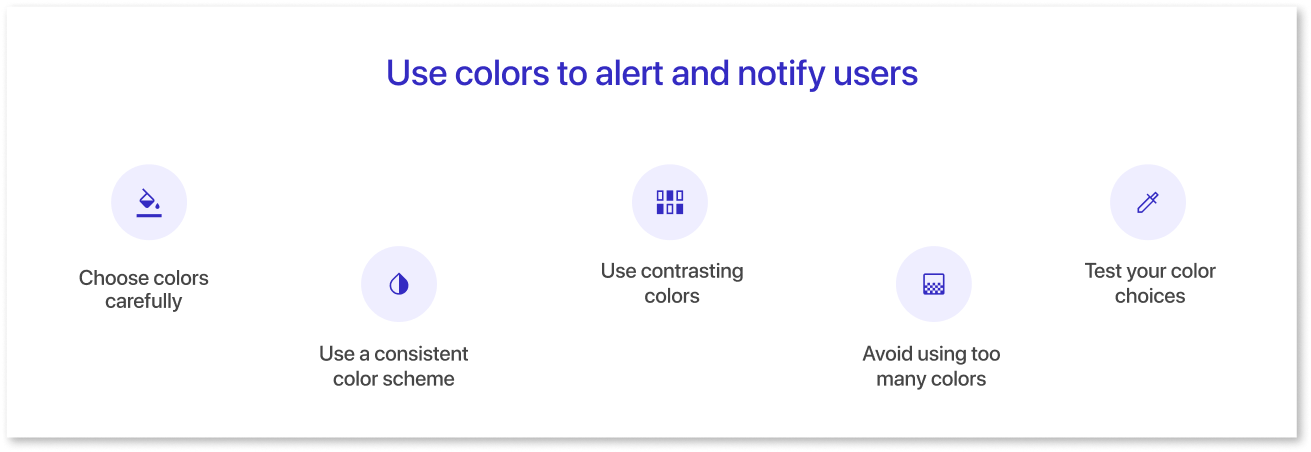
Color is a fundamental component of web design and creates an excellent user interface. You can use color schemes to notify users about tasks, activities, features, and more, using button colors and alerts.
- Choose colors based on their meaning and cultural significance, like red for danger and green for safety.
- Maintain a consistent color scheme for clarity, such as red for alerts, green for positive indicators, and yellow for warnings.
- Use contrasting colors to highlight important information and ensure easy distinction.
- Avoid excessive colors to prevent confusion; stick to a limited palette.
- Test color choices with users to ensure they effectively communicate the intended message.
Use Mokkup.ai to learn more about choosing colors in dashboard UI design for user-friendly dashboards. This comprehensive platform, created from the ground up for everyone, includes everything from the layout to the application structure.
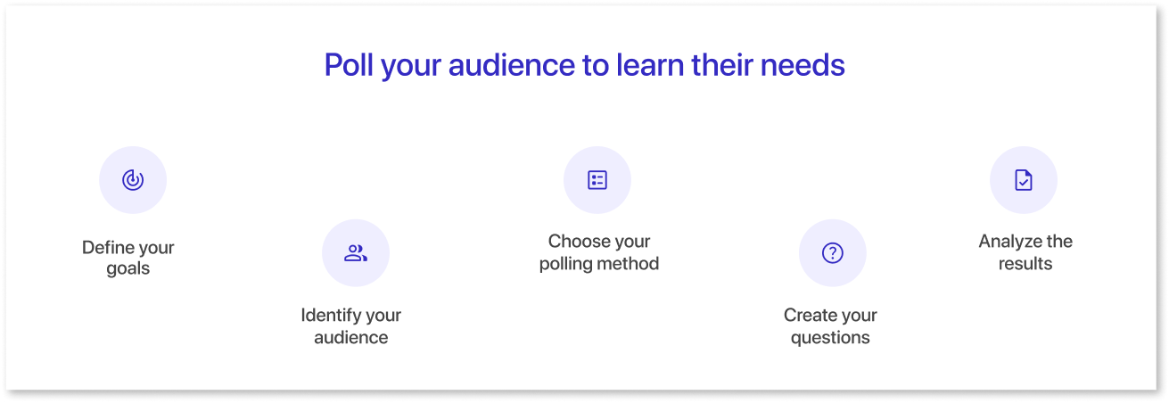
e) Poll your audience to learn their needs
What are your users interested in? When deciding how to use an application, developers/designers often need to pay more attention to metrics that are more important than they think.
Ask your users directly to learn what they think is essential rather than assuming. Facebook used this method to understand user needs and updated its interface (UI) to replace metrics like impressions with reach.
- Determine the specific information and needs you want to address with your dashboard design.
- Specify the people using your dashboard, such as stakeholders, customers, or team members.
- Select the best method for your audience and goals, such as online surveys, phone interviews, or focus groups.
- Develop clear, relevant questions, including open-ended ones, for detailed feedback.
- Examine the data to find patterns and trends, and use these insights to guide your dashboard design.
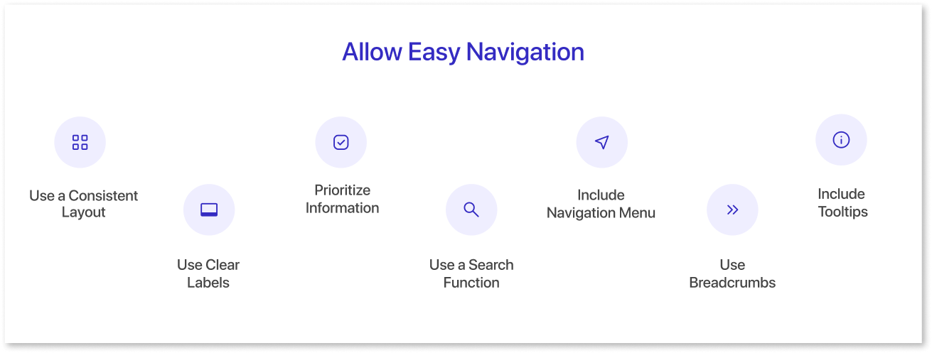
f) Allow Easy Navigation
Designing user-friendly dashboards requires carefully considering the user experience and how users will interact with them. One key element to ensuring easy navigation is keeping the layout and data design consistent throughout the dashboard.
- Maintain a consistent layout with uniform design elements for easy navigation.
- Use clear, descriptive labels for buttons and links, avoiding jargon.
- Highlight critical information prominently with visual cues like color or size.
- Add a search feature for quick access to information if the dashboard is data-heavy.
- Implement a simple navigation menu for easy access to different sections.
- Use breadcrumbs to show users their location and navigation path.
- Utilize tooltips for additional context when hovering over elements.
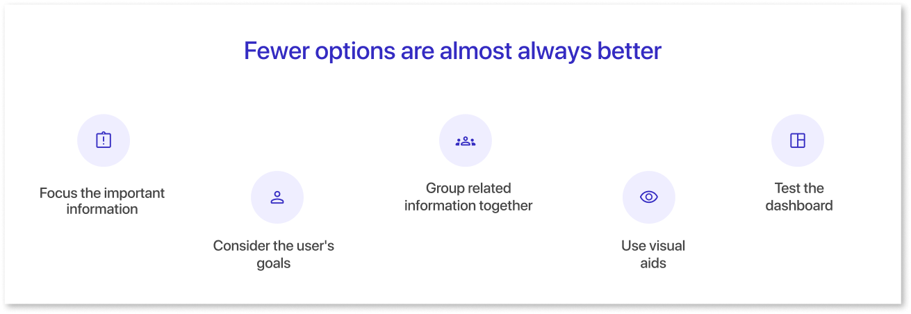
g) Fewer options are almost always better
Remember this simple rule when building user interfaces: the fewer options, the fewer problems users will encounter. When your user interface is straightforward, you'll deal with more occasional emails and support tickets.
- Identify and prioritize essential information for quick user access.
- Design based on users' goals and what they need to achieve them.
- Organize data by related categories for easier navigation.
- Use charts and graphs to simplify complex data, but avoid overcrowding.
- Test with users to refine options and design based on their feedback.
If you must balance usability and power, consider giving your dashboard an advanced feature choice. By allowing advanced features for power users, you can create a straightforward UI for other users.
Final Thoughts
Sticking to the fundamental principles and observing their use in the dashboard layout is always suggested. Further, these basic principles will help designers create excellent designs. This article covers some essential design principles and best practices in dashboard design.
Keep these principles in mind as you create your dashboards.
Prompt it. Wireframe it with Mokkup.ai.
