
What is an Interactive Dashboard Wireframe?
An interactive dashboard wireframe is a simplified, early-stage visual representation of a dashboard that outlines its layout, structure, and interactive features without including final design elements or real data. It's a blueprint that shows where key components like charts, tables, filters, and navigation options will be placed, helping stakeholders visualize how the final dashboard will look and function.
Still curious about how it works? Let's find out.
Table of Contents
- What is an Interactive Dashboard Wireframe?
- Understanding the Purpose of Dashboard Wireframe
- Difference between BI Dashboard and Dashboard Wireframe
- Build an Interactive and Effective Dashboard Wireframe With Mokkup
- Categories of Dashboard Wireframes
Understanding the Purpose of the Dashboard Wireframe
A dashboard wireframe visually represents data, providing users with a clear summary of information in an easy-to-analyse format. Stakeholders can see how the dashboard looks, what it can do, and how it functions. This process allows them to share ideas, make informed choices, and set realistic goals.
Let's look at some of the main reasons dashboard wireframing tool are valuable for businesses:

1. Planning:
Before creating dashboards, it’s essential for businesses to thoughtfully plan and design their layout using wireframing tools. These tools not only make it easy to arrange maps, charts, and graphics with drag-and-drop functionality but also allow teams to decide which key metrics to include, and which to omit.
A well-designed dashboard begins with understanding which metrics are important to stakeholders, selecting charts that best suit the data analysis, and ensuring each element directly supports the dashboard’s purpose. Many free wireframing tools simplify this process, ultimately saving time and helping create dashboards that align with the company’s goals and decision-making needs.
2. Increased interaction:
Increased interaction in dashboards means making it easier for users to engage with the data. This could include features like clicking on filters to change charts, selecting values from drop-down menus, or navigating between pages. These interactive elements allow users to explore data more freely, making it easier to understand and analyze. It enhances the user experience by giving them control over how they view and interact with the information.
3. Team Coordination:
Wireframes for dashboards act as visual blueprints that help finalize the business logic, define the metrics displayed, and outline the backend setup needed to achieve accurate results. These graphic templates promote stakeholder collaboration by allowing them to visualize the dashboard’s functionality and design. This enables stakeholders to contribute valuable input, make informed decisions, and set achievable goals based on a clear understanding of the dashboard’s capabilities.
4. Designing for the User:
Dashboard wireframing tools take into account the unique demands and requirements of different teams, such as marketing, sales, finance, and operations, each with their own KPIs to track. These tools help businesses create wireframes that are tailored to the specific needs of each department, ensuring that the design focuses on the most relevant data for each team. By breaking up wireframes based on these distinct KPIs, businesses can enhance usability, making it easier for users to navigate, understand data, and drive actionable insights.
Difference between BI Dashboard and Dashboard Wireframe
We've talked about how dashboard wireframes can help businesses, but what's the difference between a business intelligence dashboard and a dashboard wireframe?
| Aspect | BI Dashboard | Dashboard Wireframe |
| Definition | An interactive, graphical dashboard UI design that is connected to live data and presents statistics, measurements, and key insights in a summarized and easy-to-understand manner. | Before development, a blueprint or graphic representation of the dashboard design. |
| Purpose | Provides a snapshot of key information and metrics to monitor performance, track trends, and support decision-making. | Offer guidance for the ultimate dashboard design's structure and performance. |
| Level of Details | This is connected to live data and shows real numbers in real time. | Uses dummy numbers and figures that may or may not be connected to actual, live data. |
| Development Stage | Presents a completely created and deployed final product. | In the initial stages of visual representation, it was developed at the start of the dashboard design process. |
| User Interaction | Allows users to drill down to various data levels by interacting with charts, filters, etc. | Allows users to see what values are present in filters, drop-downs, and charts, but they cannot drill down to these levels. |
| Tools | Power BI allows users to visualize and analyze data with interactive dashboards, offering seamless integration with Microsoft products.And Tableau is known for its advanced capabilities in handling large datasets and creating interactive, dynamic visualizations, making it ideal for BI dashboards. | Mokkup.ai is a cloud-based tool designed for creating dashboard wireframes, offering a drag-and-drop interface, customizable templates, and more without any expertise.And Figma is also used for creating dashboard wireframes, providing collaborative design features, and creating customizable templates for UI/UX professionals. |
| Usage | End-users and stakeholders utilize it to obtain and analyze data for decision-making purposes. | Developed and planned mostly by designers and developers. |
Build an Interactive And Effective Dashboard Wireframe With Mokkup
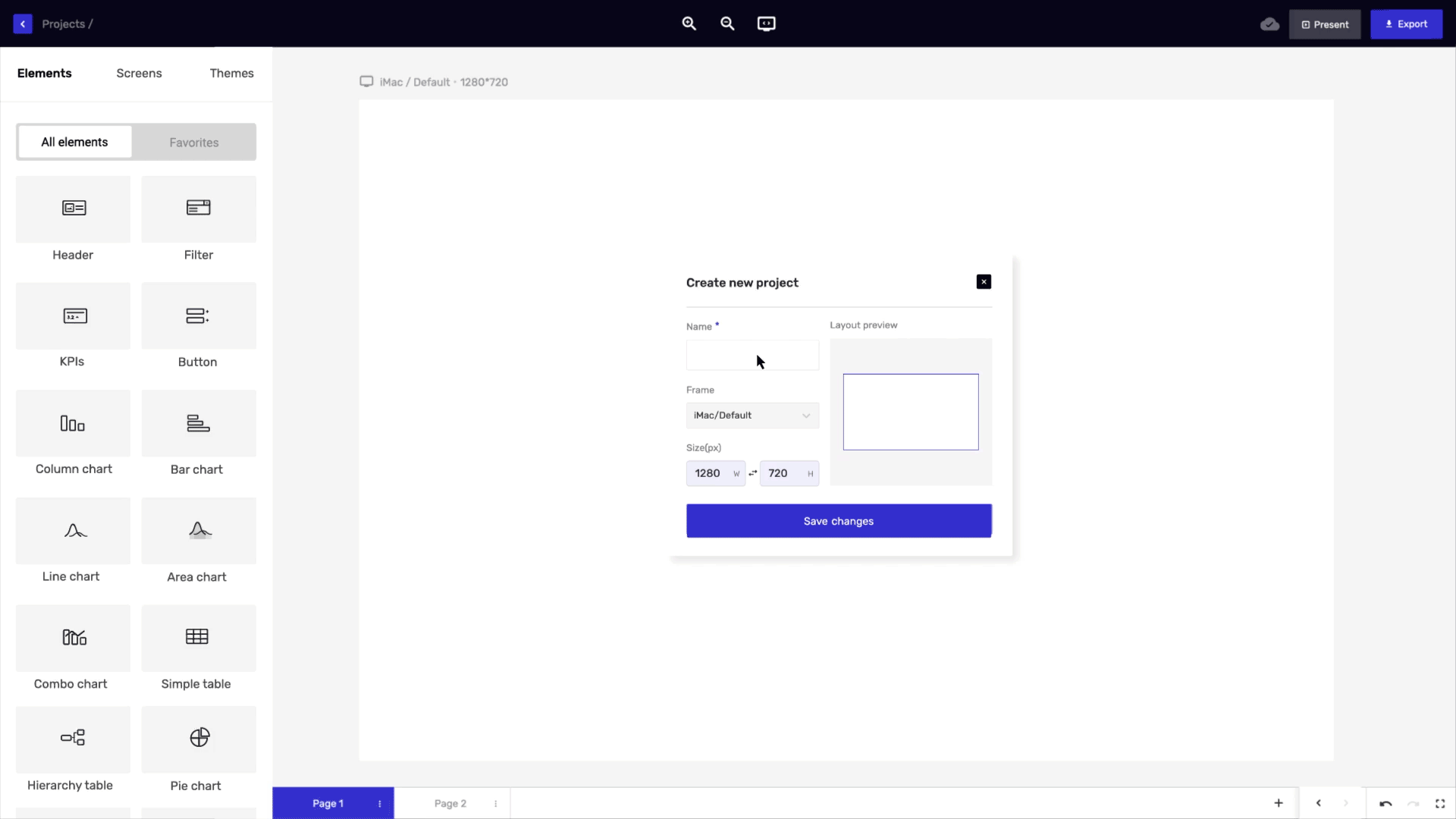
Now, let me quickly walk you through the process of creating an interactive and effective dashboard wireframe:
- Define your dashboard's purpose: Choose a project name that aligns with the data your mock dashboard will represent. Consider the goals, metrics, target audience, and key insights you want to communicate. Focus on incorporating computed fields, comparisons, and patterns to deliver valuable perspectives and actionable information, helping you evaluate data effectively and enhance your dashboard's impact.
- Select a template: You can start by exploring the "Templates" option in the sidebar, where you’ll find a variety of pre-designed dashboard wireframe templates across different categories. Browse through them to discover one that aligns with your needs.
- Customize your dashboard layout: Navigate through the sections using the bar to explore templates or begin a new project. You can browse through the categories in the left pane to find the most suitable template. The icons beside the 'Create new' button allow you to toggle between 'Grid view' and 'List view' for your page layout.
- Add visual elements: You can start incorporating visual design elements into your dashboard using Mokkup.ai's chart creator. There are various options to explore, such as bar charts, line graphs, pie charts, and others. Selecting the right visualization format can help present your data in a clear and effective way.
- Boost collaboration through commenting: Use the comment icon to add remarks, mention team members, and include emojis or images. Comments can be linked to specific elements and filtered by type or status for efficient feedback management. Resolve or reopen comments as needed, and invite teammates by mentioning them. Make your communication engaging by adding emojis, GIFs, and images to your comments.
- Share your dashboard: Share your dashboard with your target audience as soon as you are pleased. Options for sharing are available on Mokkup.ai, including web-based programs, embed code, and downloaded files.
Categories of Dashboard Wireframes
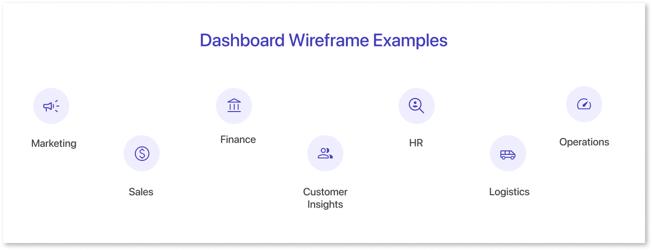
Dashboard wireframes represent visual representations that direct the organization and design of a dashboard's user interface design. The dashboards give a brief summary of the design.
They show the arrangement of components, menus, and overall performance. This helps the dashboard easy to understand. Here are a few dashboard examples that illustrate various design strategies:
- Marketing: A marketing dashboard wireframe typically tracks KPIs and metrics like website traffic, conversion rates, social media engagement, and cost-per-click for ad campaigns. For example, it might monitor metrics such as the click-through rate (CTR) on ads, follower growth on social platforms, and sales generated from campaigns. Marketers can leverage these insights to assess ROI, optimize campaign performance, and refine advertising strategies based on real-time data.
- Sales: The key performance indicators and metrics featured in these dashboards include revenue tracking for finance, conversion rates for marketing, and customer acquisition metrics for sales. For example, a sales dashboard may display monthly revenue growth and customer lifetime value, while a marketing dashboard could focus on lead conversion rates and engagement metrics. Each dashboard is tailored to highlight specific KPIs relevant to its functional area.
- Finance: A wireframe for a finance dashboard typically includes KPIs and metrics such as cash flow analysis, cost breakdown, revenue trends, and ROI metrics. For example, cash flow may be visualized with a monthly or quarterly comparison, while revenue growth can be shown through year-over-year or quarter-over-quarter metrics. Cost analysis could include details on operating and fixed costs, and investment metrics may highlight ROI percentage, payback periods, or profit margins from specific strategies.
- Customer Insights: These dashboards cover key KPIs like customer satisfaction scores, purchase frequency, and customer retention rates, alongside metrics such as average transaction value and product category popularity. For instance, a customer insights dashboard might track demographics, while a sales dashboard focuses on purchase trends and revenue per customer. Together, these metrics help businesses enhance decision-making and foster more meaningful client interactions.
- HR: A wireframe for an HR dashboard is designed to organize and display key data and metrics related to human resources. For example, it could track KPIs such as headcount (total number of employees), resignation rate (percentage of employees leaving), appraisal scores (average performance ratings), training completion rates (percentage of employees completing assigned training programs), and payroll information (average salary, overtime, and benefits data).
- Logistics: It centers on improving the flow of products and services along the supply chain. Key metrics such as inventory turnover rate, order fulfillment time, on-time delivery percentage, and warehouse capacity utilization can be tracked in real-time. Logistics managers can monitor KPIs like cost per shipment, transportation efficiency, inventory accuracy, and order cycle time. With this dashboard, they can identify performance bottlenecks, reorganize processes, and optimize the entire supply chain for better performance.
- Operation: This wireframe for a dashboard offers an in-depth analysis of operational productivity. It could include key metrics such as manufacturing output (units produced per hour), equipment utilization rate (percentage of time equipment is in use), quality control metrics (defect rates or product quality scores), downtime (hours of machine or process interruption), and operating expenses (costs per unit produced or total production cost). These KPIs help monitor the efficiency and effectiveness of operations in real-time.
Final Thoughts
Creating an interactive and effective dashboard wireframe is an essential step in building user-friendly, data-driven dashboards. With tools like Mokkup.ai, businesses can design wireframes that help visualize the layout, structure, and functionality of dashboards early on, ensuring they align with specific team needs and KPIs. For those looking to explore the design process without commitment, a dashboard mockup tool free version can offer a cost-effective solution to get started and refine ideas before moving to paid plans.
Whether for marketing, sales, finance, or other departments, wireframes allow teams to plan, collaborate, and make informed decisions before the final design is developed. With interactive elements and the ability to share and gather feedback, businesses can refine their dashboards for maximum usability and impact, ultimately helping teams make data-driven decisions with ease.
To learn more about the features provided by Mokkup, click here.
Prompt it. Wireframe it with Mokkup.ai.
