What is Data Visualization?
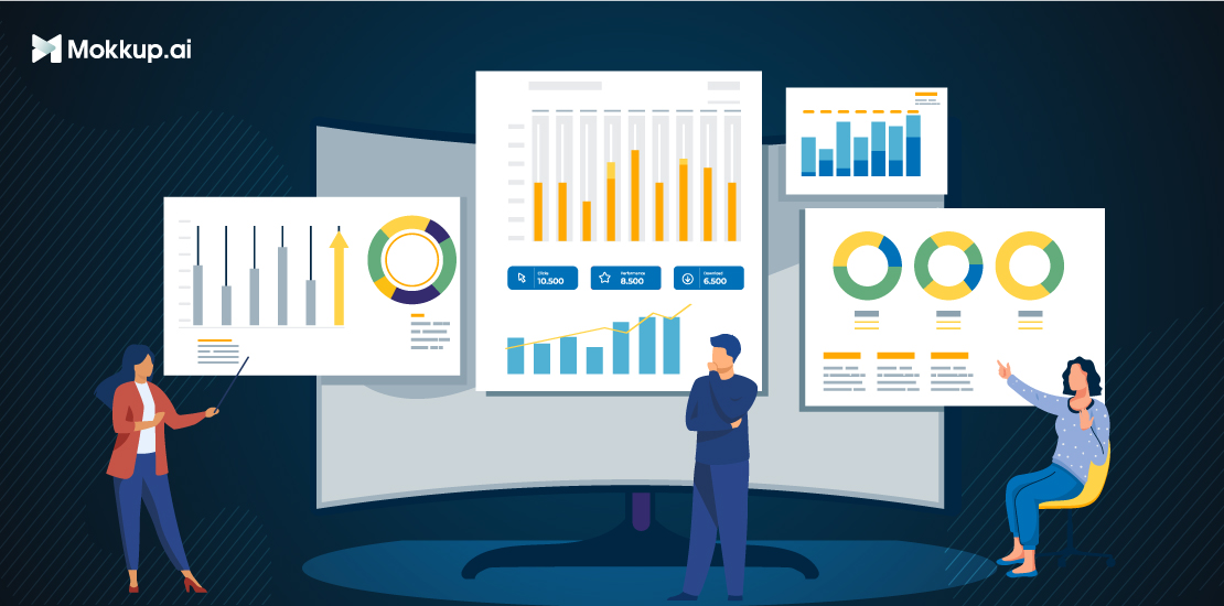
Data visualization uses visual elements like charts, graphs, or maps to represent data. It translates complex, high-volume, or numerical data into a visual representation that is easier to process. Data visualization tools improve and automate visual communication for accuracy and detail. You can use the visual representations to extract actionable insights from raw data.
Table of Contents
- Why is Data Visualization Important?
- Categories of Data Visualization
- Understanding The Importance Of Data Visualization
- How Data Visualization Enhances Data Insights
- The Role of Data Visualization in Business Intelligence
Why is Data Visualization Important?
- Finding the best values by comparing numbers in google sheets is challenging and takes a lot of effort. This is where making your data visually appealing can make your job simpler.
- Finding the highest number from a year's worth of data can be done quickly. It may only take a few seconds or even a fraction of a second. This can be achieved by plotting the data visually using widgets.
- Business stakeholders can evaluate reports on sales, marketing tactics, and product interest with the help of data analytics and visualization. The analysis shows which areas need work to improve productivity at the company. Profits subsequently increase as a result of this.
- The human brain processes images more quickly than table reports, as previously mentioned. Decision makers can gain new data insights quickly from real-time data. Data analysis can help them take the necessary steps for business growth.
- When we visualize large quantities of complex data, there are many chances for insight to come along. Business users can identify connections between the data and its causes through interactive data analysis, giving the data more context.
- Exploring data trends helps users focus on specific business areas that need attention. This enables them to make changes to improve their company. Good data visualizations make it easier to spot any errors in the data rapidly.
- Visualizations make it easier to identify incorrect data quickly. This helps eliminate it from the data set. Incorrect data can lead to the wrong course of action being recommended.
Categories of Data Visualization
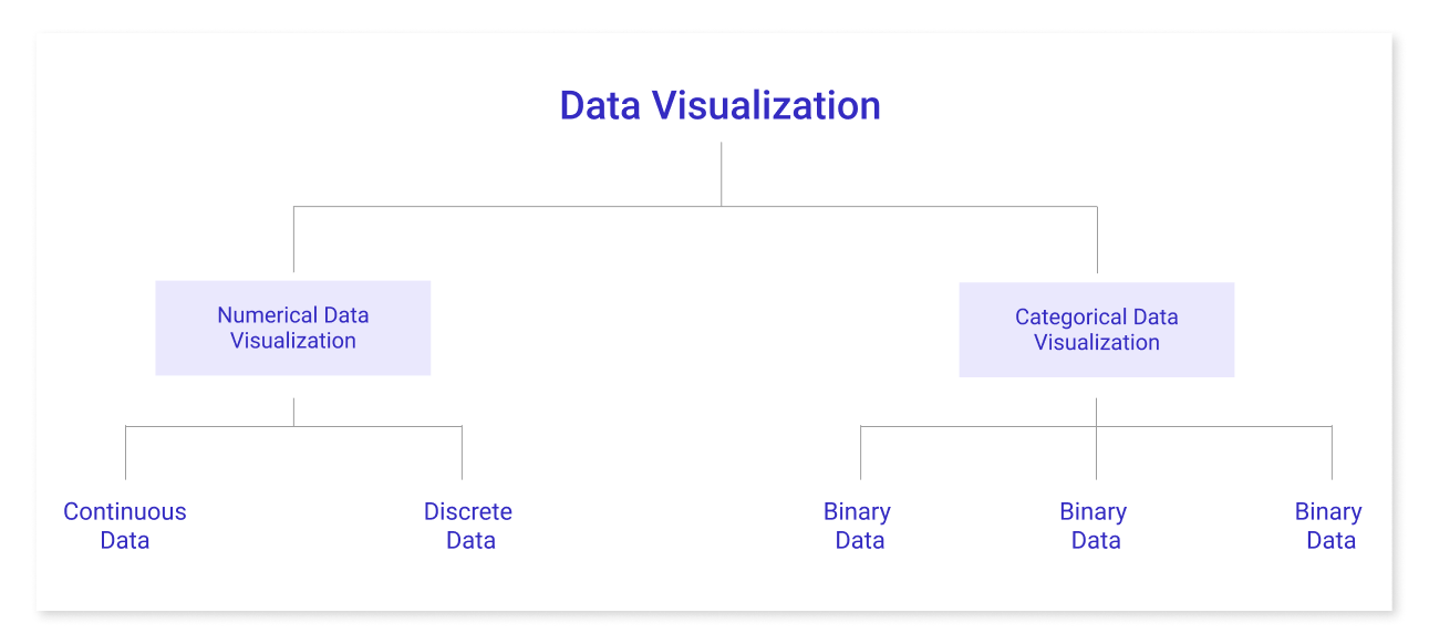
Data analysis is essential for market research. It enables us to visualize numerical and absolute data. This helps to make insights more effective and reduces the risk of analysis paralysis. Thus, the following type of data visualization exists:
1) Numerical Data Visualization
The term Numerical Data Visualization also applies to numerical statistics. Data usually represents an amount, such as height, weight, age, etc., and is referred to as numerical data. The simplest method for visualizing data is through numerical methods. It is often used to assist others in understanding sizable data sets and unorganized numbers in a way that makes it simpler to comprehend and put into practice.
Numerical data is categorized into two categories:
- Continuous Data – This can be classified or confined. (For example, height measurements).
- Discrete Data – It is not "continuous" data of this type. (Example: Number of cars or children a household has). Charts and numerical values are visualization techniques that are used to visualize numerical data. Pie charts, bar charts, averages, scorecards, etc., are some examples.
2) Categorial Data Visualization
Data with categories is also referred to as qualitative data. Any data where the data typically shows groups is considered categorical data. It is made up only of categorical variables, which are used to indicate traits like a person's rank, gender, etc. Visualizing categorical data highlights important concepts, makes links, and provides context. Three groups are used to classify categorical data:
- Binary Data – This division is dependent on place. (Example: Agrees or Disagrees).
- Nominal Data – Here, categorization is dependent on characteristics. (For example, Male or Female).
- Ordinal Data – It classifies things according to the details about the ordering. (For example, timelines or processes). Graphics, Diagrams, and Flowcharts are the visualization methods used to represent categorical data. Examples include venn diagrams, word clouds, and sentiment mapping.
Understanding The Importance Of Data Visualization
The following are some advantages of data visualization:
1. Making strategic decisions
Important stakeholders and upper management use data visualization to analyze data usefully. They save time by analyzing data more quickly and by being able to see the wider picture. For instance, they can find trends, recognize patterns, and acquire knowledge to stay one step ahead of the competition.
2. Enhanced client support
Data visualization exposes customers' demands and desires through graphical representation. It can help you pinpoint areas where your customer service is lacking, strategically improve your goods and services, and reduce operational inefficiencies.
3. Higher levels of engagement among employees
Data visualization tools can effectively communicate data analysis results to a large team. Together, the group can view data to create shared objectives and strategies. Using visual analytics, they may gauge objectives, track advancement, and boost team morale. For instance, a sales team collaborates to raise the sales bar chart's height in a single quarter.
How Data Visualization Enhances Data Insights
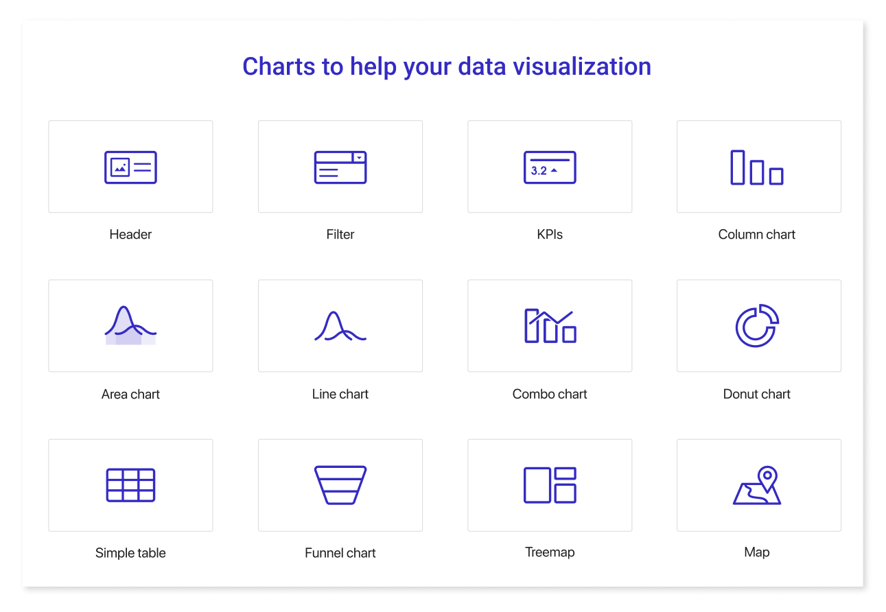
Data visualization involves handling and converting large amounts of data into useful images using widgets. We need the best software tools to connect to various data sources, including files, Web API data, and data-centric sources, to accomplish our goal.
Organizations should choose the most suitable data visualization tool for their needs. This will ensure the best results from data visualization. At the very least, the use case must allow interactive visual creation, adaptable links to data sources, data visualization design, automated data refreshing, sharing of visuals with others, secured access to data sources, and tableau public. Thanks to these features, you can utilize your info to the fullest extent.
Time savings and improved insights: You can save time and gain better insights into your data by using a data visualization tool that streamlines the data analysis process and graphically displays findings. This makes it simpler for you to make informed decisions.
The Role of Data Visualization in Business Intelligence
Since all industries can benefit from making data easier to comprehend, data visualization has significance in almost every career, regardless of the industry you find yourself in.
It is important for big data projects, whether a teacher uses it to examine test results, or a computer scientist uses it to find new developments in artificial intelligence. Some of the good examples of data visualization are listed below-
- Sales and marketing teams monitor web traffic sources: They also observe traffic patterns. Finally, they look for ways to support the company's revenue-generation efforts. It is simple to see how the ups and downs of web traffic link to sales and marketing efforts when data is visualized for sales.
- Finance: Professionals in the finance industry can use free tools to track the outcomes of their investment decisions when choosing whether to buy or sell an asset.
- E-Commerce: A marketing team can predict purchasing behaviors by monitoring consumer interest. Ensure the company has enough stock to fulfill future consumer demand; inform the production and inventory teams about this. They can use this data to plan sales and other promotional activities.
The typical sales cycle, from a customer's initial website visit to their final purchase, is another component of analytics. A company's marketing team can predict future sales. This is based on the number of on-site visits. The prediction is based on the assumption that the typical consumer completes their sales cycle within two weeks.
Conclusion
The presentation of data using data visualization would make it easier to identify patterns and boost efficiency. Understanding the patterns could help in spotting opportunities and avoid negative ones. Additionally, Mokkup.ai can assist with the visual representation of how your dashboard will look.
Prompt it. Wireframe it with Mokkup.ai.
