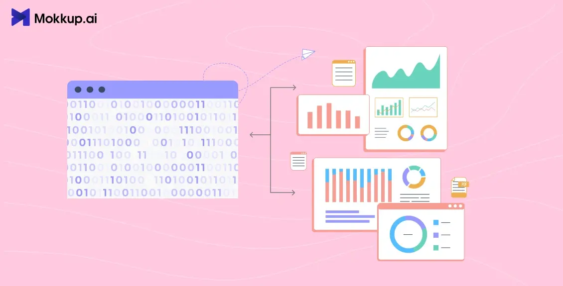
Businesses have more data than ever, but making sense of it still hasn't become easier. Teams spend hours pulling numbers from different systems. By the time a report is finalized, the situation on the ground has already shifted.
That's the pain point modern organizations are dealing with, and the problem isn't that data is scarce. It's that the insights are buried. And this is exactly the problem a business intelligence dashboard is built to solve.
It turns raw data into visual, interactive, and real-time insights to fill the gap between data and decision-making. This blog breaks down how it does so.
Table of Contents
- What is a Business Intelligence Dashboard?
- Why Businesses Struggle Without Dashboards?
- Key Components of a BI Dashboard
- How Business Intelligence Dashboards Transform Analytics?
- Best Practices for Designing Business Intelligence Dashboards
What is a Business Intelligence Dashboard?
Simply put, a business intelligence dashboard acts as a control panel for your organization. It lets leaders see their most important metrics in one place without looking through dozens of spreadsheets.
But a dashboard isn’t just a pretty interface. A well-designed BI dashboard combines the following components to help businesses move from data to decisions.
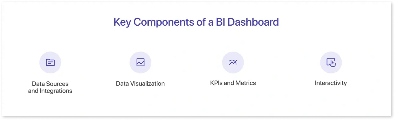
- Data integration: It pulls data from multiple systems like ERP, CRM, and cloud warehouses.
- Data visualization tools: Good Business intelligence dashboards are a medium for visualizing data by transforming complex information into clear charts, maps, and graphs.
- KPIs and metrics: BI dashboards combine KPIs and metrics that align with actual business goals instead of unnecessary vanity measures.
- Interactivity: They also offer the ability to filter, drill down, and explore “what-if” scenarios.
While static reports only tell you what happened last month, dashboards in business intelligence show you what’s happening right now and where things are heading.
Why Businesses Struggle Without Dashboards?
Regardless of the industry, data acts as a fuel for transforming and modernizing businesses. However, this data is becoming bigger daily, making it difficult for firms to analyze it and generate actionable insights.
According to IDC, the global datasphere is about to reach 175 zettabytes. That’s an amount no organization can handle easily. Executives rely on partial views or cherry-picked reports without the right systems, making decision-making inconsistent. On the other hand, teams that do attempt to analyze the full dataset often spend more time preparing it than interpreting it. In fact, a Forbes-featured survey found that nearly 80% of a data scientist’s work goes into data preparation alone.
This significantly affects fast-moving industries, as by the time a manual report lands on someone’s desk, the market has already moved on. Take the retail industry, for example. The lack of real-time business intelligence insights can be brutal there. Overordering can lead to wasted inventory and markdown losses, while underordering can leave shelves empty during peak demand. This is why BI in retail industry has exploded.
A dashboard in business intelligence solves most of these issues. It consolidates the scattered data into a single, real-time view, reducing preparation time and errors. Instead of waiting for static reports, leaders can track KPIs, spot trends, and respond to changes as they happen.
Key Components of a BI Dashboard
The key components of a dashboard are the main reasons it becomes efficient in transforming analytics for businesses. Let’s review them one by one:
Data Sources and Integrations
Business intelligence dashboards are just fancy visuals without a reliable data source. For example, a marketing dashboard that only pulls ad spend data but ignores customer lifetime value can miss the bigger picture. Thus, strong BI dashboards connect across detailed data sources like CRM, ERP, social analytics, and even IoT devices.
Data Visualization
Charts are the language of dashboards. But choosing the right type matters. While line charts best show trends, donut charts could work better to show category shares. Thus, it is important to implement the right practices of data visualization, such as knowing when to use a line chart versus an area chart, so your dashboard communicates insights clearly.
KPIs and Metrics
Dashboards live or die by the quality of their KPIs. For example, important KPIs for a retail dashboard aren’t only total sales, but also sales per square foot and stock turnover rate. Those tell the real story. Thus, it's important to include the right metrics that can offer workable steps for your business.
Interactivity
Interactive elements make a data dashboard better than a static report and invite higher participation. Elements like filters, drill-downs, and dynamic views let managers explore the data themselves instead of waiting for IT teams.
How Business Intelligence Dashboards Transform Analytics?
Turning raw data into confident decisions isn’t an instant action but a process. And this is precisely where Business Intelligence Dashboards make the difference. They reshape how organizations think about analytics.
Here’s what that journey looks like in practice.
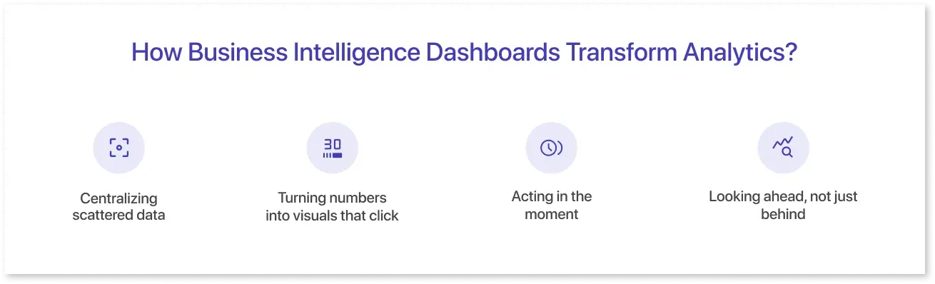
Centralizing scattered data
All kinds of businesses suffer from pulling numbers from ten different tools, only to argue about which version is “the right one.” A dashboard fixes that by pulling everything into one view. It establishes a single source of truth, so the conversation shifts from “What’s correct?” to “What do we do about it?”
Turning numbers into visuals that click
Rows of figures rarely spark action. But put the same information into a line chart or heat map, and patterns jump out instantly. This is why dashboards are built to make trends, abnormalities, and risks visible at a glance.
Acting in the moment
The biggest shift comes with real-time updates provided by BI dashboards. When a supply chain manager can see delivery delays before they snowball or a marketer can cut an ad that’s burning budget within hours,.decisions stop being reactive and start being proactive.
Looking ahead, not just behind
Modern dashboards don’t stop at reporting. With predictive and prescriptive analytics layered in, they suggest what’s likely to happen next and even suggest actions accordingly. Retail is a great example, where some business intelligence dashboard examples now forecast seasonal demand and guide inventory allocation with surprising accuracy.
Like that, Business Intelligence Dashboards take companies from data to decisions, while transforming their analytics simultaneously.
Best Practices for Designing Business Intelligence Dashboards
Not all dashboards are equal. Some confuse more than they clarify. Here are practices from successful deployments:
1. Define the Right KPIs
Too many businesses build dashboards that measure everything, which means nothing. Tie metrics directly to business objectives. For example, a finance dashboard template should spotlight cash flow and liquidity, not vanity measures.
2. Clarity and Usability First
Design in dashboards isn’t decoration, but a function too. This is why, its important to follow standard dashboard design principles for analysts to deliver clear layouts, consistent visuals, and highlight what matters most.
3. Mobile-Friendly Dashboards
Executives don’t always sit at desks. With hybrid work, dashboards need to be responsive and mobile-ready. Today, mobile accessibility determines the adoption of all data visualization tools, platforms, and software.
4. Data Governance and Quality
A huge number of organizations struggle with unreliable dashboards due to poor data governance. This struggle directly affects the adoption of a dashboard in business analytics. Thus, clean data pipelines and governance policies are non-negotiable. It is also equally important to avoid common BI implementation mistakes to ensure the dashboards turn out reliable and widely usable.
5. Adapt to AI and Emerging Trends
Generative AI is making dashboards conversational. Instead of manually clicking through filters, users can ask: “Show me churn rate for Q2 in North America” and instantly get a chart. As Google’s AI Overview changes how people interact with search, expect future of data visualization to lean further into natural language queries.
Conclusion: From Data to Decisions
Data is no longer a competitive advantage by itself, as everyone has it. How fast and how well you turn that data into action matters more now. That’s where a business intelligence dashboard makes the difference. From centralizing data to visualizing it, from enabling real-time decisions to predicting what’s next, dashboards have moved from option to necessity.
This is exactly what Mokkup.ai is built for. It helps teams design and experience business intelligence dashboards that actually drive decisions, not just display data. If you’re ready to see how your data can start working harder for you, give Mokkup a try today.
Frequently Asked Questions
A business intelligence dashboard pulls data from multiple systems, organizes it, and uses data visualization tools to highlight patterns. Instead of rows of numbers, leaders see clear visuals that point directly toward actions.
Business intelligence dashboards help teams act faster by showing real-time metrics and clear visuals instead of outdated reports. This helps leaders spot risks early, identify opportunities, and make proactive choices that improve department efficiency and outcomes.
Strong BI dashboards combine reliable integrations, clear data visualization tools, and well-defined KPIs. Additionally, they provide interactivity with filters and drill-downs.
Almost every department benefits. Marketing tracks campaigns in real time, finance monitors cash flow, and supply chains flag delays instantly.
Mokkup.ai simplifies the process of creating a business intelligence dashboard by providing ready-to-use templates and AI-generated wireframes. Teams can customize and collaborate on different business intelligence dashboard examples to align on what works before full-scale development. Once finalized, they can export these dashboard wireframes to their preferred BI tools.
Prompt it. Wireframe it with Mokkup.ai.
