
What Are Business Intelligence Dashboards?
Business Intelligence (BI) dashboards are tools that help businesses see their data in a simple manner. They turn complex numbers into charts, graphs, and reports so teams can track performance, spot trends, and make quicker decisions.
Instead of digging through spreadsheets, a BI dashboard gives an overview of critical business information in one place.
Table of Contents
- How Can BI Dashboards Help Your Business?
- What are the Key Elements of a BI Dashboard?
- What’s the Difference Between BI Dashboards and BI Reports?
- How to Create Business Intelligence Dashboards?
- Best Practices for Creating BI Dashboards
- Business Intelligence Dashboard Examples
- How Can BI Dashboards Benefit Your Business?
How Can BI Dashboards Help Your Business?
A weather app shows temperature, humidity, and forecasts to help people plan their day. Similarly, a Business Intelligence dashboard provides real-time sales, marketing, finance, and operations data, helping businesses stay informed.
It provides a clear visual summary in one place, making it easier to track progress, spot issues early, and make wise choices to achieve business goals effectively.
Here are some ways Business Intelligence (BI) dashboards can help your business:
- Data Consolidation: BI dashboards combine data from several sources (CRM, ERP, marketing tools, etc.) into a single, consolidated view, removing data silos.
- Customization for Different Users: Different teams, such as executives, sales, finance, and human resources, can have personalized dashboards adapted to their individual requirements.
- Predictive Insights: Advanced BI dashboards foresee trends using machine learning and analytics, allowing businesses to plan for future obstacles.
- Mobile Accessibility: Many BI dashboards are cloud-based and mobile-friendly, allowing users to gain vital information while on the go.
- Compliance and Data Security: BI dashboards help businesses in meeting regulatory metrics and data security regulations.
Businesses that use BI dashboards in their daily operations can gain visibility, boost strategic planning, and remain ahead of the competition.
What are the Key Elements of a BI Dashboard?
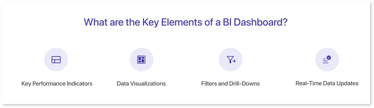
A business intelligence dashboard includes several key elements that help businesses track performance and make informed decisions:
- Key Performance Indicators (KPIs): These are the most critical metrics, such as revenue, customer retention, or sales growth, that show a business's performance.
- Data Visualizations: Charts, graphs, and tables transform raw data into understandable visuals, making trends and patterns clearer.
- Filters and Drill-Downs: Users can refine data by time, region, or category and dive deeper into specific details to gain more insights
- Real-Time Data Updates: Live updates ensure that the dashboard constantly displays the most recent information, allowing quick and accurate decision-making.
These elements work together to create a complete and user-friendly perspective of business performance, allowing teams to remain informed and proactive.
What’s the Difference Between BI Dashboards and BI Reports?
BI dashboards and BI reports both help businesses analyze data, but they serve different purposes. Dashboards offer real-time, interactive insights with visual elements like charts and graphs, making them ideal for quick decision-making. In contrast, reports are static, structured overviews generated at regular intervals, offering detailed analysis for compliance and historical comparisons.
Here’s a comparison table highlighting the key differences between BI Dashboards and BI Reports:
|
Feature |
BI Dashboards |
BI Reports |
|
Nature |
Interactive and real-time |
Static and periodic |
|
Data Updates |
Live, continuously updated |
Generated at specific intervals (daily, weekly, monthly) |
|
Visual Elements |
Charts, graphs, and interactive visuals |
Tables, text-based analysis, and structured reports |
|
Purpose |
Quick insights for decision-making |
In-depth analysis for compliance and historical comparisons |
|
Customization |
Users can filter, drill down, and modify views |
Detailed reporting, regulatory compliance, and historical analysis |
Both BI dashboards and BI reports play essential roles, with dashboards giving real-time insights and reports providing deeper, structured analysis for long-term strategy.
In simple terms, dashboards are interactive and real-time, whereas reports are detailed and static; both are useful depending on the business need.
How to Create Business Intelligence Dashboards?
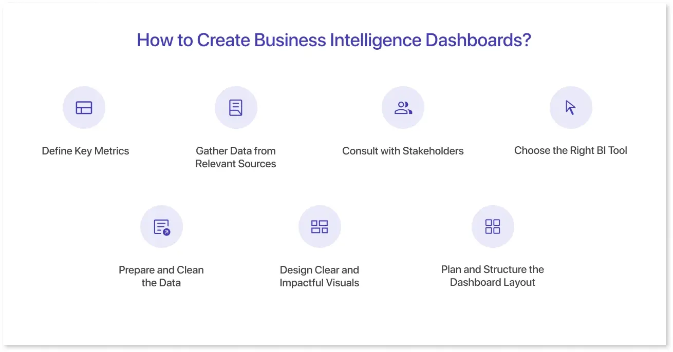
A well-designed BI dashboard helps businesses track key metrics, analyze trends, and make informed decisions. Follow these steps to build an effective BI dashboard:
1. Define Key Metrics:
Determine the most critical KPIs that are consistent with your business goals. These should provide helpful information for decision-making.
2. Gather Data from Relevant Sources:
Collect data from databases, business applications, or third-party platforms to ensure thorough research.
3. Consult with Stakeholders:
Work with your team and key decision-makers to understand their requirements and ensure the dashboard meets their needs.
4. Choose the Right BI Tool:
Select a BI dashboard tool that supports your organization’s data needs, integrates well with existing systems, and is easy to use. Mokkup allows you to export dashboard wireframes directly into BI tools like Power BI and Tableau, streamlining the transition from design to development.
5. Prepare and Clean the Data:
Organize the gathered data by removing inconsistencies, duplication, and errors to prepare it for analysis.
6. Design Clear and Impactful Visuals:
Use charts, graphs, and other visual components to convey data in a clear and understandable manner. Selecting the appropriate visualization improves clarity and understanding.
7. Plan and Structure the Dashboard Layout:
Arrange the visuals in a logical flow for easy navigation. Using a dashboard wireframing tool like Mokkup helps create a structured layout before development, ensuring an intuitive and user-friendly dashboard design.
Best Practices for Creating BI Dashboards
A well-designed BI dashboard should offer quick and simple insights. Follow these best practices to make impactful data visualizations:
- Keep it simple and focus on key indicators that align with business objectives.
- Ensure that the data is clean and checked for accuracy.
- Use appropriate visualizations to improve clarity.
- Use data storytelling to make insights more meaningful.
- Avoid unnecessary widgets and reports that do not provide value.
By following these best practices, you can create a BI dashboard that is insightful, user-friendly, and drives better decision-making.
Business Intelligence Dashboard Examples
BI dashboards are versatile and can be used across various industries. Here are some examples of how they are used in different sectors.
1. Sales Dashboards:
The sales dashboard helps track key real-time sales metrics like revenue, targets, and pipeline progress. It also gives insights into customer behavior, team performance, and sales trends, allowing businesses to efficiently identify opportunities, optimize strategies, and drive revenue growth.
2. Marketing Dashboards:
A marketing dashboard is a visual tool that tracks key marketing metrics such as campaign performance, website traffic, lead generation, and customer engagement. It provides real-time insights into marketing initiatives, helping teams measure ROI, identify trends, and optimize strategies for better audience reach and conversion rates.
3. Finance Dashboards:
A finance dashboard gives real-time information on critical financial parameters such as sales, expenses, cash flow, and profit margins. It assists firms in monitoring financial health, tracking budget performance, and identifying patterns, allowing for more informed decision-making for cost minimization and long-term growth.
4. HR Dashboards:
An HR dashboard monitors key workforce metrics such as employee performance, recruitment status, retention rates, and attendance. It offers insights into workforce trends, allowing HR departments to optimize hiring, increase employee engagement, and assure effective workforce management.
5. Service Desk Dashboards:
A service desk dashboard provides a real-time view of key support metrics such as ticket volume, resolution time, customer satisfaction, and agent performance. It helps teams track open and closed tickets, prioritize issues, and improve response times, ensuring efficient IT support and a better user experience.
6. Customer Support Dashboards:
A customer support dashboard tracks key metrics such as ticket resolution time, customer satisfaction, and response rates. It helps teams to measure support efficiency, identify frequent issues, and improve customer service.
7. Supply Chain Dashboards:
A supply chain dashboard offers insights into inventory levels, order fulfillment rates, shipment times, and supplier performance. It helps businesses to streamline logistics, reduce delays, and increase overall supply chain efficiency.
8. Healthcare Dashboards:
A healthcare dashboard monitors patient admissions, treatment outcomes, resource availability, and staff performance. It allows hospitals and clinics to improve patient care, streamline operations, and manage resources more effectively.
These business intelligence dashboards help organizations across industries turn complex data into useful insights, allowing for more informed decisions and increased productivity.
How Can BI Dashboards Benefit Your Business?
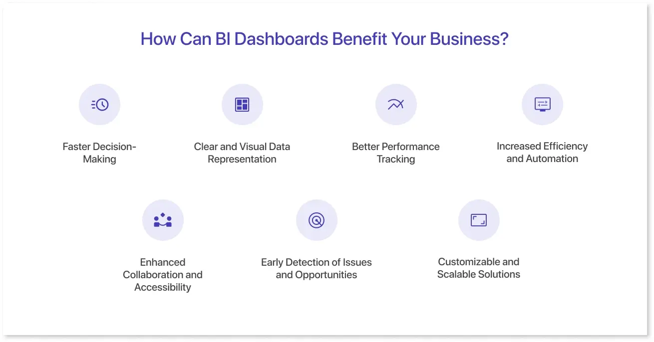
Business Intelligence (BI) dashboards help firms make better choices by providing real-time, visual insights into key metrics like sales, marketing, finance, and operations. Here’s how they add value to your business:
1. Faster Decision-Making:
BI dashboards deliver real-time data updates, allowing businesses to respond quickly to market changes, customer requests, and operational issues. Instead of waiting for periodic reports, decision-makers can access information instantly.
2. Clear and Visual Data Representation:
Dashboards offer complex data in simple charts, graphs, and tables, eliminating the need to search through spreadsheets. They also make it easier to see patterns, trends, and inconsistencies at a glance.
3. Better Performance Tracking:
Organizations can use key performance indicators (KPIs) to track business growth. BI dashboards allow managers to compare performance to targets and take corrective steps as needed.
4. Increased Efficiency and Automation:
BI dashboards automate data collection and reporting, reducing manual work, minimizing errors, and helping employees spend less time gathering data and more time analyzing and acting on insights.
5. Enhanced Collaboration and Accessibility:
Teams across several departments can access a centralized dashboard, ensuring everyone works with the same updated data. Cloud-based dashboards allow remote teams to stay informed and aligned.
6. Early Detection of Issues and Opportunities:
Businesses monitoring data can uncover real-time risks, inefficiencies, and growth possibilities. This promotes proactive problem-solving and strategic planning.
7. Customizable and Scalable Solutions:
BI dashboards can be designed to meet the demands of various users, ranging from executives looking for high-level overviews to analysts delving into specific data points. They also expand as the company grows, allowing for more significant data volumes and complicated analytics.
By offering a real-time, comprehensive view of business data, BI dashboards help firms make data-driven choices, increase efficiency, and remain ahead of the competition.
Conclusion
A well-designed business intelligence dashboard helps businesses turn raw data into actionable insights. By using the right dashboards for business intelligence, companies can track key performance metrics, identify trends, and make informed decisions. Whether it’s a sales, marketing, or finance dashboard, selecting the right business intelligence dashboard software or tool ensures efficient data visualization and better decision-making.
Following best practices, such as keeping it simple, using clean data, and applying the right visualizations, will make your BI dashboards more effective and user-friendly.
Frequently Asked Questions
To create a dashboard, define key metrics based on business goals, collect and clean data, and choose a BI tool like Power BI or Tableau. Design visuals such as charts and tables for clarity, then organize the layout for easy navigation and actionable insights.
Several free BI tools help create dashboards without a subscription. Google Data Studio integrates with Google products, Power BI (free) offers strong visualizations, and Tableau Public allows interactive dashboards but requires public sharing.
-
Operational Dashboards: Track daily activities (e.g., Service Desk Dashboard).
-
Strategic Dashboards: Show long-term business goals (e.g., Finance Dashboard).
-
Analytical Dashboards: Help analyze trends and patterns (e.g., Marketing Dashboard).
-
Tactical Dashboards: Assist decision-making for specific departments (e.g., Sales Dashboard).
A Key Performance Indicator (KPI) is a measurable value that tracks business performance. It helps monitor progress, identify trends, and guide decision-making. Examples include sales revenue, customer satisfaction score, and response time. Effective KPIs should be specific, measurable, and relevant to business goals.
Prompt it. Wireframe it with Mokkup.ai.
