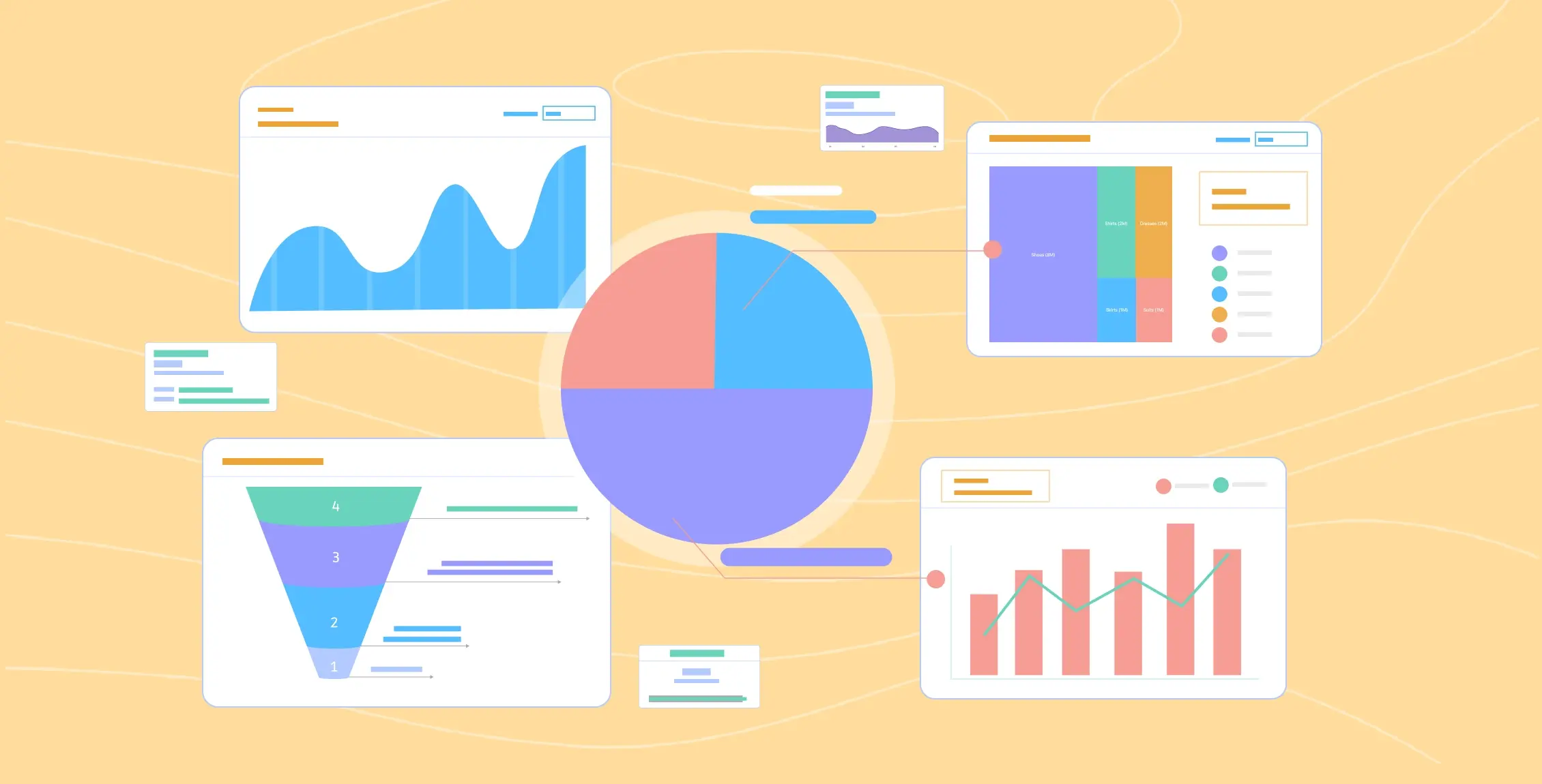
What is Data Visualization?
Data visualization definition is more than charts and graphs—it is a powerful way to tell a story. Raw data can be overwhelming, but when represented visually, patterns, relationships, and insights become easier to identify. A well-designed visualization translates complex data into an understandable format, enabling decision-makers to grasp key information quickly.
Effective data visualization goes beyond displaying numbers—it tells a story. Well-designed visuals make complex datasets accessible and engaging, allowing users to interpret and act on data more effectively. Clear, well-structured visuals simplify intricate data, making it easier for decision-makers to identify trends, outliers, and key insights. This leads to faster, more confident decision-making across various industries.
One common myth is that data visualization is only for analysts. In reality, it benefits everyone—from executives needing quick insights to marketers tracking campaign performance. Another misconception is that more detail always leads to better understanding. In truth, overly complex visuals can obscure key insights instead of clarifying them. Bad data visualization, such as misleading scales or cluttered charts, can distort the message and lead to incorrect conclusions.
The rise of AI-powered tools has revolutionized data visualization. Automation simplifies the process by generating charts, identifying patterns, and even providing smart insights without manual intervention. Tools like Tableau and Power BI offer AI-driven features that suggest optimal chart types based on data trends, making visualization more accessible to non-experts.
Table of Contents
- Principles of Good Data Visualization
- Types of Data Visualization
- The Data Visualization Process
- Tools for Data Visualization
- Data Visualization Best Practices
- Common Pitfalls and How to Avoid Them
Principles of Good Data Visualization
Simplicity is key to effective data visualization. Overly complex visuals can obscure insights, whereas minimalist designs improve comprehension. According to SkillCamper, a well-structured visualization should follow a narrative arc—introducing the problem, presenting data-driven insights, and leading to actionable conclusions.
A compelling narrative adds context to data visualization. Instead of merely presenting numbers, an effective visualization guides the audience from introduction to conclusion, helping them understand the key insights in a structured manner. Colors impact how data is perceived. Blue and green are often associated with trust and stability, while red can indicate urgency or warnings. Using too many colors can be distracting, so a well-chosen color scheme enhances readability without overwhelming the viewer.
Extraneous elements like 3D effects, shadows, and gradients can make visuals harder to read. A study by Harvard’s Rafalab emphasizes that a clean and simple design ensures the focus remains on the data rather than decorative distractions.
Types of Data Visualization
Choosing the right type of visualization depends on the nature of your data and the insights you want to convey. Below are some of the most common data visualization types:
1. Comparison Visualizations
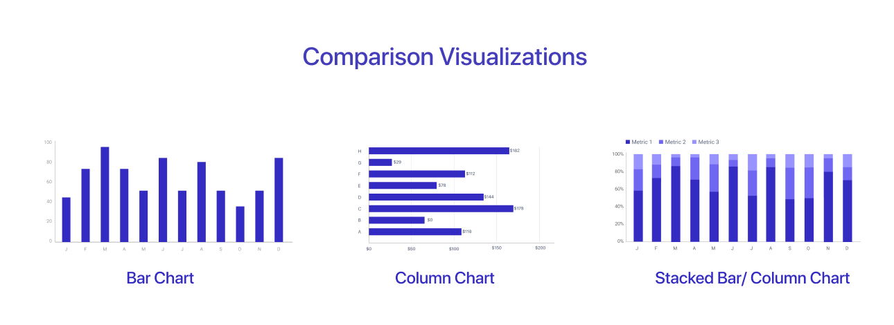
Used to compare values across categories.
- Bar Chart – Ideal for comparing discrete categories or groups.
- Column Chart – Similar to a bar chart but uses vertical bars.
- Stacked Bar/Column Chart – Shows the composition of a whole while comparing multiple groups.
2. Trend and Time-Series Visualizations
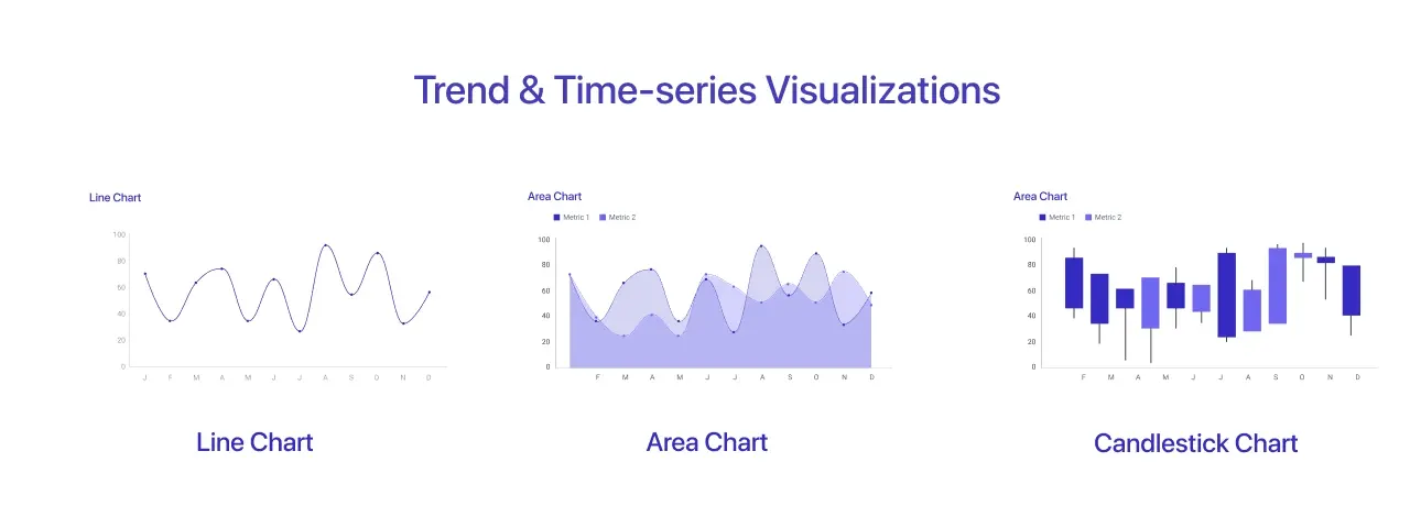
Used to show changes over time.
- Line Chart – Best for displaying trends and patterns over continuous intervals.
- Area Chart – Similar to a line chart but emphasizes volume beneath the curve.
- Candlestick Chart – Used in financial data to show price movements over time.
3. Distribution Visualizations
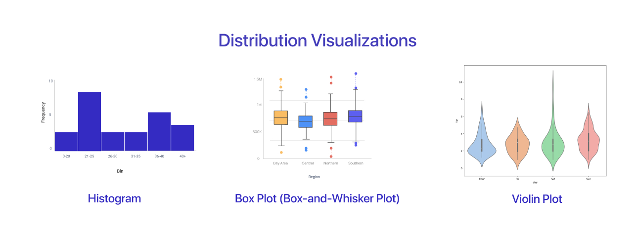
Used to display how data is spread across different values.
- Histogram – Shows frequency distribution in continuous data.
- Box Plot (Box-and-Whisker Plot) – Summarizes data distribution, highlighting median, quartiles, and outliers.
- Violin Plot – Combines a box plot and density plot to show data distribution.
4. Relationship and Correlation Visualizations
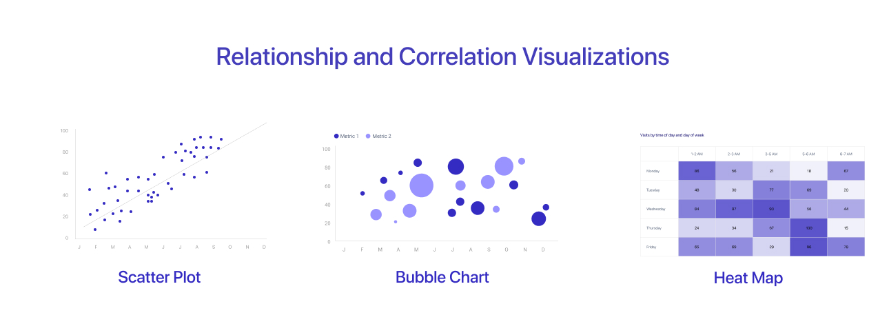
Used to show relationships between variables.
- Scatter Plot – Helps identify correlations between two numerical variables.
- Bubble Chart – An enhanced scatter plot where the size of bubbles represents a third variable.
- Heat Map – Uses color gradients to indicate variations in data values.
5. Part-to-Whole Visualizations
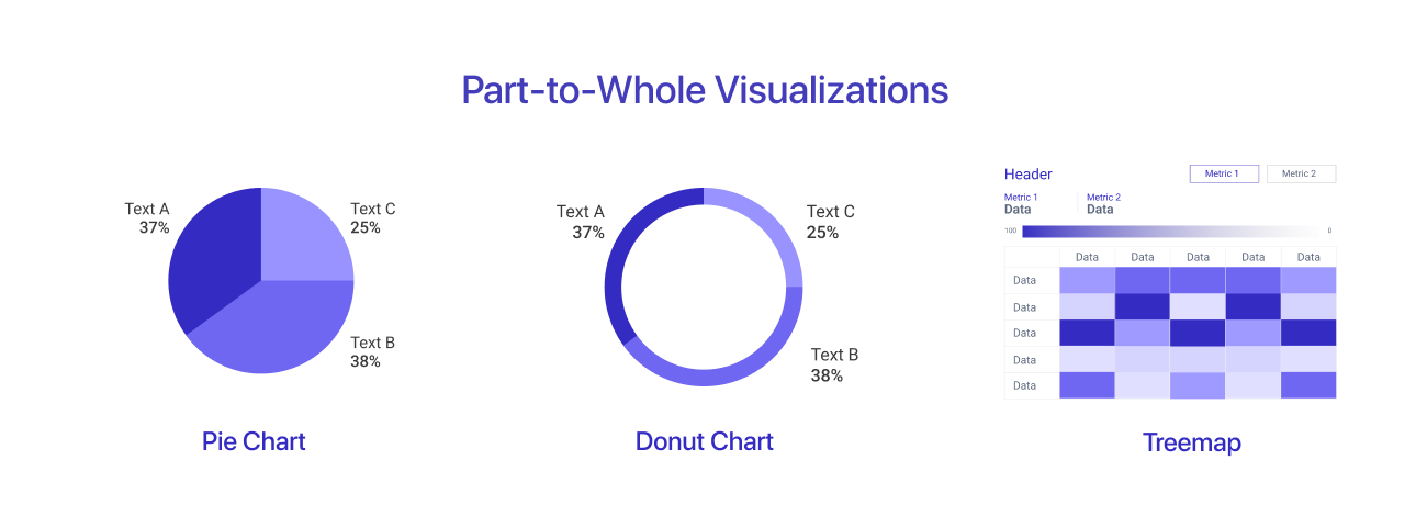
Used to show proportions and percentages.
- Pie Chart – Best for illustrating simple percentage breakdowns.
- Donut Chart – Similar to a pie chart but with a blank center for additional information.
- Treemap – Displays hierarchical data using nested rectangles.
6. Geospatial Visualizations
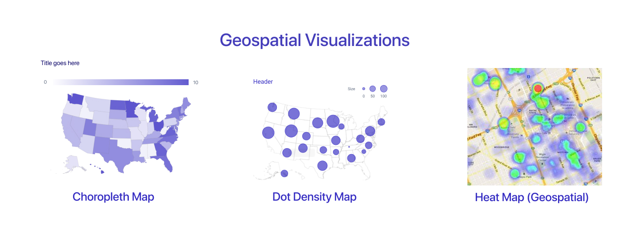
Used to represent data across geographic locations.
- Choropleth Map – Uses different shades of color to represent values across regions.
- Dot Density Map – Places dots on a map to indicate frequency or density.
- Heat Map (Geospatial) – Uses color intensity to show data concentration on a map.
7. Hierarchical Visualizations
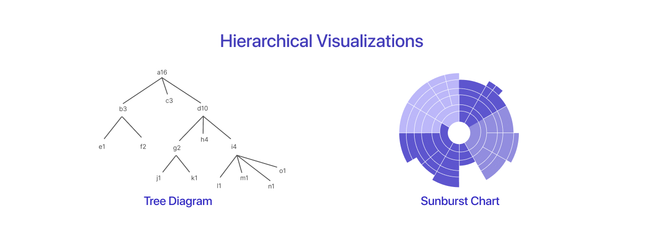
Used to display data with parent-child relationships.
- Tree Diagram – Represents hierarchical structures like organizational charts.
- Sunburst Chart – A circular version of a tree diagram showing hierarchical levels.
Selecting the right visualization type ensures that your data is presented clearly and effectively to the intended audience.
The Data Visualization Process
Before visualizing, analyze the dataset to identify patterns, anomalies, and relationships that will shape your visuals. Different stakeholders require different levels of detail. Executives prefer high-level summaries, while data scientists need granular insights.
Different audiences require different levels of detail. Executives prefer high-level insights, while data scientists may need granular breakdowns. Tailoring visuals to the audience enhances their effectiveness. Data visualization is not a one-step task. A recent study by Tableau highlights that iteration allows for refining insights by continuously adjusting the representation of data. Additionally, interactive tools help users explore data dynamically to uncover deeper insights.
Accurate data is the foundation of effective data analysis and visualization. A report by Tableau emphasizes that cleaning and verifying data before visualization prevents misleading conclusions and ensures credibility. Furthermore, research from DataCamp suggests that visualization should be an evolving process involving testing different formats, refining insights, and adjusting based on feedback. Reliable data leads to meaningful visuals, so ensuring accuracy by cleaning, validating, and standardizing data before visualizing it is essential.
Tools for Data Visualization
Selecting the right data visualization tool depends on various factors, including the user’s technical expertise, the complexity of the data, and the level of interactivity required. Below is a breakdown of popular tools categorized by user type and functionality.
1. Tools for Analysts
These tools are designed for business professionals and analysts who need to create compelling visual reports and dashboards with minimal coding:
- Tableau – A powerful business intelligence tool that allows users to create interactive dashboards and reports with drag-and-drop functionality.
- Power BI – A Microsoft tool that integrates well with other Office products and offers robust data modeling, AI-powered insights, and seamless collaboration.
- Google Data Studio – A free web-based tool that enables users to create interactive dashboards and reports by integrating with Google services like Google Analytics, Google Sheets, and BigQuery.
2. Tools for Programmers
For users comfortable with coding, these libraries and frameworks provide greater flexibility and customization for data visualization:
- D3.js – A JavaScript library that enables developers to create highly interactive and customizable web-based visualizations using SVG, HTML, and CSS.
- Plotly – A library available in Python, R, and JavaScript that supports interactive visualizations, including 3D charts and dashboards.
- Matplotlib & Seaborn (Python) – Matplotlib is a foundational library for static, animated, and interactive plots, while Seaborn simplifies the creation of aesthetically pleasing statistical visualizations.
3. Tools for Interactive Web Visualizations
These tools help developers create interactive, web-based visual representations of data:
- Observable – A modern JavaScript-based platform that allows real-time collaboration and dynamic visualization using notebooks.
- Dash – A Python framework for building analytical web applications without needing extensive front-end development skills.
- R Shiny – A web application framework for R that enables users to turn analyses into interactive dashboards.
4. Low-Code/No-Code Options
For those without coding experience, there are platforms that make data visualization more accessible:
- Mokkup.ai – A cloud-based platform designed for quickly creating dashboard wireframes with customizable templates, making it easier to plan and visualize data-driven projects before development.
- Google Data Studio – Offers drag-and-drop dashboard creation with built-in data integrations.
- Canva – Primarily a design tool but includes features for creating simple charts and infographics.
These tools make interactive data visualization accessible to users who may not have programming expertise, allowing them to focus on insights rather than technical implementation.
Data Visualization Best Practices
Creating effective data visualizations requires adherence to best practices that ensure clarity, accuracy, and accessibility. Below are essential principles to follow to make your visuals more impactful.
1. Data Integrity and Accuracy
Ensuring the accuracy of your data is crucial for building trust in your visualizations. Misleading visuals, such as truncated y-axes or selective data representation, can distort insights and lead to incorrect conclusions. Always present data transparently, maintaining proportional scales and avoiding cherry-picking.
2. Consistency in Design
A well-designed visualization maintains coherence across charts, dashboards, and reports. Using a consistent color scheme, font style, and layout improves readability and ensures that stakeholders can easily interpret insights across different visual representations.
3. Accessibility in Visualization
Designing for inclusivity ensures that all users, including those with color blindness or visual impairments, can understand your data. Use high-contrast colors alternative text for images, and avoid relying solely on color to differentiate categories. Accessibility tools like color-blind simulations can help fine-tune your design.
4. Mobile-Friendly Visuals
With increasing reliance on mobile devices, optimizing your visualizations for smaller screens is essential. Responsive design techniques, simplified layouts, and adaptive scaling allow users to interact with data seamlessly on various devices, whether in an app or on a mobile website.
Related blog: The Business Goal of Data Visualization
Common Pitfalls and How to Avoid Them
Even with best practices in place, common mistakes can undermine the effectiveness of data visualization. Understanding these pitfalls and learning how to avoid them is key to creating clear and reliable visuals.
1. The Dangers of Overcomplication
More data does not always mean more clarity. Overloading visuals with too many elements can make them difficult to interpret. Instead, focus on highlighting the most critical insights, using clear labels, and avoiding excessive chart elements.
2. Misleading Visuals: The Fine Line
Data misrepresentation can lead to misinterpretation. Common mistakes include truncated bar charts, inconsistent scales, and exaggerated trends. To maintain credibility, ensure that data is displayed proportionally and provides a true representation of the underlying trends.
3. Data Overload
Providing too much information in a single visual can overwhelm viewers. Balance detail and clarity by using drill-down capabilities, summarizing key points, and breaking down complex datasets into multiple focused visuals rather than cramming too much into one chart.
Conclusion
Mastering data visualization involves more than selecting the right chart type—it requires careful consideration of clarity, accuracy, and storytelling. By following best practices and avoiding common pitfalls, you can create visuals that effectively communicate insights and drive better decision-making.
Effective visualization of data hinges on clarity, accuracy, and accessibility. Maintaining data integrity, ensuring consistency in design, and optimizing for accessibility and mobile use are key factors in creating impactful visuals. Avoiding common pitfalls like over-complication and misleading visuals enhances the effectiveness of data-driven storytelling.
Frequently Asked Questions
For simple, no-code visualizations, beginners can start with Google Data Studio or Mokkup.ai. If they're comfortable with spreadsheets, Excel and Google Sheets also provide basic charting tools.
The right chart depends on the data type and the story you want to tell. For comparisons, use bar charts; for trends, use line charts; for distributions, use histograms or box plots; and for relationships, use scatter plots.
No, many low-code/no-code tools like Mokkup.ai, Google Data Studio, and Canva allow users to create visualizations without coding. However, coding-based tools like D3.js and Python libraries offer greater customization.
Common pitfalls include using misleading scales, cluttered visuals, excessive use of colors, and selecting the wrong chart type, all of which can distort the message and confuse the audience.
Use color-blind-friendly palettes, provide clear labels and legends, and ensure interactive elements are easy to navigate. Accessibility features like alternative text and screen reader compatibility also help improve usability.
Prompt it. Wireframe it with Mokkup.ai.
