
Interpreting large datasets does not always seem straightforward. It can become downright impossible to discern insights that actually derive value for the business.
Well, data visualization tools are here to serve as personal translators for depicting cryptic datasets into digestible formats like charts, graphs, or images. This can be observed from the data visualization tools market's growth, valued at USD 8.90 billion in 2023 and projected to reach USD 22.85 billion by 2032, expected to grow at a CAGR of 11.08% from 2024 to 2032.
With organizations generating vast amounts of data, the need for visual data tools surges. Magic happens when you choose the best platform for data visualization.
In this article, we will delve into the top data visualization tools, their features, pros, and cons. Each tool is designed to beat the heat of data load and eradicate the need for intimidating spreadsheets.
Let's get started with understanding what data visualization is all about.
Table of Contents
- What is Data Visualization?
- What are Data Visualization Tools?
- 10 Best Data Visualization Tools
- How To Choose The Best Data Visualization Tool
What is Data Visualization?
In general terms, data visualization is the process of representing complex data in a digestible format, particularly charts, visuals, graphics, and infographics. Visual elements can help break down difficult data and develop relationships, which in turn help organizations make data-driven decisions.
When you use the right visual data tools, you can help the audience understand your data most meaningfully. You can extract insights that help relevant stakeholders make efficient, real-time decisions. Visual data tools can provide an accessible way to unfold trends, outliers, and patterns in large datasets, making it easy for non-technical audiences as well.
What are Data Visualization Tools?
Now that you understand data visualization, another question that arises is how the data will be automated.
The answer is to use tools and technologies! Numerous data visualization software and tools are available to make the work of data visualization designers easier.
Putting it into a definition, a data visualization tool is software that interprets massive datasets to develop an understanding of data for users. By supporting a variety of visual styles and preferences, it can input complicated data into a graphical set that makes the overall visualization seamless.
Pro tip: There are pre-built data visualization templates available on Mokkup.ai that make simple to complex visualizations possible.
10 Best Data Visualization Tools
Every platform comes with their own pros and cons. You need to choose the one that fits your needs. Here are the 10 Best data visualization platforms, and know about their capabilities and challenges before moving ahead:
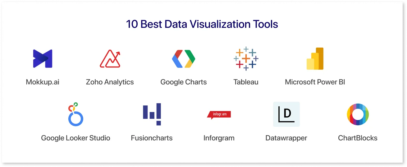
1. Mokkup.ai
Mokkup is an intuitive dashboard wireframing tool that BI analysts, developers, and data strategists often use to create compelling data visualizations. This tool has drag-and-drop capabilities to customize the dashboard using the extensive library of charts and visualizations. If you do not want to start from scratch, prebuilt templates can get you started with the project quickly.
Features:
- Wide array of industry-standard templates
- Custom elements with drag-and-drop capability
- Real-time commenting feature to engage with teammates.
- BI export to directly download files into Tableau & Power BI
- Workspace control for managing roles, accessibility, & permissions.
Pros:
- Save time in the visualization workflow.
- Gather real-time feedback to boost collaboration.
- Organize your workspace for smoother teamwork.
- Deliver analytics solutions faster.
Cons:
- Dependency on Team Buy-In
- Not a BI Tool itself
- Potential for duplication of work
2. Zoho Analytics
This is one of the AI data visualization tools that allows you to import Big Data from massive databases. It integrates online reporting services and business intelligence to extract meaningful insights and generate quick reports using all-in-one software.
Features:
- Can connect to 500+ databases
- As simple as dragging and dropping fields.
- Built-in data analysis studio to enrich unstructured data.
- Create dynamic & interactive dashboards with AI assistants.
Pros:
- Plenty of databases to create quick reports.
- Easy to share reports with teammates.
- Allows accessibility to mobile devices.
Cons:
- Massive amounts of data often create confusion.
- User onboarding requires work.
3. Google Charts
Google Charts is a popular free data visualization tool that can create pictorial and graphical visualizations. It offers visualizations coded with SVG and HTML5, zoom-in functionality, and unmatched cross-platform compatibility.
Features:
- It can run on browsers without additional plugins.
- Can be customized via CSS editing with an extensive set of options.
- Compatible with iOS and Android along with cross browser compatibility.
Pros:
- A variety of charts can be created
- Works with dynamic data with the integration of data sources like Google Sheets.
Cons:
- Limited support beyond tutorials.
- Low connectivity might affect visualization.
4. Tableau
This is a powerful data visualization software. By connecting to data sources, you can create various charts and visuals. Big companies use this tool because it offers many import options, from CSV to Google Ads that can be used in different settings.
Features:
- You can create a public version of a variety of infographics, enabling you to act on data.
- Creates visualizations from the evolving datasets with built-in intuitive products.
- Integrated with AI/ML capabilities and can be deployed on the cloud and on-premise as and when needed.
Pros:
- Provides limitless data exploration
- Easy to use and scale up
- Free public version available
Cons
- Paid version is a bit higher
- Performance issues with large datasets
5. Microsoft Power BI
Power BI is one of the easy-to-use tools to visualize data, which is available for on-premise and cloud infrastructure settings. It works by integrating data from multiple sources and bringing them to the OneLake data hub, where you can turn insights into impact.
Features:
- User-friendly report creation with AI capabilities, connecting to 100+ data sources.
- Infuses insights into the app by importing visuals from AppSource.
- Hundreds of report templates having a rich library of visuals like bars, slicers, map, funnel, and KPI.
Pros:
- Establish a single source of data.
- Free training sources
Cons:
-
Cannot work with multiple datasets.
6. Google Looker Studio
Looker is a fully customizable visualization tool that develops dashboards that are easy to access and share. With almost 600 partner connectors, it allows you to get data instantly without coding knowledge.
Features:
- Designed with an intuitive web interface, having highly customizable styling, color themes, and layout options.
- Robust library of report templates to create endless visualizations.
- Report embedding & easy shareability through Google Drive.
Pros:
- Simplifies the report generation process
- Embed and collaborate with your team in real-time.
Cons:
- Slow loading times for the reports
- No in-memory engine.
7. Fusioncharts
This is a JavaScript option for a data visualization AI tool that develops desktop and mobile dashboards. It is a widely adopted platform that integrates major frameworks with significant flexibility for comfortable coding.
Features:
- Gives ready-to-use codes to get started with the visualization
- 100+ Interactive Charts including popular charts bar, column, line & domain-specific charts like treemaps.
- 2000+ choropleth maps that cover countless countries and even cities.
Pros:
- A huge number of chart and mapping options makes it a top choice.
- Excellent helpdesk support from the online communities.
- Ease of learning with a comprehensive documentation of each library.
Cons
- An expensive data visualization platform
- Traditional interface
8. Infogram
It is a popular software program for creating quick infographics, maps, and dashboards. With ready-to-use design templates and a fully functional drag-and-drop editor, users can create simple to complex visualizations in minutes.
Features:
- Customizable tooltips for creating interesting designs for bringing content to life in minutes.
- Live data updates makes your visualizations fresh and real-time updated.
- They have extensive library of charts that contains 35 charts & 800+ map types
Pros:
- Provides APIs for importing additional data sources
- Easy embedding for an immersive experience.
Cons:
- The Enterprise version is not recommended.
- Few built-in data sources compared to other tools
9. Datawrapper
This data visualization software is used for newsroom visualizations, which enable maps and charts to be embedded in articles and online publications. Using various chart types and maps allows journalists to develop compelling visuals to embrace their news stories.
Features:
- User-friendly interface
- Unlimited visualizations even with the free plan.
- Privacy of data
Pros:
- Includes built-in color blindness checker
- Improve collaboration with the team by making use of shared folders.
- Free plan is enough to get started.
Cons:
- Paid plans are a bit expensive
- Data sources are limited.
10. ChartBlocks
With this platform, a user can import data from live sources via APIs, which opens the door to many sharing options. This tool contains hundreds of design customization features to design various aspects of the chart to make it easily shareable.
Features:
- Wizard feature for customization
- Data import option for on-click vkisualization.
- Embedding charts & share functionality
Pros:
- Reasonable pricing plans
- Easy-to-use wizard for design customizations
Cons:
- Importing data can be complicated compared to other tools.
- Outdated user interface
How To Choose The Best Data Visualization Tool
When you choose the right visualization tool, you can unleash the hidden story of your data with a clear intention. Here are some of the key factors that you can consider: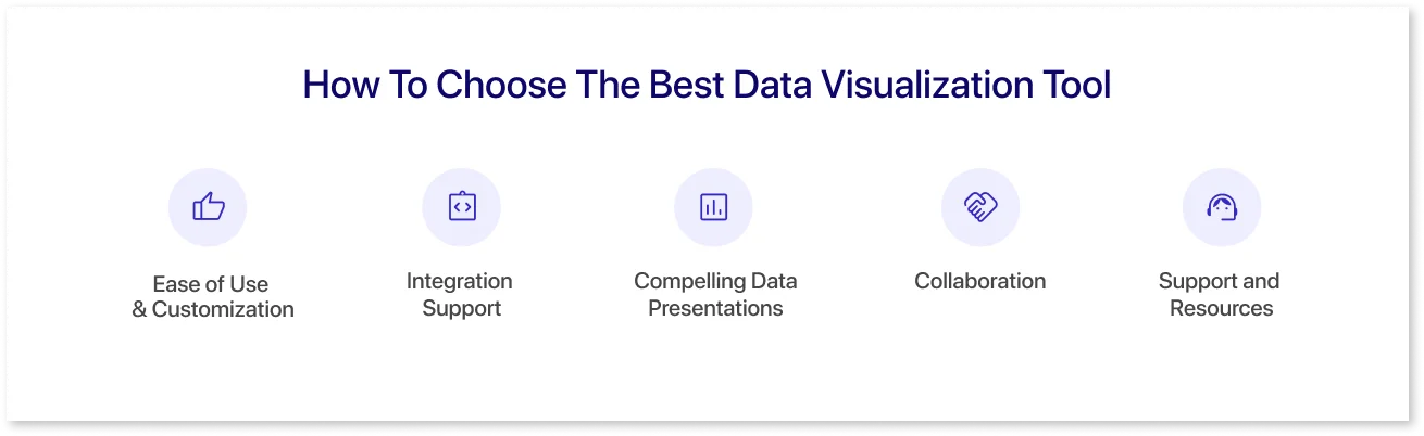
- Ease of Use & Customization: You need to look for a tool with an interactive interface that makes you comfortable while presenting data. You can then fine-tune your visualizations based on the tailoring options to make them more audience-specific.
- Integration Support: If your data sources are numerous, then the integration capability is a must-have component of a visualization tool. A versatile tool supports integration with existing data sources and can connect with multiple data source formats.
- Compelling Data Presentations: Since you will always present your findings to management and other stakeholders, your presentation needs to be top-notch. To make your visualizations more professional-looking, it is crucial to choose a tool that allows easy embedding of the reports.
- Collaboration: Presenting data to your teams often creates ambiguous situations where the team does not align with the purpose. Mockup’s commenting, version control, and sharing features will give you better control over the team's efficiency, thereby improving collaboration within the organization.
- Support and Resources: The Right visualization tool contains an extensive library of tutorials and in-app resources for new users to master visualizations. Additionally, you need to ensure that your chosen platform has support options as and when you are stuck while creating reports.
Conclusion
When the intent is to be able to make data-driven decisions, the importance of various tools to visualize data cannot be overlooked. They are the wheels to your data stories that develop meaningful reports for the audience. A right visualization tool has customization options and easily centralizes data from multiple sources to get started with visualization in minutes.
You can try Mokkup.ai to develop data-driven dashboards even if you lack technical expertise. Our ready-made templates will help you accelerate your visualization journey.
Frequently Asked Questions
Benefits of data visualization include simplifying complex data concepts and engaging with the audience with compelling visuals.
Data visualization tools reveal patterns and trends that help in breaking down the complicated data into easily identifiable information. This promotes decision-making and engagement with the stakeholders.
Charts, maps, infographics, and graphs are different kinds of data visualizations that help represent data numbers, simplifying their interpretation for a wider audience.
No, SQL (Structured Query Language) is not a data visualization software. It is a programming language that manages and queries data in relational databases.
AI data visualization tools are software platforms that use artificial intelligence to automatically analyze data and generate charts, graphs, and dashboards. These tools can detect patterns, highlight insights, and suggest the best ways to visualize data, making it easier and faster for users, especially non-technical ones.
AI can enhance data visualization by automating data analysis, identifying patterns, and generating visual insights faster. You can use AI-powered tools to auto-suggest the best chart types, detect trends or anomalies, and even create narratives alongside charts.
Prompt it. Wireframe it with Mokkup.ai.
