Data dashboards aren’t just vibrant charts anymore for businesses. They now serve as the nerve center for decision-making because they turn scattered data into clarity. What really proves their value over time isn’t the design. It’s the results.
Some data dashboards genuinely move the needle by helping teams spot problems early and make better decisions.
In this post, we will walk through five dashboard examples that actually did something. These real dashboards changed the game for businesses. We’ll break down what made them work and what you can steal from them for your setup.
Table of Contents
- What are Business Dashboards?
- Why Do Dashboards Matter for Businesses More Than Ever?
- 5 Dashboard Examples That Reshaped Decision-Making
- How to Create Business Dashboards with Mokkup?
- Best Business Dashboard Design Tips to Remember
What are Business Dashboards?
A business dashboard is a visual tool that helps companies track, analyze, and act on their data in one place. Instead of digging through spreadsheets or scattered reports, teams get a live snapshot of what’s going on, right when they need it.
The best data visualization dashboard examples don’t just show numbers. They make patterns obvious, highlight red flags, and bring key metrics to life. Whether it’s sales, marketing, operations, or finance, dashboards give everyone the clarity to make smarter, faster decisions. In short, great dashboard examples turn data into direction. That’s exactly why 78% of Fortune 500 executives now rely on dashboards for decision-making, while spreadsheet use for strategic analysis has dropped by 34% since 2020, according to Maptive.
Why Do Dashboards Matter for Businesses More Than Ever?
Business Intelligence dashboards matter a lot due to three major reasons: complexity, speed, and accountability.
- Complexity: Businesses deal with more data from more sources than ever before. Most require CRMs, ERPs, marketing tools, finance platforms, and supply chain systems, resulting in issues of handling complex data structures.
- Speed: Decision cycles are shrinking. The world is moving fast, and businesses can not afford to wait a week for a monthly report. They need ways to make decisions faster.
- Accountability: Teams are increasingly data-driven. Performance reviews, strategy shifts, and even budgets now rely on the dashboard's information.
This is why smart organizations are moving toward Business Intelligence Dashboards that track performance, predict outcomes, and suggest actions.
5 Dashboard Examples That Reshaped Decision-Making
Let’s go through real, impactful dashboard examples that have helped companies unlock clarity, speed, and better decision-making.
1. Executive Summary Dashboards
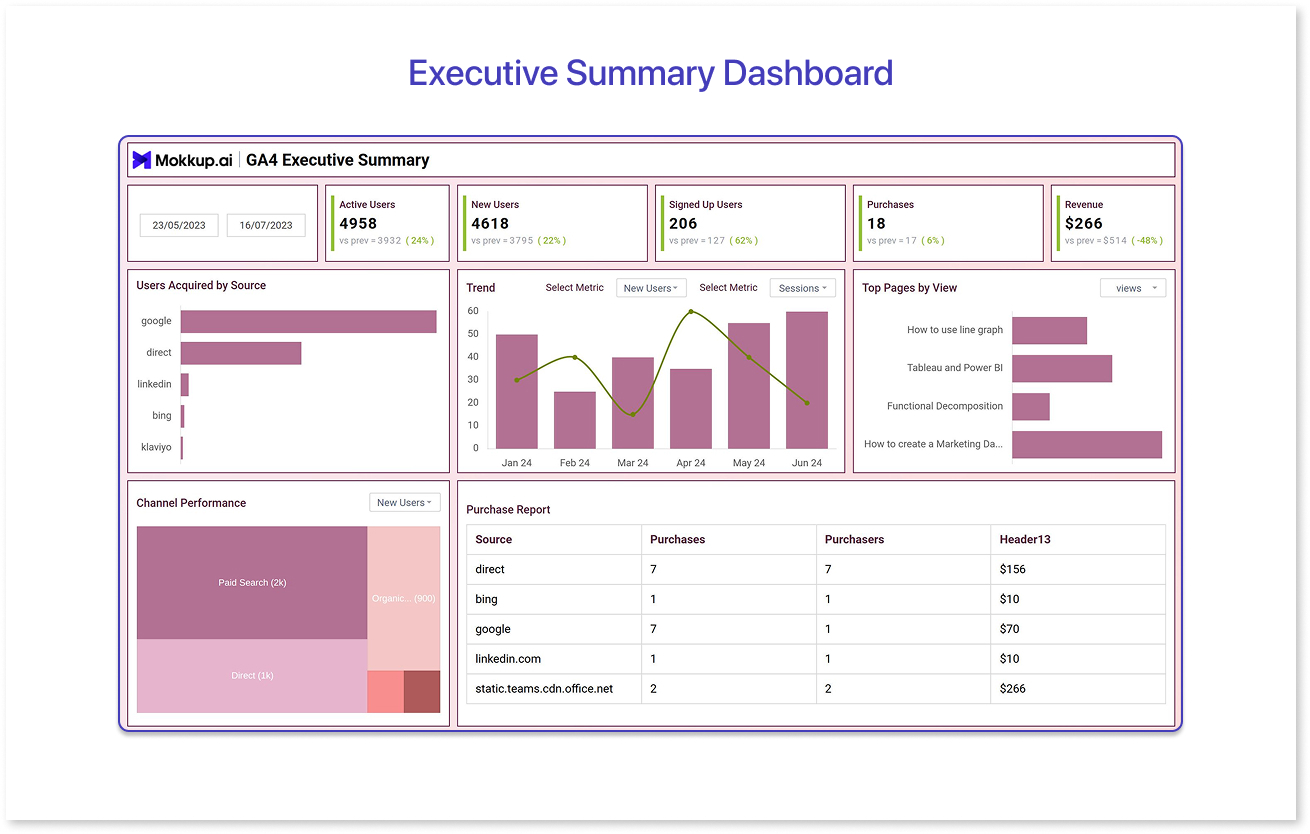
An Executive Summary dashboard gives leadership a real-time view of the business across sales, revenue, customer metrics, and more at a single view. It cuts through various details and brings together all important business metrics in one view, saving hours on reports and meetings. For decision-makers, it means quicker calls, fewer surprises, and staying ahead without getting lost in the data.
Used By: Such dashboards are mostly used by company CEOs, founders, and board members
Why It Works: This dashboard brings all the must-know numbers, like revenue, burn rate, MRR, churn, cash runway, NPS, and team productivity into one clean view. It’s everything leadership needs to stay in control, without the noise.
Key Feature: Simple color-coded flags (green, yellow, red) instantly show what’s on track and what needs fixing.
Key Benefits:
- Enables top executives to run weekly standups without digging through spreadsheets.
- Helps leadership catch issues before they become big.
- Acts as a single source of truth across siloed departments.
Example: Take this company dashboard example from Mokkup’s GA4 Executive Dashboard template, which helps a business leadership team quickly see what matters most without digging through scattered reports.
2. Sales Dashboard
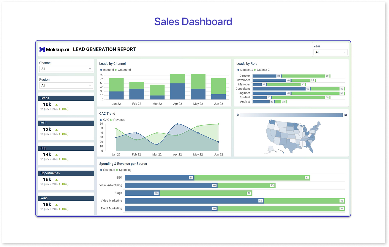
A Sales Dashboard shows how your sales team is doing, how many deals are open, what’s stuck, what’s closing soon, and how close you are to your targets. It helps teams act faster and sell smarter.
Used By: Sales teams, Sales Managers, Reps, Revenue Ops Teams, etc., usually use sales dashboards.
Why It Works: This dashboard tracks everything sales teams care about, like pipeline health, closed deals, revenue goals, lead conversions, and how each rep is performing. This kind of assistance helps sales teams manage their goals and performance on the go.
Key Feature: Drill-down capability from overall targets to individual sales rep metrics.
Key Benefits
- Enables quick action when deals stall.
- Identifies top performers and underperformers in the sales team.
- Supports forecasting with visual pipeline velocity indicators.
Example: Consider a SaaS sales dashboard for lead generation built to help teams track the customer journey, evaluate marketing effectiveness, and identify CAC trends clearly. At Mokkup, dashboards like these are exportable to BI tools like Power BI, making them a strong Power BI dashboard example for those building on that platform.
3. Finance Dashboard
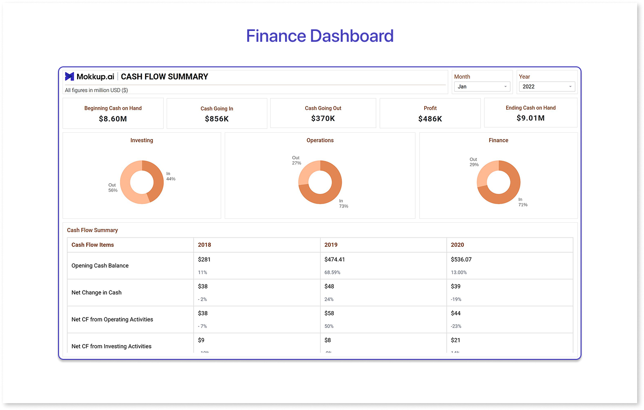
A Finance Dashboard combines key numbers like revenue, expenses, cash flow, and profit under one live view. It helps decision-makers catch overspending early, track trends over time, and confidently plan for the future. For many businesses, it’s the difference between reacting late and staying financially one step ahead.
Used By: Company CFOs, finance teams, and department heads need such dashboards to stay updated with numbers without digging through endless spreadsheets.
Why It Works: It gives a clear and updated view of cash flow, budget gaps, spending patterns, and cost breakdowns.
Key Benefits:
- Flags unusual spending early for quicker action
- Helps finance and ops teams stay aligned with a shared source of truth
- Eliminates the need to update or share Excel files over and over
Example: Take the Business dashboard example of logistics firms, requiring a clean cash flow template to reduce budget variance with centralized finance dashboards.
4. Supply Chain Monitoring Dashboards
Supply chain process monitoring is one of the most complex parts of any business. An effective tailor-made dashboard for this purpose helps teams track inventory, shipments, supplier performance, and delivery timelines in real time. It also spots delays early and keeps the entire supply chain moving smoothly. With its help, operations teams can make faster calls and avoid costly surprises before they happen.
A real‑time visibility displayed on such dashboards doesn’t just improve response times, but enhances efficiency, cuts costs, and raises customer satisfaction too, according to insights from QIMAone on the benefits of real‑time supply chain visibility.
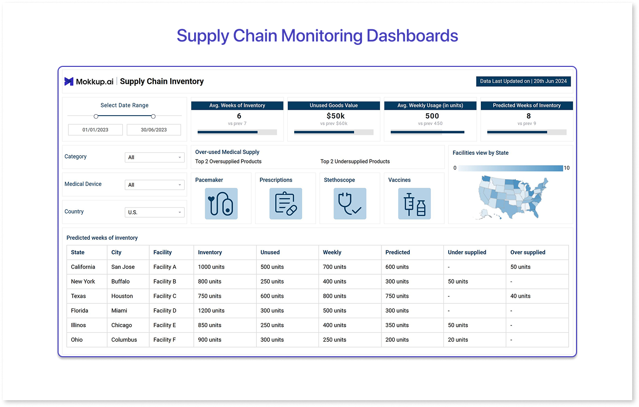
Used By: The workforce associated with the supply chain is the key user of this type of dashboard. For example, operations managers, logistics teams, and procurement leads are the right people for such visualized supply chain metrics.
Why It Works: It monitors inventory levels, delivery timelines, supplier performance, and shipping costs in real time to facilitate tracking and overviewing.
Key Feature:
-
Alerts for low stock, shipping delays, or supplier misses.
Key Benefits:
- Minimizes stockouts and overstock scenarios.
- Supports smarter vendor negotiations.
- Enables contingency planning in advance during disruptions.
Example: Consider the supply chain inventory dashboard, which focuses on key performance metrics, such as inventory efficiency, usage trends, and supply-demand alignment, for a healthcare firm. At Mokkup, dashboards like these are exportable to BI tools like Tableau, making them a strong Tableau dashboard example for those building on that platform.
5. Human Resource Dashboards
Hiring a large number of individuals and tracking the entire process can be daunting for large organizations. That's where an HR-centric dashboard comes in. It gives HR teams a clear view of headcount, hiring progress, gender diversity, ethnicity ratio, employee turnover, attendance, engagement, and much more on a single screen. This data empowers HR departments to better understand their hired workforce.
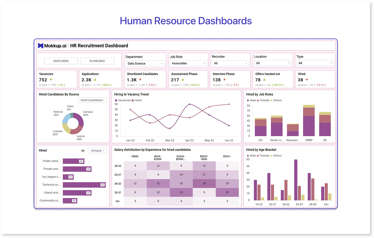
Used By: The key users of such dashboards are HR managers, recruitment Heads, and department leaders.
Why It Works: Tracks hiring status, attrition rates, training completion, diversity ratios, and employee engagement in one place.
Key Feature: It can filter data by department, seniority, and location for people analytics.
Key Benefits:
- Makes tracking diversity, equity, and inclusion goals simple
- Speeds up hiring by showing where candidates are in the recruitment process.
Examples: An IT firm’s HR recruitment dashboard with all important HR KPIs and data could be a good example.
How to Create Business Dashboards with Mokkup?
While it is good to know that a good business dashboard can help improve overall efficiency, creating one could be a challenge. That’s where Mokkup.ai helps.
It is designed to make building the best business dashboards fast and simple. It starts with over 250 ready-to-use templates that follow top dashboard design principles, so you never have to wonder where to start.
The new AI-powered prompt generation feature lets you create customizable dashboard wireframes without knowing much design skills. Plus, real-time commenting and collaboration mean your team stays aligned, avoiding confusion and messy dashboards.
All the outputs generated by Mokkup are compatible with Power BI or Tableau, so you can instantly export your dashboards to save time and hassle. If you want inspiration, check out the guide on creating marketing dashboards for fresh ideas.
Best Business Dashboard Design Tips to Remember
Regardless of the industry, here are five tips to follow for creating the best business dashboards:
- Start with the questions, not the charts. What decisions need to be made? What problems need solving?
- Declutter aggressively. Too much data kills attention. Less is more.
- Use consistent time frames. Mixing daily, monthly, and quarterly data is a recipe for confusion.
- Color with purpose. For example, red could mean alert, and green could mean good.
- Test before launch. Get feedback from end-users. Watch where they click, scroll, or get stuck.
Conclusion
When dashboards work well, they become the go-to guide for daily decisions. Multiple dashboard examples prove that with smart design and clear purpose, dashboards can drive results and shape how a company thinks and acts. From top-level strategy to day-to-day operations, they’re where plans turn into action.
Data visualization tools like Mokkup are useful for creating such dashboards. Their unique mix of features, specifically for dashboard wireframe creation, lets you get the design right before jumping into development.
Frequently Asked Questions
We can learn that clarity wins. The most impactful dashboards focus on decision-making, not just data display. They remove noise, highlight red flags, and empower users to act.
When it shifts how decisions are made, speeds up action, or uncovers patterns that weren't visible earlier. Game-changing dashboards change behavior.
Executive, sales, finance, supply chain, and HR dashboards tend to have high organizational impact because they align directly with business KPIs and resource allocation.
The best business dashboards are designed with the end user in mind. They focus on key metrics that truly matter and keep things simple. They are often interactive to let users dig deeper. They keep the data fresh so it stays relevant.
Yes, Mokkup lets you instantly export your dashboard designs directly to Power BI or Tableau for easy deployment.
Prompt it. Wireframe it with Mokkup.ai.
