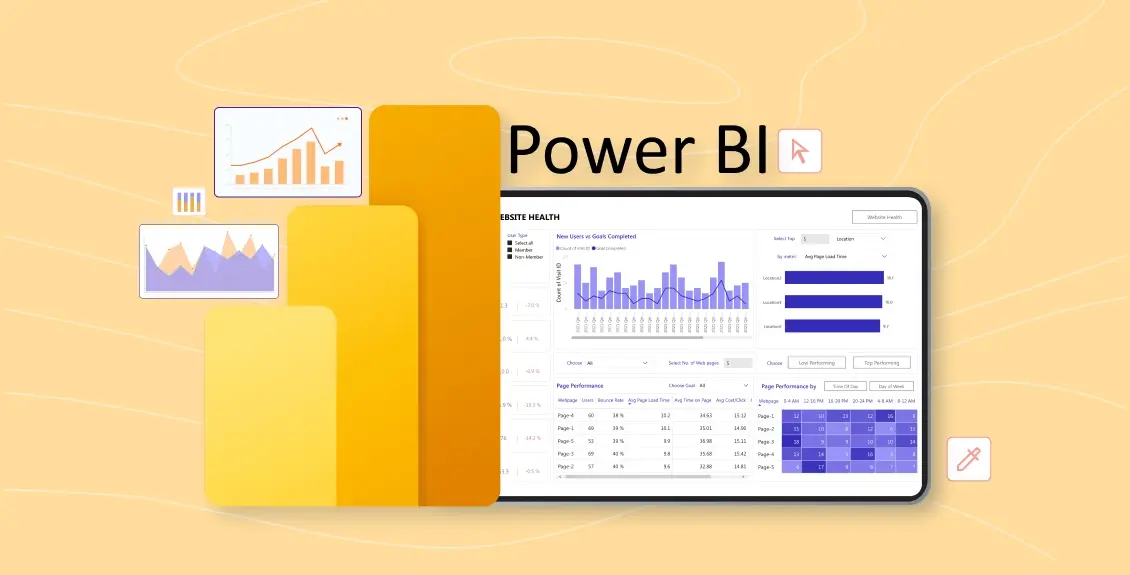
Power BI has become a go-to tool for businesses looking to visualize and analyze data effectively. Developed by Microsoft, Power BI offers a suite of business intelligence tools that transform raw data into meaningful insights.
Dashboards in Power BI provide a consolidated view of important metrics, enabling businesses to make data-driven decisions. This article explores Power BI dashboards in detail, from their features and benefits to practical applications in various industries.
What is Power BI?
Power BI is a business analytics tool developed by Microsoft that allows users to visualize data and share insights across an organization. It connects to multiple data sources, providing interactive dashboards and reports that help users better understand their data. Power BI plays a crucial role in data visualization, making complex datasets more accessible and actionable.
The Role of Power BI in Data Visualization and Business Intelligence
Power BI plays a crucial role in modern BI strategies by:
- Aggregating data from multiple sources (e.g., Excel, SQL databases, APIs)
- Enabling interactive visualizations with drag-and-drop functionality.
- Facilitating real-time decision-making with up-to-date data.
What is a Power BI Dashboard?
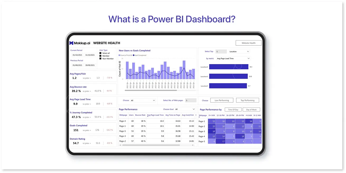
A Power BI dashboard is a collection of visualizations that provide a consolidated view of key business metrics. Unlike Power BI dashboard vs reports, dashboards are single-page summaries that offer a snapshot of important data points.
Key Features and Benefits of Power BI Dashboards:
- Real-time data visualization: Enables businesses to track performance and trends instantly.
- Interactivity: Users can drill down into data, apply filters, and explore insights.
- Ease of sharing: Dashboards can be shared with teams, making collaboration seamless.
- Customization: Users can personalize the KPI dashboard power bi with themes, layouts, and custom visuals.
- Integration with Microsoft tools: Seamlessly integrates with Excel, Azure, and Teams.
Difference Between Power BI Reports and Dashboards
|
Feature |
Power BI Dashboard |
Power BI Report |
|
Pages |
Single page |
Multiple pages |
|
Data Source |
Can pull from multiple reports |
Focused on one dataset |
|
Interactivity |
Interactive but static |
Fully interactive with more filters |
|
Purpose |
High-level insights |
Detailed data analysis |
Why Use Power BI Dashboards?
Power BI dashboards serve as an essential business intelligence tool, offering numerous benefits:
- Enhanced decision-making: Businesses can make data-driven decisions quickly.
- Interactivity and accessibility: Users can explore data without requiring extensive technical knowledge.
- Scalability: Power BI supports businesses of all sizes, from startups to enterprises.
- Cost-efficiency: Offers free and paid versions to suit different business needs.
- Security: Provides robust data protection features like Row-Level Security (RLS).
Key Features of Power BI Dashboards
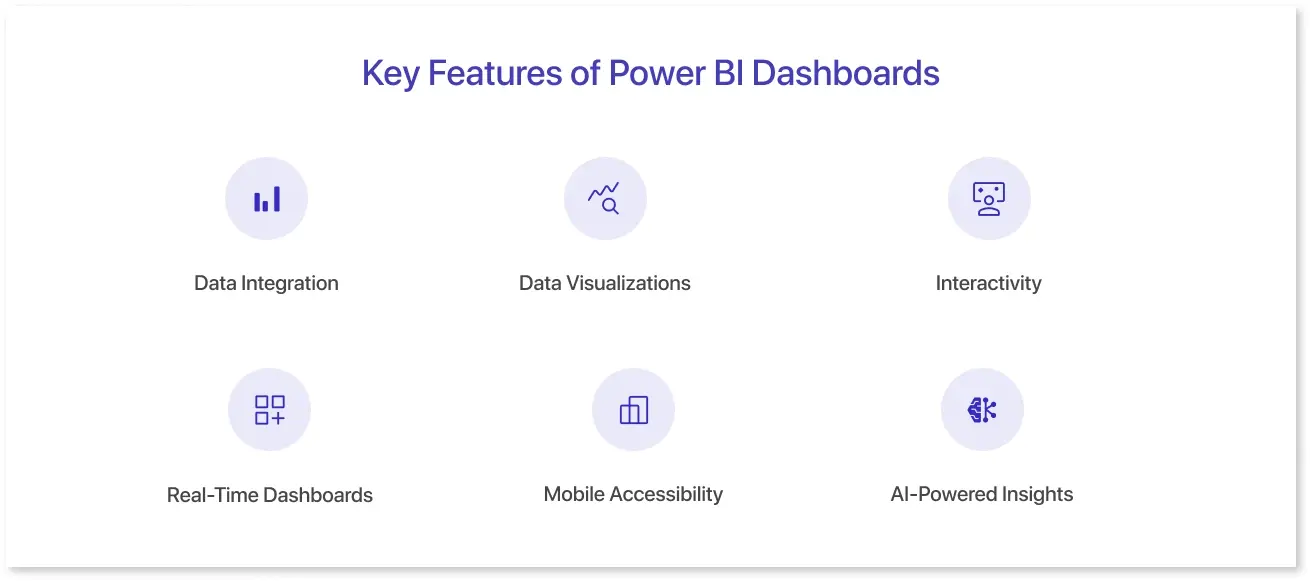
1. Data Integration
Power BI connects to various data sources, including Excel, SQL Server, web data, and cloud-based platforms. Users can import, transform, and clean data using Power Query to ensure accuracy and consistency.
2. Data Visualizations
Power BI offers a variety of visualization options, including:
- Bar and line charts
- Maps
- Tables
- KPIs
- Custom visuals: Selecting the right visualization is crucial for effectively presenting data insights.
3. Interactivity
Power BI dashboards allow users to interact with data using:
- Slicers: Filter data interactively
- Drill-throughs: Access more details by clicking on a visualization
- Filters: Customize data views
4. Real-Time Dashboards
Users can set up real-time data feeds, making Power BI ideal for industries that require instant data updates, such as finance and retail.
5. Mobile Accessibility
The Power BI mobile app allows users to access dashboards on the go, and its responsive designs are optimized for tablets and smartphones.
6. AI-Powered Insights
Power BI incorporates artificial intelligence (AI) to enhance analytics, using tools like key influencers and decomposition trees to uncover patterns and trends.
How to Create a Power BI Dashboard

Creating a Power BI dashboard involves several steps, from connecting data sources to customizing and sharing the final dashboard. This section provides a detailed, step-by-step guide to help you build an effective Power BI dashboard.
Step 1: Connect Power BI to Data Sources
Power BI allows you to connect to multiple data sources, including:
- Excel files – Useful for small datasets and manual data entry.
- SQL Server databases – Suitable for structured enterprise data.
- Cloud-based services – Examples include Google Analytics, Salesforce, and Azure.
- APIs and Web Data – Enables fetching live data from websites and applications.
How to Connect Data in Power BI:
- Open Power BI Desktop.
- Click on Home > Get Data.
- Choose your data source (e.g., Excel, SQL Server, Web, or API).
- Click Connect, authenticate if required, and load the data.
Step 2: Transform and Clean the Data
Once your data is loaded, you may need to clean or restructure it using Power BI’s Power Query Editor. This ensures that your data is accurate and properly formatted before visualizing it.
Common Data Transformations:
- Removing duplicate rows to maintain data integrity.
- Filtering out irrelevant data to improve performance.
- Merging and appending tables to consolidate related datasets.
- Calculated columns and measures are added using DAX (Data Analysis Expressions) for better analysis.
To access the Power Query Editor:
- Click on Transform Data in Power BI.
- Apply the necessary data-cleaning steps.
- Click Close & Apply to save changes.
Step 3: Create a Report and Convert It into a Dashboard
After preparing the data, you can create reports in Power BI, which serve as the foundation for dashboards.
How to Create a Report:
- Go to Report View on Power BI Desktop.
- Use the Visualizations pane to add charts, tables, KPIs, and maps.
- Drag and drop relevant fields from the Fields pane into visuals.
- Adjust formatting to enhance readability.
Once the report is complete, publish it to the Power BI Service and create a dashboard by pinning key visualizations from multiple reports.
Steps to Create a Dashboard in Power BI Service:
- Open Power BI Service (app.powerbi.com).
- Navigate to the Workspace where your report is published.
- Open the report and click on the Pin icon to add a visual to a new or existing dashboard.
- Organize the pinned visuals to create a structured, interactive dashboard.
Step 4: Customizing Your Dashboard
Customization helps make the dashboard more user-friendly and visually appealing. Power BI provides various options to enhance the dashboard's readability and effectiveness.
Formatting and Styling Options
- Use themes to apply consistent colors and fonts.
- Adjust gridlines and backgrounds to improve visual separation.
- Format titles, labels, and tooltips for clarity.
Using Custom Visuals
Power BI allows you to add third-party visuals from the Power BI Marketplace, such as:
- Advanced heatmaps
- Custom gauge charts
- AI-powered Key Influencer charts
To add a custom visual:
- Click on Visualizations > Get More Visuals.
- Browse the Power BI Marketplace and import the required visuals.
Step 5: Using Mokkup’s BI Export Feature for Wireframing Dashboards
Before committing to a final Power BI dashboard, wireframing can help visualize the layout and user flow. Mokkup.ai simplifies this process by allowing users to create dashboard wireframes with drag-and-drop elements and export them directly to Power BI.
How Mokkup Enhances Power BI Dashboard Creation:
- Pre-built templates: Offers ready-made wireframe templates that align with Power BI structures.
- Drag-and-drop elements: Users can arrange visuals and KPIs before implementing them in Power BI.
- Seamless export: Once the wireframe is finalized, it can be exported to Power BI for real-time data integration.
This feature streamlines dashboard planning, ensuring that layouts are well-structured and optimized for user experience before finalizing in Power BI.
Power BI Dashboards for Different Industries
1. Finance
- Use Case:Tracking financial performance, budgeting, and forecasting.
- Example: Power BI financial dashboard with revenue trends and cost analysis.
- Key Metrics: Profit margins, cash flow, expense ratios.
2. Marketing
- Use Case: Monitoring campaign performance and customer engagement.
- Example: Social media and web analytics dashboards.
- Key Metrics: Click-through rates (CTR), conversion rates, and customer demographics.
3. Sales
- Use Case: Analyzing sales pipelines and forecasting revenue.
- Example: Power BI sales dashboard with key performance indicators (KPIs).
- Key Metrics: Lead conversion rates, revenue growth, sales targets.
4. Healthcare
- Use Case: Managing patient data and hospital operations.
- Example: Hospital performance and clinical metric dashboards.
- Key Metrics: Patient satisfaction scores, readmission rates, staff productivity.
5. Supply Chain & Logistics
- Use Case: Tracking inventory levels and delivery performance.
- Example: Logistics dashboards for supply chain managers.
- Key Metrics: On-time delivery rates, inventory turnover, transportation costs.
6. Human Resources
- Use Case: Analyzing employee performance and recruitment trends.
- Example: HR dashboards for workforce management.
- Key Metrics: Employee turnover rate, hiring efficiency, workforce diversity.
How to Share Power BI Dashboards

1. Publishing Dashboards to Power BI Service
- Users can publish their dashboards to Power BI Service for easy access.
- Dashboards can be shared via email, web links, or embedding in websites.
2. Collaborating with Teams
- Power BI Workspaces allow multiple users to work on dashboards simultaneously.
- Users can add comments, tag team members, and share insights directly within the platform.
3. Exporting Power BI Dashboards
- Power BI allows the exporting of dashboards into various formats, such as PDF, Excel, and PowerPoint.
- Users can schedule report distributions to stakeholders automatically.
- Mokkup BI Export Feature: If you prefer to prototype your dashboard before finalizing it in Power BI, Mokkup provides an easy BI Export feature that allows users to transition their wireframes into Power BI seamlessly, reducing design iteration time.
5 Best Power BI Dashboard Examples
Power BI dashboards help businesses transform raw data into meaningful insights. Whether you're tracking sales, monitoring marketing performance, or analyzing customer trends, a well-designed dashboard can simplify complex data and improve decision-making. The best dashboards are not just visually appealing—they provide clarity, interactivity, and actionable insights tailored to specific business needs.
Below, we’ll explore five Power BI dashboard examples that demonstrate how data can be effectively structured and visualized. Some of these dashboards are available as ready-to-use templates, making it easier to get started with your analysis.
1. Sales Performance Dashboard
A sales performance dashboard in Power BI allows businesses to track revenue, product performance, and sales trends over time. It provides a structured view of sales data, helping teams identify patterns, compare actual sales against targets, and optimize sales strategies.
This dashboard typically includes key metrics such as total sales, profit margins, and sales by region or product category. Interactive filters enable users to break down sales performance by different time periods, sales representatives, or customer segments. A clear visual layout helps sales teams make data-driven decisions to improve revenue and profitability.
2. Financial Reporting Dashboard
For finance teams, a Power BI financial reporting dashboard provides a real-time overview of a company’s financial health. It consolidates key financial metrics such as revenue, expenses, profit and loss, and cash flow trends, allowing businesses to monitor their financial performance efficiently.
The dashboard offers drill-down options, enabling users to analyze specific cost centers, compare budgeted vs. actual expenses, and track profit trends over time. This structured approach to financial data helps organizations maintain financial stability, make informed investment decisions, and prepare for future growth.
3. Customer Insights Dashboard
Understanding customer behavior is crucial for business growth, and a customer insights dashboard in Power BI provides a comprehensive view of key customer metrics. This dashboard helps businesses analyze purchase trends, customer demographics, retention rates, and customer lifetime value (CLV).
By visualizing customer data, businesses can identify high-value customers, understand buying patterns, and optimize marketing strategies. It also helps in tracking customer satisfaction through feedback scores and Net Promoter Scores (NPS), making it easier to improve customer experience and engagement.
4. Marketing Campaign Performance Dashboard
Marketing teams need to track and measure campaign success, and a Power BI marketing performance dashboard does exactly that. It consolidates key advertising and promotional metrics, providing insights into impressions, clicks, conversion rates, and return on investment (ROI).
With this dashboard, marketers can compare different campaign channels, evaluate ad spend efficiency and make real-time adjustments to improve results. It also includes detailed breakdowns of campaign performance by platform, helping businesses identify which marketing efforts generate the highest returns.
5. Employee Performance Dashboard
Monitoring employee performance is essential for HR and management teams, and a Power BI dashboard can streamline this process. This dashboard tracks key workforce metrics such as attendance trends, productivity scores, project completion rates, and engagement levels.
With visual representations of performance data, HR teams can identify high-performing employees, detect potential issues, and implement strategies to improve workforce efficiency. The dashboard also helps in performance reviews and planning employee development programs based on data-driven insights.
These Power BI dashboard examples highlight how data visualization can drive smarter business decisions. With Mokkup’s BI export feature, you can design dashboard wireframes and easily export them for use in Power BI. This allows teams to plan and refine their dashboards before building them in Power BI, ensuring a well-structured and effective final product.
Power BI Dashboard Best Practices
Building an effective Power BI dashboard requires more than just visual appeal. A well-structured dashboard should enhance decision-making, maintain clarity, and ensure data accuracy. Below are additional best practices that help improve dashboard performance and usability.
1. Clarity and Simplicity
- Display only essential KPIs to avoid overwhelming users.
- Use clear labels and tooltips to guide users through data interpretation.
- Group related information logically for easy comprehension.
2. Consistency in Design
- Maintain a uniform color scheme, font style, and layout across all reports.
- Align dashboard elements with brand guidelines to ensure a professional look.
- Standardize the placement of filters, slicers, and legends for a seamless experience.
3. Mobile-Friendly Dashboards
- Use responsive visuals that adjust automatically to different screen sizes.
- Test dashboards in Power BI Mobile View to ensure usability on smaller screens.
- Avoid complex visuals that may not render well on mobile devices.
4. Choosing the Right KPIs
- Select KPIs based on business objectives and actionable insights.
- Prioritize leading indicators (e.g., customer engagement) over lagging indicators (e.g., past revenue).
- Remove redundant metrics to avoid clutter.
5. Efficient Use of Filters and Slicers
- Provide interactive slicers to allow users to explore data dynamically.
- Use hierarchical filters to help users drill down into specific data points.
- Avoid excessive slicers, which can reduce dashboard performance.
6. Optimizing Performance
- Use Aggregations and Data Reduction Techniques to improve report loading times.
- Optimize DAX formulas by minimizing row-level calculations.
- Reduce the number of visuals per page to enhance responsiveness.
7. Data Accuracy and Validation
- Always cross-check data sources before publishing dashboards.
- Use error handling in DAX formulas to prevent calculation issues.
- Ensure real-time or scheduled refresh to keep reports updated.
8. Exporting and Sharing Options
- Enable PDF and Excel exports for users who need offline reports.
- Utilize Power BI Embedded for seamless dashboard integration into business applications.
- Use Mokkup's BI Export Feature to create wireframes before finalizing the Power BI dashboard, ensuring stakeholder alignment.
Future Trends in Power BI Dashboards
Advancements in artificial intelligence, cloud computing, and personalization are driving the future of the Power BI interactive dashboard. AI-powered analytics will play a crucial role in automating insights, reducing manual data exploration, and enhancing predictive analytics. As organizations seek faster decision-making, Power BI will continue integrating with AI services like Azure Machine Learning and OpenAI, enabling businesses to uncover patterns and trends with minimal effort.
Cloud-based Power BI dashboards will become even more essential, allowing real-time access to data from anywhere in the world. With the increasing adoption of Microsoft Fabric, dashboard Power BI will provide enhanced data lake integration, making it easier to handle large-scale datasets. This trend will lead to more real-time dashboards, empowering businesses to react swiftly to market changes.
Conclusion
Creating effective Power BI dashboard ideas requires thoughtful planning, from selecting the right data sources to designing clear visualizations. Organizations can develop dashboards that provide actionable insights by using Power BI’s advanced features, such as interactive filters, real-time data updates, and cloud sharing.
Additionally, Mokkup’s BI export feature offers an excellent way to wireframe and validate dashboard layouts before building them in Power BI. This ensures that the final dashboard is well-structured and meets user expectations.
By following best practices in dashboard design and leveraging Power BI’s collaboration tools, businesses can create powerful, data-driven dashboards that support informed decision-making.
Frequently Asked Questions
A Power BI dashboard is a single-page summary of key metrics, whereas a report consists of multiple pages with detailed analysis, filters, and drill-through capabilities. Dashboards pull data from multiple reports, while reports are based on a single dataset.
Yes, Power BI supports real-time data updates by connecting to streaming datasets, APIs, and cloud-based services. This allows businesses to monitor performance metrics dynamically.
Mokkup.ai allows users to wireframe Power BI dashboards before implementation, ensuring an optimized layout and user experience. It offers pre-built templates, drag-and-drop elements, and a BI export feature, helping teams plan and validate dashboards before adding real data in Power BI.
You can share dashboards via Power BI Service by publishing them to a workspace and granting team members access. Additionally, dashboards can be shared via email, embedded in web applications, or exported as PDFs and Excel files.
Yes, Power BI supports custom visuals from the Power BI Marketplace, allowing users to add specialized charts, heatmaps, AI-powered insights, and more to enhance their dashboards.
Prompt it. Wireframe it with Mokkup.ai.
