
Creating dashboards that help people and not just look good is part logic, part design, and a lot of empathy. You're not just plotting data on a screen. You're building a tool that helps someone make better decisions faster. And that starts with implementing the right dashboard design principles.
When dashboards are designed well, they do more than display numbers. They tell a story, build trust, and speed up decisions. Whether you're working with business leaders, analysts, or frontline teams, the goal is the same: make the data work for them.
Let's break down the dashboard design best practices that help you do exactly that.
Table of Contents
- Why Good Dashboard Design Matters?
- Top Dashboard Design Principles
- How does Mokkup Turn These Principles into Dashboards for Businesses?
Why Good Dashboard Design Matters?
A cluttered dashboard doesn't just look bad, it actively gets in the way. Instead of saving time, it wastes it. Instead of revealing insights, it buries them. And the people supposed to benefit end up annoyed or ignoring it altogether.
An effective dashboard design does the opposite. It brings order to all that data and makes the important information pop to give clarity and confidence. Great dashboards feel intuitive because they're built on smart layout, clear visual hierarchy, and metrics that actually matter. Even Microsoft's BI dashboard guide backs this by mentioning that great dashboards aren't just read more, they're shared more and acted on more.
That's why strong design principles aren't optional. They're how you make dashboards actually useful.
Top Dashboard Design Principles to Follow
A well-designed dashboard helps users spot what matters fast. It's not just about how it looks, but how easily someone can understand and act on the data. That's where dashboard design principles come in. They guide layout, visuals, and content so the end result is clean, focused, and genuinely useful.
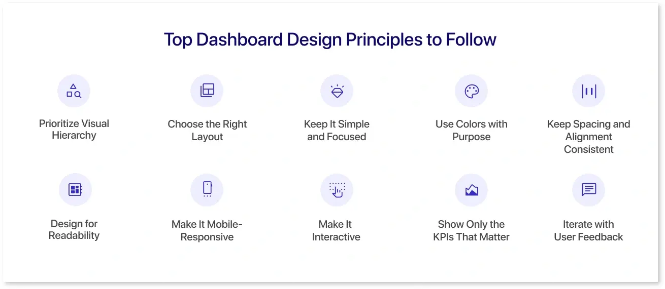
Here are the key ones worth knowing.
1. Prioritize Visual Hierarchy
A clear visual hierarchy means users don't need to scroll or stress to find what matters. They just see it. That's what turns effective dashboard design into faster decisions. Following the right rules while setting up the visual hierarchy makes it easier for things to fall into place for later steps. Since people read dashboards the way they read anything else, you can use this habit to place the important information at the right spots in your data dashboards.
For example, start by following how users naturally scan a screen, which is from top to bottom and left to right. That means your most important numbers should go where the eye lands first, typically the top-left corner. These small choices help users instantly recognize what matters, without second-guessing where to look.
2. Choose the Right Layout
Treat choosing the layout for your dashboard like organizing a desk. Everything essential should be within reach, and nothing should be buried or out of place.
- For daily tracking: A neat grid works best. It helps users scan and spot changes quickly.
- For strategic overviews: Start with big-picture KPIs, then let users drill down into more detail if needed.
Another way to keep the overall layout useful is to group similar charts together and align elements cleanly. Giving some breathing room between visuals is also a good idea because a good dashboard layout feels easy, even if the data behind it is complex. If you're unsure where to start, browsing some of the best dashboard wireframes can spark ideas.
3. Keep It Simple and Focused
The most effective dashboard design doesn't try to show everything. It shows what matters. Cluttered dashboards make people work harder than they need to. They waste time, blur priorities, and bury insights under unnecessary data. The best dashboard designs are sharp and selective. They spotlight the KPIs driving decisions and quietly leave the rest out.
This practice isn't about oversimplifying. It's about knowing your dashboard's job and letting it do it well. In the end, clarity always beats completeness.
4. Use Colors with Purpose
Colors aren't just for decoration; they are also for instructions. In dashboard design best practices, colors are used to direct attention, signal urgency, or show patterns.
Ideally, muted shades should carry the background or supporting metrics. Bolder, high-contrast colors should flag what's important, like outliers or goals that need action. And consistency is non-negotiable. If green means "good" in one tile, it can't mean "neutral" in another.
When applied with intent, color becomes a built-in guide for your data dashboards.
5. Keep Spacing and Alignment Consistent
Spacing and alignment are among the most overlooked dashboard UI guidelines, even though they make a big difference. Uneven padding, misaligned charts, or crammed visuals give the dashboard a rushed feel.
Consistent spacing isn't just about looking neat. It creates structure and separates what's related from what's not. And it makes scanning data feel effortless.Good Analytics dashboard design doesn't just deliver numbers. It makes them easier to trust, just by how they're arranged.
6. Design for Readability
Tiny fonts, abbreviated labels, and jargon-packed charts can silently kill the readability of your dashboards.
To avoid that, use clear, legible fonts and label them short and meaningful. Avoid cramming too much into one screen. A user should be able to glance at your dashboard and instantly get the gist. This is why many great dashboard designs aren't fancy. They're clean, easy to read, and straight to the point.
7. Make It Mobile-Responsive
Not everyone views your dashboard on a 27-inch monitor. A growing number of users access data on tablets or phones. Responsive design isn't optional anymore; it's now a must. Adaptive charts, scalable fonts, and tap-friendly elements ensure your Analytics dashboard design holds up on any device. As per Wifitalents, 55% of BI users check dashboards from mobile. If your design breaks on small screens, you might be losing a large user base and functionalities.
8. Make It Interactive
One of the more underrated dashboard design principles is knowing when and how to make your dashboard interactive. Static dashboards are okay if you're just sharing a snapshot. But if you want users to explore, question, and actually engage with the data, give them tools to do that.
Simple features like filters, drop-downs, or hover-to-reveal tooltips can turn a flat dashboard into something dynamic. It gives users control over what they see, and that sense of control builds trust and curiosity.
That said, don't turn it into a video game. Interactivity should make things clearer, not more complicated.
9. Show Only the KPIs That Matter
Not every metric deserves space in your data dashboard. Pick only 5-7 KPIs that directly support your user's goals. If you pick more than that, nothing would stand out.
This step often gets skipped because everyone wants to "include everything." However, good dashboard UX best practices are about decisions, not documentation. If a metric isn't driving action, it's noise.
10. Iterate with User Feedback
Dashboard design principles don't stop once the dashboard goes live. The real insights come after users start using it. Maybe they're skipping key visuals or keep asking for something you thought was obvious. Such common BI implementation mistakes are not failures; they are feedback. Thus, watch how people interact with the dashboard. Use tools like heatmaps, interviews, or simple usage data to spot what's working and what's just taking up space.
Some of the best dashboard designs didn't succeed in version one. They succeeded by listening, tweaking, and evolving with the user.
How does Mokkup Turn These Principles into Dashboards for Businesses?
Mokkup.ai isn't just built on the best dashboard design principles; it uses them to make dashboards faster, smarter, and more usable from day one. Here's how it helps you turn the principles mentioned above into actionable data dashboards:
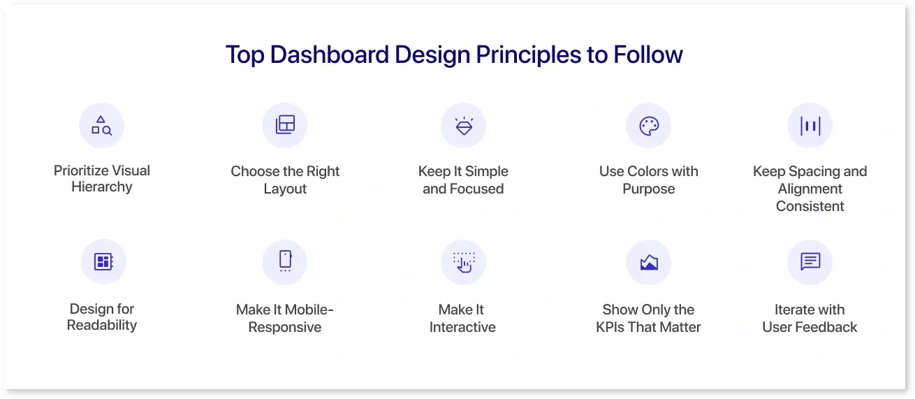
- It starts you strong: Mokkup offers 250+ prebuilt, ready-to-use templates that already follow the top dashboard design principles to reduce clutter and boost readability. This availability helps you avoid the stress of starting from scratch or second-guessing structure.
- It keeps design intentional: Mokkup's newly launched AI-powered prompt generation feature ensures every dashboard you build sticks to design fundamentals without needing a design degree. It is trained on vast real-world dashboards that help it build clean, focused layouts that respect hierarchy and simplicity.
- It works like your team does: Real-time commenting and live collaboration turn your team's feedback into action. This significantly reduces the chances of confusing dashboards due to team members' different visions and preferences.
- It's built for real-world use: It's instant export to Power BI/Tableau, means your dashboards look good and can be deployed effortlessly.
- It guides with purpose: With 50+ widget styles, 15+ color palettes, and 250+ prebuilt templates, all designed following the best dashboard design principles, Mokkup nudges you toward layouts that highlight key metrics rather than distract from them.
Mokkup isn't just a wireframe tool. It's where good dashboard designs start.
Conclusion
Great dashboards do more than display data. They tell a story, guide decisions, and cut through the noise. And behind every dashboard that works is a set of time-tested dashboard design principles. These aren't just best practices sitting in a textbook. They're what separates a dashboard that's just "there" from one that gets used every day.
But knowing how to design dashboards is one thing. Applying that consistently, across teams and projects, is another. That's where Mokkup.ai changes the game. It brings the structure and AI trained on real dashboard design data, so you don't start from scratch and your layouts still follow solid fundamentals, even if you're not a designer.
Frequently Asked Questions
The best dashboard design principles focus on clarity, relevance, visual hierarchy, simplicity, consistency, interactivity, and continuous user feedback. In other words, they focus on making it purposeful and user-friendly.
Start with the end goal, which usually dictates decisions. Choose 5–7 KPIs that align with business objectives and match the user's role. If the numbers don't help answer a real question, they probably don't belong on the dashboard.
It's the experience that makes a dashboard user-friendly in the true sense. Great dashboard designs guide the eye, make interactions easy, and feel intuitive even for first-timers. A user-friendly dashboard supports exploration without overwhelming people.
Visualization helps users obtain actionable information faster and more effectively from dashboards. Charts and colors aren't just decoration, they're tools for clarity. Following solid dashboard design principles in visualizing data can turn a cluttered mess into a cleanly visualized data structure.
Mokkup.ai makes designing dashboards feel effortless. Its AI is trained on proven dashboard UX best practices to auto-generate layouts where every element and widget is built with hierarchy, clarity, and business context in mind.
Prompt it. Wireframe it with Mokkup.ai.
