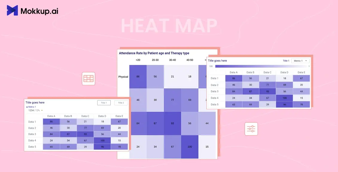
What is a Heatmap? A heat map is a graphical representation of data where values in a matrix are represented as colors. It is a powerful visualization tool that helps to reveal patterns, trends, and variations in data by using color to represent different values. Heat maps are widely used in various fields, including statistics, data analysis, biology, finance, and geography, to name a few.
Table of Contents
- Components of a Heat Map
- Types of Heat Maps
- Benefits of Using Heat Maps in your Dashboard
- How to Create a Heatmap using Mokkup
Components of a Heat Map
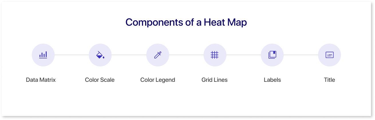
The components of a heat map include:
1. Data Matrix:
The foundation of a heat map is a two-dimensional data matrix where rows and columns represent variables or categories, and each cell contains a value. This matrix is the source of information that the heat map visualizes.
2. Color Scale:
A color scale is used to map the numerical values in the data matrix to colors. This scale typically ranges from a low-intensity color (e.g., cool tones like blue or green) to a high-intensity color (e.g., warm tones like red or yellow). The color scale is crucial for interpreting the magnitude of values and patterns in the data.
3. Color Legend:
A color legend is a key that associates colors in the heat map with specific numerical values. It helps users understand the meaning of different colors on the map and interpret the data accurately.
4. Grid Lines:
Grid lines or borders separate the individual cells in the data matrix, making navigating and interpreting the heat map easier. These lines help users distinguish between different rows and columns.
5. Labels:
Row and column labels provide context for the data, describing what each row and column represents. These labels are often placed along the axes of the heat map to help users identify specific variables or categories.
6. Title:
A title is used to describe the overall content or purpose of the heat map. It provides a brief summary or context for the data being visualized.
Types of Heat Maps
There are several types of heat maps, each designed to visualize different types of data. Here are some common types:
1. Classic Heat Map:
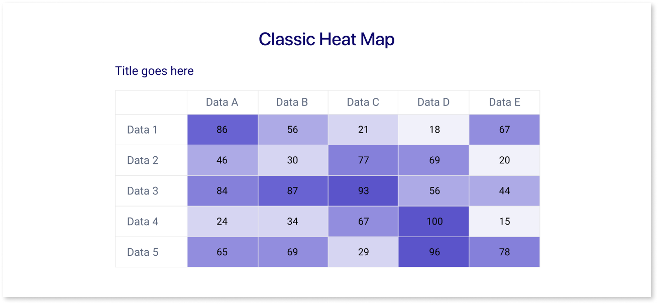
Using a color gradient, this standard heat map represents data values in a matrix. It effectively visualizes patterns and variations in continuous and categorical data.
2. Hierarchical Heat Map:
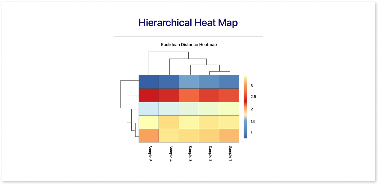
In this type, rows and columns are organized based on hierarchical clustering, which groups similar rows and columns together. This helps reveal relationships and structures in the data.
3. Geographic Heat Map:
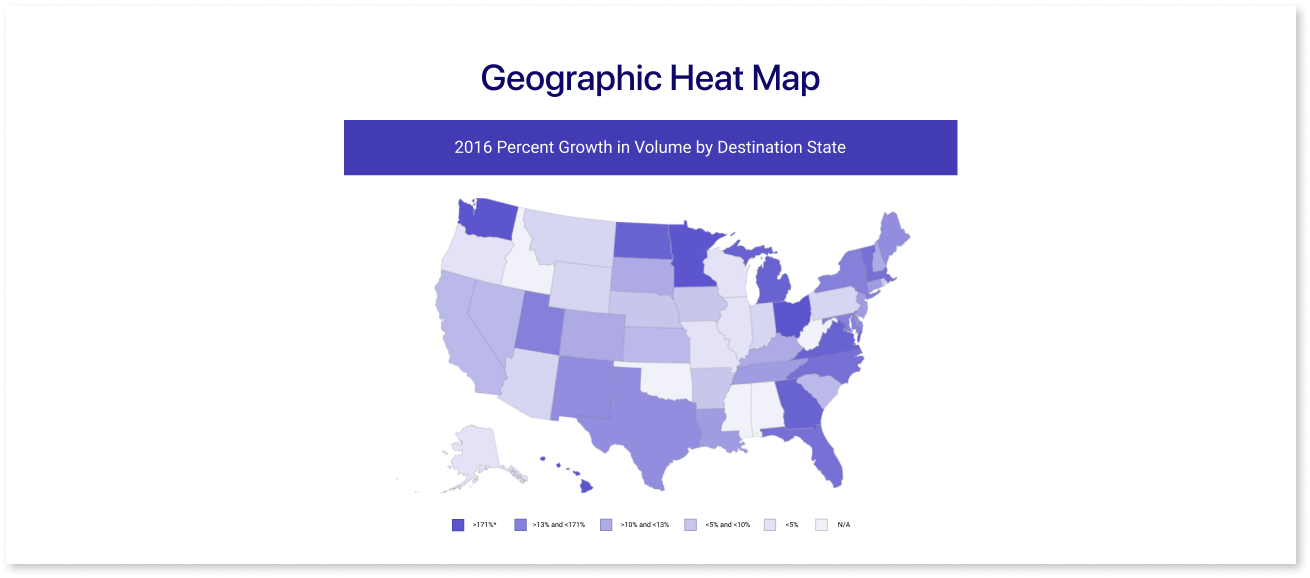
Used to represent spatial data, such as population density, temperature variations across regions, or any location-based data. Colors are applied to geographical areas to highlight variations.
4. Cohort Analysis Heatmap:
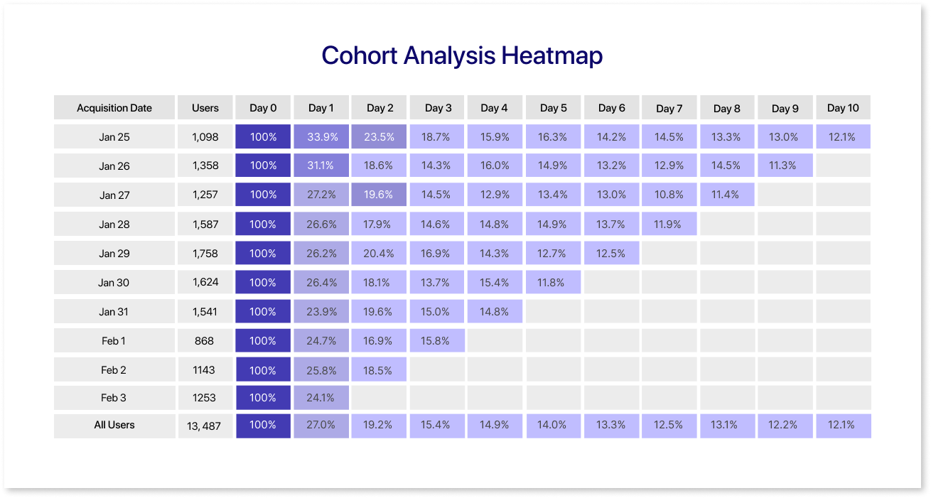
A Cohort Analysis heatmap is a visual tool that shows how different groups perform over time. Rows represent specific groups (cohorts), and columns show different time periods. Colors in the heatmap reveal metrics like user retention or revenue, helping quickly spot trends and make smart business decisions.
5. Website Heatmap:
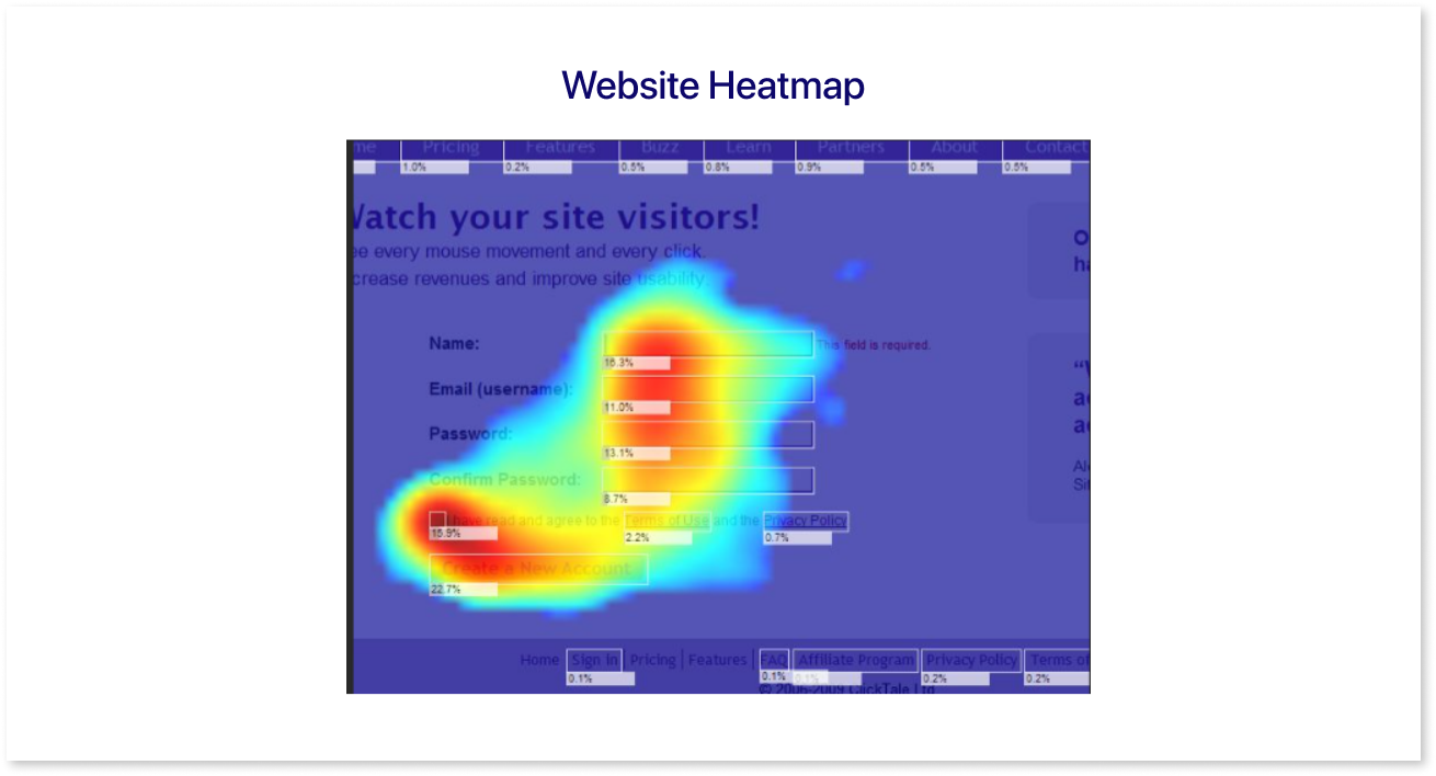
A website heatmap visually represents user interactions on a webpage, using color gradients to highlight high and low activity areas. Hotter colors, like red and orange, indicate more engagement, while cooler colors signify less interaction. These visualizations help website owners identify popular sections, user behavior patterns, and areas needing improvement.
Benefits of Using Heat Maps in Your Dashboard
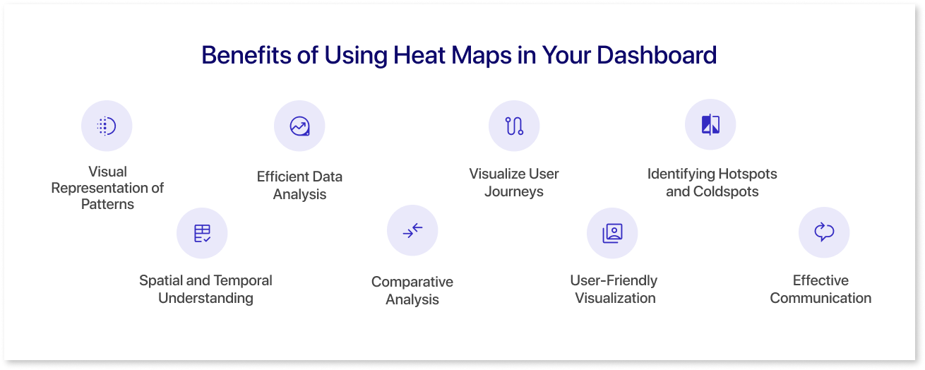
Integrating heat maps into your dashboard can offer several benefits, enhancing the effectiveness of data visualization and decision-making. Here are some key advantages:
1. Visual Representation of Patterns:
Heat maps provide a visually intuitive representation of data patterns. Users can quickly identify trends, clusters, and variations, making it easier to recognize important insights at a glance.
2. Efficient Data Analysis:
The color-coded nature of heat maps allows for efficient data analysis. Users can focus on areas of interest, spot outliers, and understand the overall distribution of values without delving into detailed numerical data.
3. Visualize User Journeys
A user journey heatmap visually represents interaction density, with warmer colors indicating high activity and cooler colors indicating lower engagement. It helps identify popular user paths and areas, facilitating the optimization of user experiences.
4. Identifying Hotspots and Coldspots:
Heat maps highlight hotspots (areas with high values) and coldspots (areas with low values). This is particularly valuable for identifying critical areas or potential issues, guiding users to focus on specific regions that may require further attention.
5. Spatial and Temporal Understanding:
Geographic heat maps provide a spatial understanding of data, revealing regional variations. Time series heat maps help users grasp temporal patterns, facilitating a comprehensive understanding of how data evolves over time.
6. Comparative Analysis:
Heat maps enable easy comparison of variables or categories. By placing similar items close to each other, users can quickly identify relationships, correlations, or disparities, fostering a deeper understanding of the data.
7. User-Friendly Visualization:
Heat maps are user-friendly and accessible, even for individuals without advanced data analysis skills. The visual nature of heat maps simplifies complex data, making it easier for a broad audience to interpret and derive insights.
8. Effective Communication:
Heat maps are powerful tools for communication. They allow data to be presented clearly and compellingly, facilitating effective communication of trends, patterns, and key findings to stakeholders, team members, or clients.
By leveraging these benefits, incorporating heat charts into your dashboard design enhances data visualization's overall usability and impact, enabling users to glean valuable insights and make informed decisions more efficiently.
How to Create a Heatmap using Mokkup
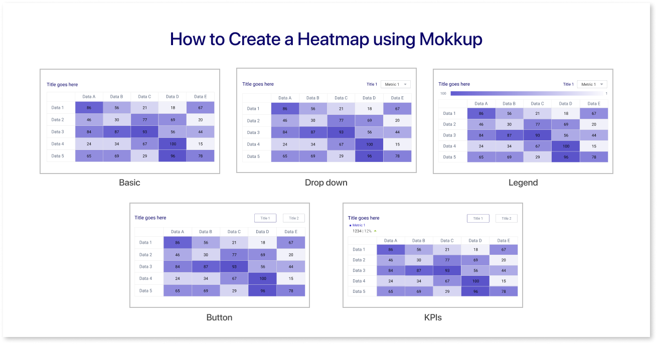
Mokkup.ai is a cloud based dashboard wireframing tool that helps business professionals create high quality dashboard wireframes without any prior design experience. It is designed to be incredibly user-friendly, even for those without prior design experience. Its intuitive drag-and-drop interface makes adding elements to your dashboard wireframe a breeze, allowing you to focus on crafting a visually appealing and informative dashboard.
On Mokkup, previewing your heatmap in the final dashboard is as easy as a single click. Check out our guide for practical tips and step-by-step instructions to use heatmaps effectively. Learn about customizing colors, interpreting data, and more to get the most from your visualizations.
For additional support and tutorials, visit our Help Center through this link. Whether you're new or experienced, the Help Center is your resource for mastering heatmaps on Mokkup.
Summing Up
In summary, heat maps are powerful tools for understanding website user behavior. With their visually intuitive representation of data, businesses can uncover patterns, optimize content, and enhance user experience. Beyond traditional analytics, heat maps offer valuable insights, making them essential for informed decision-making in the digital landscape. Embracing heat maps is a strategic move for refining online strategies and improving website performance.
Frequently Asked Questions
Heat maps use color gradients to show value intensity, making patterns and clusters instantly visible. Visualizations like bar or line charts focus more on trends, comparisons, or distributions over time.
Warmer colors (reds, oranges) usually indicate higher values or activity, while cooler colors (blues, greens) show lower ones. Look for clusters, hotspots, or gaps to spot trends and anomalies.
The larger the dataset, the more reliable the patterns. While there’s no fixed rule, aim for a statistically significant sample, enough data points to avoid misleading results from random variations.
In Mokkup.ai, simply drag and drop a heatmap widget into your dashboard wireframe, customize the color scale, and preview results instantly. No design expertise is required.
Top tools include Mokkup.ai for dashboard wireframes, Hotjar and Crazy Egg for website heatmaps, and Google Looker Studio or Tableau for business intelligence use cases.
Prompt it. Wireframe it with Mokkup.ai.
