
The Art and Science of Data Visualization
Did you know that choosing the wrong chart can completely change how data is understood? A poorly designed graph may hide key trends, while the right visualization can instantly clarify insights. According to the July 2025 Power BI Feature Summary, Microsoft has introduced enhancements to pie and donut charts, aiming to improve data interpretation and clarity
The challenge lies in knowing how to choose data visualization that matches the context. With so many chart types and tools available, selecting the right one has never been more important. This guide explains the chart selection process, explores common visualization types, and highlights practices that make data easier to interpret.
Table of Contents
- Why Choosing the Right Data Visualization Matters
- Step-by-Step Process for Selecting the Best Chart or Graph
- Core Types of Data Visualizations and When to Use Them
- Matching Data Types with Visualizations: Practical Examples
- Common Mistakes in Data Visualization (& How to Avoid Them)
- Top Tools for Creating Effective Data Visualizations in 2025
- Best Practices for Data Storytelling and User Engagement
Why Choosing the Right Data Visualization Matters
The value of data often depends on how it is presented. Even accurate numbers can lose meaning if the visualization is unclear. That’s why choosing the right chart or graph is more than a design choice; it directly affects how well information is understood and acted upon.
A few reasons why chart selection is critical:
- Clarity of insights: The right visualization highlights trends, patterns, and outliers that may not be visible in raw data.
- Faster decision-making: Clear visuals help audiences interpret information quickly, reducing the time needed to analyze reports.
- Avoiding misinterpretation: A poorly chosen chart can distort scale, exaggerate results, or hide context, leading to the wrong conclusions. The September 2025 Tableau release introduced enhancements to Q&A features, aiming to provide clearer and more accurate insights
- Engagement: Visualizing data captures attention and makes reports more accessible to both technical and non-technical users.
In business, visualization's impact is clear. A marketing team might use a heatmap to see customer activity across regions, while finance analysts rely on line graphs to monitor cash flow trends. Each case requires a different type of chart, and using the wrong one could easily lead to missed opportunities or flawed strategies.
Step-by-Step Process for Selecting the Best Chart or Graph
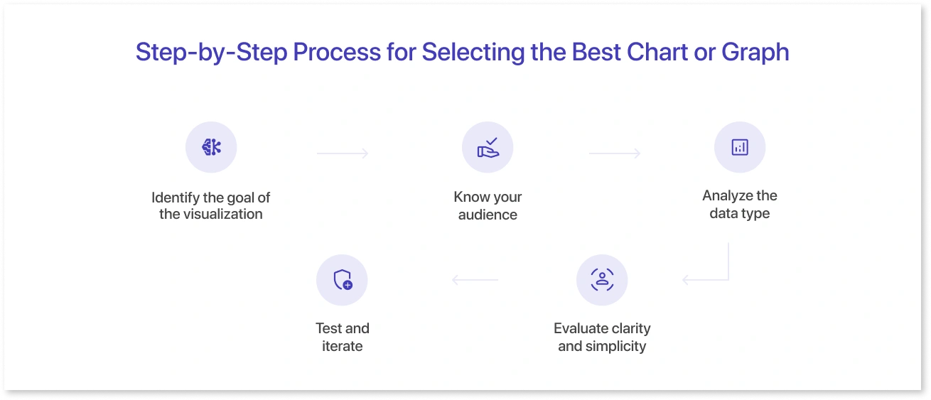
Selecting the right chart doesn’t have to be overwhelming. Following a structured approach ensures that the data is communicated clearly and effectively.
1. Identify the goal of the visualization
Start by asking what the chart needs to show. Do you highlight trends over time, compare categories, or show part-to-whole relationships? Understanding the goal narrows down the chart types that make sense.
2. Know your audience
Different audiences interpret data differently. Executives may prefer simple bar or line charts for quick insights, while analysts might need scatter plots or histograms for deeper analysis.
3. Analyze the data type
Consider whether the data is categorical, numerical, or time-based. The nature of the data guides whether a pie chart, line graph, or table is most appropriate.
4. Evaluate clarity and simplicity
Avoid cluttered visuals. A chart should be easy to read at a glance. Tools like Mokkup can help designers and analysts quickly test different layouts to see which presents data most clearly before finalizing dashboards.
5. Test and iterate
Create draft visualizations and gather feedback. Even minor adjustments in color, scale, or labeling can significantly improve comprehension. Using pre-built templates or wireframes can speed up this process and serve as a practical chart selection guide for teams.
Following this step-by-step process reduces guesswork and ensures that the chosen chart aligns with both the data and the intended message.
Core Types of Data Visualizations and When to Use Them
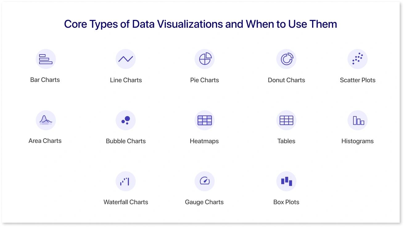
Understanding the main types of data visualizations helps choose the right one for each scenario. Each chart type serves a specific purpose and is better suited to certain data patterns.
1. Bar Charts
Used for comparing categories or showing changes over time. They are simple and clear, making them ideal for sales figures, survey results, or product comparisons.
2. Line Charts
Show trends or continuous data over time. Line charts help identify increases, decreases, and patterns in metrics like revenue, traffic, or stock prices.
3. Pie Charts
Display proportions or percentages within a whole. They are useful for showing market share, budget distribution, or demographic splits.
4. Donut Charts
A variation of pie charts that can include additional context in the center, making them suitable for highlighting a key figure alongside the proportions.
5. Scatter Plots
Identify relationships or correlations between two variables. Often used in research, sales forecasting, or analyzing customer behavior.
6. Area Charts
Like line charts, but emphasize the magnitude of change over time. Area charts work well for cumulative data like revenue growth or website engagement metrics.
7. Bubble Charts
A type of scatter plot where the size of the bubble represents a third variable. Useful for multi-dimensional data comparisons, such as sales by region and product size.
8. Heatmaps
Highlight patterns, density, or intensity across large datasets. Common in user behavior analysis, resource allocation, or geographical data visualization.
9. Tables
Best for detailed numbers where precision matters. Ideal for financial reports, operational metrics, or datasets that require exact values.
10. Histograms
Show frequency distributions of numerical data. Histograms are useful for understanding data spread, like age ranges of customers or test scores.
11. Waterfall Charts
Illustrate cumulative effects of sequential positive and negative values. Often used in financial analysis to show profit and loss or changes in revenue.
12. Gauge Charts
Display a single value within a range, commonly used for KPIs, performance metrics, or progress tracking.
13. Box Plots
Visualize data distribution through quartiles, highlighting medians, ranges, and outliers. Useful for spotting variability and anomalies in datasets.
Tools like Mokkup make it easier to experiment with these visualization types in wireframes before building full dashboards. By testing different charts and layouts early, teams can ensure the final visualization communicates insights effectively while reducing redesign effort.
Matching Data Types with Visualizations: Practical Examples
Choosing the right visualization often depends on the type of data being presented. Matching data types to the appropriate chart ensures clarity and prevents misinterpretation.
1. Categorical Data
Data that fits into distinct groups like product categories, regions, or departments works best with:
- Bar charts for comparisons across categories
- Pie or donut charts for showing proportions within a group
- Stacked bar charts for highlighting subcategories
Example: A retail team analyzing sales by product category can use a bar chart to compare revenue across items and a stacked bar chart to see online vs. in-store sales. Visualizing these options in a wireframe can help decide which chart communicates the message most clearly.
2. Numerical or Continuous Data
Data measured on a scale, such as revenue, website traffic, or test scores, is ideal for:
- Line charts to display trends over time
- Area charts to emphasize cumulative changes
- Histograms to show distributions
Example: A marketing team tracking monthly website visits can use a line chart to spot seasonal trends and a histogram to see the frequency of daily visits. Drafting these charts in a tool that supports quick layouts can save time before final implementation.
3. Correlated Data
When analyzing relationships between two or more variables:
- Scatter plots to identify patterns or correlations
- Bubble charts for adding a third variable dimension
- Heatmaps for density or intensity comparisons
Example: A product manager examining the relationship between advertising spend, clicks, and conversions might try a bubble chart to visualize all three variables at once. Testing different chart types early helps ensure the insights are clear.
4. Performance Metrics and KPIs
Single-value metrics like progress, performance, or capacity are best represented with:
- Gauge charts for quick status checks
- Waterfall charts to show cumulative impacts
Example: Finance teams can use waterfall charts to see how revenue grows from different sources or gauge charts to track KPI achievements. Visualizing these in mock dashboards before finalizing can reduce redesigns and improve clarity.
Common Mistakes in Data Visualization (& How to Avoid Them)
Even small errors in visualization can mislead viewers or obscure important insights. Recognizing and avoiding common mistakes helps ensure data is clear and actionable.
1. Choosing the Wrong Chart Type
A line chart for categorical data or a pie chart for trends over time can confuse the audience. Always match the chart to the data type and goal.
2. Overloading with Information
Too many variables, colors, or labels make charts cluttered. Keep it simple and focus on the key message you want to convey.
3. Ignoring Scale and Axes
Inconsistent scales or truncated axes can distort trends and exaggerate differences. Always label axes clearly and maintain proportional scales.
4. Using Excessive Colors
Too many colors can distract and confuse. Stick to a simple palette that highlights the important data points.
5. Neglecting Labels and Context
Charts without titles, legends, or units force viewers to guess what the data represents. Every chart should include clear labels and context. Every chart should consist of clear labels and context to follow proper data visualization techniques.
6. Misrepresenting Data
Avoid manipulating visuals to exaggerate results, such as cherry-picking data or misaligned bar lengths. Accuracy should always come first.
7. Forgetting the Audience
A complex heatmap may impress analysts but overwhelm executives. Always consider who will view the data and tailor the visualization for them.
By being aware of these mistakes, teams can ensure they select the best chart for data analysis and that dashboards remain accurate, readable, and impactful.
Top Tools for Creating Effective Data Visualizations in 2025
Choosing the right tool can greatly improve the efficiency of data visualization and sharing. Among the available options, Mokkup stands out for its combination of AI-driven features and collaboration capabilities.
Mokkup offers:
- AI Wireframe Generation: Instantly create dashboard layouts and chart suggestions based on your data. This helps teams test ideas quickly without starting from scratch.
- Export to BI Tools: Once a wireframe is ready, it can be exported directly to popular BI platforms like Power BI and Tableau, keeping designs consistent and reducing manual work.
- Live Collaboration: Teams can work together in real time, leave comments, and make adjustments instantly. This feature improves communication between analysts, designers, and stakeholders.
- Pre-Built Templates and Components: Ready-to-use charts and layouts speed up the process of building dashboards.
- Design Consistency: Built-in best practices guide users to maintain clear, readable, and enterprise-ready visualizations.
Other popular tools complement these features depending on specific needs:
- Tableau: Known for powerful analytics and interactive dashboards.
- Power BI: Offers seamless integration with Microsoft ecosystems and advanced reporting capabilities.
- Looker: Focuses on real-time data exploration and embedding analytics into workflows.
- Google Data Studio: Free and easy to use for basic dashboarding and reporting.
Among these, Mokkup stands out for bridging the gap between design and implementation. It allows teams to experiment with wireframes, collaborate in real time, and export directly to BI tools, all in a single workflow.
Best Practices for Data Storytelling and User Engagement
Effective data storytelling makes dashboards not just informative but engaging.
- Focus on the main message: Highlight key insights first and avoid clutter.
- Use the right chart type: Match visuals to the data to make patterns clear.
- Keep it simple: Limit colors, labels, and unnecessary elements.
- Provide context: Include titles, units, and explanations so viewers understand the data quickly.
- Encourage interactivity: Filters, drilldowns, and hover-over details help users explore insights without feeling lost.
Clear storytelling ensures dashboards guide decisions rather than just display numbers.
Conclusion
Choosing the right data visualization is key to turning numbers into insights. The process involves understanding your data, matching it with the appropriate chart, and presenting it clearly for your audience. By avoiding common mistakes, using effective tools, and following best practices for storytelling, dashboards become more than just reports; they become decision-making tools. Clear and thoughtful visualization ensures data drives action and supports better business outcomes, whether it's simple bar charts or interactive dashboards.
Frequently Asked Questions
Start by understanding the goal of your visualization and the type of data you have. Match the chart to the data- Categorical data works well with bar charts, continuous data with line or area charts, and relationships between variables with scatter or bubble charts. Clarity and simplicity should guide your choice.
Common types include bar charts, line charts, pie and donut charts, scatter plots, area charts, bubble charts, heatmaps, histograms, waterfall charts, and gauge charts.
Bar or column charts are ideal for comparisons. Line or area charts work best for trends over time. Choosing the right chart ensures the message is clear and actionable.
Key factors include the type of data, the audience, the message you want to convey, and the level of detail needed. Avoid clutter, maintain consistent scales, and provide context with titles and labels.
The right visualization highlights patterns, supports decision-making, and prevents misinterpretation. Poor chart selection can hide insights or create confusion, while the right choice makes data easy to understand and actionable.
Prompt it. Wireframe it with Mokkup.ai.
