
What is a Chart?
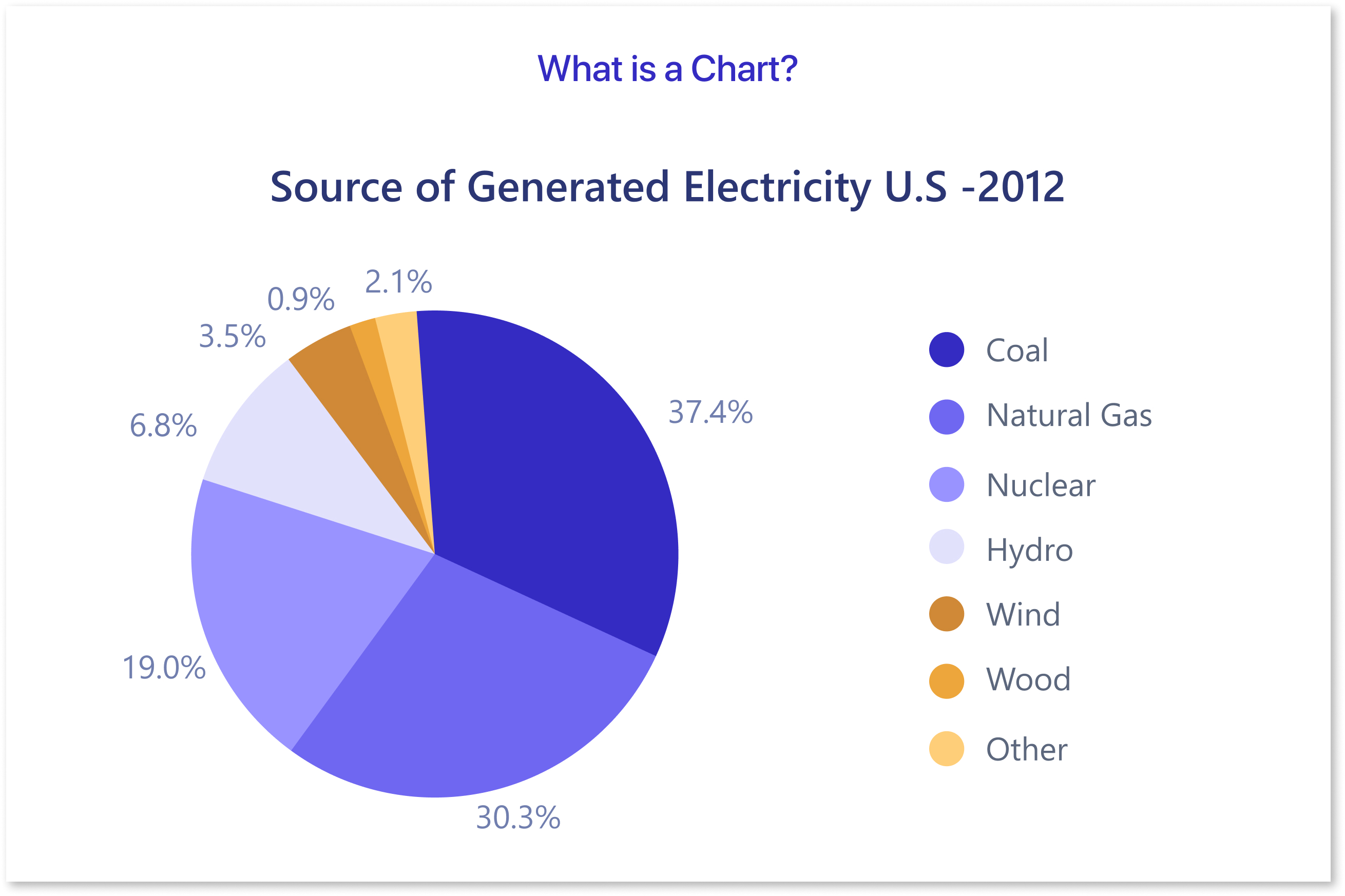
A chart is a visual representation of data designed to make information easier to understand and analyze. It uses symbols like bars, lines, or pie slices to display trends, patterns, and relationships. Charts simplify complex datasets, helping audiences quickly grasp insights, whether comparing values, tracking changes, or identifying distributions.
Table of Contents
- Introduction to Data Visualization
- Common Chart Types and Their Best Use Cases
- Do’s and Dont's of Data Visualization
- How to Pick the Right Chart Type Using Mokkup.ai?
Introduction to Data Visualization
Data visualization is the art and science of turning raw, complex datasets into graphical representations like charts, graphs, and diagrams. It transforms numbers into visual stories, making information more accessible and easier to interpret. Whether you're analyzing trends, comparing categories, or identifying patterns, visualizations help simplify complex concepts, enabling businesses and individuals to make informed decisions. Data visualization examples, such as bar charts, line graphs, and scatter plots, demonstrate how various datasets can be clearly represented for easy understanding.
In today’s data-driven world, data visualization tools play a vital role across industries. From tracking market trends in finance to optimizing operations in supply chains, visualizations present insights in a way that is both impactful and easy to share. Whether using simple charts or more complex visualizations, the right data visualization tools help transform raw data into valuable insights. Different types of charts, like stacked bar charts, pie charts, and line graphs, are essential for presenting various data points effectively.
Effective dashboard design is key to presenting these visualizations in a way that is both informative and user-friendly. By utilizing well-structured layouts and intuitive elements, dashboards provide real-time data insights in a centralized location. Whether for internal teams or client presentations, a dashboard mockup can offer a preview of the finished product, ensuring that all necessary data points are clearly displayed and easily accessible.
Common Chart Types and Their Best Use Cases
1) Bar Chart:
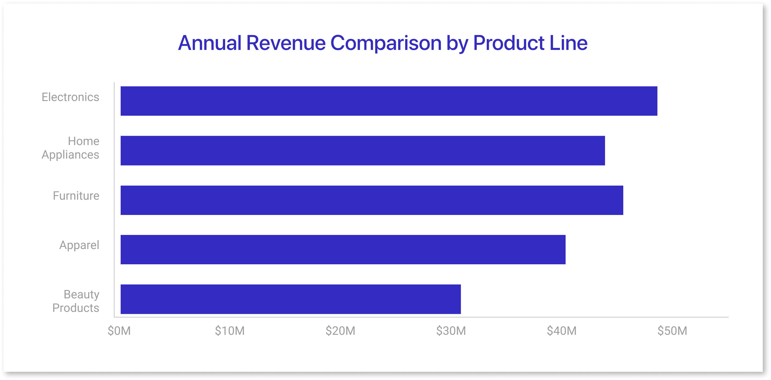
- Bar charts use horizontal bars to compare values across categories.
- They are ideal for showing discrete data and highlighting differences between groups.
- Bar lengths are proportional to the data they represent, making comparisons straightforward.
- Example: Comparing annual revenue for different product lines in a company.
2) Column Chart:
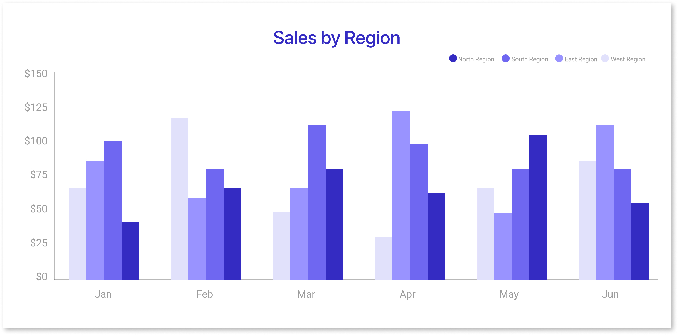
- Similar to bar charts but with vertical bars, column charts are used to compare data across categories.
- They are particularly effective when showing changes over time for discrete data points.
- Grouped or stacked versions allow for comparisons within categories or totals.
- Example: Displaying monthly sales figures for multiple regions.
3) Line Chart:
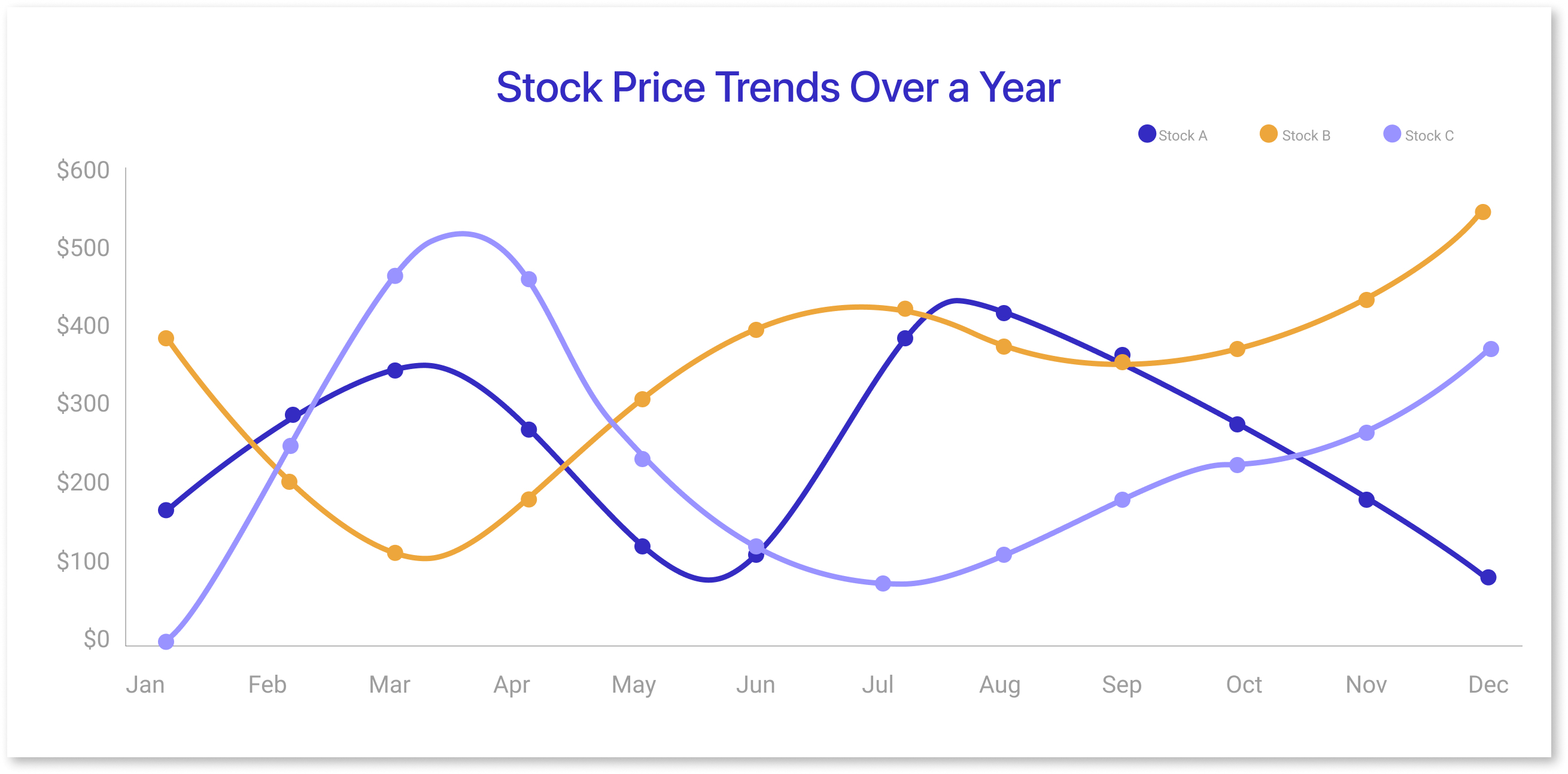
- Line charts display data points connected by lines, making them ideal for showing trends over time.
- They are excellent for visualizing continuous data and detecting patterns like growth or decline.
- Multiple lines can be used to compare related datasets.
- Example: Tracking stock prices over a year to identify market trends.
4) Area Chart
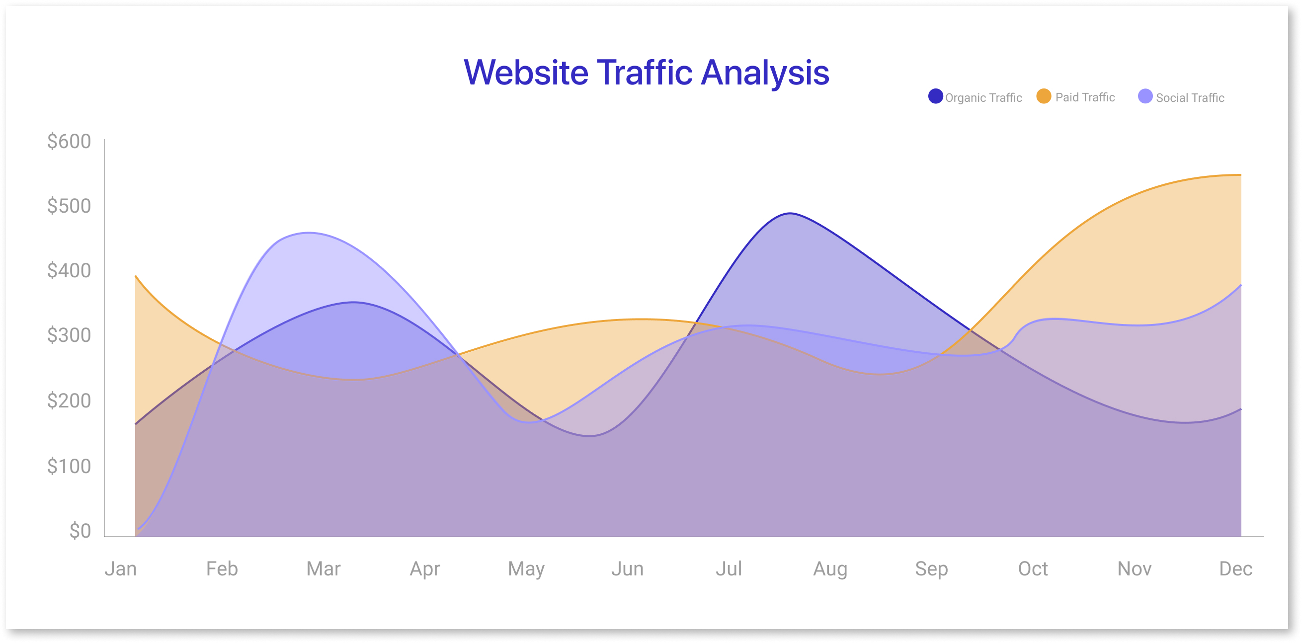
- Area charts are similar to line charts but fill the space beneath the line with color.
- They emphasize magnitude and are suitable for showing cumulative trends or part-to-whole relationships.
- Stacked area charts help compare multiple datasets.
- Example: Analyzing total website traffic with breakdowns by source, like organic, paid, and social.
5) Pie Chart:
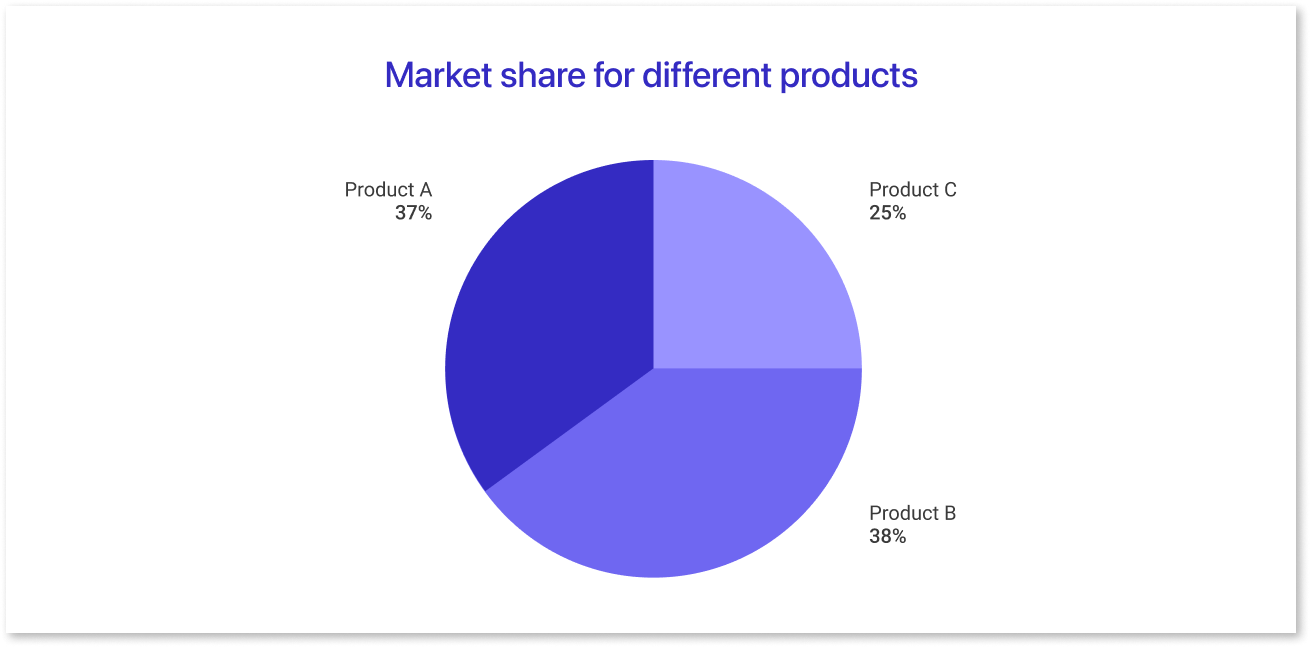
- Pie charts divide a circle into slices to represent the proportions of a whole.
- They are best used for data with limited categories and distinct percentages.
- Overuse or too many slices can make them hard to interpret.
- Example: Visualizing the allocation of a marketing budget across different channels.
6) Scatter Plot:
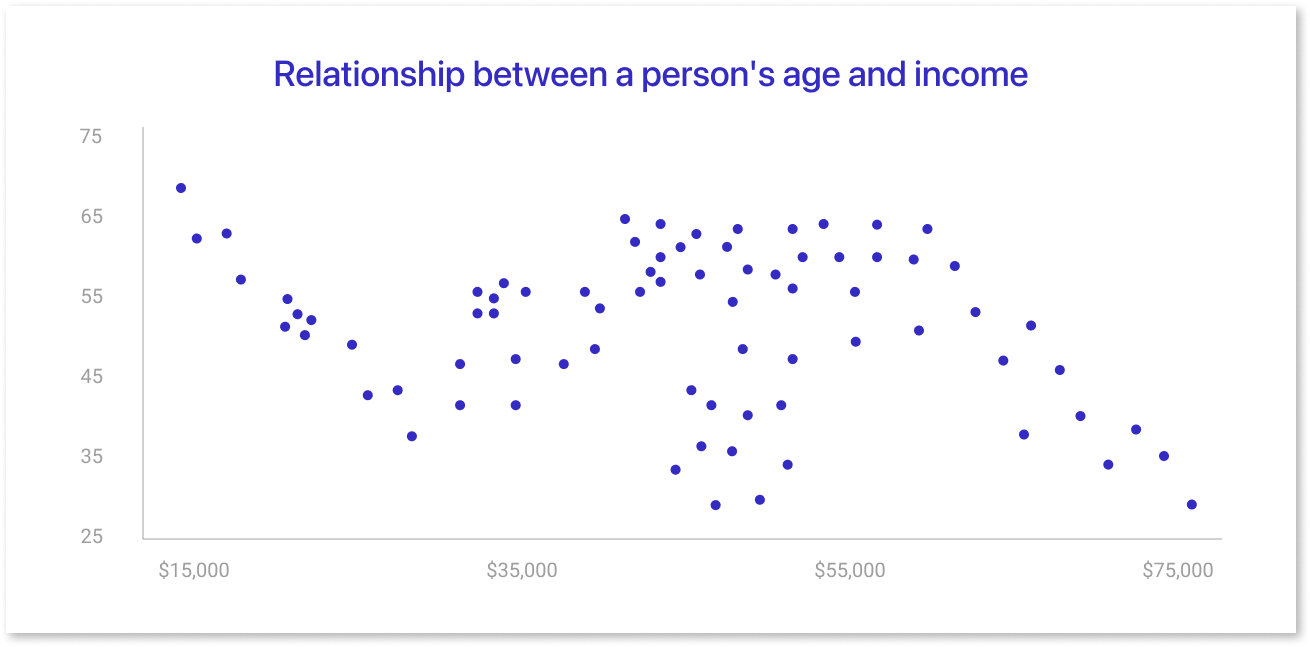
- Scatter plots use dots to show relationships between two variables.
- They help identify correlations, clusters, or outliers in the data.
- Adding trend lines can emphasize relationships or patterns.
- Example: Examining the relationship between advertising spend and sales revenue.
7) Histogram:
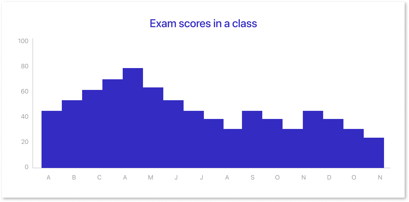
- Histograms display the frequency distribution of numerical data.
- They group data into bins to show how values are spread or clustered.
- Useful for understanding data distribution, such as normality or skewness.
- Example: Analyzing the distribution of employee salaries in a company.
8) Heatmap:
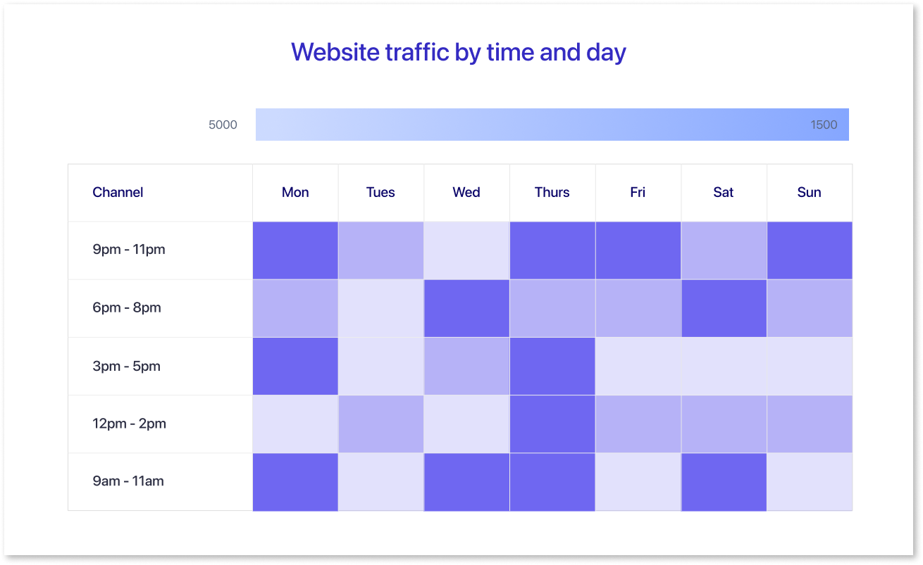
- Heatmaps use color intensity to represent data density or values within a matrix.
- They are excellent for identifying patterns or hotspots in large datasets.
- Often used for time-series data or categorical data comparisons.
- Example: Visualizing customer activity by hour and day to find peak engagement times.
These are some of the most common chart types, and the choice of chart depends on the specific data you want to convey and the story you want to tell with your data visualization.
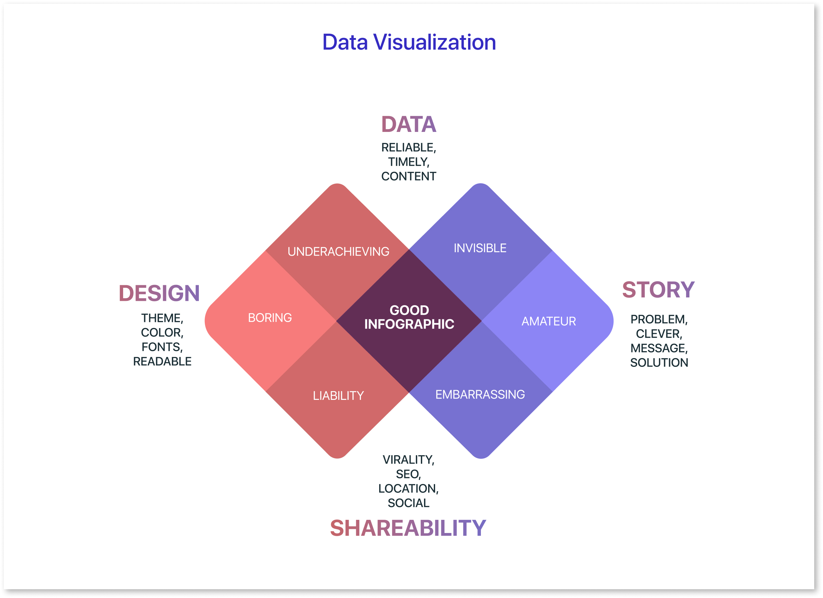
Do’s and Dont's of Data Visualization
Best practices of data visualization can help you create clear, concise, and informative visualizations that communicate your message effectively. By following these do’s and don’ts, you can ensure that your audience can understand your data and make informed decisions.
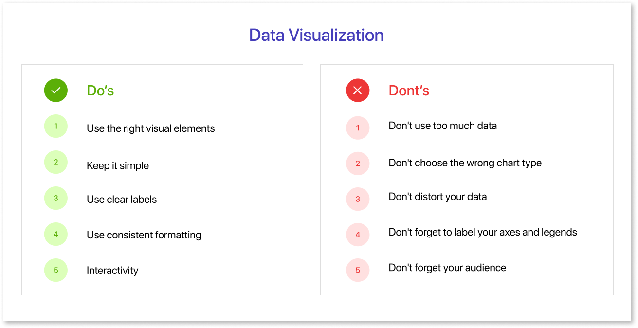
Do’s of Data Visualization:
1. Use the right visual elements:
The right visual elements can help you effectively communicate your data. The most common visual elements are color, size, shape, and position. For example, using a stacked bar chart can help break down complex data into more digestible parts, making it easier for your audience to understand the relationships between different data points.
- Color: Color can represent different data values, highlight important information, or create a sense of hierarchy.
- Size: Size can represent different data values, draw attention to important information, or create a sense of scale.
- Shape: Shape can represent different data values, create a sense of order, or add visual interest.
- Position: Position can represent different data values, create a sense of flow, or direct the viewer's attention.
2. Keep it simple:
Data visualizations should be easily understood and interpreted. Avoid using too many visual elements or too much complexity. Choose the right types of data visualization for your message, whether it's a bar chart, line graph, or a more detailed stacked bar chart.
3. Use clear labels:
Labels should be clear and concise and accurately describe the data they represent. For example, when presenting types of data visualization, make sure your labels clearly indicate what each data set or category represents.
4. Use consistent formatting:
Use consistent formatting throughout your visualization, such as the same color scheme, font, and line weight. This will help to make your visualization look more professional and polished, ensuring that all data and presentation elements are aligned.
5. Interactivity:
For digital visualizations, consider adding interactive elements like tooltips or filters to provide additional context or allow users to explore the data. These can be especially useful for exploring complex data visualizations and enabling deeper insights.
Dont’s of Data Visualization:
1. Don't use too much data:
One of the most common mistakes in data visualization is trying to cram too much information into one chart. This can make your visualization cluttered and difficult to understand. Instead, focus on highlighting the most important insights from your data. In cases where data volume is high, consider breaking it into multiple visualizations or using a stacked bar chart to manage the complexity.
2. Don't choose the wrong chart type:
Different chart types are better suited for different types of data. For example, a pie chart is good for showing the composition of a whole, but a line chart is better for showing trends over time. Similarly, a stacked bar chart can help show the breakdown of categories within a total. Choose the chart type that best fits your data and its purpose.
3. Don't distort your data:
It's important to be honest and accurate with your data visualization. Don't try to manipulate your data to make it look better than it really is. This can mislead your audience and damage your credibility. Always ensure the correct presentation of your data, whether you are showcasing trends, comparisons, or proportions.
4. Don't forget to label your axes and legends:
Make sure that your audience understands what they're looking at. Label your axes with clear and concise descriptions, and include a legend to explain the different colors or symbols in your visualization. When presenting types of data visualization, such as stacked bar charts, label each segment clearly to avoid confusion.
5. Don't forget your audience:
When creating a data visualization, it's important to consider your audience. Consider what they already know about your topic and what they need to know. Tailor your visualization to their level of understanding and needs. If your audience is unfamiliar with certain data and presentation methods, simplify the visualization or include explanatory text.
Remember that the choice of visualization type should align with your data and your message. Not all data is suited for every type of chart or graph, so choose the one that best communicates your insights. Effective data visualization combines the science of data with the art of design to engage and inform your audience.
How to Pick the Right Chart Type Using Mokkup.ai?
Selecting the correct chart type is crucial for creating effective data visualizations. With Mokkup.ai, this process becomes straightforward, thanks to its wireframing capabilities. A dashboard wireframe is a preliminary layout that maps out how data will be displayed, offering a clear blueprint before the final design. It’s particularly helpful for:
- Visualizing how different charts and metrics fit together.
- Collaborating with teams to refine ideas.
- Saving time by reducing back-and-forth revisions.
Mokkup.ai simplifies this process with features designed to make wireframing and chart selection effortless. Here’s how its tools can guide you in picking the right chart type:
1. 180+ Dashboard Templates and Drag-and-Drop Elements
Mokkup.ai provides over 180 pre-built dashboard templates tailored to various industries and use cases. You can select a template that matches your needs and customize it further by drag-and-drop elements.
- Add charts, visuals, and text boxes with a simple drag-and-drop action.
- Adjust layouts to fit your data without requiring design expertise.
- How This Helps: It streamlines the process of visualizing data layouts and ensures that your dashboard looks polished from the start.
2. Live Demo Feature with PowerBI and Tableau Versions
Mokkup.ai’s live demo feature lets you preview the pre-built templates in PowerBI and Tableau formats for better visualization.
- Preview how the charts and dashboards will look in real BI tools.
- Identify and fix any gaps in the visualization before finalizing.
- How This Helps: It ensures that the dashboard wireframe fits the aesthetics expected in the tools where it will ultimately be implemented.
3. Customizable Screen Sizes for Adaptability
Adapt your dashboard for different devices or screen sizes directly in Mokkup.ai.
- Resize your wireframe to ensure compatibility with desktops & tablets.
- Adjust chart placements to maintain clarity across various screen dimensions.
- How This Helps: Guarantees a consistent user experience, regardless of the device used to view the dashboard.
4. Extensive Library of Charts and Visuals
Access a wide range of chart options and visuals in Mokkup.ai’s library. Whether you need bar charts, line graphs, or heat maps, you’ll find everything in one place.
- Explore pre-designed charts tailored for different data types.
- Quickly drag and drop charts into your wireframe for seamless integration.
- How This Helps: Simplifies chart selection and reduces the time spent creating visuals from scratch.
5. Commenting Feature for Real-Time Feedback
Collaborate effectively by using Mokkup.ai’s built-in commenting feature.
- Share your wireframe with team members to collect feedback.
- Address suggestions or changes directly within the platform.
- How This Helps: Improves communication and accelerates the review process, ensuring faster project completion.
By combining these features, Mokkup.ai makes it easy to pick the right chart type, customize it for your data, and collaborate with your team—all within one platform. With no learning curve, it’s the perfect tool for creating impactful dashboards in minutes.
Conclusion
In conclusion, picking the ideal chart type for your data doesn't have to be a headache. You can ensure your data tells a clear and compelling story by understanding the basics of data visualization and exploring common chart types like bar charts, line graphs, and scatter plots. Following the dos and don’ts of visualization helps maintain clarity and avoid common pitfalls, such as overcrowded visuals or misleading representations.
Tools like Mokkup.ai simplify the process of selecting and customizing charts. With its extensive library of templates, drag-and-drop features, and real-time feedback capabilities, Mokkup.ai empowers you to create wireframes that align perfectly with your data and objectives. By applying these principles and leveraging the right tools, you can transform raw data into visuals that are not only informative but also impactful for decision-making and storytelling.
Prompt it. Wireframe it with Mokkup.ai.
