
A scatter plot is a graphical representation where individual data points are plotted on a two-dimensional graph, allowing you to see the relationship between two variables. By displaying data visually, scatter plots help uncover patterns, trends, and correlations that might not be immediately apparent through raw data alone. Widely used across various industries, from sales and marketing to finance and research, scatter plots are invaluable for making data-driven decisions. This blog delves into the essentials of scatter plots, showcasing their significance and explaining why integrating them into your business analytics toolkit can provide a competitive edge.
Table of Contents
- What are Scatter Plots in Data Visualization?
- What are the Components of a Scatter Plot?
- Types of Scatter Plots
- When to Use a Scatter Plot?
- How to Create a Scatter Plot using Mokkup
- Advantages and Limitations of Scatter Plots
What are Scatter Plots in Data Visualization?
A scatter plot displays points that represent the values of two different variables. Each point on the plot corresponds to one observation from the dataset. The position of each point is determined by the values of the two variables:

For example, in a dataset analyzing the impact of climate change on various cities, the X-axis could represent the average annual temperature increase, and the Y-axis could represent the population affected by this increase. Each point on the scatter plot would represent a city, showing how climate change impacts different populations. Different colors or shapes could be used to distinguish between continents or regions, making it easier to compare the effects globally.
What are the Components of a Scatter Plot?
It's important to understand the various components that make up this type of visualization to utilize and interpret scatter plots effectively. Below is a detailed explanation of each component using a dataset analyzing the impact of climate change on various cities:
1. Axes
- X-axis (Horizontal Axis): This axis represents one of the variables in the dataset. The values along this axis are used to position points horizontally. For example, the X-axis could represent the average annual temperature increase in each city.
- Y-axis (Vertical Axis): This axis represents the second variable in the dataset. The values along this axis are used to position points vertically. For instance, the Y-axis could represent the population affected by the temperature increase in each city.
2. Data Points
Each point on a scatter plot represents a single data observation plotted at the intersection of its X and Y values. The position of the point indicates the relationship between the two variables for that observation. For example, if we are plotting the impact of climate change on cities, each point represents a city's average annual temperature increase and its affected population.
3. Title
The title of the scatter plot provides a brief description of what the plot represents. It helps viewers understand the context of the data being visualized. For example, the title might be "Impact of Climate Change on Urban Populations."
4. Axis Labels
Each axis should have a label indicating what variable it represents and the units of measurement, if applicable. This ensures clarity and aids in the interpretation of the data points. For example, the X-axis might be labeled "Average Annual Temperature Increase (°C)" and the Y-axis "Population Affected (millions)."
5. Scale and Ticks
- Scale: The scale on each axis determines the range of values and how they are spaced. A proper scale ensures data points are spread out appropriately for better visualization.
- Ticks: Marks along the axes at regular intervals. Ticks help determine the exact values of data points on the plot. They are often accompanied by tick labels that show the corresponding value.
6. Grid Lines
Horizontal and vertical lines that span the plot area correspond to the ticks on the axes. They help estimate the data points' values by providing a reference frame.
7. Trend Line
A line that can be added to the scatter plot to indicate the overall direction or trend of the data points. It helps in understanding the general relationship between the two variables. The trend line can show whether the relationship is positive, negative, or non-existent. For example, a line sloping upwards indicates a positive correlation, suggesting that as the temperature increases, the affected population also increases.
8. Legend
A legend explains the meaning of various shapes, colors, or symbols used in a scatter plot. Each shape or symbol represents a different data series or category, making it essential for understanding comparative studies or categorical data visualizations. For instance, different colors or shapes could be used to distinguish between cities on different continents, aiding in a comparative analysis of how climate change impacts various regions globally.
9. Size of Bubbles
In a bubble chart, a scatter plot variation, the size of each bubble represents a third variable. This additional dimension can provide more insight into the data. For example, in our climate change dataset, the size of the bubble could represent the GDP of each city, illustrating how economic factors correlate with climate change impacts.
10. Color
Color can be used to represent different categories or other variables. For instance, different colors might represent cities from different continents, or they could indicate the severity of climate change impacts (e.g., light colors for minor impacts and dark colors for severe impacts). This enhances the ability to identify patterns and differences in the data quickly.
Types of Scatter Plots
Scatter plots come in various types, each serving a specific purpose in data analysis and visualization. Understanding these different types can help you choose the most appropriate one for your data. Here are some common types of scatter plots:
1. Basic Scatter Plot
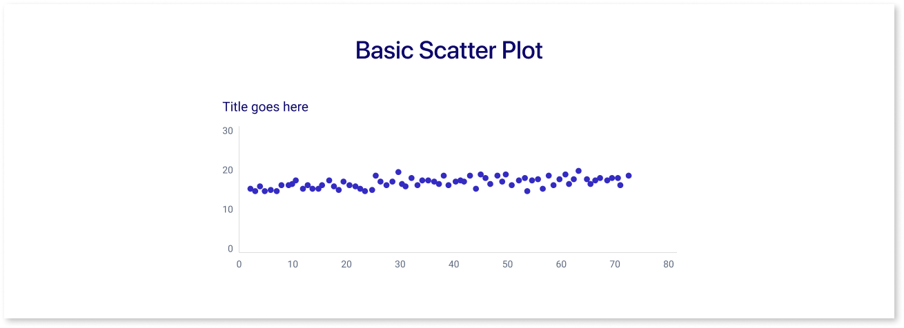
- Description: The simplest form of a scatter plot, where each point represents an observation based on two variables.
- Usage: Used to identify relationships, correlations, or trends between two continuous variables.
2. Bubble Scatter Plot

- Description: Similar to a basic scatter plot but includes a third variable represented by the size of the data points (bubbles).
- Usage: Useful when you want to add another dimension of data, such as population size, magnitude, or intensity.
3. Categorical Scatter Plot
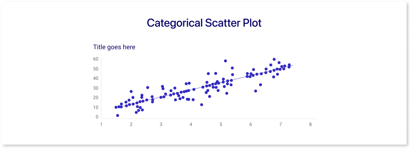
- Description: Uses different colors or shapes to distinguish between categories or groups within the data.
- Usage: Helps to identify patterns or differences between different groups in the dataset.
4. Heatmap Scatter Plot
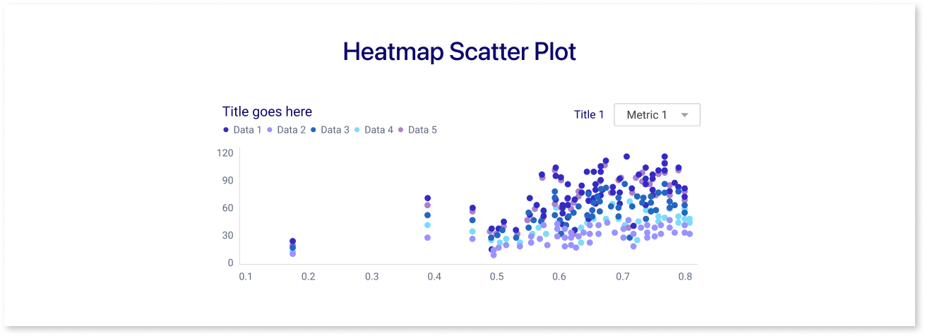
- Description: Uses color intensity to represent the density of data points in different regions of the plot.
- Usage: Useful for large datasets to visualize areas with high concentrations of data points.
5. Connected Scatter Plot
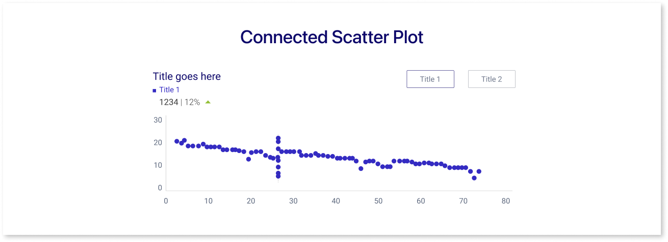
- Description: Data points are connected by lines, often in the order they appear in the dataset.
- Usage: Useful for time series data or when the order of observations matters.
When to Use a Scatter Plot?
Here are several scenarios where scatter plots are particularly created and interpreted for business:
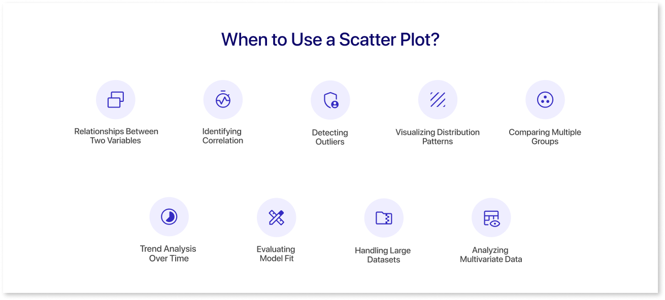
1. Exploring Relationships Between Two Variables
- Scatter plots are ideal for visualizing the relationship between two continuous variables. This can help identify whether there is a correlation and if so, the nature of the relationship.
- Example: Plotting the height and weight of individuals to see if taller people tend to weigh more.
2. Identifying Correlation
- Scatter plots help in determining the strength and direction of a relationship between two variables:
- Positive Correlation: As one variable increases, the other variable also increases.
- Negative Correlation: As one variable increases, the other variable decreases.
- No Correlation: No discernible pattern in the data points.
- Example: Examining the relationship between study hours and test scores.
3. Detecting Outliers
- Outliers are data points that fall significantly outside the general pattern of the data. Scatter plots make it easy to spot these anomalies.
- Example: In a scatter plot of income versus expenditure, identify individuals whose expenditure is unusually high or low compared to their income.
4. Visualizing Distribution Patterns
- Scatter plots can reveal clustering patterns, spread, and gaps in data which help in understanding the distribution of data points.
- Example: Plotting the age and income of a population to see if there are clusters of age groups with similar income levels.
5. Comparing Multiple Groups
- Scatter plots can compare multiple groups within the same plot by using different colors or shapes, making it easy to distinguish and analyze different categories or groups.
- Example: Comparing the relationship between exercise time and cholesterol levels among different age groups.
6. Trend Analysis Over Time
- While line plots are typically used for time series data, scatter plots can also be used, especially when data points are not evenly spaced over time.
- Example: Plotting the dates (X-axis) and stock prices (Y-axis) to observe the stock price trends over time.
7. Evaluating Model Fit
- In statistical modeling, scatter plots can be used to compare observed data against model predictions, helping to evaluate the fit and performance of a model.
- Example: Plotting predicted versus actual values in a regression analysis to assess how well the model captures the data trend.
8. Handling Large Datasets
- Scatter plots, especially heatmap scatter plots or those with transparency, are useful for large datasets to show density and distribution without clutter.
- Example: Visualizing millions of data points in a customer database to identify dense clusters of similar customer behaviors.
9. Analyzing Multivariate Data
- Scatter plots can be extended to include more variables by using bubble sizes, colors, or 3D plotting, providing insights into the interactions among multiple variables.
- Example: Plotting a 3D scatter plot of GDP (X-axis), life expectancy (Y-axis), and population size (bubble size) to study the relationship between these variables for different countries.
How to Create a Scatter Plot using Mokkup
A wireframe is a visual guide representing a dashboard's skeletal framework. It outlines the layout, structure, and essential components without delving into the finer details like design elements and color schemes. Wireframes are crucial in the initial stages of dashboard creation as they provide a clear blueprint, ensuring that the dashboard's functionality and flow meet the business requirements. When incorporating scatter plots into dashboards, wireframes help in strategically placing these plots to ensure they effectively communicate trends, correlations, and outliers in the data, aiding in better business decision-making.
Mokkup.ai is a cloud-based dashboard wireframing tool that enables business professionals to create high-quality dashboard wireframes without any prior design experience. It is designed to be incredibly user-friendly, even for those without a design background. Its intuitive drag-and-drop interface makes adding elements to your dashboard wireframe simple, allowing you to focus on crafting a visually appealing and informative dashboard.
Steps to Create a Scatter Plot on Mokkup:
- Add a Scatter Plot Element: Use the drag-and-drop interface to add a scatter plot element to your wireframe. Look for scatter plot options in the element library.
- Customize Axes: Define your X and Y axes by assigning the appropriate variables from your dataset. Label each axis clearly to ensure your plot is easy to understand.
- Plot Data Points: Input your data into the scatter plot. Each point will represent an observation from your dataset, positioned based on its X and Y values.
- Adjust Visuals: Customize the appearance of your scatter plot by changing colors, sizes, and other visual elements to highlight specific data points or trends.
- Preview and Finalize: Preview your scatter plot within the final dashboard layout. Make any necessary adjustments to ensure clarity and visual appeal.
Tips for Effective Scatter Plots:
- Customize Colors: Use different colors to represent different categories or groups within your data for better visual distinction.
- Size of Data Points: In a bubble chart, use the size of the bubbles to represent a third variable, adding another layer of information to your scatter plot.
- Interpreting Data: Pay attention to the trend line and the overall distribution of data points to draw meaningful conclusions from your scatter plot.
For additional support and tutorials, visit our help center articles.
Advantages and Limitations of Scatter Plots
|
Advantages |
Limitations |
|
Visualization of Relationships: Scatter plots show the relationship between two continuous variables. They help to identify patterns, trends, and correlations. |
Limited to Two Variables: Scatter plots are only useful for analyzing relationships between two variables. Other techniques like scatter plot matrices or dimensionality reduction methods are needed for higher-dimensional data. |
|
Detection of Outliers: Outliers can be easily spotted on a scatter plot, which can be crucial for data analysis and decision-making. |
Difficulty with Large Data Sets: With very large datasets, scatter plots can become cluttered and difficult to read, making it hard to discern patterns or trends. |
|
Easy Interpretation: Scatter plots are easy to interpret, making them accessible to a wide audience, including those without advanced statistical knowledge. |
Overplotting Issues: When data points overlap (overplotting), it can be challenging to see individual points or accurately interpret the density of points in a region. |
|
Identification of Clusters: They can reveal clusters or groupings within the data, indicating that there may be subgroups or patterns worth investigating further. |
No Causal Inference: While scatter plots can show correlation, they cannot establish causation. Further statistical analysis is required to determine cause-and-effect relationships. |
|
Trend Line Visualization: By adding a trend line, it’s possible to see the direction and strength of a relationship, providing more insight into the nature of the data. |
Interpretation Challenges with Weak Relationships: When the relationship between variables is weak or non-linear, it can be difficult to interpret the scatter plot meaningfully. |
|
Simplicity in Creation: They are simple to create with various tools and software, requiring a basic understanding of the data being plotted. |
Requirement of Continuous Data: Scatter plots are unsuitable for categorical data and work best with continuous data. Categorical data analysis requires different types of visualizations. |
|
Data Point Representation: Each point on the scatter plot represents an individual data point, providing a detailed view of the data distribution. |
Potential Misleading Representations: Without proper scaling and labeling, scatter plots can be misleading, misrepresenting the strength or nature of the relationship between variables. |
Summing Up
Scatter plots are a valuable visualization tool for exploring and illustrating the relationship between two continuous variables, easily highlighting outliers, clusters, patterns and trends. However, they are limited by their inability to handle more than two variables, potential overplotting with large datasets, and their restriction to showing correlation rather than causation. Proper scaling, labeling, and context are essential for accurate interpretation. Visualize how your scatter plot analysis works with the rest of your dashboard by building a wireframe on Mokkup.ai first.
Frequently Asked Questions
Look for upward or downward trend- positive slopes show direct relationships, while negative slopes show inverse ones.
Correlation shows a relationship between two variables, but causation means one variable directly impacts the other.
Use scatter plots for variable relationships and outliers, while line charts are better for trends over time.
Outliers appear as points far from the cluster or trend line, signaling unusual patterns worth investigating.
Excel, Google Sheets, Tableau, and Power BI offer easy-to-use scatter plot features for beginners.
They reveal relationships between spend, reach, and conversions, helping spot trends and optimize campaign strategies.
Prompt it. Wireframe it with Mokkup.ai.
