
If we have to define a histogram, it is a visual dynamo that transcends conventional charts and graphs. Imagine a group of connected rectangles, where each rectangle represents a different part of the data. It's like a story told visually, going beyond just numbers.

Let's explore histograms to understand their creation, explore various types, and see how they differ from charts and graphs, as well as other data visualizations.
Table of Content
- What is a Histogram?
- The Role of Histograms in Data Analysis
- Diverse Applications of Histograms in Dashboards
What is a Histogram?
A histogram is nothing but a graphical representation of the dataset distribution. It provides a visual summary of the underlying frequency distribution of a set of continuous or discrete data. In statistics and data analysis, people commonly use histograms to comprehend patterns and characteristics of a dataset.

Components of a Histogram
| Components | Description |
| X-Axis | The X-axis, also known as the horizontal axis, represents the range of values in the dataset. And is composed of bins. |
| Y-Axis | The Y-axis shows how often values appear on the X-axis. |
| Bins & Intervals | On the X-axis, intervals, known as bins, divide the data. These intervals are essential for grouping data points and creating a visual representation of the distribution. The width of the bins determines the range of values grouped. Choosing an appropriate bin width is crucial, as it can impact the interpretation of the histogram. |
| Frequency | It represents the numerical data points falling within each bin. The height of each bar represented in the histogram corresponds to the frequency of data points in that bin. |
| Density | In some cases, it's more informative to use density instead of frequency. Density is the frequency divided by the width of the bin, providing a normalized measure. This is particularly useful when dealing with datasets of different sizes. |
Types of Histograms

- Symmetric Distribution: In a normal distribution, a bell-shaped curve forms as the data is evenly spread around the mean. The histogram has one peak in the middle. Data points have an equal chance of being on either side of the average.
- Right-Skewed Distribution: Also called positively skewed, has a long tail on the right side. Most of the data points concentrate on the left, with the tail extending towards higher values. Right-skewed histograms indicate that the dataset has outliers or extreme values on the higher end.
- Left-Skewed Distribution: Conversely, a left-skewed distribution, or negatively skewed, has a long tail on the left side. The majority of data points cluster on the right, with the tail extending towards lower values. Left-skewed histograms suggest the presence of outliers or extreme values on the lower end of the distribution.
- Uniform Distribution: All values or intervals in a dataset have similar frequency. Also called rectangular distribution. In a histogram, this appears as a flat, constant level across all bins, indicating no apparent clustering or skewness.
- Normal Unimodal Distribution: A normal unimodal distribution is a subset of the symmetric distribution. In this case, a single peak centers the data, forming a classic bell curve. This type of distribution is common in naturally occurring phenomena and is often used as a reference for statistical analysis.
- Symmetric Bimodal Distribution: This distribution has two peaks of similar height, indicating two modes or patterns in the data. This indicates that the data may arise from two different processes or populations.
- Non-Symmetric Bimodal Distribution: Having two peaks of different heights, unlike the symmetric bimodal distribution, reveals that the data is not evenly distributed between the two modes, exposing the complexity of the dataset.
The Role of Histograms in Data Analysis
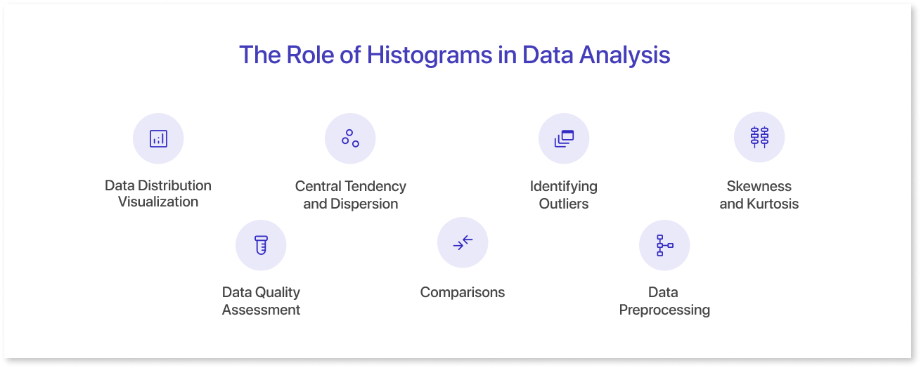
Histograms help analysts understand data distribution, shape, and central tendency by displaying data points in intervals or bins. Their benefits include detecting irregularities, identifying skewness and kurtosis, evaluating the quality of the data, and allowing easy dataset comparisons.
The following are some important features of histograms' role in data analysis:
- Data Distribution Visualization: Histograms display the frequency or count of data points within predefined intervals or bins.
- Data Quality Assessment: The purpose of a Histogram help in assessing the quality of the data by revealing patterns and irregularities.
- Central Tendency and Dispersion: Histograms show central tendency (mean, median, mode) and dispersion of data. Observing the width and shape of the histogram allows one to assess the spread or dispersion of the data.
- Comparisons: Histograms allow for easy comparison between different datasets or between different periods. This helps in understanding changes and variations in the data over time.
- Identifying Outliers: In a histogram, it is easy to identify outliers, which are data points that significantly differ from the majority.
- Data Preprocessing: Before applying statistical techniques, analysts often use histograms to understand the data's characteristics and decide on appropriate data preprocessing steps.
- Skewness and Kurtosis: Histograms allow for a visual assessment of the skewness (asymmetry) and kurtosis (tailedness) of a distribution. Positive skewness indicates a distribution with a longer right tail, while negative skewness indicates a longer left tail.

Benefits of Using Histograms
Histograms are powerful graphical representations of data distribution that provide valuable insights into the underlying patterns and characteristics of a dataset. They are helpful when you want to know how often and where values occur in a group.
Here are some scenarios where you can effectively employ an example of a histogram:
- Visual Clarity: Histograms provide a clear and concise visual representation of data distribution. This data visualization format helps analysts and decision-makers understand complex data patterns quickly and easily. When used alongside different types of bar graphs, histograms enhance the clarity and effectiveness of data presentation.
- Easy Communication: When communicating findings to a diverse audience, histograms serve as effective tools for simplifying complex data. The visual appeal of histograms aids in conveying key insights without the need for extensive statistical knowledge.
- Pattern Recognition: The visual nature of histograms facilitates the identification of patterns and trends in data. Analysts can identify high points, low points, or imbalances, which helps recognize patterns and differences in the distribution of the data.
Challenges and Considerations
| Categories | Challenges | Consideration |
| Clutter | Including too many histograms or complex ones can lead to visual clutter. | Prioritize relevant histograms and use interactivity to focus on specific aspects. |
| Bin Size and Intervals | Selecting appropriate bin sizes and intervals is subjective and impacts data perception. | Allow dynamic adjustments and exploration of different views. |
| Limited Space | Dashboard wireframes have limited space, making it challenging to present detailed histograms. | Opt for compact representations, like small multiples or linked histograms. Small multiples are a collection of small things. Linked histograms are a group of histograms that share a common axis or data. |
| Interpretation Challenges | Users may struggle to interpret histograms, especially without a statistical background. | Include tooltips and annotations for guidance. |
| Interactivity | Static histograms limit user interaction. | Implement features such as filtering and zooming for dynamic exploration. |
| Accessibility and Color Choices | Poor color choices hinder usability, especially for users with color vision deficiencies. | Use an accessible color palette and provide alternative text. |
| Data Quality and Outliers | Outliers can distort histogram perception. | Allow toggling outlier visibility and present additional statistical measures. |
| Real-time Considerations | Dashboards deal with real-time data, requiring dynamic adaptation. | Ensure seamless handling of real-time updates and provide user-adjustable update settings. |
| Repetitive Patterns | Using similar histogram templates may lead to monotony. | Introduce variety and tailor templates to the specific data characteristics for a more engaging design. |
Diverse Applications of Histograms in Dashboards
Histograms excel in scenarios where understanding the frequency and distribution of values is crucial for decision-making. Whether the nuances of market trends, analyzing customer behavior, or exploring scientific data, histograms work wonders by providing a better perspective.
- Data Distribution: Histograms shine when illustrating the distribution of a dataset. Design dashboards dedicated to showcasing data patterns and frequencies across various ranges.
- Performance Analytics Dashboards: For businesses focused on tracking performance metrics, histograms offer a nuanced understanding of performance variations.
- Financial Dashboards: Histograms are important in finance for showing financial distributions, like transaction amounts, portfolio returns, and risk assessments.
- Customer Engagement: Marketing and customer-centric businesses can use histograms to display customer behaviors, purchase frequencies, or engagement levels.
- Healthcare Metrics: In healthcare, histograms can effectively represent patient demographics, medical test results, or treatment outcomes.
- Supply Chain Analysis: For supply chain management, histograms are ideal for illustrating variations in delivery times, inventory levels, or production output.
- Social Media: Social media managers and analysts can benefit from histograms when analyzing user engagement metrics, post reach, or audience demographics.
- HR Metrics: HR professionals can employ histograms to visualize employee performance scores, training completion rates, or time-to-hire metrics.
When creating a dashboard, it's a good idea to use a dashboard wireframing tool like Mokkup.ai, whether or not you include a histogram. This will help you understand the space you need, what other elements you can add to make the dashboard more impactful, etc.
Final Thoughts
Histograms are useful in statistics and data analysis as they show details of datasets, like their shape and skewness. And when it comes to building your dashboards with a wealth of possibilities, you already know where to go. So, what are you waiting for? Head over to Mokkup.ai and harness the full potential of histograms in statistics and data analysis.

Frequently Asked Questions
A histogram is a chart that shows how often values fall into continuous ranges (bins). It helps you quickly see the shape, spread, and patterns (like skew or clusters) in numeric data.
Use a histogram to understand the distribution of a continuous metric, such as response time, sales amount, age, or error rates, especially when you have many data points.
Histograms group numeric values into ordered bins with no gaps between bars; bar charts compare categories (like regions or products) and usually have space between bars.
Common shapes you’ll see:
- Bell‑shaped (normal)
- Right‑skewed (tail to the right)
- Left‑skewed (tail to the left)
- Bimodal (two peaks)
To reveal the distribution of your data so you can spot central tendency, spread, skew, outliers, and natural groupings before doing deeper analysis.
Prompt it. Wireframe it with Mokkup.ai.
