
Data visualization is like magic for data. It turns complicated numbers into pictures that anyone can understand. It's not just for experts; anyone can use it to learn things from data and explain stuff better. Among the various visualization techniques, column and bar charts are important for presenting data in a structured and effective way.
Table of Content
- What is a Column Chart?
- What is a Bar Chart?
- Differentiating Stacked and 100% Stacked Bar/Column Charts
- Choosing the Right Type: Bar Chart vs. Column Chart
- Final Thoughts
What is a Column Chart?
A column chart is like a picture made of bars. Each bar represents a group, and how tall it is tells you how much stuff is in that group. People like it because it's simple and helps them see data better.
Why do we use Column Charts to depict data?
- Excellent for displaying and comparing discrete sets of data across different categories. The chart is easy to understand and shows trends, patterns, and variations in the data.
- Effective for showcasing the magnitude of each data point within a category. You can use varying length of the bars or heights to identify the category with the highest or lowest values. This helps in making informed decisions based on the data.
- Column charts simplify complex information, making it easier for a wide audience to understand and process.
Types of Column Charts
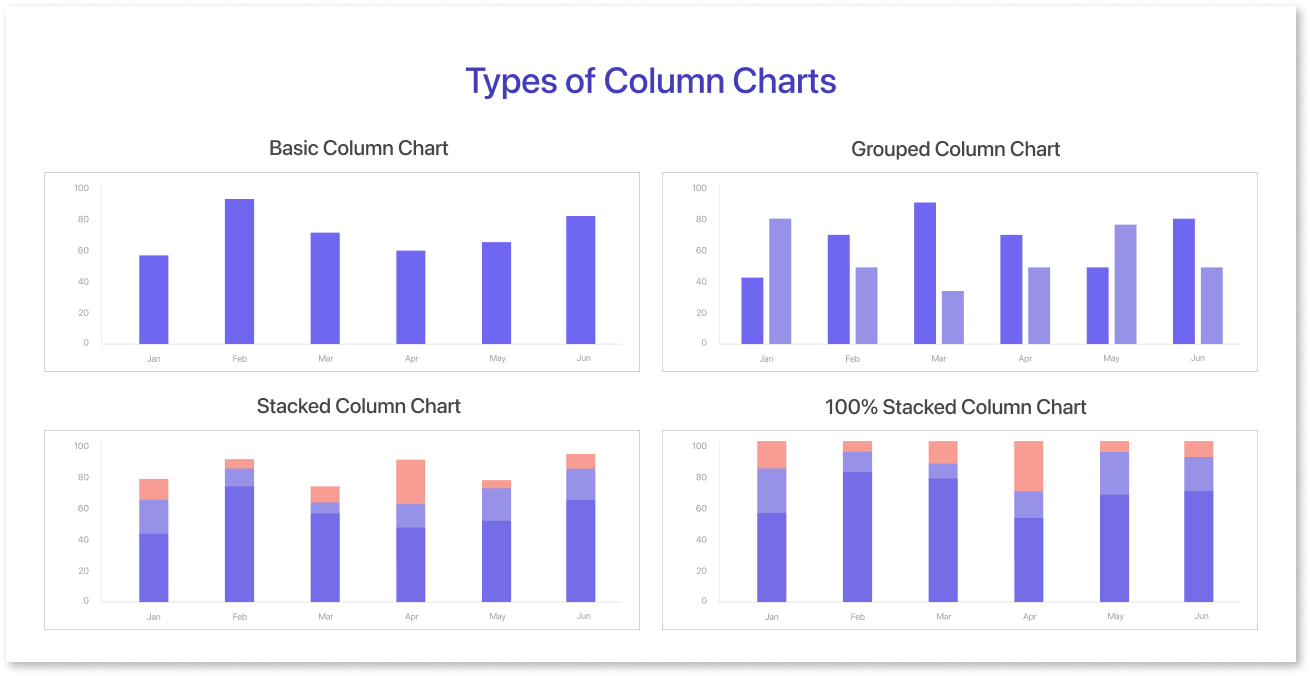
Column charts are great at showing different kinds of data, making it easy to compare. You can set them up in different ways to fit the kind of data you're working with. It's like having different tools for different jobs. Here are a few primary types of chart in the column category:
Grouped Column Chart:
It shows how they use money for labor, supplies, and marketing for specific projects. The height of the bar shows values for each category, and each cluster represents a different category. Comparing values within each category across many data sets is successful using this kind.
Use Cases: The grouped column chart displays how a company is doing financially. It shows the money they make from different products and over time. It shows how they use money for labor, supplies, and marketing for specific projects. This helps them manage their budget and make smart decisions by showing where their money goes in each project.
Stacked Column Chart:
The chart displays distinct types of data with vertical bars. Each bar represents a category and the segments inside show different data sets or parts of the total. Each bar represents the cumulative value of the components with its total height. Stacked column charts are useful for comparing contributions and understanding the composition of total value from different components.
Use Cases: Show the overall income for a company, with sections showing income from different types of products (like electronics, clothing, and appliances). Representing the composition of a project budget, with segments indicating the allocation for labor, materials, marketing, and more.
100% Stacked Column Chart:
A 100% Stacked Column Chart shows the proportions of data series in one category. It also displays the total value for each category. This chart helps compare the percentage distribution of data within categories. It makes it easier to see how different data series contribute to the overall picture.
Use Cases: Tech company HR uses a chart to display the skills of Engineering Department employees. The chart arranges employees, segments their skills (e.g., software development, project management), and shows skill percentages. This aids in hiring, training, and resource distribution, ensuring diverse skills for successful projects and data-driven decision-making.
What is a Bar Chart?
A graph shows numbers using lines or rectangles of the same size, with the bars' height or length showing important information. Bar charts are useful and popular for showing data in a clear and attractive manner. People commonly use them to display and compare data across categories or groups.
Different types of bar charts include grouped bar charts, stacked bar graph/charts, vertical bar charts, and horizontal bar graphs. Each type has its own unique way of presenting data, making it suitable for different analytical purposes. For a deeper understanding of bar charts.
Types of Bar Graphs
Bar charts are flexible tools for displaying data, with several forms available to meet different requirements for data representation. The bar chart shows different datasets efficiently while making comparisons and analyses simple. Bar charts come in a variety of designs and arrangements, giving rise to several sorts of charts. Here are the four chart types of bar graphs:

- Basic Bar Chart: Graphical representation in which rectangular bars of varying lengths are used to display and compare data values for different categories.
- Grouped Bar Chart: Display different data series or variables within each category. Comparing data is easy because we group and display bars side by side within each category.
- Stacked Bar Chart: Segments separate bars to show different components and display data cumulatively. Each part of the bar shows how much a section adds to the total value, which the whole bar represents. Honestly, a stacked bar chart comes with a lot of advantages, to know more about the advantages.
- 100% Stacked Bar Chart: A 100% Stacked Bar Chart shows categories as parts of a whole, always totaling 100%. It helps compare categories in data, making it useful for analyzing market share, surveys, and budgets.
This chart simplifies complex data for easy understanding but works best with a few categories to avoid confusion. Remember to start the y-axis at zero to prevent potential errors.
The Role of Bar Chart in Depicting Data
- Bar charts display data for categories or groups, allowing easy comparison and analysis of sizes. It also represents multiple data sets within a single chart, facilitating comparisons and patterns across various categories.
- Stacked bar charts illustrate how parts divide a total value, helping us comprehend proportions and distribution. Bar charts display data in a clear and organized way, using vertical or horizontal bars for easy understanding.
- Bar charts simplify data interpretation, making it easier for many people to understand and helping with decision-making.
- Grouped bar charts simplify the comparison of values in each category across different data sets. This provides useful insights for decision-making.
Differentiating Stacked and 100% Stacked Bar/Column Charts
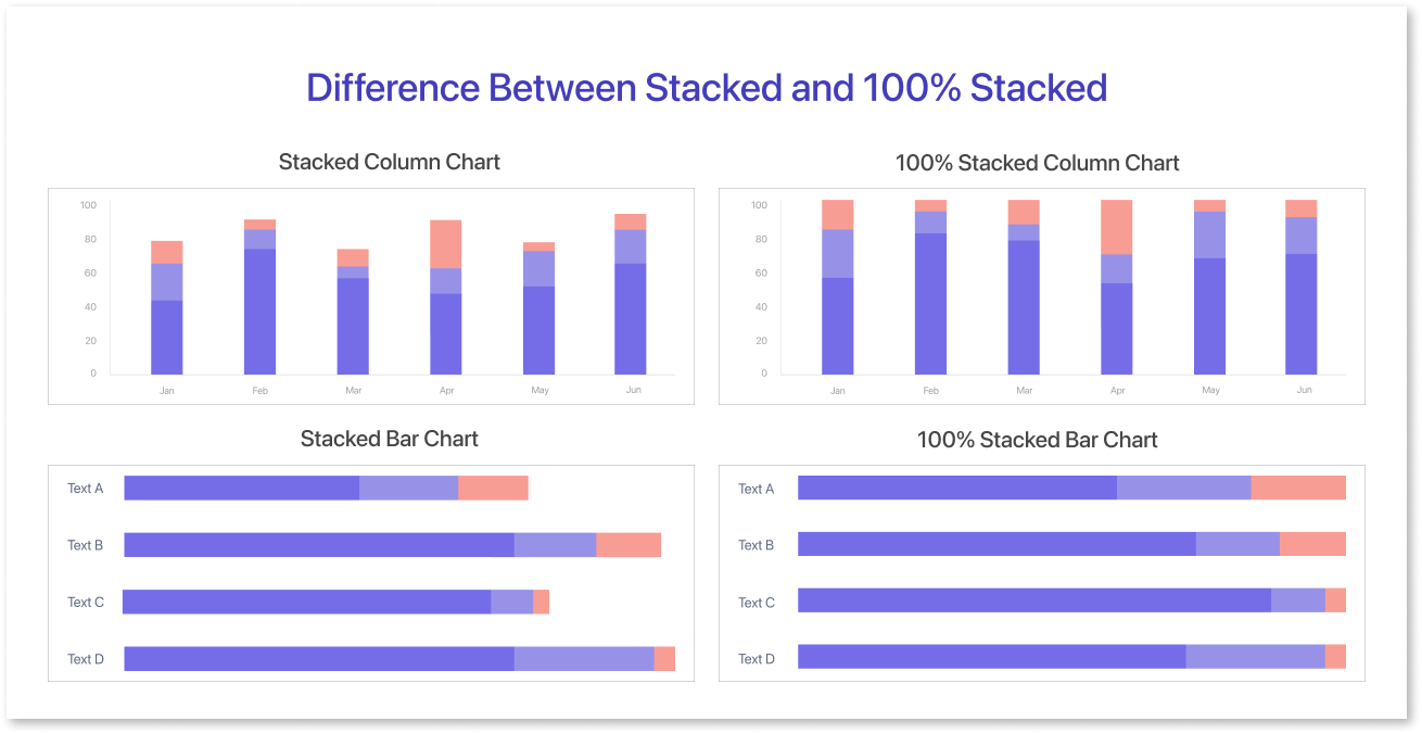
| Aspect | Stacked Bar Chart | Stacked Column Chart | 100% Stacked Bar Chart | 100% Stacked Column Chart |
| Data Representation | Absolute values | Absolute values | Relative proportions | Relative proportions |
| Vertical or Horizontal Bars/Columns | Horizontal (bars) | Vertical (columns) | Horizontal (bars) | Vertical (columns) |
| Segment Height Within Bars/Columns | Correspond to categories | Correspond to categories | Correspond to category percentages | Correspond to category percentages |
| Total Bar/Column Height | Represents total value | Represents total value | Always the same (100%) | Always the same (100%) |
| Ideal for | Showing the composition of a whole | Showing the composition of a whole | Highlighting relative distribution within a whole | Highlighting relative distribution within a whole |
| Example Usage | Comparing product sales in regions | Comparing departmental expenses | Visualizing the percentage breakdown of market share | Visualizing demographic proportions |
The difference between bar and column charts depends on the data and how clear the presentation is. People prefer bar charts for non-numerical data and column charts for numerical data. Both charts show data visually and help viewers compare and understand information.
Choosing the Right Type: Bar Chart vs. Column Chart
Fundamental techniques for data visualization include bar charts and column charts, which both depict data graphically for easy comprehension. Despite their similarities, these dashboard UI examples have unique qualities that make them suited for particular data representation requirements. This helps you pick the best chart style for your data by explaining differences, benefits, and things to think about.
| Categories |
Bar Charts |
Column Charts |
| Orientation |
Bars in bar charts are typically horizontal, with categories or groups represented along the vertical axis. Ideal for comparing data across categories with longer names, or when emphasizing a comparison in a horizontal manner. |
Columns in column charts are vertical, with categories or groups represented along the horizontal axis. Effective for comparing data across categories, especially when dealing with shorter category names. |
| Pros |
Suitable for displaying data with longer category names. It is effective when you need to emphasize the horizontal comparison. E.g.: In retail, you can compare the sales performance of multiple items over a specific time period. Decision-makers can easily identify the best-selling products and those that need more attention. They can do this by looking at the different bars that represent each product. |
Well-suited for displaying data with shorter category names. Efficient for comparing data across multiple categories. Easy to read and interpret, especially with a limited number of categories. E.g.: An online business wants to analyze its monthly website traffic sources. A column chart is good for showing shorter category names like "Organic," "Social," and "Direct" efficiently. The chart helps the marketing team see which sources are most effective for comparing traffic data. |
| Spatial Constraints |
Ideal if vertical space is limited. |
Appropriate when horizontal space is limited. |
| Readability |
Effective for readability with a limited number of categories. |
Easy to read, especially with a larger number of categories. |
Final Thoughts
In data visualization, choosing the right representation is like selecting a camera lens—important for revealing your subject's essence. Bar and column charts are versatile tools offering unique advantages.
When it comes to efficiently turn your data into stunning visual insights, platforms like Mokkup.ai provide the perfect bridge between the initial wireframing phase and the creation of informative charts. You can easily design dashboard wireframes with advanced features using a user-friendly interface.
It also helps optimize data representation, even for beginners in dashboard design. We have ready-made dashboard wireframe templates for you to use, along with plenty of personalizable options.
Unlock the power of Mokkup today and revolutionize your dashboard wireframing process in an instant by clicking the button below.
Frequently Asked Questions
The main difference is orientation. A bar chart displays data horizontally, while a column chart shows data vertically. Both are used to compare categories, but their layout suits different types of data or screen space.
Use a column chart when you have fewer categories and want to show trends over time or comparisons in a way that highlights progression (left to right). It works well when your category labels are short and easy to display along the X-axis.
It’s mostly for readability and design preference. Bar charts are horizontal to better handle long category labels or when there are many items to compare. Column charts are vertical and often used to show time-based or sequential data where the X-axis naturally represents time or categories.
- Using too many bars, making the chart cluttered
- Not starting the Y-axis at zero, which can mislead viewers
- Using 3D effects that distort the data
- Choosing the wrong chart when a line or stacked chart would be more effective
- Poor labeling or inconsistent color use
Yes, you can. Just make sure each chart serves a clear purpose and maintains visual consistency. For example, use bar charts to compare categories with long labels and column charts for time-based comparisons. Avoid using both for the same data set unless there's a clear distinction in what each chart is showing.
Prompt it. Wireframe it with Mokkup.ai.
