Need to make sense of a great deal of data quickly? This is where data visualization dashboards come in. Dashboards may help you convert raw statistics into clear, interactive visualizations that you can use to manage sales, customer behavior, or performance indicators.
In this blog, we'll go over the various types of dashboards, walk through some real-world instances, and demonstrate how to design one step by step.
Table of Contents
- What is a Data Visualization Dashboard?
- What are the Components of a Good vs Bad Data Visualization Dashboard?
- Why Use a Dashboard for Data Visualization
- 10 Data Visualization Dashboard Examples
- How to Make a Data Visualization Dashboard?
- Free Dashboard Templates For Data Visualization
What is a Data Visualization Dashboard?
A data visualization dashboard is a visual tool that presents vital information and metrics in an understandable, interactive format, typically using charts, graphs, and tables. Instead of digging through raw data, you can quickly see what's happening in your company or project. It allows you to monitor performance, identify patterns, and make faster decisions in one place.
Assume you run an e-commerce business. A dashboard can display daily sales, top-selling products, inventory levels, and client returns in a single view. Instead of jumping between numerous tools or reports, you can quickly see what's working, what's not, and where you need to take action.
What are the Components of a Good vs Bad Data Visualization Dashboard?
Not all dashboards are the same. Some make data simple to understand and act on, while others create confusion. Here's a brief comparison to help you distinguish between a good and a bad data visualization dashboard.
|
COMPONENTS |
GOOD DASHBOARD |
BAD DASHBOARD |
|
Clarity |
Clean and easy to read |
Cluttered and hard to follow |
|
Focus |
Shows only the most important metrics |
Tries to show everything at once |
|
Chart Choice |
Uses the right chart for the right data |
Random or complicated charts that confuse |
|
Labels & Titles |
Clear, meaningful labels and headings |
Missing or vague labels |
|
Interactivity |
Filters, drill-downs, or hover details where needed |
No interactivity or overwhelming with too many controls |
|
Consistency |
Consistent colors, fonts, and layouts |
Mixed styles and inconsistent visuals |
|
Data Relevance |
Tied directly to goals or KPIs |
Includes unnecessary or outdated data |
|
Responsiveness |
Loads quickly and updates in real-time or as needed |
Slow to load or shows old data |
Why Use a Dashboard for Data Visualization
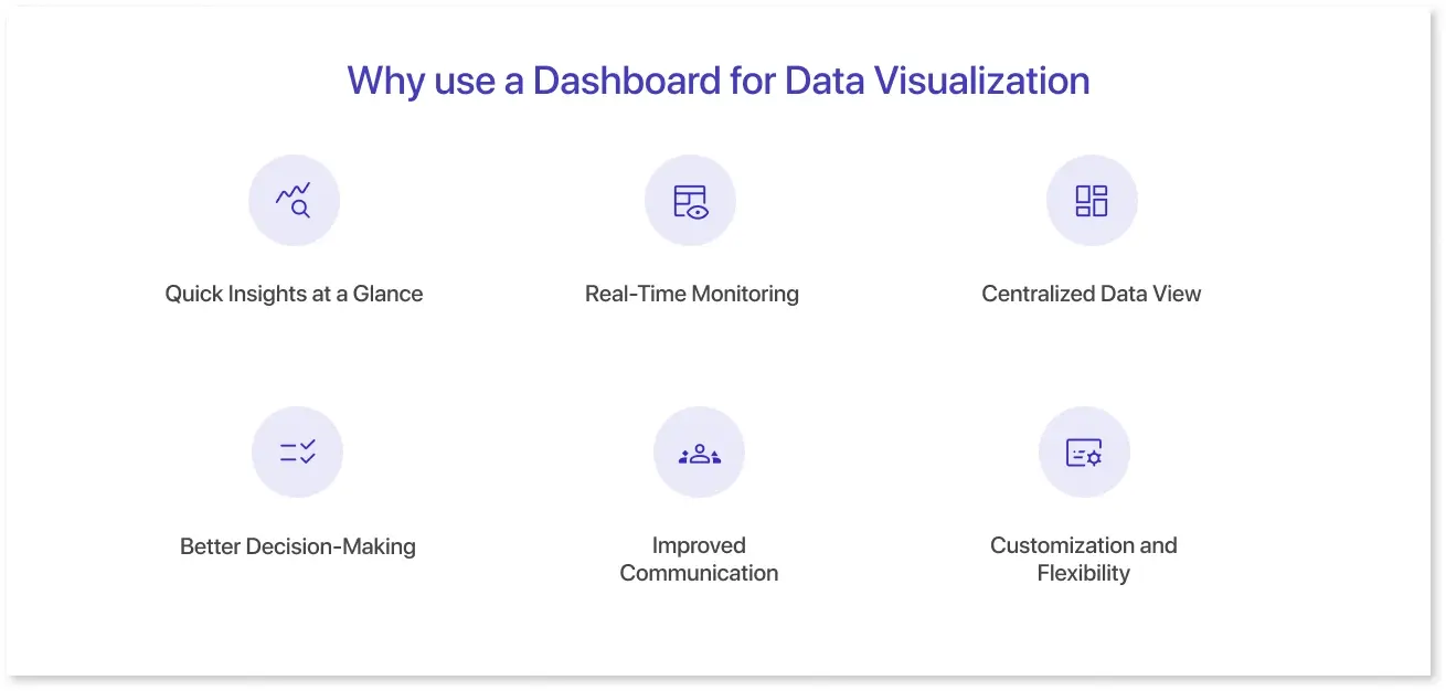
Dashboards are one of the most effective ways to make sense of extensive data. They bring clarity, speed, and focus to decision-making by turning numbers into visual stories. Here’s why they’re so helpful:
1. Quick Insights at a Glance:
Dashboards convert raw data into visual elements like charts, graphs, and KPIs. This allows you to instantly understand what is going on without spending time looking through spreadsheets.
For example, a marketing dashboard may provide website traffic, ad performance, and conversion rates in one view, allowing teams to understand what's working.
2. Real-Time Monitoring:
Many dashboards automatically update, providing the most recent data whenever needed. This is especially useful for time-sensitive decisions. For example, a logistics company may utilize a real-time delivery dashboard to monitor shipping delays or fleet performance as they occur.
3. Centralized Data View:
Dashboards can collect data from numerous sources (such as Excel, Google Analytics, and CRM applications) and display it on a single screen. There's no need to verify five separate reports.
For example, a sales dashboard can display CRM leads, e-commerce sales, and regional performance from multiple systems all in one place.
4. Better Decision-Making:
Visuals help identify trends, patterns, and outliers in raw data, enabling teams to quickly make more informed, data-driven decisions.
For example, a finance dashboard may indicate a significant revenue decline in a specific location, requiring a more in-depth investigation and faster response.
5. Improved Communication:
Dashboards allow you to share data with stakeholders easily. Whether it's team members, executives, or clients, everyone can view the same, simplified visuals.
For example, a project management dashboard can help teams stay on track by displaying project timelines, task completion rates, and team workloads.
6. Customization and Flexibility:
Dashboards can be tailored to different roles and needs. You can select what data to show, how it appears, and who sees it. For example, a CEO might see high-level KPIs, while a department head sees more detailed operational metrics on their dashboard.
In short, dashboards simplify complex data, save time, and allow you to focus on what's most important – making better, faster decisions.
10 Data Visualization Dashboard Examples
Here are 10 dashboard visualization examples from various use cases and industries to show you how adaptable and powerful they can be:
1. Sales Performance Dashboard:
A sales performance dashboard helps track revenue goals and team productivity.
- Tracks: Sales revenue, targets, conversion rates, and top-performing products or reps.
- Used by: Sales managers to monitor team performance and revenue trends.
2. Marketing Campaign Dashboard:
A marketing campaign dashboard breaks down campaign results and optimizes marketing strategies.
- Shows: Ad performance, ROI, traffic sources, click-through rates, and conversions.
- Used by: Marketing teams to measure campaign effectiveness and optimize spend.
3. Customer Support Dashboard:
A customer Support dashboard that keeps support teams informed about service quality.
- Displays: Ticket volume, response time, resolution time, and customer satisfaction (CSAT) scores.
- Used by: Support managers to improve service quality and agent performance.
4. Executive/CEO Dashboard:
An Executive/CEO dashboard is a high-level dashboard that focuses on overall business performance.
- Includes: KPIs across departments such as revenue, customer growth, churn, etc.
- Used by: Executives to make quick strategic decisions.
5. Financial Dashboard:
A financial dashboard offers a detailed look into an organization’s financial health.
- Tracks: Income, expenses, profit margins, cash flow, and budget vs. actuals.
- Used by: Finance teams to keep track of financial health and ensure accountability.
6. HR Dashboard:
An HR dashboard designed to manage and improve workforce metrics.
- Displays: Hiring metrics, employee turnover, engagement survey results, and training completion.
- Used by: HR leaders to track workforce trends and improve employee experience.
7. Project Management Dashboard:
A project Management dashboard to monitor project timelines, progress, and resource usage.
- Highlights: Task progress, deadlines, resource allocation, and project status.
- Used by: Project managers to stay on top of deliverables and schedules.
8. Website Analytics Dashboard:
A website analytics dashboard helps enhance user experience and site performance.
- Tracks: Page views, bounce rate, session duration, and traffic sources.
- Used by: Web teams to understand user behavior better and optimize site performance.
9. Supply Chain & Logistics Dashboard:
A supply chain & logistics dashboard provides real-time visibility into logistics and supply chains.
- Displays: Inventory levels, order fulfillment rates, delivery times, and shipping costs.
- Used by: Operations teams to improve logistics and reduce delays.
10. Healthcare Dashboard:
A healthcare dashboard is a strategic and operational tool for managing hospital resources and patient care.
- Monitors: Patient admissions, treatment results, bed occupancy, and staff availability.
- Used by: Hospital administrators to ensure effective patient care and resource management.
These examples demonstrate how dashboards can be personalized to any position or industry, making data easier to understand, share, and act on.
How to Make a Data Visualization Dashboard?
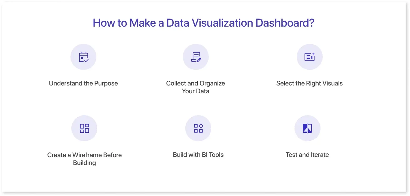
Developing a data visualization dashboard requires both planning and execution. It's not enough to add charts; you must also communicate the proper story with your data. Here's a simple approach to follow:
1. Understand the Purpose:
What decision will this dashboard assist in? Define your goals, audience, and the most important metrics.
2. Collect and Organize Your Data:
Gather data from trusted sources. Make sure it is clean, accurate, and related to your goals.
3. Select the Right Visuals:
Choose charts, graphs, or tables that effectively express your message—line charts for trends, bar charts for comparisons, etc.
4. Create a Wireframe Before Building:
This is where tools like Mokkup can save you time and effort. With Mokkup, you can design interactive dashboard wireframes without any design skills. It helps finalize the layout, structure, and flow before involving developers or connecting real data.
You can export your dashboard wireframes directly into BI tools like Power BI and Tableau, ensuring a seamless transition from design to development.
5. Build with BI Tools:
Connect your data sources with platforms such as Tableau, Power BI, or Looker, and transform your wireframe into a real, interactive dashboard.
6. Test and Iterate:
Share the dashboard with stakeholders, collect feedback, and make adjustments. A good dashboard is more than simply visually stunning; it's also simple, fast, and helps users to take action.
By following these steps, you can create dashboards that are not only visually appealing but also fully aligned with your business objectives.
Free Dashboard Templates For Data Visualization
Looking for a quick start on your next dashboard project? Here are three free dashboard templates to visualize your data quickly, get inspired, or share with your team. Each template is designed to be flexible, easy to use, and focused on real-world use cases.
1. AI Application Analysis Dashboard:
The Mokkup’s AI Application Analysis dashboard wireframe helps you visualize key metrics related to AI models or applications, such as usage trends, revenue, and user interaction. It’s ideal for product teams or tech leads who need to monitor AI systems.
2. Travel Management Dashboard:
The Mokkup’s Travel Management dashboard wireframe is designed to simplify travel management by offering a holistic view of all key travel metrics. It helps teams track bookings, monitor revenue trends, and assess customer satisfaction, allowing for data-driven decisions to improve operational efficiency and enhance the travel experience.
3. Ecommerce Geographical Analysis Dashboard:
Mokkup’s Ecommerce Geographical Analysis dashboard wireframe offers insights into sales distribution across regions, customer locations, and overall regional performance. It is ideal for e-commerce teams looking to analyze market reach and geographic trends.
These are just a few examples of the many ways you can visualize data effectively. If you’re looking for more inspiration or ready-to-use layouts, you can browse more free dashboard templates on Mokkup to get started with your next project.
Conclusion
Data visualization dashboards transform complex data into clear, actionable insights. By combining the right visuals with relevant metrics, they make it easier to track performance, spot trends, and drive smarter decisions across teams.
A well-structured dashboard provides clarity and focus while managing sales, operations, or the customer experience. With the proper planning and resources, anyone can create dashboards that support business goals and improve day-to-day decision-making.
Frequently Asked Questions
A visualization is a single chart, graph, or image that represents data (like a bar chart showing sales by region). A dashboard, on the other hand, is a collection of multiple visualizations displayed together on one screen to provide a comprehensive view of key metrics and trends. Think of a dashboard as the full report and visualizations as the individual pieces that make up that report.
Anyone with access to the data and a dashboard tool can create visualizations—this includes data analysts, business intelligence professionals, marketers, project managers, and even non-technical users. Most modern BI tools offer drag-and-drop interfaces, making it easier for users of all skill levels to build and customize dashboards.
Start by understanding what the dashboard is meant to show—look at titles, labels, and filters. Focus on key metrics and trends, and compare them across time periods or categories. Use interactivity like drill-downs or filters to explore deeper insights. Always interpret visuals in the context of the business goal they’re tracking.
Top tools include Tableau, Power BI, Looker, Google Data Studio, and Qlik Sense. Tableau and Power BI are known for strong visuals and ease of use. Looker suits embedded analytics, Google Data Studio is a free, beginner-friendly option, and Qlik Sense offers great interactivity. The best choice depends on your data needs and team skills.
Prompt it. Wireframe it with Mokkup.ai.
