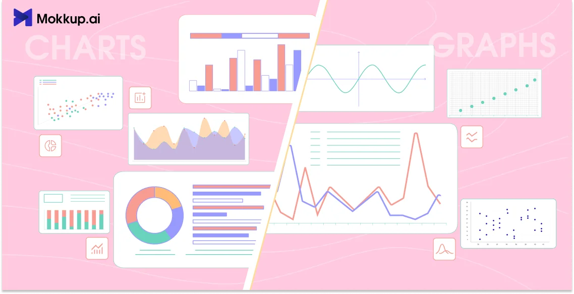
Charts and graphs are essential tools for data visualization, but the debate of chart vs graph or graph vs chart continues. Understanding their differences helps you choose the correct visualization for your data. This blog will help you know their definitions, use cases, and best practices.
Table of Contents
- What Are Charts and Graphs?
- Key Differences Between Charts and Graphs
- Types of Charts and Graphs and When to Use Them
- Pros and Cons of Using Chart vs Graph
- Best Practices for Creating Effective Charts and Graphs
- Real-Life Applications: Charts and Graphs in Action
What Are Charts and Graphs?
Charts and graphs both convey data visually, but they serve different purposes. Graphs highlight relationships and patterns, whereas charts focus on categorizing information. Let’s look at the charts and graphs definitions individually:
What are Charts?
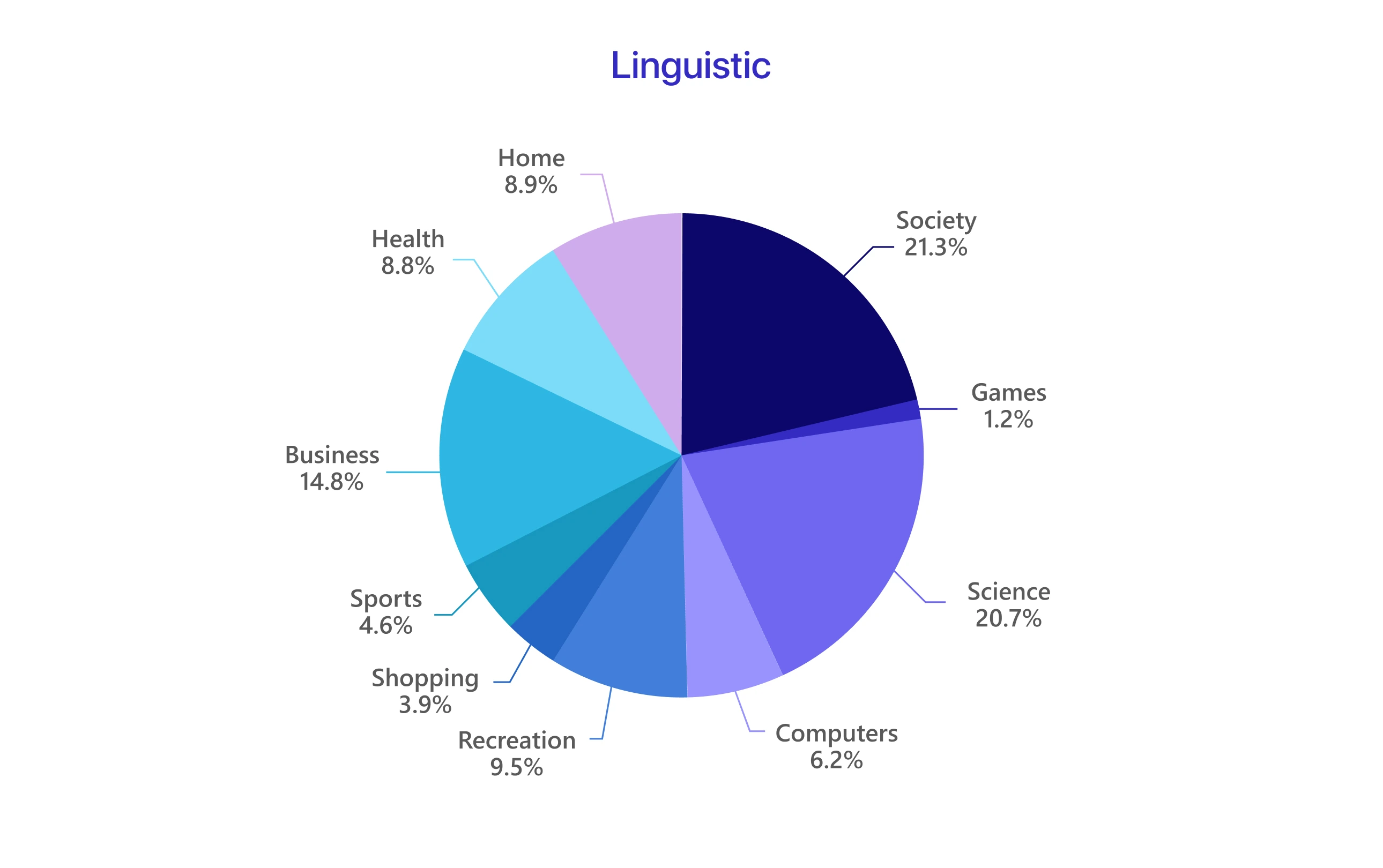
What is a chart? Think of "charts" as an umbrella term. They cover various visual representations used to organize, summarize, and show data. Charts can be used to compare categories, display proportions, and map geographic data.
Similarly, let's understand what graphs are.
What are Graphs?
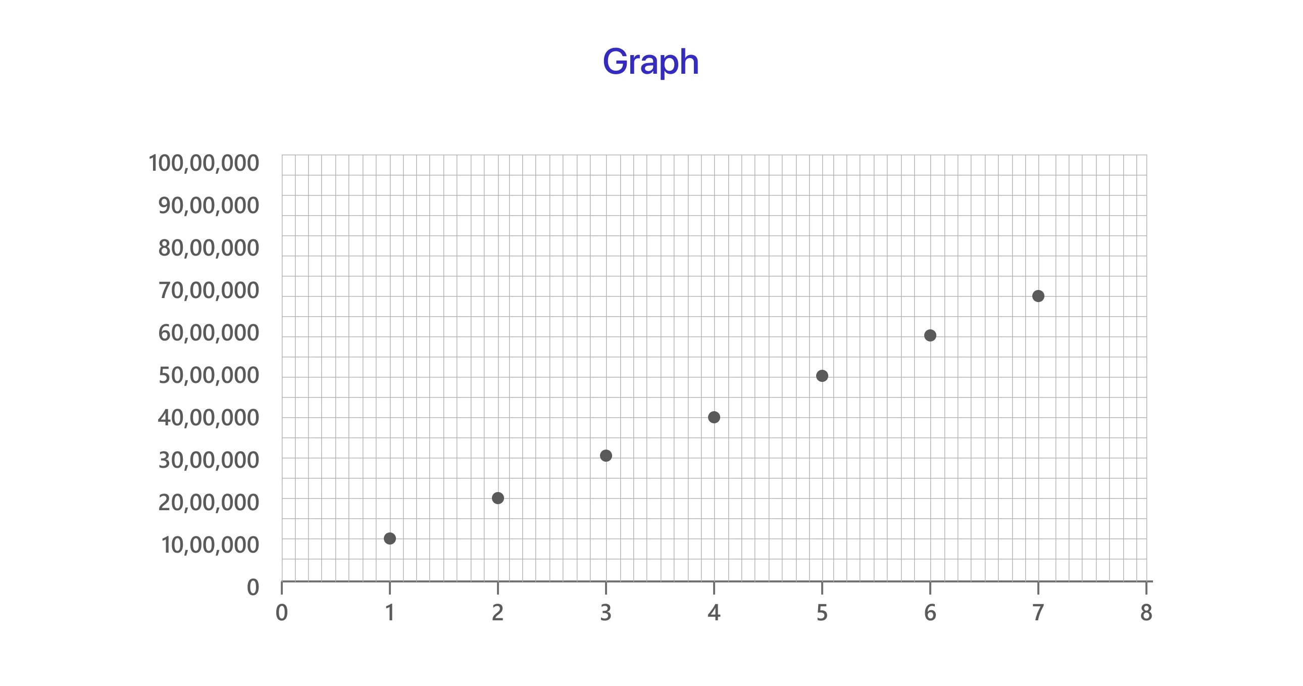
"Graphs" are charts that show the relationship between variables. They often depict how one variable changes in response to another, particularly over time. Graphs are commonly used in scientific research, mathematics, and finance to analyze trends and patterns.
Now that we know what charts and graphs are, we can look at the differences between the two.
Key Differences Between Charts and Graphs
Understanding the significant differences between charts vs graphs in data visualization is essential for effectively communicating information.
1. Structure and Design:
Charts and graphs show data using visual elements like bars, lines, and points. Charts commonly categorize data, making them helpful in comparing different items. Conversely, graphs aim to present continuous data while highlighting patterns and relationships over time.
According to research published in the MIT Sloan Management Review, bar charts, line charts, and pie charts are among the most commonly used chart types for communicating data to a broader audience.
2. Purpose and Functionality:
Charts are particularly effective for illustrating parts of a whole, such as in pie charts, where each segment shows a proportion of the total. Graphs, such as line graphs and scatter plots, effectively display trends over time or changeable relationships.
For Example, a retailer uses a scatter plot to compare advertising spend (x-axis) with sales revenue (y-axis), revealing relationship trends, correlations, or outliers.
3. Readability and Interpretation:
The readability of a chart or graph depends on the audience and data complexity. Bar charts are more straightforward for comparing categories, while line graphs are better for showing trends clearly.
According to research, viewers are more likely to evaluate trends with line graphs than with bar graphs, indicating that line graphs are better suited to tracking trends over time.
We’ve seen the differences between the two. Now, let’s explore the different types of charts and graphs and when to use them.
Types of Charts and Graphs and When to Use Them
Picking the right chart type can make data more accessible and valuable. Charts and graphs have strengths, and knowing when to use them ensures more transparent communication of insights.
A. Common Types of Charts
Charts simplify complex data, making it easier to understand. Here are some of the most common types:
1. Pie Chart:
A circular chart divided into segments, each representing a percentage of the whole, is mainly used to show percentage distributions and compare segments of a dataset, making it helpful in tracking market share, budget allocations, and survey results.
2. Bar Chart:
The "bar chart vs. bar graph" debate frequently results in more confusion than clarity. A bar graph can be defined as a bar chart focusing on variable relationships. However, this differentiation is uncommon in practice. Most people, including many data visualization tools, regard the phrases as synonyms. As a result, when addressing categorical data visualization, they are often interchangeable.
3. Histogram:
Represents data distribution by showing how many data points (the frequency) fall within different ranges (bins).
4. Area Chart:
Highlights change over time by filling the area beneath the line.
5. Donut Chart:
A variation of pie charts for dashboards helps display part-to-whole relationships.
B. Common Types of Graphs
Graphs are handy for demonstrating trends, correlations, and continuous data patterns. The most often used types are:
1. Line Graph:
It follows trends over time, making it perfect for time series analysis. Even though they fulfill the same function, line charts and graphs are frequently used interchangeably.
2. Scatter Plot:
It shows the connections between variables, helping businesses analyze correlations to make informed decisions and drive strategic outcomes.
3. Radar Graph:
Radar graphs (spider charts or web charts) help compare multiple items across several characteristics. For example, you could use a radar graph to compare the skills of different employees (communication, technical expertise, teamwork, etc.) or the features of other products (price, performance, battery life, etc.).
4. Bubble Chart:
It visualizes three-dimensional data using bubbles of varied sizes, with the x and y axes representing two variables and the bubble size representing a third. This makes it suitable for financial research, market trends, and demographic comparisons.
C. How to Choose the Right Tool for Your Data
Selecting between a chart or graph depends on the type of data, the message you want to convey, and your audience’s familiarity with data visualization. While graphs and charts are helpful in visual storytelling, selecting the wrong one might lead to misinterpretation or confusion. Here's a step-by-step approach for making the appropriate decision:
1. Understand Your Data Type: The first key consideration is the data type you're working with.
- Categorical Data: This data type represents categories or groups (e.g., sales by region, product types, survey responses). Bar charts, pie charts, and donut charts are ideal for displaying categorical data.
- Numerical Data: This data represents measurable quantities (such as temperature, revenue, and height). Numerical data can further be divided into:
- Discrete Data: Values that can only be whole numbers (e.g., number of customers and products).
- Continuous Data: Values that can take on any value within a range (e.g., temperature, height, weight). Graphs like line graphs, scatter plots, and histograms are often used for numerical data.
2. Identify Your Message: What story do you want to tell using your data? Your message will influence your choice of visualizations.
- Comparison: If you want to compare values across categories, a bar chart or column chart is a good choice.
- Trend Over Time: A line graph can show how something changes over time.
- Relationship: A scatter plot helps explore the relationship between two variables.
- Proportion: A pie or donut chart is appropriate to show parts of a whole.
- Distribution: A histogram or box plot is helpful to visualize how data is distributed.
3. Factors to Consider:
- Data Distribution: Understanding the distribution of your data might help you make an informed decision. For example, a histogram is preferable to a line graph if you wish to display the distribution of numerical data.
- Audience: Consider your audience's knowledge of data visualization. Simpler charts, such as bar charts and pie charts, are often more effective when presenting to a broad audience. For a technical audience, consider using more complicated visualizations such as scatter plots or box plots.
- Message: Your message is the most important thing. Select the visualization that most effectively explains your crucial insights. Don't let the complexity of the data overshadow the message you're trying to convey.
4. Visual Examples of Poor vs. Good Chart/Graph Choices:
-
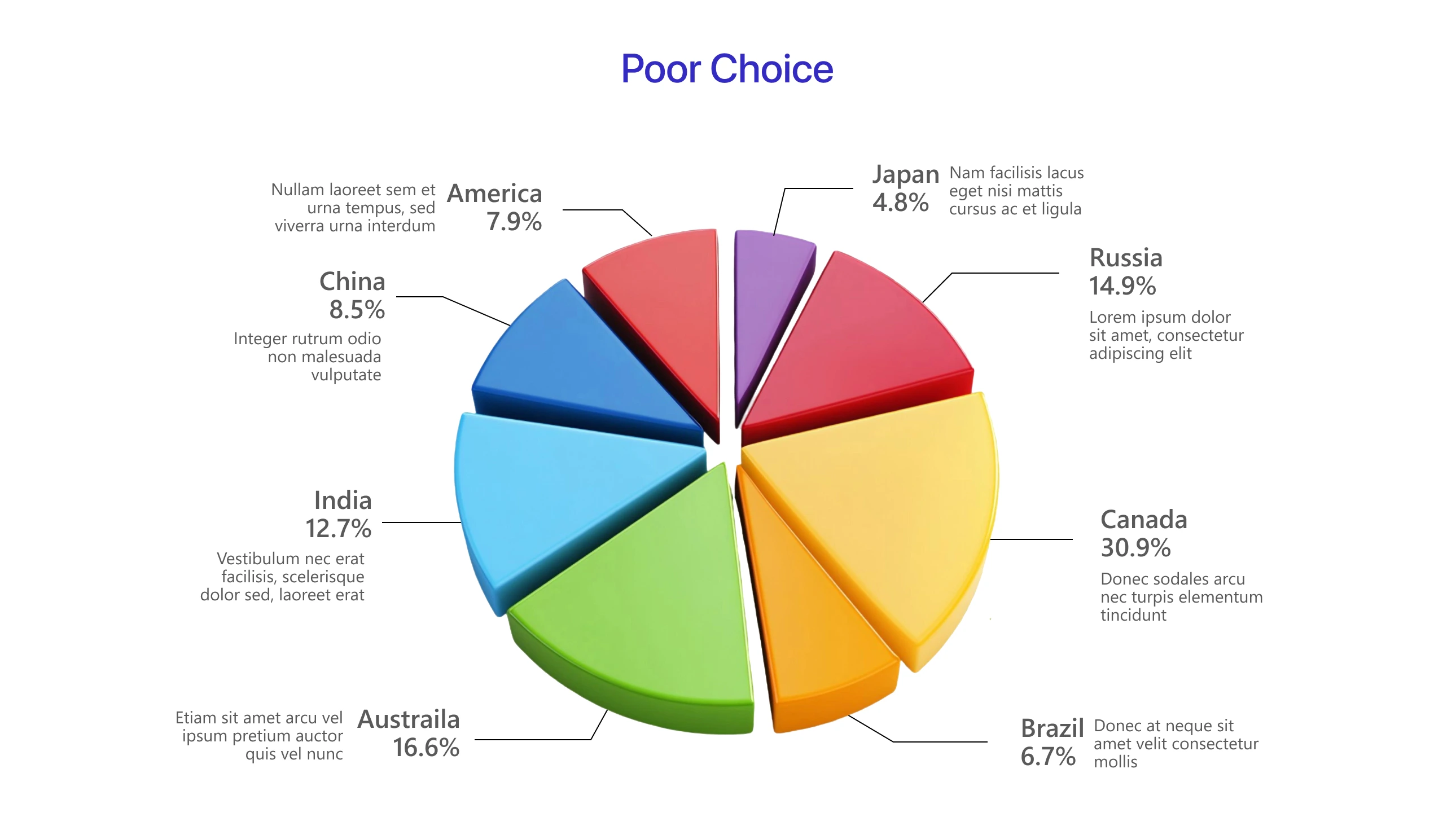
Poor Choice: 3D pie charts are often a bad choice because they distort the perception of size and make it hard to compare slices accurately.
-
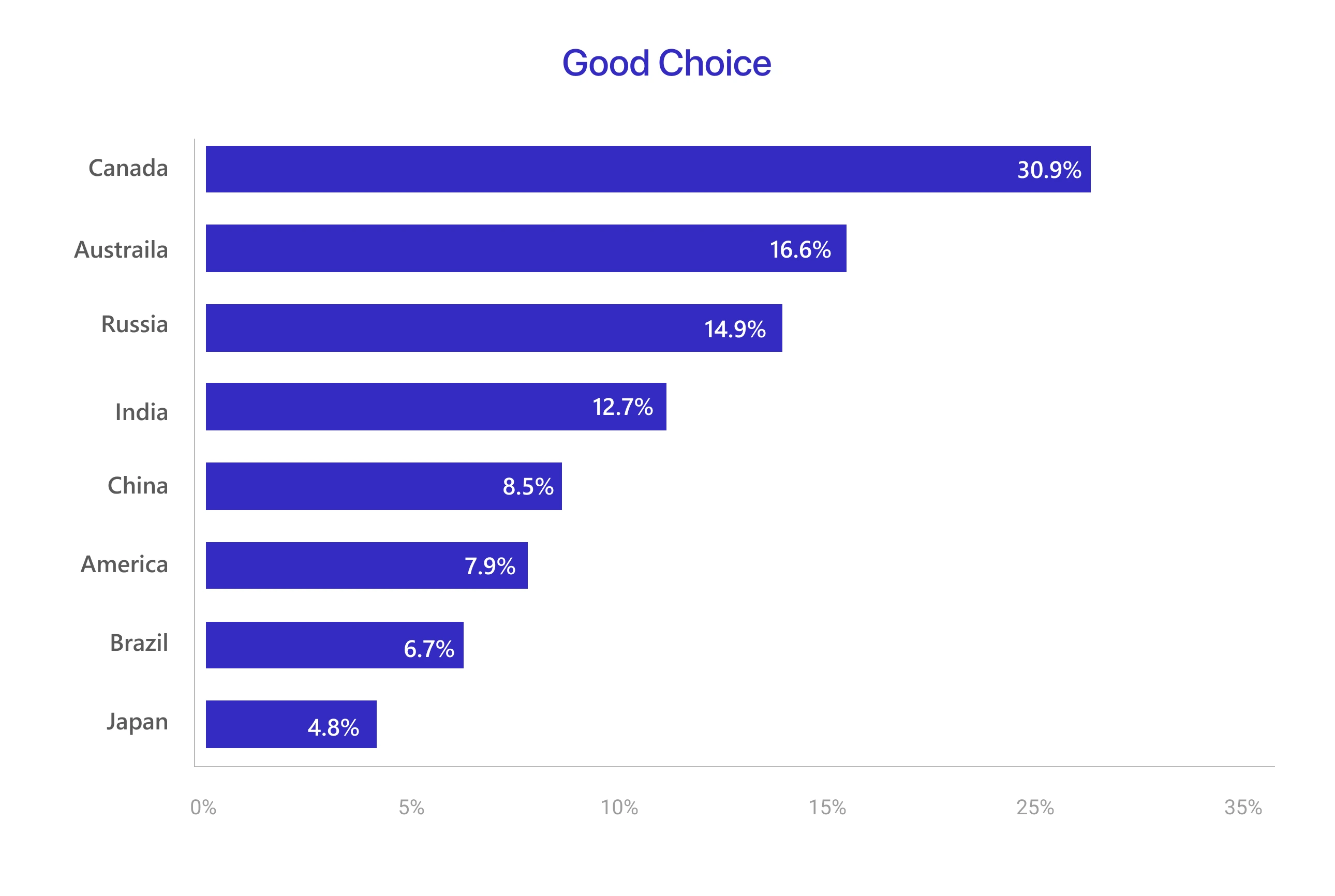
Good Choice: Bar charts are much better for comparing categorical data. They are clear, easy to understand, and accurately represent the data.
-
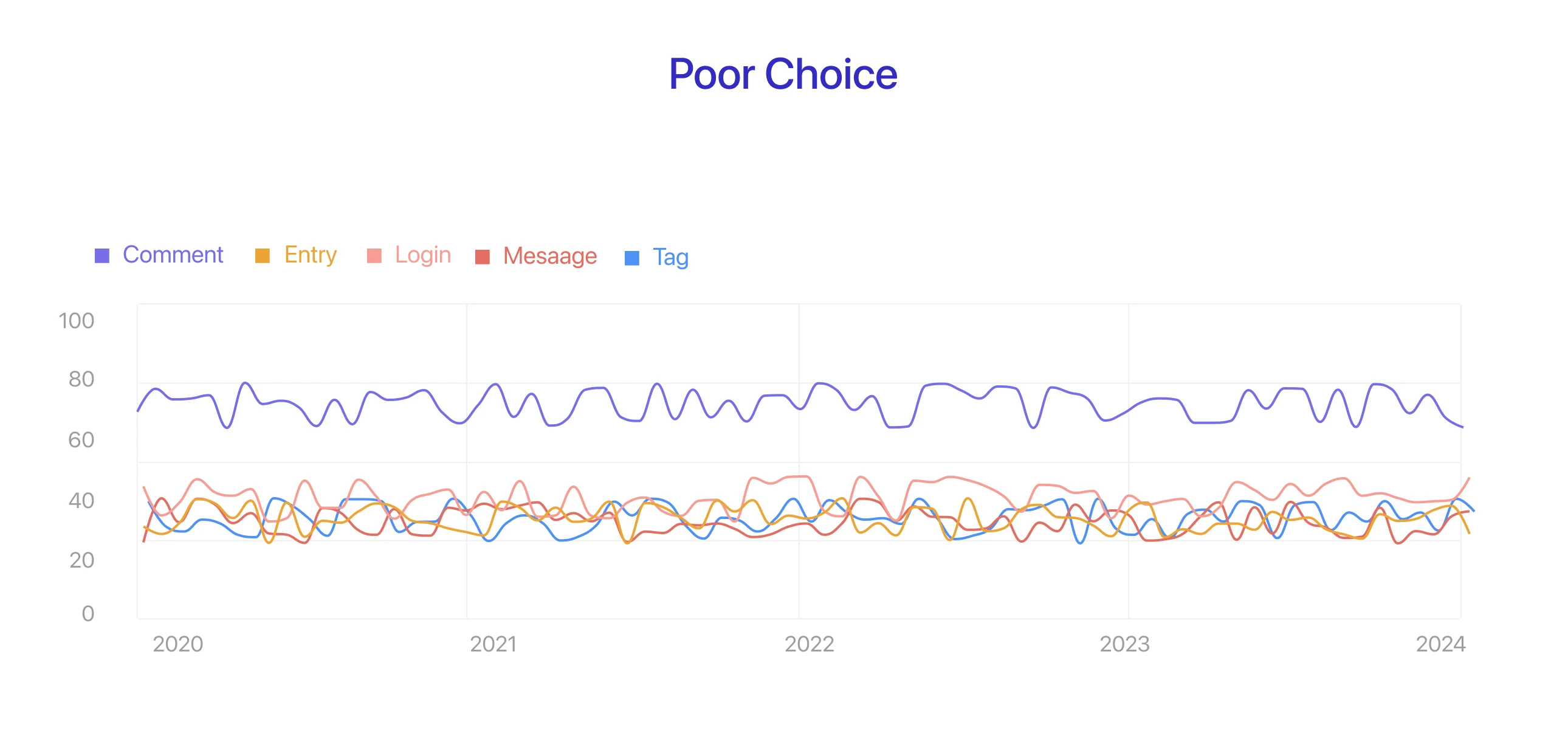
Poor Choice: Too many lines in a single graph can make it cluttered and difficult to understand.
-
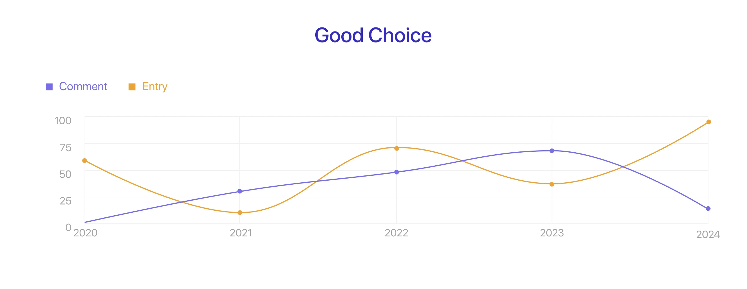
Good Choice: Small multiples are a great way to show multiple related time series without overwhelming the viewer. They make it easier to compare different categories.
Considering these factors and using the step-by-step guide, you can select the correct graph or chart to communicate your data and insights effectively. The visual examples should illustrate the impact of good and poor choices.

Pros and Cons of Using Chart vs Graph
Graphs and charts each have strengths and weaknesses. Choosing the proper visualization depends on your data and goals.
1. Advantages of Charts:
Charts simplify data for broad audiences:
- Easy Comparison: Charts are excellent at comparing categories. Bar charts are good at demonstrating differences across groups.
- Intuitive Design: Pie and bar charts are well-known and easy to understand, even by individuals with limited data literacy.
- Clear and structured: Well-suited for simple comparisons.
2. Advantages of Graphs:
Graphs reveal trends and relationships:
- Trend Visualization: Line graphs demonstrate how data changes over time.
- Complex Data: Graphs can include multiple variables, allowing for detailed analysis. Line graphs, for example, can efficiently show multiple connected time series.
- Detailed Insights: Graphs can manage many data points, providing a granular view of trends.
3. Disadvantages of Charts:
Charts have certain limitations:
- Misinterpretation: Some chart types, such as 3D pie charts, have the potential to distort data and mislead viewers.
- Limited Continuous Data: Charts are typically inadequate for displaying continuous data and its relationships.
- Oversimplification: Charts can occasionally oversimplify complex data, concealing key details.
4. Disadvantages of Graphs:
Graphs can be challenging:
- Beginner Difficulty: Certain graphs, such as scatter plots, might be complicated for non-technical audiences.
- Clutter: Too many data points or lines in a graph can make reading difficult.
- Overcomplication: Graphs can quickly become too complicated, hiding the intended meaning.
By now, you should clearly understand graphs and charts and their advantages and disadvantages. Now, let's explore how to create effective graphs or charts.
Best Practices for Creating Effective Charts and Graphs
Creating effective charts and graphs is vital for clear communication. These best practices will help you create visualizations that are both informative and easy to understand.
1. How to Make a Chart Easy to Read
A well-designed chart conveys insights quickly. Here’s how to keep it clear:
- Use Simple Color Schemes, Labels, and Legends: Highlight key data with meaningful colors. How do you choose colors for data visualization? Use contrasting shades to emphasize important points and limit the color palette to avoid clutter. Keep labels concise and legends clear.
- Use Clear Titles and Axis Labels: Titles should identify the chart's subject, while axis labels should indicate what is being measured. Avoid jargon.
- Avoid 3D Effects: 3D charts disrupts data. Stick to 2D unless necessary, and avoid distractions like shadows or animations.
2. How to Make a Graph Easy to Read
Graphs must reveal trends clearly. Follow these tips:
- Use Gridlines Sparingly: Light gray or dotted gridlines can help, but too many can clutter the view.
- To Avoid Confusion, Keep Scales Consistent: Use the same scale across multiple graphs.
- Limit Data Points: Too many points can overwhelm the viewer. Divide data into smaller graphs or use smoothing techniques.
3. Common Mistakes to Avoid
These mistakes can make charts or graphs harder to understand:
- Not Labeling Axes: Always label your axes with precise units and explanations.
- Overloading Charts: Too many categories make charts confusing. Group similar categories or use a heatmap instead.
- Using Complex Graphs for Simple Comparisons: Stick to basic charts like bar graphs instead of complex ones for easy comparisons.
Avoiding these mistakes ensures your charts and graphs remain clear and compelling. Let’s see how these best practices are applied in real-world scenarios.
Real-Life Applications: Charts and Graphs in Action
Charts and graphs simplify complex data and provide simple, visual insights. When properly designed, they make information easy to understand at a glance.
1. Charts in Business and Marketing
Charts are essential in business and marketing because they help to analyze performance, discover trends, and guide strategic decisions. They convert raw data into actionable insights.
-
Charts in Entertainment & Media:
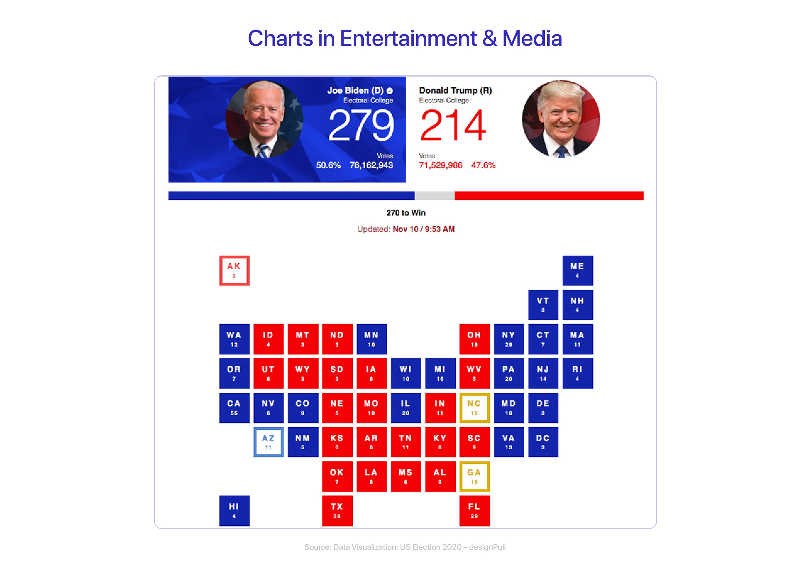
Media outlets use charts to display news, trends, and statistics in an engaging visual format. Charts simplify difficult information, allowing audiences to better understand essential insights.
-
Charts for Business Requirements:
Businesses use charts to track sales, identify trends, and evaluate performance, making decision-making easier.
2. Graphs in Scientific Research and Education
Graphs enable scientists and educators to display data, identify patterns, and explain complex concepts. They make research outcomes and lessons easier to understand.
-
Graphs for Scientific Research
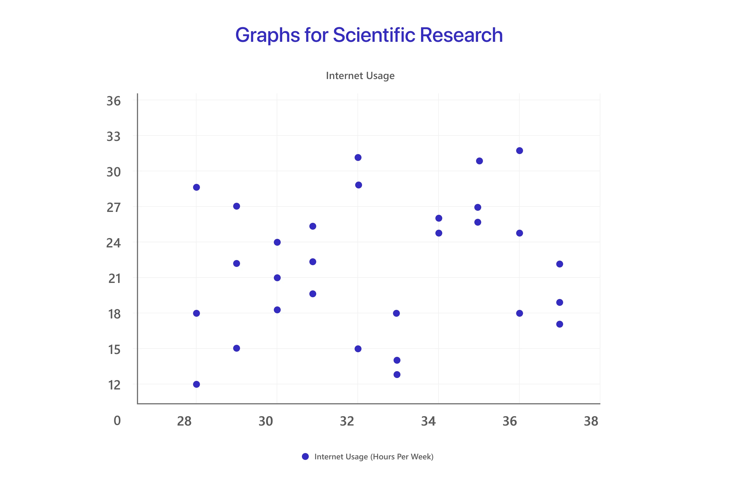
From exploring correlations to presenting complex datasets, graphs play a crucial role in scientific research.
-
Graphs in Education
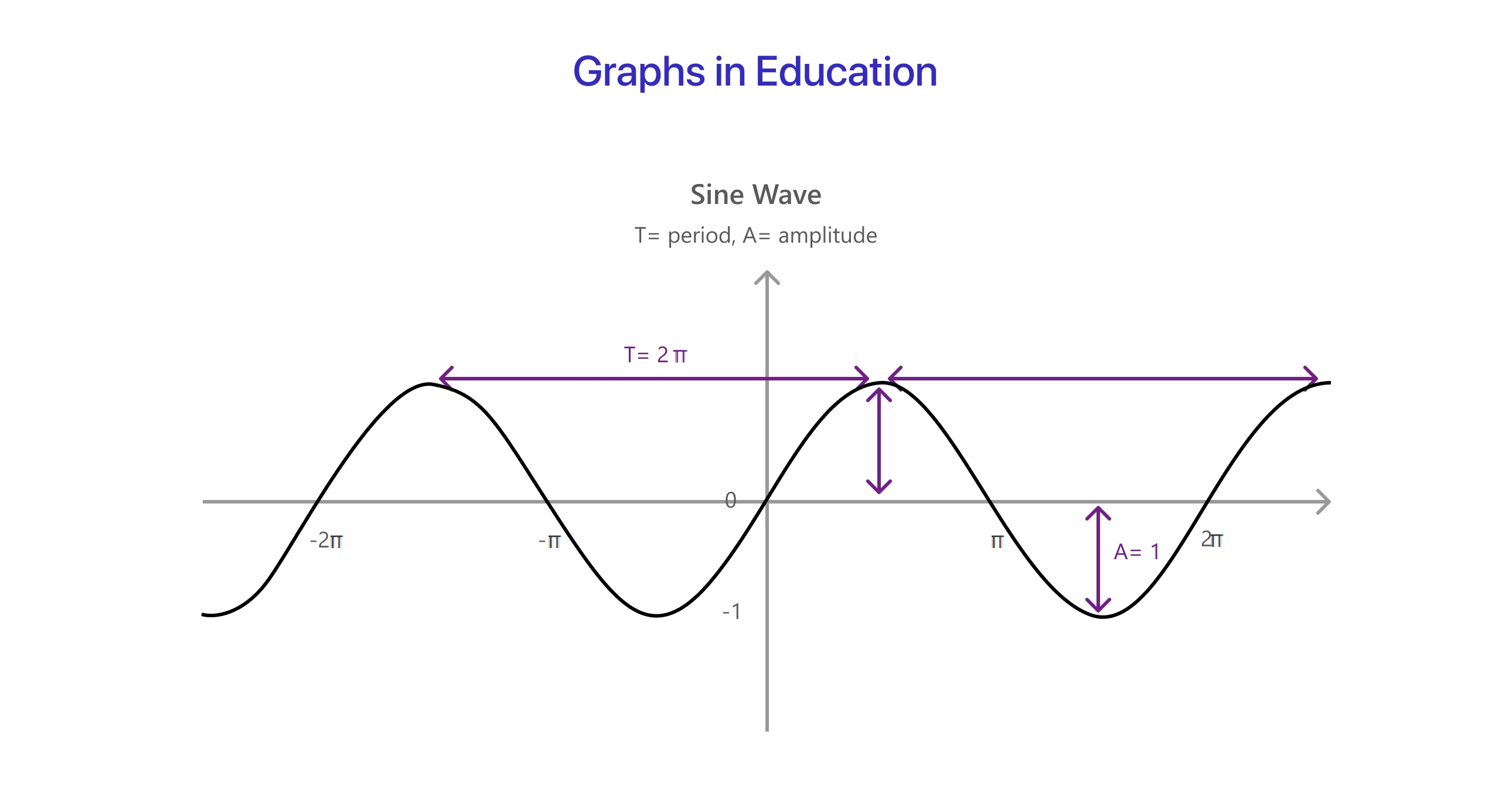
Graphs are visual representations of data that help students understand numerical concepts, function behavior, and identify trends. With these real-life applications in mind, it’s clear how charts and graphs play a vital role in communicating data effectively.
Conclusion
Charts and graphs are essential for sharing data, whether in business or research. By choosing the right type and following best practices, you can create visuals that clearly communicate your message and help your audience understand the key insights.

Frequently Asked Questions
Charts display data visually, often representing categories, while graphs show relationships between variables, typically with continuous data.
There’s some debate in the data visualization community. While pie charts are often called graphs, they’re more commonly considered charts since they represent parts of a whole.
Use a pie chart to show parts of a whole and compare relative proportions. A bar chart is better for comparing different categories or values. This addresses the question of when to use a pie chart vs bar graph.
Bar charts are excellent for comparing discrete categories, while line graphs are ideal for showing trends over time. This explains when to use a bar chart vs a line graph.
Yes! Always ensure clarity by using appropriate labels, choosing simple color schemes, and keeping scales consistent. Follow best practices to avoid clutter and ensure readability.
Popular tools include Mokkup.ai, Excel, Google Sheets, Power BI, and Tableau. Each offers unique features, depending on your needs for creating and customizing charts and graphs.
Prompt it. Wireframe it with Mokkup.ai.
