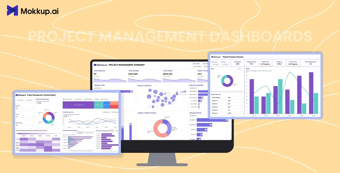
If you’ve ever managed a project that started strong and then slowly slipped into chaos, you know the feeling. Tasks start overlapping, updates come late, budgets blur, and you spend more time chasing clarity than actually managing.
That’s the point when teams realize how much a Project Management Dashboard can simplify things.
It gives everyone the same picture, like what’s done, what’s pending, and what’s slipping, without endless status meetings or spreadsheets.
The best part is that you don’t need to build one from scratch. With ready-to-use Project Management Dashboard Templates, you can instantly visualize goals, KPIs, and timelines the way your team works.
In this guide, we’ll explain the difference between Agile, Waterfall, and Hybrid Project Management Dashboards to help you plan, adapt, and deliver projects more effectively.
Table of Contents
- What is a Project Management Dashboard?
- Understanding Project Management Dashboard Types
- Agile Project Management Dashboard
- Waterfall Project Management Dashboard
- Hybrid Project Management Dashboard
- Agile vs Waterfall vs Hybrid: Key Differences
- Mokkup.ai’s Ready-to-Use Project Management Dashboard Templates
- Why Use Mokkup.ai to Build Project Management Dashboards?
What is a Project Management Dashboard?
A Project Management Dashboard is a visual summary of your project’s key indicators like progress, cost, scope, and team performance in one view.
Instead of jumping between Excel, Jira, and email threads, dashboards consolidate everything into clear visuals. They answer questions like:
- Are we on schedule?
- Are we spending more than planned?
- Which tasks are delayed or over-resourced?
- What’s the next milestone?
This is why, when asked, 83% of project managers said that using project management dashboards or reports is essential to staying on top. Around 61% check them daily or several times weekly to track progress and spot issues early.
Thus, it has becomes not just a reporting tool, but a decision-making engine. It gives managers real-time visibility, reduces surprises, and ensures everyone, from teams to stakeholders, is aligned on one version of the truth.
Understanding Project Management Dashboard Types
Every project works differently. Some evolve sprint by sprint, others move phase by phase. That’s why using one standard Project Management Dashboard template rarely fits all. Each approach demands its own lens to track progress, risks, and crucial KPIs effectively.
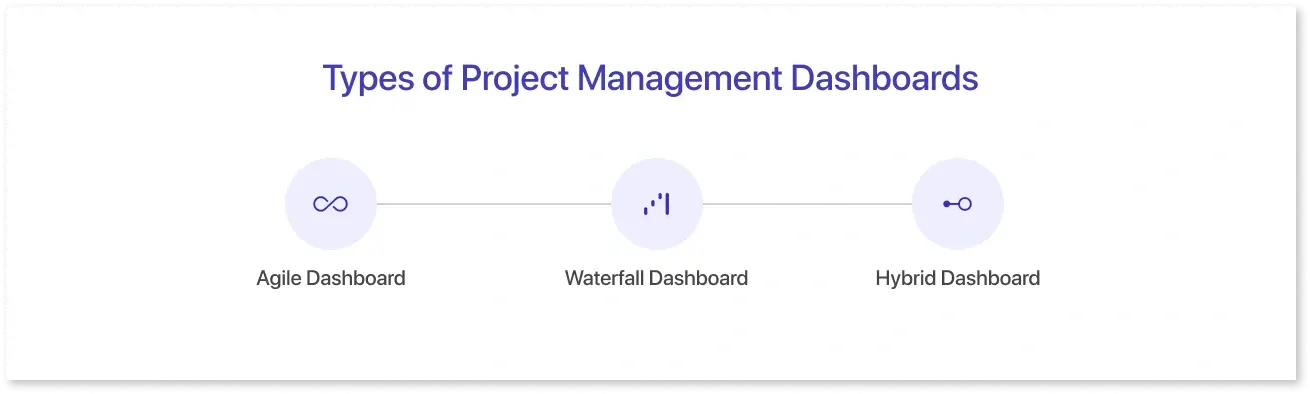
That’s why three main Project Management Dashboard Templates exist:
- Agile Dashboard: Built for teams that move fast. It tracks sprints, velocity, and backlog in real time.
- Waterfall Dashboard: Ideal for structured, sequential projects with clear milestones and dependencies.
- Hybrid Dashboard: A mix of both, giving agility for ongoing tasks and structure for long-term goals.
Agile Project Management Dashboard
Agile projects move fast with short cycles, changing priorities, and constant iteration. So, the dashboard must keep up. This is why an Agile dashboard template visualizes work in sprints.
It focuses on tracking short development cycles known as sprints, which are typically 1- 4 weeks of planned work where teams commit to completing a set of tasks or features. A good Agile Project Management Dashboard gives teams real-time visibility into what’s being delivered and how efficiently.
Most teams follow the Scrum framework, where roles like Product Owner, Scrum Master, and Developers collaborate to plan, execute, and review each sprint. A Scrum dashboard (a type of Agile Project Management Dashboard) helps visualize this process by showing sprint goals, team velocity, and backlog progress in real time.
Here’s what it usually monitors:
- Sprint Progress: The amount of planned work has been completed within the sprint.
- Team Velocity: The average amount of work a team finishes each sprint, helping forecast future capacity.
- Burndown Chart: A line graph showing how fast the team is completing work compared to the sprint timeline.
- Backlog Health: The readiness and priority of upcoming tasks waiting to be picked up.
- Blockers: Issues or dependencies preventing progress
They are especially helpful for Scrum Masters and Product Owners who need to monitor output without micromanaging. Data visualization in such dashboards helps monitor constant change in a project with clarity. They help teams adapt faster, spot roadblocks early, and keep everyone accountable to short-term goals that drive long-term success.
In short, a good Agile project management dashboard helps teams stay accountable to short-term sprint goals that drive long-term success.
It answers questions like:
- Are we completing what we planned this sprint?
- Is our delivery speed (velocity) improving or slowing down?
- Which tasks or stories are getting delayed again and again?
Waterfall Project Management Dashboard
Unlike agile, where priorities shift often, waterfall projects follow a fixed, sequential plan. Each phase, from requirements to design, development, and testing, must be completed before the next one begins. That’s why a Waterfall Project Management Dashboard focuses less on flexibility and more on tracking progress against defined milestones and timelines.
It gives project managers a clear view of whether the project is progressing on time, staying within budget, and meeting quality expectations before advancing to the next phase.
Here’s what it usually monitors:
- Milestone Completion: Tracks progress across key stages like planning, development, and testing.
- Gantt Chart/timeline Tracking: Compares actual progress with planned schedules to spot delays early.
- Budget Utilization: Monitors how much of the allocated budget is spent and whether costs align with estimates.
- Resource Allocation: Shows who’s working on what and whether workloads are balanced.
- Risk Status: Highlights potential issues that could impact delivery or scope.
These dashboards are especially useful for project managers and stakeholders who need structured visibility over long-term projects. They differ from agile dashboards by emphasizing predictability, planning accuracy, and control, ensuring the project follows its defined path without deviation.
In short, a Waterfall project management dashboard ensures every phase is completed as planned, helping teams deliver large, sequential projects with minimal surprises.
Hybrid Project Management Dashboard
A Hybrid Project Management Dashboard blends Waterfall's structure with Agile's flexibility. Many modern teams use this approach when some project parts need fixed milestones (like design or compliance) while others require iterative updates (like development or marketing).
Unlike Agile dashboards, which focus on short sprints, or Waterfall dashboards, which emphasize sequential delivery, a Hybrid Project Management Dashboard combines both views. This helps managers track overall timelines while still monitoring agile sprint performance. No surprise then that around 60% of project managers now prefer hybrid methods, mixing Agile flexibility with Waterfall structure to match the unique demands of each project.
Here’s what it usually monitors:
- Phase-level Milestones: Tracks long-term project goals, like Waterfall dashboards.
- Sprint Performance: Monitors agile metrics such as velocity and sprint completion within each phase.
- Cross-Team Dependencies: Highlights how agile and non-agile teams depend on each other.
- Budget and resource balance: Ensures time and funds are being optimized across both structured and iterative workflows.
- Progress Overview: Combines Kanban-style boards for agile sections with Gantt charts for fixed schedules.
This type of dashboard is best for organizations transitioning from traditional to agile methods or those managing large, cross-functional projects.
When designed in tools like Power BI or through a customizable Project Management Dashboard UI, hybrid dashboards can connect data from multiple tools (like Jira, Asana, or MS Project) into one visual workspace.
In short, a hybrid project management dashboard helps teams get the best of both worlds, including the predictability of waterfall and the agility of iterative delivery.
Hybrid vs Agile vs Waterfall Comparison Table
Here’s how Agile, Waterfall, and Hybrid Project Management Dashboards differ in approach and use. Understanding where these methods differ helps you pick the right dashboard approach.
|
Aspect |
Agile |
Waterfall |
Hybrid |
|
Approach |
Iterative - continuous feedback and adaptation |
Sequential - fixed stages and scope |
Combination of both iterative and structured |
|
Planning |
Flexible, evolves during project |
Fully defined at the start |
Core milestones fixed; sprints evolve with phase |
|
Delivery |
Frequent releases |
Single final delivery |
Both interim and milestone deliveries |
|
Risk Handling |
Early risk detection through short cycles |
Risks discovered late |
Balanced |
|
Best For |
Fast-changing projects (software, startups) |
Predictable projects (construction, compliance) |
Cross-functional or evolving projects |
Choosing the Right Dashboard for Your Project
There’s no universal best dashboard, only what fits your method, culture, and data maturity.
Here’s a quick guide:
- Go Agile if your project evolves fast, priorities change weekly, and customer feedback drives success.
- Go Waterfall if your deliverables, cost, and timeline are locked or you work in heavily regulated domains.
- Go Hybrid if you juggle multiple teams, departments, or parallel tracks.
Mokkup.ai’s Ready-to-Use Project Management Dashboard Templates
Designing dashboards from scratch can eat up valuable time. That’s why Mokkup.ai offers some ready templates for different purposes. Whether you're looking for a simple free Project management dashboard template to get started or a fully-built enterprise wireframe, you can pick a format that fits your workflow and scale it as your needs grow.
Here are a few examples:
1. Project Management | Detailed Report
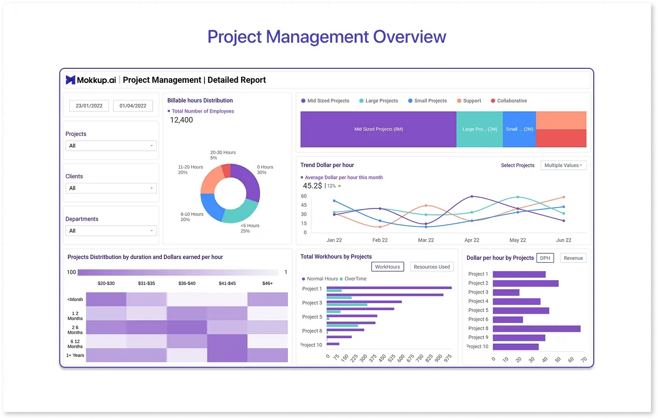
This is a ready-to-use project management dashboard Power BI template (also available for Tableau) designed to give teams and stakeholders real-time visibility into performance, resources, and profitability. It acts as a project KPI dashboard for organizations handling multiple projects at once.
Key KPIs tracked:
- Billing hours distribution – Employee work hours and utilization
- Types of projects – Large, small, or collaborative projects
- Trend dollars per hour – Average earnings per hour and monthly change
- Work hours by project – Regular vs. extra hours
- Project inflows – New, extended, and completed projects
- Profit and feedback trends – Financial and qualitative outcomes
Use cases:
Ideal for project managers, consulting firms, and operations teams who need one unified Project Management Dashboard for Power BI to monitor project health, optimize resource use, and make informed, data-backed decisions.
2. Project Progress Overview
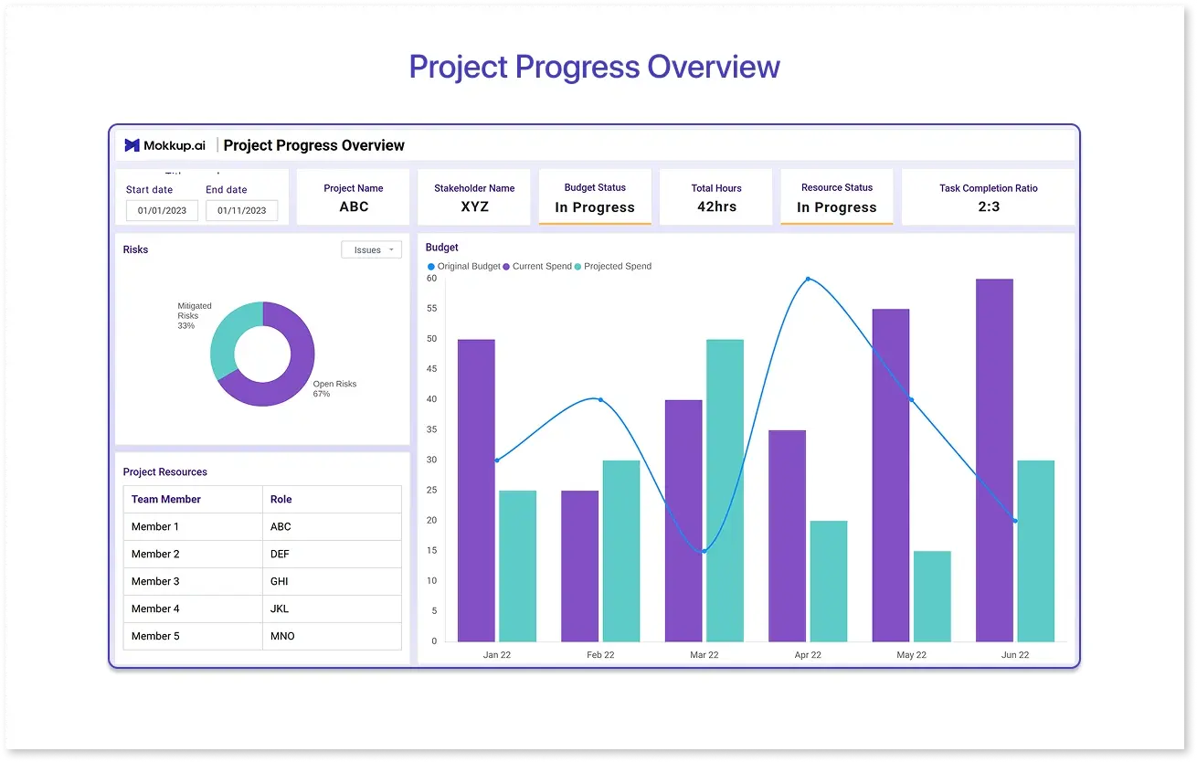
The Project Status overview Dashboard is a ready-to-use Project Management Dashboard Template that gives managers a quick, 360° view of how projects are progressing in real time. It’s built to simplify monitoring, resource tracking, and performance measurement across multiple projects, making it an ideal project KPI dashboard for growing teams.
Key KPIs tracked:
- Project Progress Overview: Name, current status, projected end date, and key milestones
- Task and Resource Insights: Task completion ratio, active resources, and allocated budget
- Performance Indicators: Immediate task list, error rate, and satisfaction score
Use cases:
Perfect for project leads, product managers, and cross-functional teams who want a single dashboard to track progress, maintain timelines, and ensure quality delivery.
3. Project Management Overview
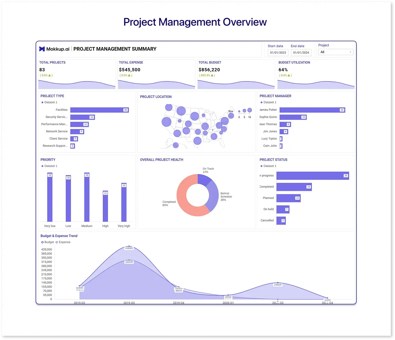
The Organizational Project Overview Dashboard is a powerful project management dashboard template that brings every key metric under one view. It helps managers and teams track performance, spending, and project health at an organizational level, making it an essential project KPI dashboard for leadership visibility and accountability.
Key KPIs tracked:
- Total Projects: Number of active or completed projects
- Total Expense & Budget: Overall spending vs. allocated funds
- Budget Utilization: Percentage of budget already used
- Project Location: Geographical distribution of ongoing initiatives
- Overall Project Health: Visual indicator of current progress and performance
Use cases:
Best suited for senior managers, program directors, and PMOs who need a quick snapshot of multiple projects’ health and finances.

Why Use Mokkup.ai to Build Project Management Dashboards?
Building a dashboard from scratch often takes weeks of back-and-forth between teams. Mokkup.ai changes that. It lets you design interactive, presentation-ready dashboards in minutes.
Here’s what makes it stand out:
- AI-powered prompt-based dashboard creation: Just describe what you need, and Mokkup.ai instantly generates a complete dashboard wireframe for any industry.
- AI-powered review: Get smart AI review your dashboard wireframes and give suggestions to refine layouts, visuals, and clarity.
- Pre-built templates: Choose from ready-to-use Project Management Dashboard templates to save hours of design work.
- Collaboration-friendly: Collect feedback from clients or teammates directly on the dashboard wireframe.
Conclusion
Whether you manage agile sprints, construction phases, or a mix of both, dashboards give you control and confidence. They help you spot risks early, allocate resources better, and communicate progress clearly.
The Project Management Dashboard Templates on Mokkup.ai save hours of design time while giving you professional-grade visuals and flexibility to fit any workflow.

Frequently Asked Questions
Track schedule variance, cost variance, milestones achieved, resource utilization, and risk indicators. In agile, add sprint velocity and burndown rates.
List sprint goals, connect your task tracker (like Jira), visualize burndown, backlog, and velocity. Use templates like Mokkup.ai’s Agile Sprint Dashboard to start faster.
A milestone-based layout showing phase progress, budget vs actuals, and pending deliverables. Mokkup.ai’s Waterfall KPI Dashboard is purpose-built for that.
Use color-coded indicators for budget, schedule, and scope; add risk and issue trends; monitor workload distribution and open blockers.
SPI (Schedule Performance Index), CPI (Cost Performance Index), milestone achievement rate, issue resolution time, and customer satisfaction.
Use Gantt charts, milestone timelines, or hybrid sprint+phase trackers. The goal is to let anyone instantly see “where we are” and “what’s next.”
Prompt it. Wireframe it with Mokkup.ai.
