
Data visualization is the visual representation of complex data to help understand and communicate insights. Large numbers are difficult for our brains to comprehend. As a result, we may overlook important information and have difficulty understanding the main points. Large numbers are difficult for our brains to comprehend.
Recommend using a simpler method to present your findings to the intended audience. Achieve this by using visuals such as pictures or graphs. Let’s delve deeper into what are the characteristics of a good data visualization discussed in this blog post.
Data scientists use visualization as a process for collecting, processing and modeling data for drawing conclusions. Analyzing data from different sources helps create useful dashboards for finding patterns, analyzing data, and visualizing information.
Table of Content
- What is Data Visualization and Why is it so Important?
- Different forms of Data Visualization
- Key Principles of Data Visualization Design
- Advantages & Disadvantages of Data Visualization
- Best Practices for Effective Data Visualizations
For creating an effective dashboard, constructing wireframes is the key. These wireframes show your final design, helping you choose charts, graphs, and KPIs for improved analysis and visualization. There are various tools that let users create dashboard wireframes such as Mokkup.ai, Adobe XD, Sketch, Figma, and more.
What is Data Visualization and Why is it so Important?
Your business collects lots of data about sales, marketing, customers, staff, costs, and KPIs every day. However, sorting through all this data can make it challenging for people to extract meaningful insights. That is when great data visualization comes to the rescue.
It helps in transforming data that is easy to comprehend, visually appealing, and valuable business insights. New data visualization tools combine external data sources to give a better understanding of your KPIs. They also use AI analytics to find connections between your KPIs, the market, and the world.
Imagine you work for a large company that wants to simplify its complex workflow. To do this, the team comes together to reorganize the process. The first step is to fully understand the current workflow, find problems, and think of ways to make it better.
In this case, best interactive data visualization plays an important role in visualizing the organizational workflow. The team uses graphic tools to show the current workflow, including steps, connections, and decisions. These visualizations serve as a starting point for improving the workflow and creating a more efficient process.
Now, let's explore the four key purposes of data visualization in the context of these data visualization examples:
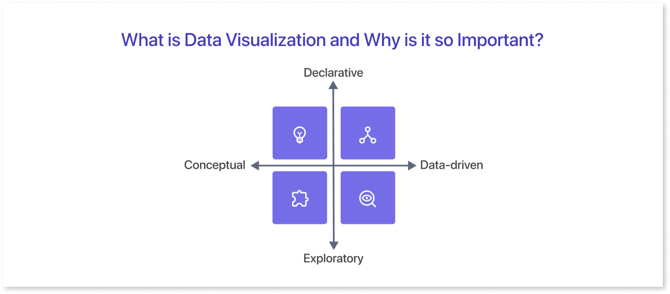
Concept Creation
Teams often use data visualization as an open source to stimulate idea generation. These graphic tools are frequently utilized during brainstorming or design thinking sessions at the early stages of the project. It helps in gathering diverse viewpoints and highlights common concerns.
These visuals help important people understand the problem the team is working on, even though they may need some improvement.
Conceptual Illustration
Data visualization helps in illustrating ideas for effective communication of concepts, whether they relate to strategies, procedures, or other aspects. It finds common contexts for educational settings like tutorials, certification courses, and centers of excellence.
Additionally, it can help in representing data for organizational structures and processes, simplifying communication among the appropriate individuals for particular tasks.
Visual Exploration
Visual exploration and data visualization share a strong relationship. It helps experts find patterns, trends, and data points in datasets, aiding data analysis and scientific research. On the other hand, everyday data visualization contributes to conveying a narrative once a new insight has been discovered.
Data Representation
Data visualization is important in data science. It helps people share data with colleagues and decision-makers more effectively.
Teams responsible for managing reporting systems mostly rely on predefined template views for analyzing performance. Yet, performance dashboards do not restrict data visualization. In text mining, a word cloud can help find important ideas, patterns, and connections in unstructured data.
Also, they might illustrate the relationships between things in a knowledge graph using a graph structure. Different ways exist to display various data types. It is important to understand that this capability should go beyond the main analytics group.
Importance of Data Visualization
The visualization of data enables a quick and effective way to communicate information in a universal manner using graphical representation. This technique helps organizations estimate sales. It also helps them identify areas needing improvement.
Additionally, it helps organizations retain stakeholders. Moreover, it helps them find the best product placement times and locations. Lastly, it helps organizations understand what influences consumer behavior.
Let’s have a look at some of the few benefits of the data visualization given below:
- Facilitates quick comprehension of the information, enhancing understanding, and expediting the decision-making process.
- Helps to gain a better grasp of the necessary steps to achieve the desired goals.
- It streamlines the sharing of information, increasing the chances of sharing valuable insights with all relevant parties.
- Builds up the interest of your audience by delivering information that is easily understandable and engaging.
The growing importance of “big data” and data analysis projects has highlighted the need for data visualization. Companies use machine learning to collect large amounts of data. Analyzing, understanding, and explaining this data can be difficult and time-consuming. Visualization speeds up the procedure and makes data easier to understand and accessible for stakeholders and business owners.
Different forms of Data Visualization
Dashboards are a group of different data visualizations put together keeping in mind factors like user journey, importance of data, etc. The different types of data visualizations are as follows:
Tables:
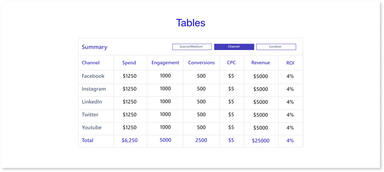
A table consists of rows and columns for variable comparison. Tables are useful for organizing information. However, they can be overwhelming for users who only want to see the main trends.
Pie Charts & Treemaps:
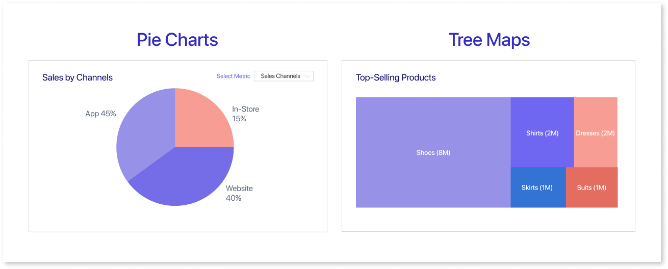
Pie charts visually represent the proportions of a whole by dividing it into slices. Each slice shows a percentage, giving a quick summary of categorical data such as market share or survey answers.
Whereas, tree maps show hierarchical data structures using layered rectangles. The sizes of the rectangles correspond to quantitative values, and each individual represents a branch of the hierarchy.
Line Charts & Area Charts:
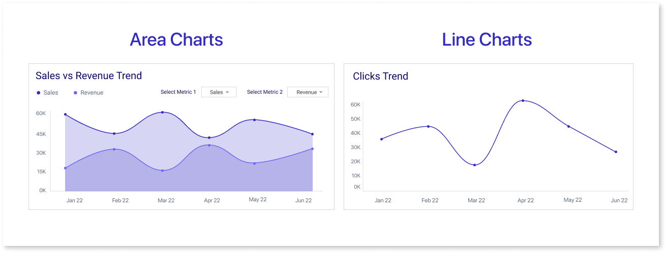
These charts show how things change over time by plotting data points. They are often used in predictive analytics. Area charts connect data points with lines, stack variables, and use color to differentiate. Line graphs use lines to show changes.
Histogram:
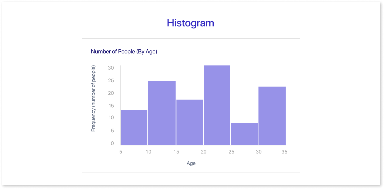
This graph displays data within a range by using a bar chart without gaps between the bars. An end user can quickly and easily identify outliers in a given dataset by using this graphic.
Scatter Plots:

Researchers frequently use these graphics to depict the relationship between two variables in regression data analysis. Sometimes, people may confuse these with bubble charts, which use the x-axis, y-axis, and bubble size to show three variables.
Heat Maps:
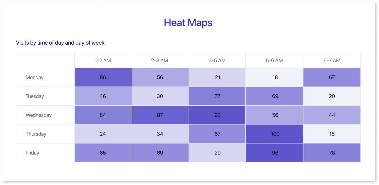
These graphical representations are useful for displaying behavioral data based on the location. The location can either be on a map or even a webpage.
Stacked & 100% Stacked Bars :
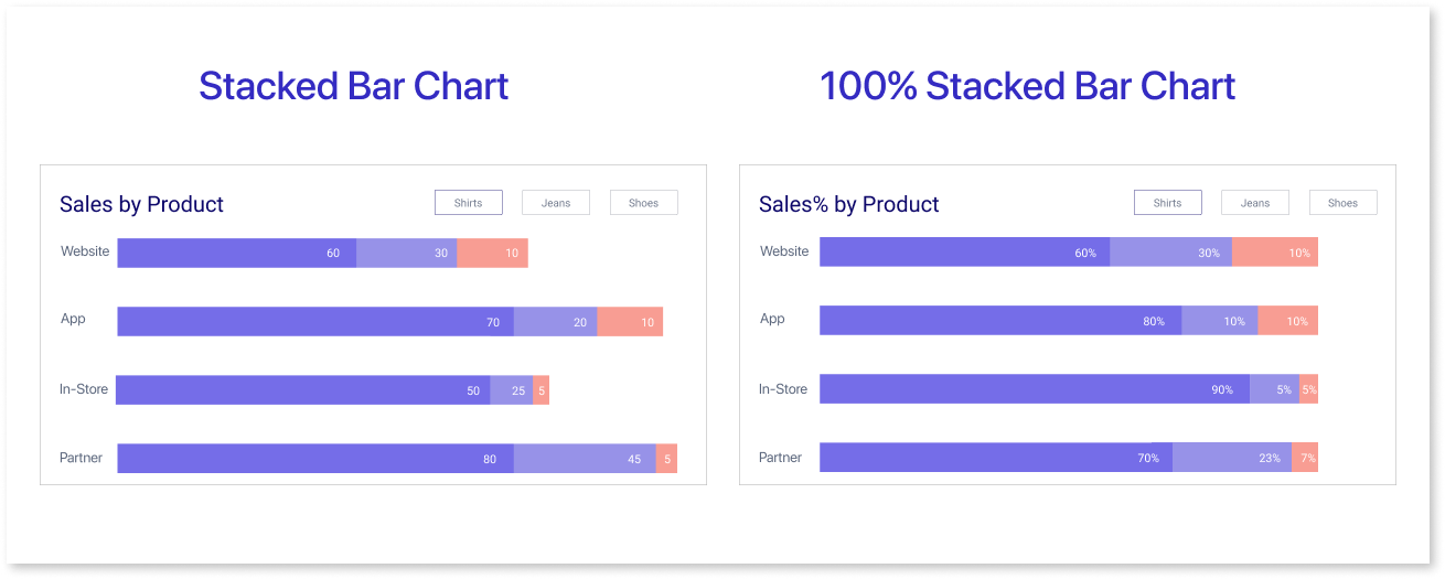
Stacked and 100% stacked bars are types of bar charts. A stacked bar chart displays data series separately, showing the size and contribution of each sub-group.
A 100% stacked bar chart shows the parts that make up a whole. Each bar shows the total and percentage of each part, giving a clear picture of the distribution.
Graphs and charts help businesses understand data and make informed decisions.
Key Principles of Data Visualization Design
Data visualization serves as a potent instrument for understanding intricate information and conveying valuable insights to an audience. However, crafting engaging data visualizations can prove to be a daunting task. Here are the key data visualization principle that can help you improve your designs for visualization.
Mindful Color Usage:
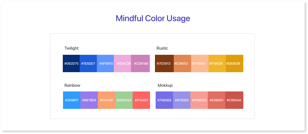
Color is a strong tool that can help make your representation more visually appealing and understandable. However, color selection is important, as too many shades can confuse your audience. Consider both the message you want to convey and the type of data you're working with when selecting colors. Darker shades show more data points, while cooler colors show fewer data points.
Relevant Data Labels & Annotations:
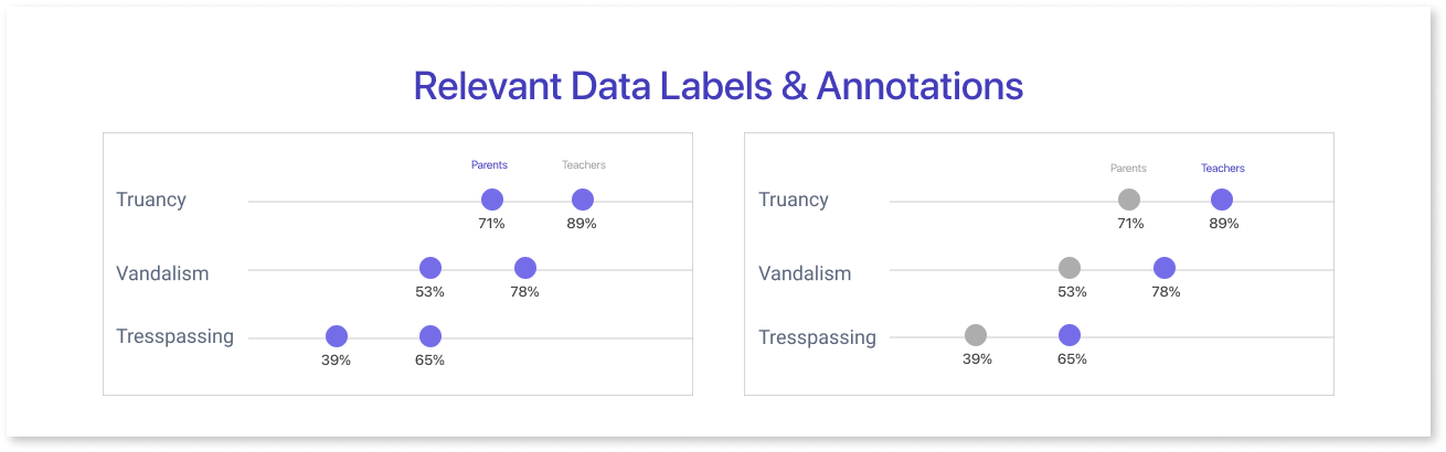
Annotations provide additional information about the data, while data labels help to identify the data points in the visualization. Both of these features are critical for ensuring that the audience understands what the visualization is about. Use concise and accurate wording when marking data points.
Typography:
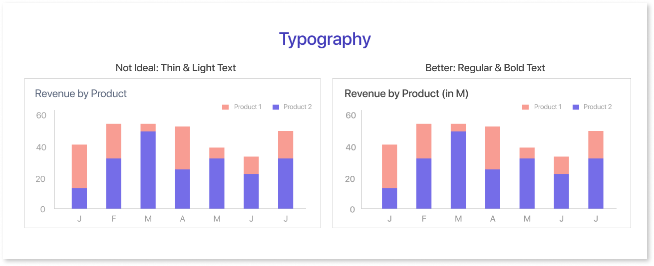
When trying to convey information, a clear and readable font can make all the difference. Likewise, if the text is too small it may make the visualization less appealing. Hence, it is vital to establish a distinction between the colors of the text and the background. Annotations offer supplementary details regarding the data, whereas data labels aid in distinguishing the data points on the visualization.
Key Role of Alignment:
To align elements in good data visualization, sort the x- and y-axis correctly for precise alignment of data points. Perfect alignment of text and labels is vital. Finding the balance with white space is key—too much may affect readability, while too little can create clutter. Aim for an optimal balance to present information clearly and facilitate easy interpretation.
Layout
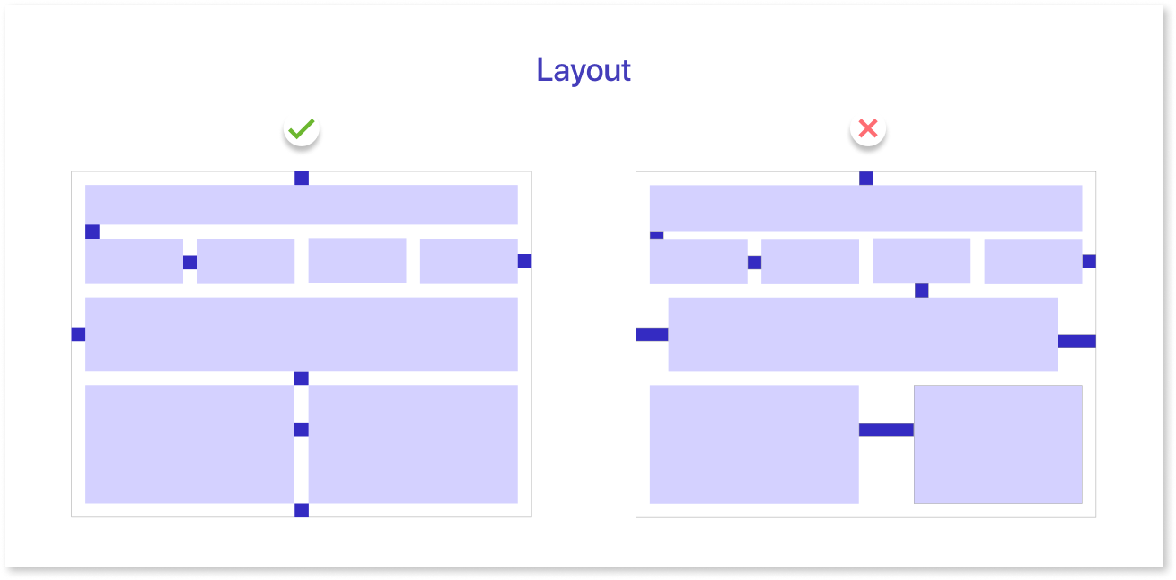
A well-designed layout is essential for effectively communicating information in data visualization. A well-organized layout places important elements like charts, graphs, and labels strategically to direct the viewer's attention.
Focus on important information, use a clear design, and think about how the visuals tell a story. An optimal layout improves the viewer's understanding, facilitating a smooth interpretation of the data presented.
Advantages & Disadvantages of Data Visualization
Presenting data in a visual manner may seem to have no drawbacks. Displaying data in an incorrect manner might distort or misconstrue it. When choosing to create an interactive visualization, it’s best to consider both the advantages and disadvantages in mind.
| Advantages | Disadvantages |
| Easily accessible information | Misleading or incorrect data |
| Helps in exploring opportunities and useful insights | Not all correlations imply causation |
| Helps in visualizing patterns and relationships | Interpretation can obscure key messages |
Data visualization allows people to see, interact with, and learn more about the data. The right visualization can help everyone understand, no matter how simple or complex the information is.
Best Practices for Effective Data Visualizations
To make sure your data visualization helps your audience understand your message, keep it simple and intentional.
Different tools can help create dashboard wireframes, giving a clearer idea of how your final dashboard might look.
Mokkup.ai is a cloud-based dashboard wireframing tool that enables you to develop mockup dashboards from the ground up. You can also select from a range of prebuilt, customizable templates that suit your requirements.
The best practices listed below can assist in ensuring that your effective data visualization characteristics is useful and clear:
Define the Context:
It’s important to provide basic information to help the audience around why a particular data point is important. To motivate people, they need to understand how their current performance relates to important factors. These factors include goals, benchmarks, and key performance indicators (KPIs).
Understand your audience:
Tailor your data visualization to meet the specific needs of your target audience. Consider their goals, the questions they prioritize, and whether your visualization aligns with their concerns. Ensure that the data encourages them to take action within their professional scope.
Select the Right Visuals:
Different visuals suit different sorts of data. Scatter plots show correlations between two variables, while line graphs display time series data effectively. You must ensure that your chosen visual representation must be able to deliver the main message. Misuse of charts and data might result in confusion rather than clarity.
Simple is Better:
When visualizing data, be careful with the extra elements you use to grab the viewer's attention. Eliminate distractions that may divert your target audience's focus to create impactful data visualizations.
Conclusion
In summary, data visualization simplifies complex information, making it accessible and actionable. To tailor visuals to your audience's needs, choose the right representations, and keep designs simple and clear. Effective data visualization enhances understanding and facilitates informed decision-making while avoiding potential pitfalls.
Ensure you follow all the characteristics of data visualization by using Mokkup.ai
Prompt it. Wireframe it with Mokkup.ai.
