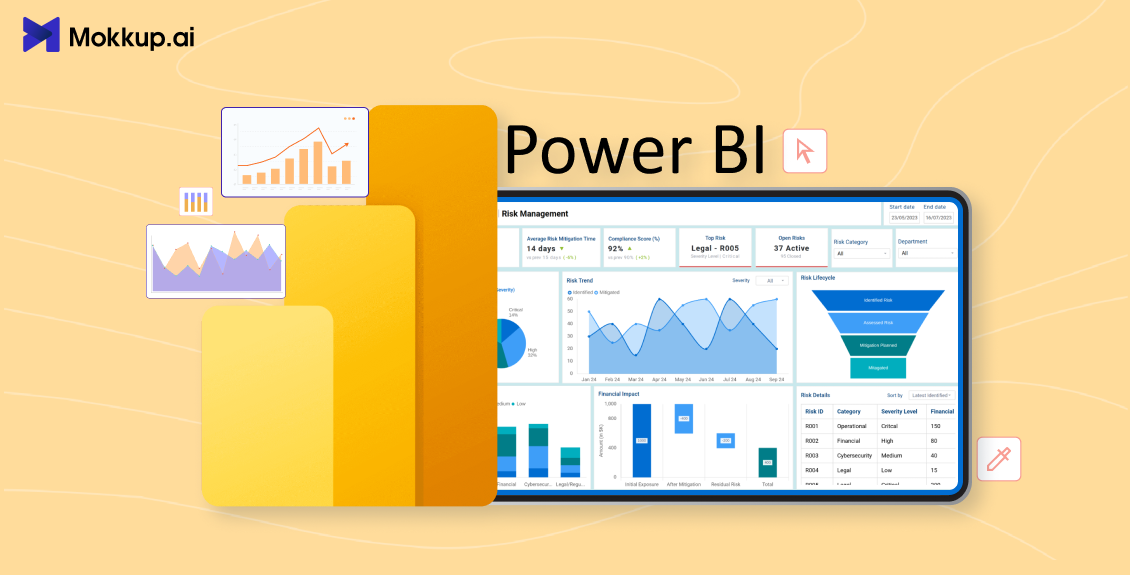
Every project hints at the trouble, but you don't see it. When the budget, timelines, risks, and data sources are scattered across multiple tools, your whole year of planning fails as you have lost track of everything in between. A Power BI project management dashboard makes them loud with a showcase of all crucial business aspects on one live screen, giving project managers real-time visibility into project health.
Wellingtone’s State of Project Management report found that 72% of project professionals spend half a day or more every month collating reports by hand, and around half still have no access to real-time project KPIs.
The visibility gap seems clear when you bring the consolidated view to your table while making big decisions. Likewise, you are one step away from hitting the early signs of risks, profoundly impact your ability to make the correct financial/operational decisions.
This guide covers 8 real Power BI project management dashboard examples used by PMOs, delivery managers, and BI consultancies, the KPIs each one tracks, and 13+ free wireframe templates you can open, customize, and export to Power BI today.
Table of Contents
- 8 Power BI Project Management Dashboard Examples
- What Is a Power BI Project Management Dashboard?
- Key KPIs Every Power BI Project Management Dashboard Should Track
- Types of Power BI Project Management Dashboards
- How to Design a Power BI Project Management Dashboard
8 Power BI Project Management Dashboard Examples
Here are 8 handpicked project and PMO dashboard wireframe templates from Mokkup’s library. Each one is built for a specific role, from the PMO director who scans one screen a month to the delivery manager who lives in the report all day. Every Power BI project management dashboard example below covers the layout, the KPIs it tracks, and the situation where it earns its place, with a link to open the template directly.
1. Project Management Summary (PMO / Executive) Dashboard
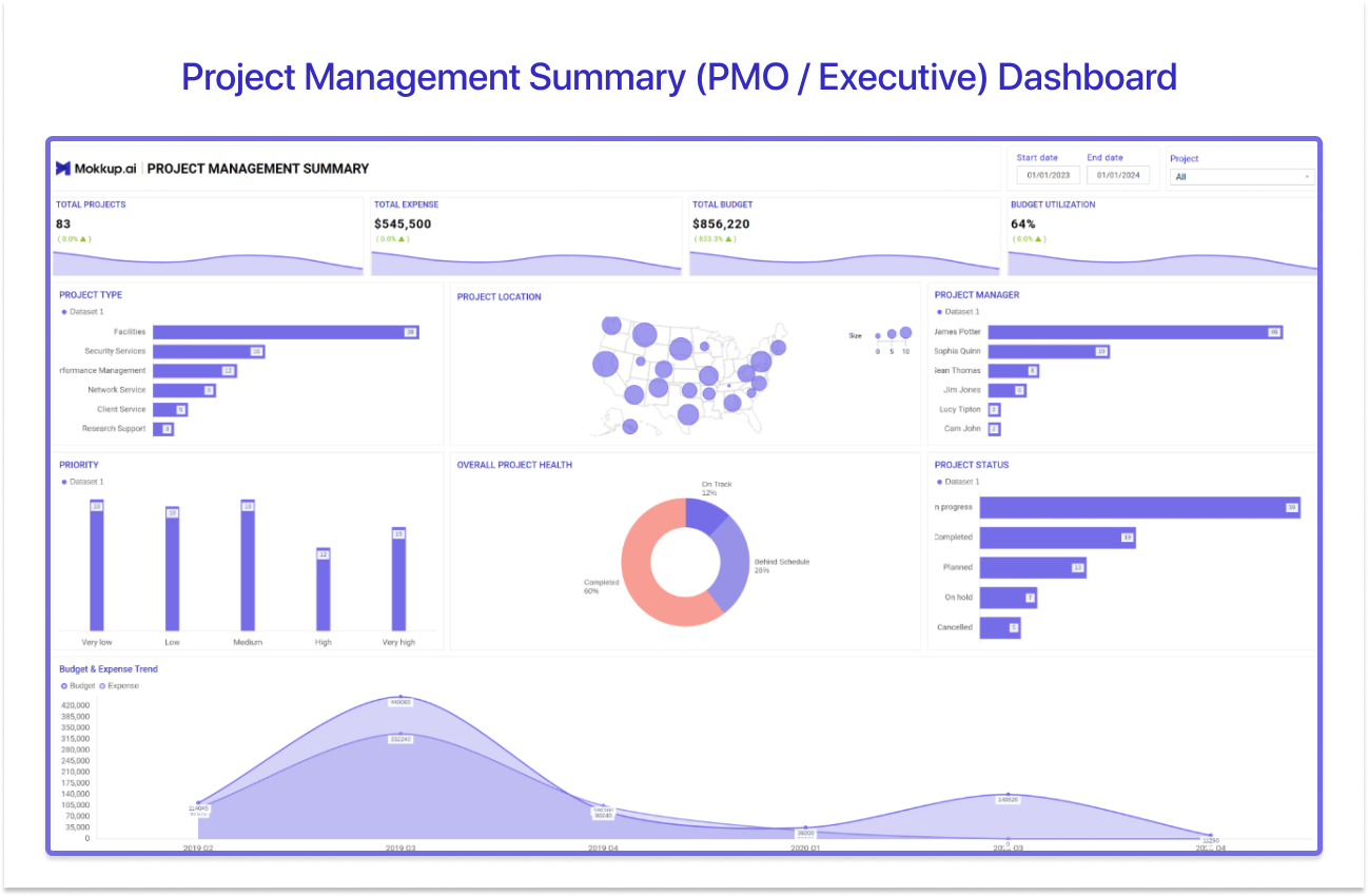
If your stakeholder is a PMO lead or an executive who wants one page and no scrolling, this is the Power BI PMO dashboard to start with. The layout answers three questions in a single glance: How many projects are running? How much of the budget is gone? Is anything on fire?
The template leads with headline cards for total projects, total budget, and total expense, followed by a budget utilization percentage that tells the sponsor how much runway remains. A project location map shows the geographic spread of the portfolio, which matters more than most teams expect when delivery spans regions, and an overall project health visual rolls status up into a single RAG-style read. A PMO director would choose this layout for monthly portfolio reviews, where the goal is scanning, not drilling. It is deliberately shallow, and that is the point.
Explore the Project Management Summary template →
2. Project Progress & Status Dashboard
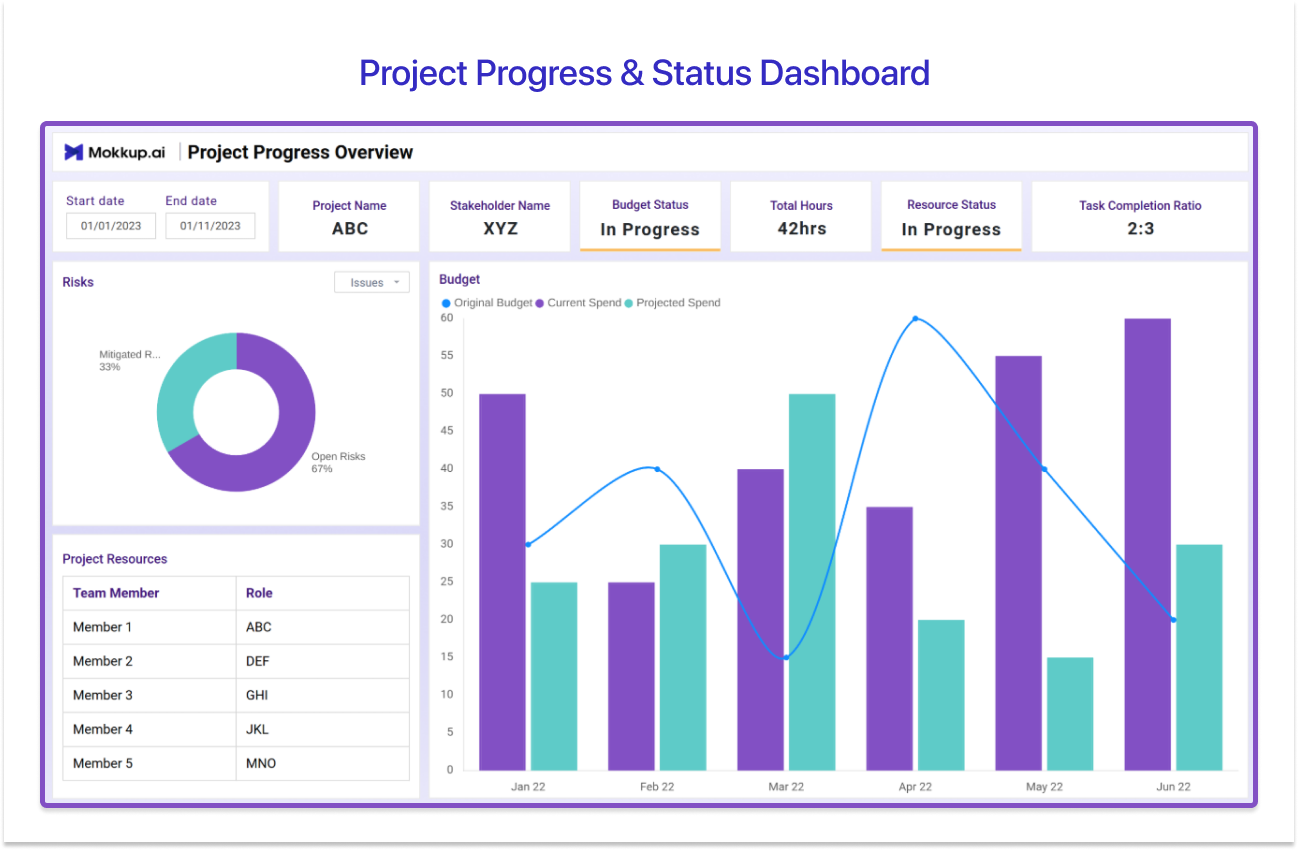
This is the closest thing to a universal Power BI project status dashboard: one project, one story, told across three screens. Project managers reporting a single project’s health to stakeholders will get the most from this layout.
The Summary screen carries the project name, overall status, projected end date, and key achievements, which is essentially milestone tracking framed for people who will never open the project plan. The Overview screen goes one level deeper with project resources, task completion ratio, and budget, so the conversation about pace and spend happens on the same page. The Performance screen closes with an immediate task list, error rate, and a stakeholder satisfaction score, the last of which quietly tells you how the next steering meeting will go. As a Power BI project tracking dashboard for weekly status calls, this three-screen flow means nobody asks “so where are we, actually?” at the end.
Explore the Project Progress & Status template →
3. Project Financial & Resource Detailed Report Dashboard
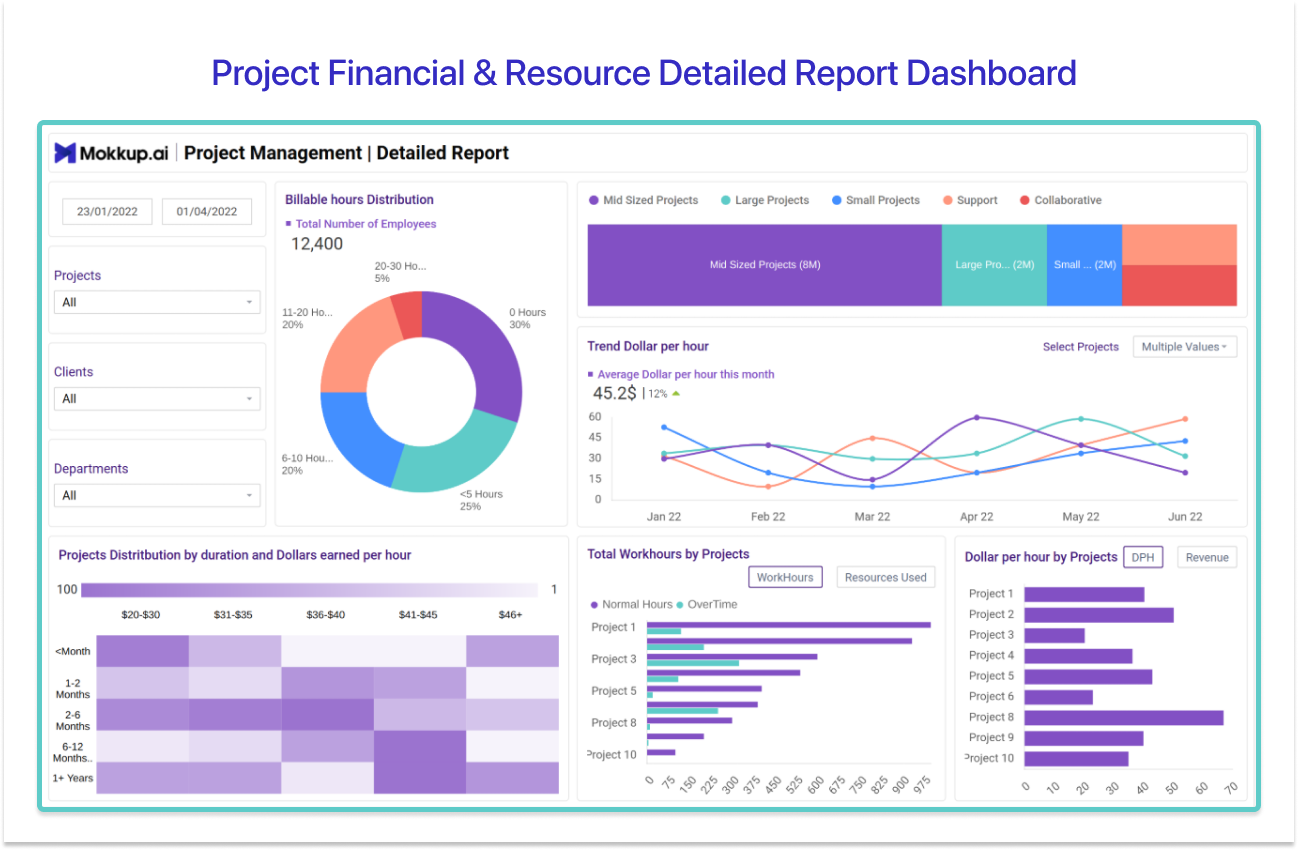
Built for teams that bill by the hour, this Power BI project management dashboard ties resourcing, project mix, and profitability into one detailed report. BI consultancies and PMOs running billable work are the natural audience.
The first screen focuses on effort economics: billing hours distribution across the team, the mix of project types, a dollar-per-hour trend, and total work hours by project split into regular and extra hours, which is where scope creep shows up before anyone names it.
The second screen tracks project inflows, covering new projects in the pipeline, extensions, and concluded projects, alongside feedback on completed work, profit by concluded project, and the overall revenue and profit trend. A delivery lead would choose this layout when the question is not “Are we on schedule?" but “Is this engagement actually making money?” Few project dashboards answer that honestly on one screen; this one is designed to.
Explore the Project Financial & Resource Detailed Report template →
4. Agile / Software Development Project Dashboard
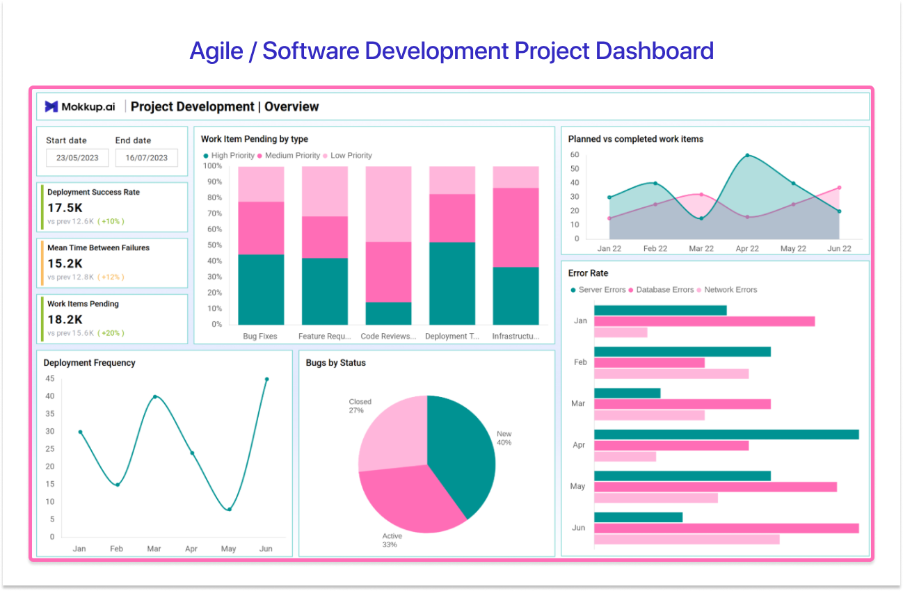
Software projects fail differently, so they need a different Power BI project management dashboard. This DevOps-flavored layout is built for engineering managers and agile teams tracking release health alongside the plan, where sprint velocity and deployment cadence matter more than a Gantt chart.
The screen opens with a time range selector, then moves through deployment success rate and mean time between failures (MTBF), the two numbers that tell you whether releases are stable. Work item pending flags bottleneck in the pipeline, deployment frequency shows how quickly the team ships, and a planned vs completed work items comparison keeps sprint commitments honest.
Error rate and a bugs-by-status breakdown close the loop on quality, showing whether defects are being resolved or just accumulating in the backlog. Choose this layout when your stakeholders speak in releases and sprints rather than phases and milestones.
Explore the Agile / Software Development Project template →
5. Team Workload & Efficiency Dashboard
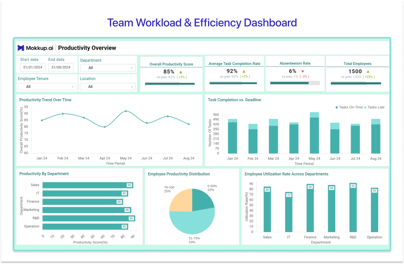
Project plans assume capacity; this dashboard checks it. PMOs and team leads balancing workload across a delivery team use this layout to see whether the hours going in match the output coming out, before burnout or idle time distorts the schedule.
The template is anchored by an overall efficiency score, a single combined read on productivity, and backed by task completion rate and time efficiency metrics that show how well working hours convert into finished work. Absenteeism rate sits alongside them because attendance patterns usually explain efficiency dips faster than any other metric.
Training participation and a skill impact score round out the view, connecting learning investment to actual delivery improvement. Filters for tenure, location, and skill set let a lead compare segments of the team rather than averaging everyone into one number. Pick this Power BI project management dashboard layout when resourcing conversations keep turning into guesswork.
Explore the Team Workload & Efficiency template →
6. Staff & Task Scheduling Dashboard
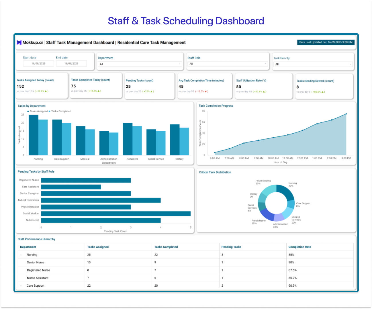
Day-to-day delivery lives here. Operations and project leads assigning tasks and shift coverage across a team need something more granular than a status roll-up, and this layout is built exactly for that cadence.
Task completion rate and tasks assigned today give a live read on the day’s workload, while average task completion time exposes where work is slower than it should be. Staff utilization rate shows active work against available capacity, pending tasks reveal what is stacking up by department or role, and tasks needing rework flag quality problems before they multiply.
Filters for date, department, task priority, and staff role let a lead redistribute work in minutes rather than in the next planning meeting. Of the eight Power BI project management dashboard examples in this guide, this is the one designed for daily use, and its value compounds precisely because someone opens it every morning.
Explore the Staff & Task Scheduling template →
7. Project Risk Management Dashboard
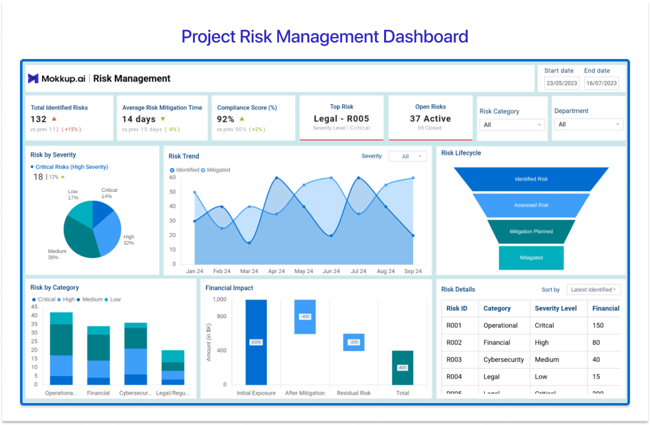
Every project has a risk register; almost nobody reads it. This layout turns that register into a visual page PMOs and risk officers can actually act on, covering identified risks, mitigation timelines, and financial exposure across a portfolio.
Headline cards track total identified risks, average risk mitigation time, and a compliance score percentage, with open risks counted separately so unresolved exposure never hides in a total. A severity pie chart splits risks into low, medium, and high; a multi-line trend chart shows how risk volume moves over time; and a funnel visual follows the risk lifecycle from identification to resolution, exposing exactly where mitigation stalls.
The financial impact waterfall is the piece executives remember, since it converts abstract risk into money. A risk details table underneath carries ID, category, severity, and impact for anyone who needs the source rows. Choose this when steering meetings keep getting surprised.
Explore the Project Risk Management template →
8. Resource Allocation & Team Structure Dashboard
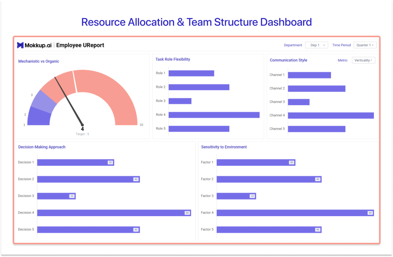
Before you can allocate resources, you need to see the organization honestly. This Power BI resource management dashboard maps reporting lines and decision-making structure, which makes it the odd one out in this list and, for PMOs planning resourcing across projects, one of the most useful.
The centerpiece is a hierarchical chart of departments, roles, and reporting structures, so allocation decisions rest on how the organization actually connects rather than how the org chart from two years ago claims it does. Around it sit characteristics that shape delivery: a mechanistic vs organic structure comparison, task-role flexibility, predominant communication style, and decision-making approach.
Department heads use this layout when projects keep stalling at the same handoff points, because structural friction shows up here before it shows up in schedule variance. It pairs naturally with example 5, which measures the workload the structure has to carry.
Explore the Resource Allocation & Team Structure template →
What Is a Power BI Project Management Dashboard?
A Power BI project management dashboard is a single-page interactive report that consolidates project status, budget, resourcing, and risk data into real-time KPI views for project managers, PMOs, and stakeholders. It replaces manually assembled status decks with one governed screen where task completion, budget utilization, and open risks update as the underlying data changes.
The distinction is worth keeping in mind: a task board shows what individuals are doing, while a project management dashboard Power BI build shows whether the project is on track, on budget, and within its risk appetite. It is designed for stakeholder reporting first, which is why layout decisions matter as much as the data model behind them. A sponsor should find their number in ten seconds; everything else on the page is context.
Power BI is well suited to this job for practical reasons. DAX measures handle schedule variance and budget utilization calculations once, then reuse them across every visual. Slicers let a PMO filter the same report by project, department, or period without maintaining separate versions, and a scheduled refresh in the Power BI Service means the Monday status meeting opens with Monday’s numbers, not last Thursday’s export.
Key KPIs Every Power BI Project Management Dashboard Should Track
Choosing KPIs comes before choosing a layout. The eight Power BI project management dashboard examples above each combine a handful of metrics from two groups, and knowing which group your stakeholders care about tells you which template to open first. A useful test: if a KPI would not change a decision at the next steering meeting, it belongs in a drill-through page, not on the main screen.
Delivery and Status KPIs
- Overall project status: The RAG-style headline reads; it decides whether the meeting is a check-in or an intervention.
- Task completion ratio: Completed tasks against planned, the plainest measure of whether pace matches the plan.
- Projected end date and schedule variance: The forecast finish and its drift from the baseline surface before it becomes a surprise.
- Key achievements and milestones: What has actually shipped, because stakeholders trust delivered milestones more than percentages.
- Immediate task list: What needs attention this week, which turns the dashboard from a report into a working tool.
- Error or defect rate: How much of the work is coming back is an early signal that speed is being bought with quality.
Budget, Resourcing, and Risk KPIs
- Budget vs actual / budget utilization %: How much has been spent against plan, the first number every sponsor looks for.
- Resource allocation and utilization rate: Whether people are over-assigned, under-used, or roughly right.
- Staff or task coverage: Who is covering what, so gaps appear on the dashboard before they appear in delivery.
- Open risks: The count of unresolved risks still in play.
- Risk severity: How the open risks are distributed across low, medium, and high.
- Compliance score: Adherence to regulatory and internal policy, tracked before an audit forces the question.
Types of Power BI Project Management Dashboards
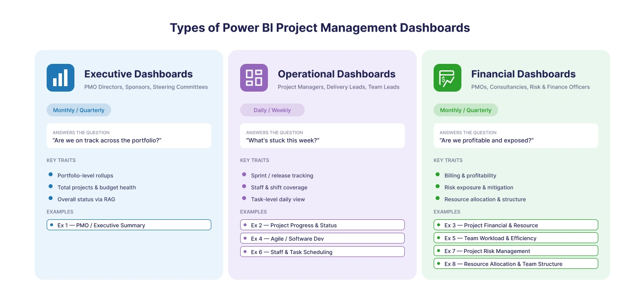
Not every Power BI project management dashboard serves the same audience, and matching the type to your stakeholder before building saves more rework of any decision in the process. Three types cover nearly every project use case.
1. Executive and Portfolio-Level Dashboards
A high-level roll-up for PMO directors, sponsors, and steering committees: total projects, budget health, and overall status, designed for scanning rather than drilling. If the viewer’s next action is a question rather than a task, this is their dashboard. Example 1 fits this type.
2. Operational Delivery Dashboards
The day-to-day layer for project managers, delivery leads, and team leads, covering task tracking, sprint and release health, and staff and shift coverage. These get opened daily, so density and filters matter more than polish. Examples 2, 4, and 6 fit this type.
3. Resourcing, Risk, and Financial Dashboards
Planning-focused views for PMOs, consultancies, and risk officers: billing and profitability, workload capacity, risk exposure, and organizational structure. These answer the questions that decide next quarter rather than next week. Examples 3, 5, 7, and 8 fit this type.
How to Design a Power BI Project Management Dashboard (The Wireframe-First Approach)
Here is the cycle most BI developers know too well: build the report, present it, and watch the sponsor or PMO director send it back because the layout buried the one status or budget number they came to check. PMI’s Pulse of the Profession research found that organizations waste 9.9% of every dollar invested due to poor project performance, and dashboard rework is a quiet contributor. Every revision cycle is dev time spent re-answering a question that could have been settled before the build.
The fix is to get the layout approved before any development starts. Four steps:
- Choose the dashboard type from the 8 examples above. Executive roll-up, operational delivery, or resourcing and risk. Matching the layout to the stakeholder is most of the battle.
- Open the matching Mokkup wireframe template and customize the layout. Rename KPI cards, swap visuals, and arrange the screen around the numbers your sponsor actually asks about, with no data connection needed yet.
- Share the wireframe link with the sponsor or PMO director before writing a single DAX measure. A 30-minute review of a wireframe costs nothing; the same feedback after the build costs a week.
- Once approved, export directly from Mokkup to Power BI and use it as the starting report template, so the build begins from a layout that has already passed its hardest review.
Browse the project management templates in Mokkup’s library →
Explore All 13+ Free Power BI Project Management Dashboard Templates
Mokkup’s library holds 13+ project and PMO wireframe templates covering every project use case: status tracking, PMO and portfolio summary, resourcing, risk management, agile and DevOps delivery, and staff scheduling. The 8 examples above are the featured picks; the rest sit in the template hub waiting for the use case that fits.
Unlike a static PBIX download, every Power BI project management dashboard template in the library is interactive from the first click. You can edit the layout with AI by describing what you need in a prompt, share a live link with your sponsor or PMO lead for sign-off, and export to Power BI or Tableau in one click once the layout is approved. That order, design first, approval second, and build third, is what separates a dashboard that ships once from one that gets rebuilt every quarter.
The right project management dashboard depends on your role and your question. Sponsors and PMO leads need the portfolio roll-up, delivery managers need status and scheduling views, and risk officers need exposure on one page. The 8 Power BI project management dashboard examples above cover each of those seats, and all 13+ templates are free to start.
Frequently Asked Questions:
1. What is a Power BI project management dashboard?
It is a single-page interactive report that consolidates project status, budget, resourcing, and risk data into real-time KPI views for project managers, PMOs, and stakeholders. Instead of collating numbers from separate tools into a monthly deck, teams get one screen that updates as the underlying data changes.
2. Which dashboard type should a PMO start with?
Start with the portfolio-level summary (example 1), which shows total projects, budget utilization, and overall health on one screen. Once that view is trusted, add operational layers like status tracking and risk as separate reports rather than crowding the summary page.
3. Are the project management templates really free?
Yes, the templates are free to open and explore, and you can start editing with a free Mokkup account. Some advanced templates in the library carry a Pro tag, which requires a Pro subscription to customize.
4. Can I export a Mokkup wireframe to Power BI?
Yes. Once the layout is approved, you can export the wireframe directly to Power BI in one click and use it as the starting report template, so the build begins from a design your stakeholders have already signed off on. Tableau export is supported in the same way.
5. What KPIs matter most on a project dashboard?
The shortlist for most teams: overall project status, task completion ratio, budget vs actual, schedule variance, resource utilization, and open risks by severity. Pick the six to eight things your steering meeting actually discusses; everything else belongs on a drill-through page.
Prompt it. Wireframe it with Mokkup.ai.
