
Are your dashboards giving users the freedom to explore data on their own?
Static reports often limit decision-makers to a fixed view, while interactive dashboards empower them to drill down, apply filters, and uncover insights that matter most.
Interactive dashboards have become an essential part of modern business intelligence. Unlike static reports, they allow users to navigate data dynamically, ask better questions, and receive answers instantly. Businesses today expect dashboards that adapt to their needs rather than just display numbers.
The push for interactivity is closely tied to how decision-making has evolved. Teams handle vast datasets across multiple systems, and executives cannot afford delays caused by waiting for new reports from IT. With interactive dashboards, they can move from a high-level overview to detailed insights in just a few clicks.
Table of Contents
- Benefits of Interactive Dashboards
- Best Practices for Creating Interactive Dashboards
- Tools for Building Interactive Dashboards
- The Role of AI and Automation in Dashboard Interactivity
- Common Challenges in Building Interactive Dashboards
Benefits of Interactive Dashboards
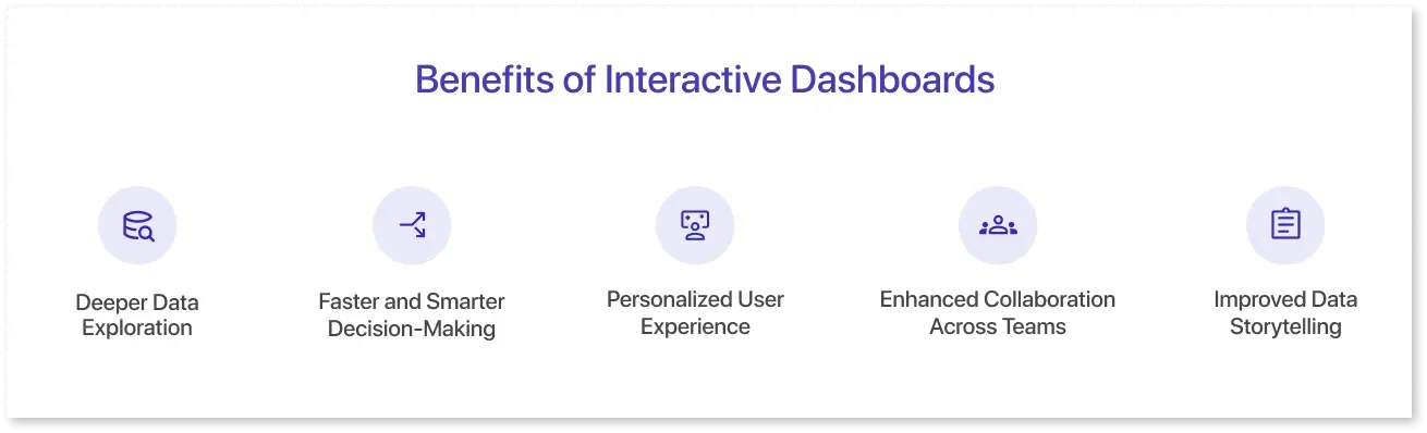
Interactive dashboards are more than just visually appealing charts. Their real strength lies in enabling data visualization that adapts to specific business questions. Interactivity ensures that decision-makers are not locked into a single view but can navigate through multiple layers of insights quickly.
Here are some of the key benefits:
1. Deeper Data Exploration
Instead of presenting a fixed report, Tableau interactive dashboards allow users to explore data on demand. They can drill down from a high-level KPI to the underlying details and discover hidden patterns. For example, sales managers can start with quarterly revenue and then click through to see performance by region, product line, or sales representative.
2. Faster and Smarter Decision-Making
Time-sensitive decisions require quick access to relevant data. Interactivity removes the dependency on static reports or IT teams by putting exploration in the hands of business users. When stakeholders can adjust filters, compare trends, or run side-by-side analysis instantly, decisions become both faster and more accurate. A QuantHub article reports that interactive dashboards significantly reduce reliance on IT by empowering users to explore data directly.
3. Personalized User Experience
Not every stakeholder looks at data in the same way. A finance leader may focus on cash flow metrics, while a marketing manager is more interested in campaign performance. Interactive dashboards provide a personalized view through role-based filters, customizable layouts, and the flexibility to focus only on metrics that matter to each user.
4. Enhanced Collaboration Across Teams
Data silos often block collaboration. With Power BI interactive dashboards, teams can share insights in a common space and refine their analysis together. Features like drill-through reports, filter sharing, and embedded notes help ensure that everyone is aligned on the same set of facts, reducing miscommunication.
5. Improved Data Storytelling
Static charts often fail to communicate the full story. Interactivity allows data to be presented as a narrative where users can follow the trail of insights step by step. This makes presentations more engaging and supports clearer communication during meetings, project reviews, or client updates.
Best Practices for Creating Interactive Dashboards
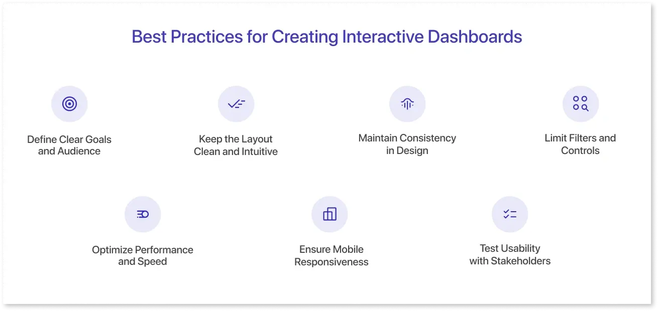
Designing an interactive dashboard goes beyond placing charts and filters on a screen. A well-structured dashboard should make it easy for users to explore data without feeling overwhelmed. Following best practices ensures the dashboard looks professional and delivers actionable insights efficiently.
Here are some proven practices to consider:
1. Define Clear Goals and Audience
Before adding visuals, clarify the dashboard's purpose. Is it meant for executives who need a quick overview or analysts who require detailed exploration? Defining the audience helps determine which KPIs to highlight, what level of interactivity is necessary, and how much detail should be included.
2. Keep the Layout Clean and Intuitive
Cluttered dashboards reduce usability. Use whitespace effectively, organize visuals into logical sections, and avoid overloading the screen with too many elements. A clean layout ensures users can navigate the dashboard smoothly and focus on what matters most. Toptal highlights that prioritizing clarity and intuitive hierarchy in dashboard layout significantly improves user focus and comprehension.
3. Maintain Consistency in Design
Consistency in color schemes, fonts, and chart types builds familiarity. For instance, if sales performance is represented using bar charts, avoid switching to a pie chart for the same metric elsewhere. This not only improves readability but also builds trust in the data presentation.
4. Limit Filters and Controls
While interactivity is powerful, too many filters can confuse users. Offer only the most relevant controls, such as date ranges, product categories, or regions. Advanced options can be placed in secondary menus to keep the main interface simple.
5. Optimize Performance and Speed
Dashboards that take too long to load discourage adoption. Reduce unnecessary calculations, limit the number of visuals per page, and optimize data queries. Performance testing before rollout is critical for user satisfaction.
6. Ensure Mobile Responsiveness
With decision-makers often working on the go, dashboards should adapt seamlessly to tablets and mobile devices. Responsive layouts and simplified mobile views make interactivity accessible across platforms without losing usability.
7. Test Usability with Stakeholders
End-users should be involved in testing early versions of the dashboard. Their feedback can highlight pain points, unnecessary complexity, or missing features. Iterative testing ensures the final product matches both business needs and user expectations.
Tools for Building Interactive Dashboards
The right tool plays a major role in an interactive dashboard's effectiveness. While best practices guide the design, the platform determines the level of flexibility, scalability, and performance that can be achieved. NACCHO’s new interactive dashboard showcases how dynamic filters and narrative storytelling bring public-health data to life for stakeholders.
Different dashboarding tools serve different needs, ranging from enterprise-level analytics to quick prototyping.
Here are some of the most widely used data dashboard tools:
1. Mokkup (Dashboard Wireframing Tool)
Mokkup is a high-fidelity dashboard wireframing tool built for data analysts, BI developers, and stakeholders who want to design precise, prototype-ready dashboards before investing in full BI development. It bridges the gap between dashboard planning and actual development fast and collaboratively.
Key Features:
- AI-Generated Wireframes: Use simple text prompts to create initial dashboard layouts. Mokkup’s GenAI transforms your description into a wireframe packed with the right KPIs, charts, and layouts.
- One-Click Export to BI Tools: Export your wireframe directly into Power BI or Tableau, including dummy data to replicate interactions and layout. This accelerates the transition from design to development.
- Real-Time Collaboration: Stakeholders, designers, and analysts can collaborate in real time, adding comments, feedback, and adjustments. This streamlines alignment and speeds up approvals.
- Faster Workflow, Reduced Development Time: Teams can build and validate dashboard designs in about 30 minutes, earning stakeholder approval faster and reducing BI development time by up to 80%.
Best For: BI teams using Power BI or Tableau & Analysts and designers prototyping dashboards.
2. Power BI
Power BI, developed by Microsoft, is one of the most popular platforms for creating interactive dashboards. Its deep integration with Excel, Azure, and other Microsoft services makes it a strong enterprise choice. Users can drag and drop data fields, apply filters, and easily create drill-through reports. It also supports role-based access, ensuring secure data sharing across teams.
Best for: Organizations already using Microsoft’s ecosystem and enterprises that need advanced reporting at scale.
3. Tableau
Tableau is known for its strong visualization capabilities and interactive features. Its drag-and-drop interface allows users to create dashboards without extensive coding knowledge. Features like drill-down analysis, storyboards, and parameter controls make it a favorite for businesses prioritizing visual storytelling and data exploration.
Best for: Businesses needing powerful visuals and flexibility to handle large, complex datasets.
4. Looker Studio (formerly Google Data Studio)
Looker Studio is a free tool within Google’s ecosystem, offering easy connections to Google Analytics, BigQuery, Ads, and Sheets. While simpler than enterprise-grade tools, it’s highly accessible and a good choice for small to mid-sized businesses. Interactive elements like filters, date range selectors, and clickable scorecards make digital marketing and reporting effective.
Best for: Teams seeking a cost-effective solution with strong Google integration.
5. Qlik Sense
Qlik Sense offers a unique associative data engine, allowing users to freely explore relationships across multiple datasets. Unlike linear query-based exploration, Qlik highlights hidden patterns that might not be visible in traditional BI tools. It also supports AI-driven insights and strong collaboration features.
Best for: Companies that need deep data exploration and flexibility across large, diverse data sources.
The Role of AI and Automation in Dashboard Interactivity
AI and automation are reshaping dashboards into smarter decision-making tools. Instead of passively displaying KPIs, modern dashboards actively highlight anomalies, detect trends, and provide instant alerts. This reduces analysts' time digging through data and ensures leaders can act on insights faster. UXPin explains that AI-powered dashboards can automate insights and personalize experiences, surfacing trends and anomalies that users might otherwise miss.
Automation also enhances interactivity by handling repetitive tasks like data refreshes, report distribution, and even generating explanations for shifts in metrics. Features such as natural language queries allow users to ask questions in plain English, removing the technical barrier and making data accessible across the organization.
Beyond accessibility, predictive AI adds a forward-looking layer. Dashboards can now suggest the “why” behind changes and recommend possible actions, turning them into strategic assistants rather than static reports. This evolution makes dashboards informative and prescriptive, empowering teams to make confident, data-driven decisions.
Common Challenges in Building Interactive Dashboards
While interactive dashboards deliver immense value, creating them isn’t always straightforward. Many organizations struggle with balancing functionality, design, and usability. If not addressed, these challenges can reduce adoption rates and weaken the impact of BI investments.
1. Data Quality and Integration Issues
Challenge: Inconsistent data, mismatched formats, or broken pipelines can make dashboards unreliable.
How Mokkup Helps: While Mokkup doesn’t clean your data, it allows you to mock up visualizations with sample datasets, so stakeholders can validate what metrics matter most before investing in heavy integration work.
2. Overloaded Dashboards
Challenge: Trying to show too many KPIs and charts often results in cluttered dashboards.
How Mokkup Helps: With drag-and-drop elements, teams can design multiple dashboard wireframe versions and quickly spot what feels overwhelming. This helps streamline content before development begins.
3. User Training and Adoption
Challenge: Even great dashboards fail if users don’t know how to explore them.
How Mokkup Helps: Teams can share wireframes with stakeholders early, gather feedback, and then work on dashboard development.
4. Security and Access Controls
Challenge: Not all users should see the same level of data detail.
How Mokkup Helps: Mokkup allows role-based previewing, so teams can plan user-specific views (editor vs. commentor) in the design stage, reducing risks later.
5. Maintaining Consistency Across Teams
Challenge: Different departments create dashboards with different KPI definitions and visual styles, which can be confusing.
How Mokkup Helps: With customizable templates and brand-aligned themes, Mokkup ensures design consistency across teams, helping organizations establish a unified dashboarding standard.
Future Trends
Interactive dashboards are evolving into intelligent systems that do more than display data; they guide decisions. The best dashboard software will increasingly leverage AI to personalize insights, highlight the most relevant metrics, and even suggest actions based on detected trends. Natural language queries will make data exploration accessible to all users, allowing teams to ask questions and get instant visual answers without technical expertise.
Dashboards will also become more integrated into daily workflows, embedding directly into collaboration tools like Slack, Teams, or project management platforms. Mobile-first designs, predictive analytics, and real-time alerts will make dashboards proactive partners in decision-making, helping organizations act faster and more strategically while ensuring data remains actionable and easy to interpret.
Frequently Asked Questions
An interactive dashboard is a visual tool for exploring and analyzing data dynamically. Users can filter, drill down, and click charts to uncover insights in real time.
Top tools for prototyping and collaboration include Power BI, Tableau, Looker Studio, Qlik Sense, and no-code platforms like Mokkup.
A good dashboard has clear KPIs, intuitive navigation, responsive charts, drill-down options, real-time data updates, and visual consistency.
Consider your data sources, team skills, scalability needs, collaboration features, and the level of interactivity required before selecting a tool.
Focus on simplicity, highlight key metrics, use filters wisely, ensure fast performance, and test designs with stakeholders for clarity.
Prompt it. Wireframe it with Mokkup.ai.
