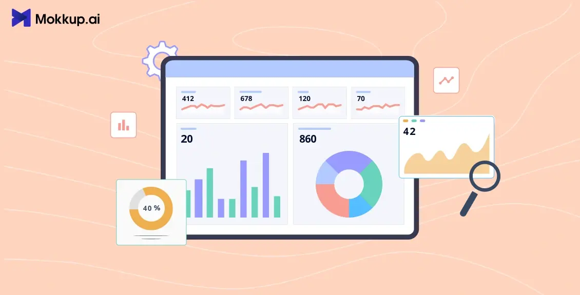
The success of any business depends on how effectively it measures the key performance indicators (KPIs). But how do they know what exactly they need to measure?
This can indeed overwhelm the data team with complex data structures that won't make the organization’s strategy sustainable. In fact, according to Accenture, 67% of business leaders find it challenging to access the data. The problem can be reduced with the use of feature-rich KPI dashboards, which help managers streamline processes and keeps the project on track.
Read this blog to learn the seven best features that define a professional, ready-to-use KPI dashboard template.
Table of Contents
- What are KPI Dashboards?
- Top 7 Features Every KPI Dashboard Must Have
- Best Practices to Build a KPI Reporting Tool
What are KPI Dashboards?
KPIs are measurements used by analysts to track business performance or project milestones. KPI dashboards show the metrics in the form of charts and graphs. The purpose is to keep all data points in a logical format. With real-time dashboards, managers can automate any manual data to uncover insights that actually contribute to decision-making.
The key performance indicators dashboard allows the analysis of complex datasets by providing accurate project progress tracking or a simple tool to make data-driven decisions. A KPI analytics dashboard is a foundation for the data analyst or other team members taking a data-driven approach. It includes metrics that support their end goal and help them derive actionable insights. It starts with identifying the right KPIs and applying the data visualization technique to facilitate the needed context. Not just this, but a right KPI analytics tool must also have features that cater to specific business needs. Let’s know them.
Top 7 Features Every KPI Dashboard Must Have
These are the top features that make a good data visualization dashboard with the relevant KPIs or metrics:
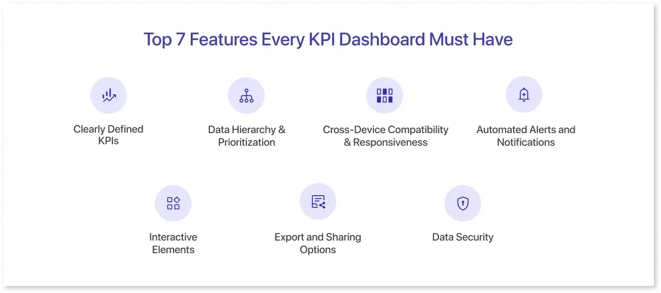
1. Clearly Defined KPIs
A Performance tracking dashboard consists of relevant KPIs that serve the purpose of analysis. For that, you must prioritize KPIs that matter the most to the business and align with the business strategy. Your business is getting into trouble if you track ambiguous metrics, which can lead to misalignment and confusion. For example, a marketing dashboard must include KPIs that promote campaign effectiveness and improve customer retention.
2. Data Hierarchy & Prioritization
Not all KPIs are required to be tracked. Some are priority metrics, and some are supporting ones. Understanding the difference between the two ensures a prioritized layout that provides the key information that pops out. For data hierarchy, strategically put the right KPI charts, KPI graphs, and other elements to emphasize the critical data points. This can help executives avoid the BI implementation mistakes by knowing what they are looking for with a quick snapshot of data.
3. Cross-Device Compatibility & Responsiveness
A good KPI dashboard works seamlessly with multiple devices, ensuring compatibility and accessibility. A responsive dashboard ensures that there are no hiccups even when the user switches from desktop to mobile or tablet. It will adjust the UI automatically to the screen size and resolution of the device. This adaptation to different screen sizes catalyzes a consistent user experience and is fundamental for reaching a wider audience.
4. Automated Alerts and Notifications
Another essential feature in your KPI dashboard is the automated alerts on changes in KPIs, like sudden performance drops. Reacting to changes can keep your project on track, and it can only be possible when you receive alerts for them. Likewise, managers can ensure that dashboards are constantly monitored and take timely actions on critical issues by harnessing real-time insights. For example, if the website traffic drops by 20%, the lead generation team is automatically notified to investigate the issue.
5. Interactive Elements
A dashboard with interactivity adds exploration and deeper analysis of trends. It means using drill-downs, filters, and time/date ranges to target a specific segment. Not only this, but clickable charts and collapsible sections will organize the data logically, improving the overall dashboard experience for the user. For instance, marketing firms drilling down to the customer satisfaction score to pinpoint the areas of improvement are one of the good dashboard examples.
6. Export and Sharing Options
The dashboard development is incomplete without the sharing option. Your KPI dashboard must encourage collaboration with easy sharing and exporting options. This feature lets users download it in PDF, PNG, Excel, or CSV formats and get it directly into Power BI or Tableau files, just like Mokkup does. Likewise, your dashboard wireframe can be seamlessly downloaded with a single click, improving collaboration and knowledge sharing.
7. Data Security
The KPIs in your dashboard can contain sensitive information. Security features like role-based access control are crucial, regardless of which data visualization tool you choose. Restricting the dashboard's visibility can keep your data safe from unauthorised access, preventing data loss. It also requires compliance with HIPAA and GDPR for secure sharing of financial, customer, and operational data.
Best Practices to Build a KPI Reporting Tool
A value-driven KPI dashboard can be created using best practices that support strategic decisions. Here are some of them:
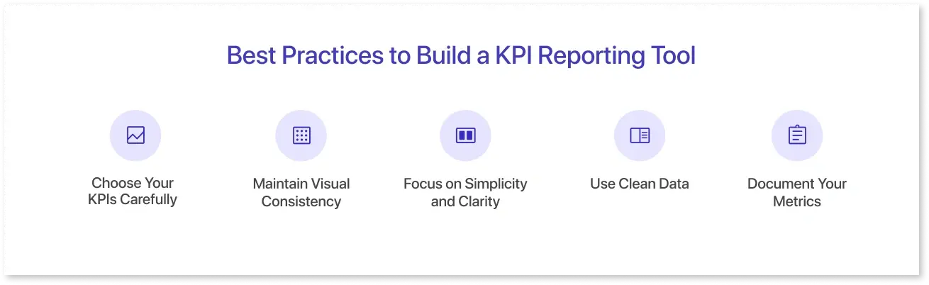
- Choose Your KPIs Carefully: You need to develop a dashboard by considering the audience and what information they want. The KPI selection needs to be aligned with the business goal. That way, your reporting will reflect what truly matters to the end user. You can choose metrics that indicate prompt action or progress monitoring.
- Maintain Visual Consistency: A nice-looking dashboard considers the correct visual pattern by sticking to consistent colors and styles. It requires organizations to pick the right chart types while following the design principles that make the dashboard effective.
- Focus on Simplicity and Clarity: Too much data or KPIs will overwhelm users. Charts and graphs are good to use, but clutter will ruin the KPI dashboards. To develop user-friendly dashboards, highlight the relevant data points using color cues, clear labeling, and intuitive layouts.
- Use Clean Data: The performance tracking dashboard can be useless if the data is taken from poor-quality sources. It is recommended to consider data that is integrity-based and ensures the accuracy of the facts stated.
- Document Your Metrics: KPI dashboards can become a source of confusion when they fail to deliver the intended message. Documenting each metric or preparing a tooltip to be handed over to the team is crucial for making more thoughtful decisions. This will enhance the clarity of the metrics and build trust in your dashboards.
Conclusion
Many forward-thinking businesses rely on KPI dashboards to measure and improve business performance. By integrating the right features, such as accessibility, goal alignment, and interactive elements, they can develop dashboards that ensure data-driven decisions. These features enable businesses to do everything right, from data collection to choosing the right charts, making the dashboard a single source of truth for business activities.
Frequently Asked Questions
The KPI analytics dashboard must have features like accessibility and interactivity, contain visual hierarchy, and be accurate in data.
Real-time data is crucial in a dashboard, enabling businesses to make proactive decisions based on up-to-date information. You can respond quickly to issues without relying on outdated information.
The visualizations used in a dashboard can improve KPI tracking by simplifying complex numerical data into an easily digestible format, which can lead to better-informed decisions.
There are many kinds of KPIs that can be displayed on a dashboard, such as sales revenue, customer satisfaction, website traffic, conversion rates, and much more.
Yes, you can customize your dashboard based on your preferred role so that you can view the data that aligns best with job responsibilities and goals.
Prompt it. Wireframe it with Mokkup.ai.
