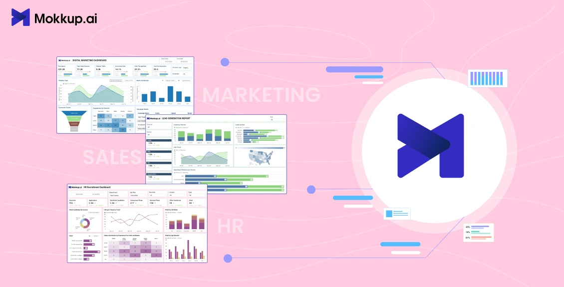
In modern business operations, data is not just an asset; it’s a competitive advantage. But raw numbers alone don’t drive results; you need a clear, actionable way to interpret them. That’s where ready-to-use free dashboard templates come in.
Instead of spending days designing layouts, configuring KPIs, and formatting visuals, pre-built templates give you a functional, well-structured starting point. They reduce setup time, improve reporting consistency, and allow teams to focus on acting on insights rather than building reports from scratch.
The demand for such dashboards is high across departments:
- Marketing teams use them to track campaign ROI, audience behavior, and lead generation efficiency.
- Sales teams rely on them to monitor pipeline performance, revenue growth, and deal velocity.
- HR teams need them to analyze recruitment, employee engagement, and workforce trends.
This is where Mokkup.ai stands out. As an AI-powered dashboard wireframing tool, it allows you to instantly generate a dashboard design template based on your requirements, then customize it to your needs. You get professional-grade layouts, optimized KPI placements, and intuitive visual structures without starting from zero.
In this guide, we’ll explore nine powerful dashboard templates from Mokkup.ai covering marketing, sales, and HR, and explain how each can transform your reporting process.
Table of Contents
- Why Use Pre-Built Dashboard Templates?
- Marketing Dashboard Templates
- Sales Dashboard Templates
- HR Dashboard Templates
- How to Choose the Right Dashboard Template
Why Use Pre-Built Dashboard Templates?
Building a dashboard from scratch requires time, design skills, and a clear understanding of which KPIs to track. This setup process becomes a bottleneck for many teams, delaying insights that could guide strategic decisions. Pre-built dashboard templates remove friction by offering ready-to-use layouts designed around common business needs.
Here’s why they’re worth considering:
1. Faster Setup and Deployment
Instead of spending hours deciding on chart types, color schemes, or data layouts, pre-built templates come with a functional structure ready for immediate use. You simply connect your data sources, and the dashboard populates automatically.
Example: A marketing manager can upload campaign data into a pre-built “Campaign Performance” dashboard and get instant visualizations of click-through rates, conversions, and ROI without manually building charts.
2. Built-In KPIs and Metrics
Templates are created with industry-standard KPIs already included. This ensures that you’re tracking the right data points from the start without researching best practices or guessing which metrics matter most.
- Marketing dashboards might already have impressions, CTR, and engagement rate.
- Sales dashboards could include lead conversion rate, revenue growth, and average deal size.
- HR dashboards might come preloaded with employee turnover, retention rate, and satisfaction scores.
3. Reduced Design and Technical Effort
You don’t need a background in graphic design or data visualization tools to create an effective dashboard. The visual hierarchy, color coding, and chart selection are already optimized for clarity and quick interpretation.
4. Easy Integration With BI Tools
Pre-built templates of Mokkup.ai are compatible with BI tools like Power BI and Tableau. You can connect live data sources, automate updates, and keep your dashboards current without manual intervention.
5. Scalability and Customization
Even though they’re ready-to-use, most templates allow customization, such as adding filters, adjusting KPI thresholds, or swapping chart types, to match specific business goals.
Marketing Dashboard Templates
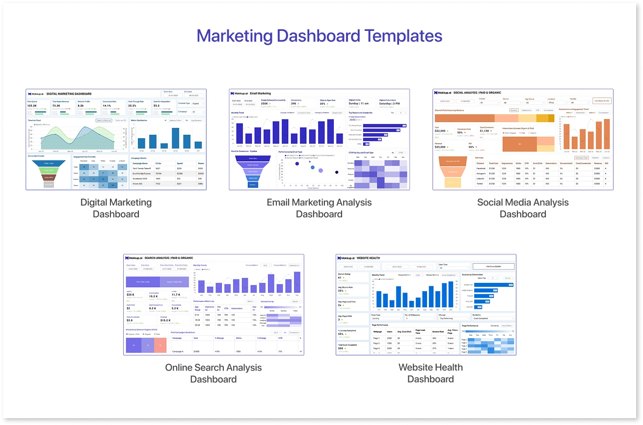
Marketing teams often juggle multiple channels- SEO, email campaigns, social media, web performance, content marketing, and more. Pre-built marketing dashboard templates meet this need by offering visually structured, KPI-driven layouts that simplify reporting and performance tracking.
Below are five Mokkup.ai templates built for common marketing functions. Each includes a description, benefits, and ideal users:
1. Digital Marketing Dashboard
Description: Aggregates website traffic, conversions, ad spend, and campaign ROI in a single interactive view.
Pros:
- Highlights top-performing campaigns and channels.
- Easy comparison of paid vs. organic performance.
- Automated data visualization saves setup time.
Who Benefits: Digital marketers, performance analysts, SEM/PPC teams.
2. Email Marketing Analysis Dashboard
Description: Offers metrics like open rate, CTR, conversions, bounce rate, and revenue per campaign. Includes both summary and detailed breakdown views.
Pros:
- Deep insights into email performance.
- Identifies subscriber trends and drop-off points.
- Facilitates targeting and timing optimization.
Who Benefits: Email marketers, CRM specialists, campaign managers.
3. Social Media Analysis Dashboard
Description: Consolidates engagement (likes, shares, comments), follower growth, campaign reach, and ROI. Offers segmented views by platform and campaign type.
Pros:
- Visualizes engagement trends clearly.
- Compare organic vs. paid content at a glance.
- Simplifies cross-channel performance reporting.
Who Benefits: Social media managers, content strategists, brand teams.
4. Online Search Analysis Dashboard
Description: Displays organic and paid search metrics, impressions, clicks, conversions- as well as keyword ranking, authority score, and backlinks. Includes executive summary and detailed view.
Pros:
- Offers keyword performance and competitive insights.
- Balances visibility trends with conversion data.
- Helps prioritize SEO strategies.
Who Benefits: SEO analysts, content marketers, search strategists.
5. Website Health Dashboard
Description: Monitors domain rating, page load time, bounce rate, pages per visit, and completed user journeys. Designed to highlight UX and technical performance.
Pros:
- Identifies user flow bottlenecks.
- Ties technical metrics to conversion outcomes.
- Helps improve site performance and retention.
Who Benefits: Web analysts, UX designers, performance marketers.
Sales Dashboard Templates
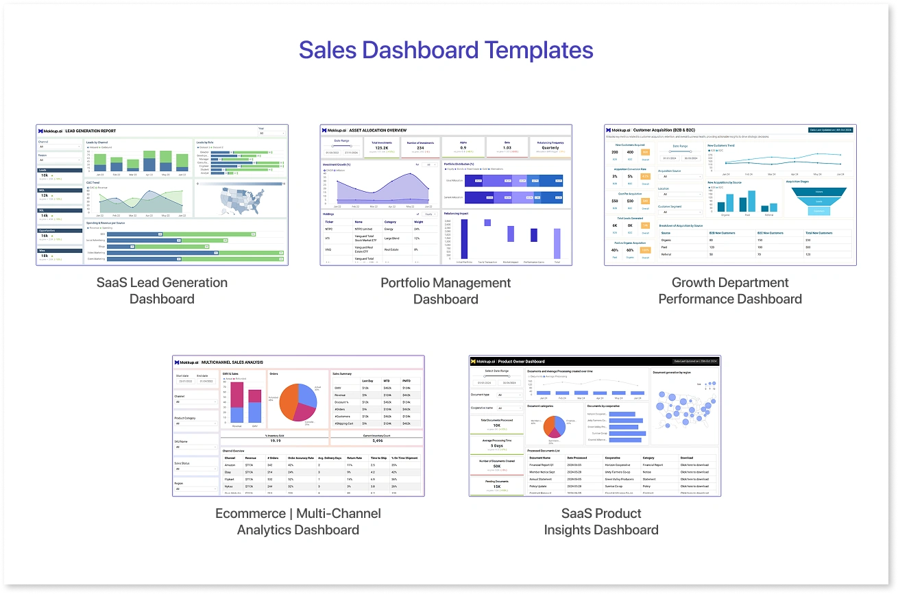
Sales operations move fast, and tracking key performance indicators in real time is critical. Pre-built sales dashboard templates remove the need for manual design and ensure that data is displayed clearly and actionably. They are widely used by sales managers, business analysts, and revenue leaders to monitor trends, identify bottlenecks, and improve decision-making.
Below are five sales dashboard templates from Mokkup.ai, each with its use cases, advantages, and ideal users:
1. SaaS Lead Generation Dashboard
Overview: Tracks leads from initial contact to qualified status, showing channel performance, CAC (Customer Acquisition Cost), and funnel conversion rates.
Pros:
- Clear breakdown of lead sources and ROI.
- Highlights stages where prospects drop off.
- Useful for optimizing acquisition budgets.
Ideal For: SaaS marketing teams, demand generation managers, and SDR teams.
2. Portfolio Management Dashboard
Overview: Gives a consolidated view of multiple business units or accounts, including revenue share, growth rate, and key account performance.
Pros:
- Easy comparison of portfolio components.
- Helps identify high- and low-performing assets.
- Supports resource allocation decisions.
Ideal For: Account managers, business development teams, portfolio analysts.
3. Growth Department Performance Dashboard
Overview: Displays department-wide sales metrics, including pipeline value, close rate, and performance against targets.
Pros:
- Highlights team and individual performance.
- Shows trends in sales velocity and win rates.
- Useful for performance reviews and forecasting.
Ideal For: Sales directors, growth strategists, operations leaders.
4. Ecommerce | Multi-Channel Analytics Dashboard
Overview: Tracks eCommerce sales performance across multiple channels like website, marketplaces, and social platforms.
Pros:
- Shows channel-level revenue, traffic, and conversion rates.
- Identifies best-performing sales channels.
- Helps optimize ad spend and inventory planning.
Ideal For: E-commerce managers, digital marketing teams, and retail analysts.
5. SaaS Product Insights Dashboard
Overview: Monitors SaaS product usage, churn rates, and MRR (Monthly Recurring Revenue) trends, along with key engagement metrics.
Pros:
- Detects early signs of churn.
- Highlights popular features driving engagement.
- Supports product roadmap decisions.
Ideal For: Product managers, customer success teams, SaaS founders.
HR Dashboard Templates
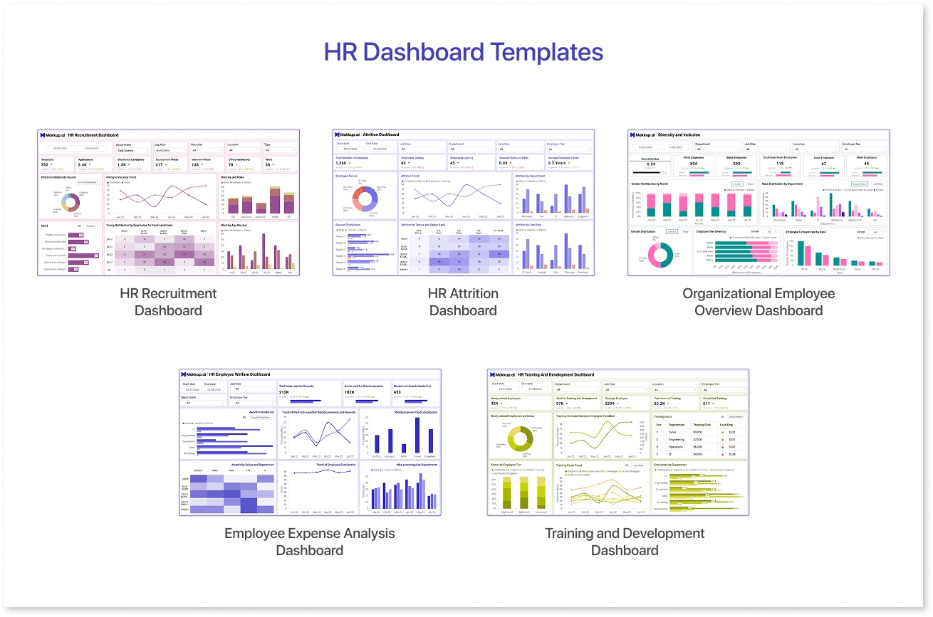
Human Resources teams handle diverse responsibilities, from hiring and onboarding to performance management and retention. Tracking all these metrics manually can be time-consuming and prone to errors. Pre-built HR dashboard templates streamline this process, offering clear, ready-to-use structures that give leadership quick insight into workforce trends.
Mokkup.ai makes it even easier by letting you generate AI-driven HR dashboard wireframes in minutes. You can connect data, tweak layouts, and export to tools like Power BI, Tableau, or Google Data Studio without starting from scratch.
Here are five HR dashboard templates that can help HR professionals track and improve workforce performance.
1. HR Recruitment Dashboard
Overview: Provides visibility into the hiring pipeline, including applications received, interviews scheduled, offers made, and hires completed.
Pros:
- Highlights recruitment bottlenecks.
- Tracks recruiter performance and candidate quality.
- Supports time-to-hire and cost-per-hire analysis.
Ideal For: Talent acquisition managers, recruiters, and HR directors.
2. HR Attrition Dashboard
Overview: Tracks employee turnover rates, voluntary vs. involuntary exits, and department-level attrition trends.
Pros:
- Pinpoints departments or teams with high turnover.
- Identifies patterns in employee exits.
- Supports retention strategy planning.
Ideal For: HR analytics teams, employee engagement managers, and senior leadership.
3. Organizational Employee Overview Dashboard
Overview: Consolidates key workforce metrics such as headcount, gender diversity, average tenure, and departmental distribution.
Pros:
- Offers a big-picture view of workforce composition.
- Useful for diversity and inclusion tracking.
- Supports compliance and reporting requirements.
Ideal For: CHROs, HR generalists, organizational development teams.
4. Employee Expense Analysis Dashboard
Overview: Tracks payroll, benefits, travel expenses, and other employee-related expenditures over time.
Pros:
- Identifies cost trends and anomalies.
- Helps in budget allocation and cost optimization.
- Simplifies financial reporting for HR.
Ideal For: HR finance teams, compensation analysts, and CFOs.
5. Training and Development Dashboard
Overview: Monitors employee training participation, completion rates, skill development progress, and training ROI.
Pros:
- Tracks compliance with mandatory training programs.
- Shows skill improvement trends across departments.
- Measures the effectiveness of learning initiatives.
Ideal For: L&D managers, HR development specialists, training coordinators.
How to Choose the Right Dashboard Template
Selecting the right dashboard template is not just about finding something visually appealing; it’s about ensuring the design aligns with your data needs, business goals, and reporting processes. A poor fit can lead to cluttered visuals, missing KPIs, and wasted time on unnecessary customization. Here’s a structured approach to help you choose the most effective template for your team.
1. Define Your Reporting Goals
Before browsing templates, be clear about what you want to measure and why.
- Are you tracking marketing ROI, sales conversion rates, or HR retention trends?
- Will the dashboard be used for daily monitoring or quarterly performance reviews?
Clear goals will guide you toward templates with the right KPIs already included.
2. Match the Template to Your Data Sources
Not all templates integrate seamlessly with every BI tool or database.
- Check if the template can be exported to your preferred platform, such as Power BI, Tableau, or Google Data Studio.
- Ensure it supports real-time data updates if your reporting requires up-to-the-minute accuracy.
3. Prioritize KPI Relevance Over Aesthetics
While design matters for readability, the relevance of KPIs is more important.
- Look for templates where every chart and table has a clear purpose.
- Avoid dashboards overloaded with vanity metrics that don’t influence decisions.
4. Consider the Audience
A dashboard meant for executive leadership will be very different from one designed for department managers.
- Executive dashboards should be high-level, focusing on strategic metrics.
- Operational dashboards can go deeper into process details and granular data.
5. Evaluate Customization Flexibility
Even with a great starting template, you’ll likely need to tweak layouts, colors, or data points.
- Mokkup.ai templates are built to be drag-and-drop customizable, so you can adapt them to evolving needs without rebuilding from scratch.
- Make sure the template supports adding or removing KPI easily.
6. Test with Sample Data
Before committing, load the template with real or sample data to see if it tells the right story.
- Check for data alignment issues.
- Ensure that the visuals remain clear and meaningful when populated with actual numbers.
7. Choose Templates with Scalability
Your data and reporting needs will grow.
- Pick a template that can easily add new metrics or pages without redesigning the dashboard.
- For multi-department use, ensure it can simultaneously handle segmented views for marketing, sales, and HR.
Why Mokkup.ai Makes Template Selection Easier?
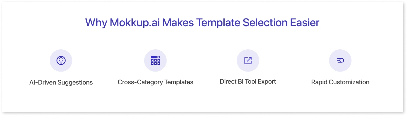
- AI-Driven Suggestions: You can generate dashboards from a simple text prompt, reducing trial and error.
- Cross-Category Templates: Access ready-to-use layouts for marketing, sales, HR, finance, and more.
- Direct BI Tool Export: No need to rebuild designs in another platform- just export and connect your data.
- Rapid Customization: Modify designs on the go without breaking layout consistency.
This ensures your team spends less time designing dashboards and more time acting on the insights they provide.
Conclusion
Ready-to-use dashboard templates save time and provide a strategic edge by eliminating the need to design from scratch. They speed up the process from raw data to actionable insights, letting teams focus on interpreting trends and making informed decisions rather than building reports.
These simple dashboard examples also ensure consistent reporting across departments. With standardized layouts, everyone from individual contributors to executives can align around the same clear data story, reducing misunderstandings. Whether in Marketing, Sales, or HR, the right dashboard goes beyond tracking; it drives performance. It helps marketers identify top channels, sales teams spot pipeline issues, and HR uncover workforce trends before they escalate. Dashboards transform scattered metrics into a cohesive, real-time view that supports smarter planning, and you can explore multiple dashboard template examples to match different use cases effectively.
Mokkup.ai combines AI-powered dashboard wireframing with flexible customization. Just describe your needs, and it creates a tailored layout ready for your data. You can easily adjust visuals, connect data sources, and deploy.
Frequently Asked Questions
Marketers and sales teams use dashboards to monitor KPIs like lead generation, conversion rates, sales performance, and customer engagement. These dashboards help track campaigns, sales funnels, and business growth.
Log in, go to “Templates,” select one, and use the drag-and-drop interface to customize charts, tables, and text. Save your dashboard once edits are complete.
You can find ready-made templates in Mokkup.ai’s “Templates” section, covering marketing, sales, HR, and more. Browse and pick one that fits your needs.
Templates focusing on campaign performance, lead generation, and customer engagement are ideal for marketing, offering clear insights into key metrics.
Yes. Mokkup.ai supports small teams with collaborative features for easy dashboard creation and customization.
Absolutely. You can adjust data sources, visualizations, and layout to match your specific requirements and business goals.
Yes. Mokkup.ai’s templates are intuitive and pre-built, making them easy for beginners to create and customize dashboards.
Prompt it. Wireframe it with Mokkup.ai.
