
Data visualization is crucial in uncovering trends and patterns hidden within your data. Since humans are wired to process visuals faster than raw numbers, organizing information into clear, meaningful groups and presenting it visually helps us quickly spot what’s unusual, detect patterns worth exploring further, and decide on the right course of action.
Dashboard design is both a science and an art. The science lies in following established dashboard design best practices, rooted in years of research, while the art comes into play when tailoring the dashboard layout to suit your audience and purpose. When visualizations are clear, engaging, provide the proper context, and offer interactive elements like drill-downs, they make data approachable and valuable for people at any level of data literacy.
The Three Core Principles of a High-Impact Dashboard
A dashboard is a communication tool; it's not doing its job if it can’t present information. The best dashboards follow three main principles:
- Instant Understanding: The main insights should be clear within seconds. Users should quickly see key metrics and trends without extra explanations.
- Purposeful Visuals: Every chart or graph should have an apparent reason to be there, showing comparisons, spotting patterns, or highlighting unusual data. If it doesn’t add value, it shouldn’t be included.
- Action-Focused Design: A good dashboard design doesn’t just show data; it helps users know what to do next. It should link to business goals and point toward possible actions.
Dashboards that follow these three rules engage users and make a real impact.
Table of Contents
- Why Good Dashboard Design Matters
- How Do Data Visualization Experts Approach Dashboards?
- Tools to Use for Designing Effective Dashboards
Why Good Dashboard Design Matters
Dashboards are powerful data visualization tools. Instead of showing plain numbers, they use charts and graphs to tell a story, making it easier for people to understand the data. The tricky part is deciding what to show, how, and where to place it. A good dashboard design includes the correct data and metrics to share a clear message without overwhelming the viewer.
As UX design experts say, when the design is right, your audience can quickly understand the insights, whether customers or top management. If it’s wrong, they may leave more confused than before. With plenty of hands-on experience building dashboards, we’ve put together some tips to help you design ones that truly deliver.
How Do Data Visualization Experts Approach Dashboards?
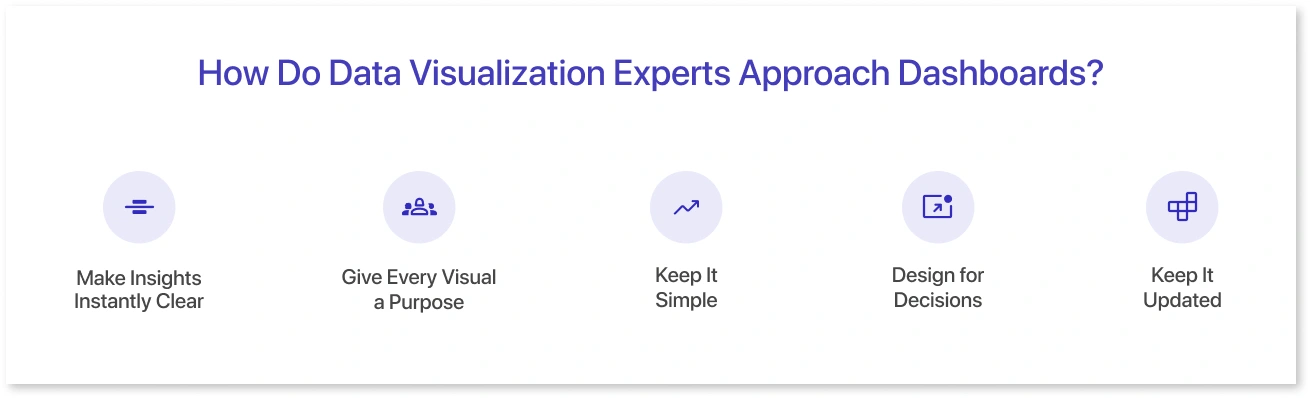
Creating a dashboard is more than just putting data on a screen; it is also about making that data useful to the people who use it. According to industry experts, a well-designed dashboard should be clear, purposeful, and actionable, guiding users seamlessly from insight to decision. Drawing on the advice of some of the most respected voices in data visualization, here are five expert-backed tips to help you design dashboards that deliver.
Tip 1: Make Insights Instantly Clear
Cole Nussbaumer Knaflic, author of Storytelling with Data, says, "Your dashboard should answer the most important question within seconds." Your audience should not require a guide or training to grasp the key takeaway.
For example, in a sales dashboard, key figures such as total revenue, percentage growth, and sales target progress should be prominently displayed, large, bold, and easy to read. Supporting information, such as region-specific breakdowns or product-level trends, can be placed further down for those who require it.
Tip 2: Give Every Visual a Purpose
According to data visualization expert Alberto Cairo, "Every element on a dashboard should earn its place." This includes removing flashy or decorative charts that do not help with decision-making.
For example, a 3D pie chart depicting market share may appear appealing but be more difficult to read than a simple horizontal bar chart. If a visual does not help the user compare, find a pattern, or identify an outlier, it wastes valuable screen space.
Tip 3: Keep It Simple
The Toptal design team recommends, “Less is more. Show only the data your audience needs right now.” Cluttered dashboards can overwhelm users and obscure essential insights.
For instance, instead of displaying 15 KPIs simultaneously, you could group them by theme, sales performance, customer engagement, and operational metrics, and provide filtering or tabs for further exploration. A clean layout with plenty of white space can make complex data feel more manageable.
Tip 4: Design for Decisions
Andy Kirk, a visualization consultant, says, "Dashboards aren't just for looking at, they're for doing." Your dashboard should lead users to take action.
For example, a marketing dashboard displaying a sudden drop in ad click-through rates could include a prompt or link to investigate campaign-level performance.
Similarly, an inventory dashboard that displays stock-outs may recommend reordering options or highlight suppliers with delayed deliveries.
Tip 5: Keep It Updated
Experts at Databox, in their blog “Why Dashboards Are Important”, suggest reviewing dashboards regularly to ensure they remain relevant, accurate, and aligned with business goals. This practice helps identify outdated metrics, refine visualizations, and keep decision-making data up to date.
For example, suppose your company adopts a subscription model. In that case, your dashboard should include metrics such as monthly recurring revenue (MRR) and churn rate to keep decision-making on track with current objectives. An outdated dashboard not only misleads but also undermines trust in the data.
Great dashboards do not happen accidentally; they result from deliberate design decisions guided by best practices. By following these expert tips, you can create dashboards that look good and have a real business impact by transforming complex data into precise, practical knowledge.
Tools to Use for Designing Effective Dashboards
Designing an effective dashboard requires not only the right charts and KPIs, but also the right data visualization tool. The platform you choose can influence how quickly dashboards are created, how simple they are to maintain, and how effectively insights are communicated to stakeholders.
Whether you're creating enterprise-level dashboards, wireframing ideas, or putting together quick reports, here are some of the most popular tools and what makes them exclusive:
1. Power BI
Microsoft's Power BI is a powerful tool for interactive reporting and deep data exploration. It works seamlessly with other Microsoft tools, such as Excel and Azure, making it particularly useful in enterprise environments. Through strong data modeling and AI-powered insights, it assists organizations in identifying patterns and trends that drive better decision-making.
2. Tableau
Tableau, widely regarded as the gold standard for data visualization, is well-known for its advanced analytics and visually appealing dashboards. It's especially useful for data storytelling, allowing teams to create dashboards that don't just analyze data but also tell compelling stories. Tableau's drag-and-drop interface allows for greater flexibility, while its ability to handle large, complex datasets makes it a popular choice among advanced users.
3. Google Looker Studio (formerly Data Studio)
If you're new to dashboards, Looker Studio is a great free option. It connects to various Google and third-party data sources, making it simple to pull in data without requiring extensive setup. While it lacks the depth of Tableau or Power BI, it's ideal for creating quick, shareable dashboards, particularly for marketing, SEO, and digital performance tracking.
4. Mokkup.ai
Mokkup.ai is more than just a wireframing tool; it also simplifies the BI development process through innovative features. Its AI-powered wireframe generator can create editable dashboard layouts with a single prompt, making it simple for teams without design experience to get started.
Additionally, its BI export feature allows you to convert wireframes directly into Power BI or Tableau files, saving hours of development time and ensuring alignment between stakeholders and developers.
5. Excel
While often overlooked, Excel is still one of the most versatile dashboard tools. Its versatility enables simple KPI scorecards and complex data models with pivot tables, charts, and automation. Excel offers speed and accessibility that many modern tools do not, making it ideal for quick insights, ad hoc analysis, and smaller projects.
Your choice of tool depends on factors like project scope, budget, team expertise, and the level of interactivity required. Combining tools, such as Mokkup.ai for wireframing and Tableau or Power BI for deployment, can create the most efficient workflow.
Conclusion
Designing an effective dashboard is all about clarity, balance, and purpose. By following best practices, selecting the right charts, and using reliable tools, you can turn complex data into clear, actionable insights. A well-designed dashboard doesn’t just look good; it helps users find answers quickly and make better decisions.
Frequently Asked Questions
Keep dashboards focused and straightforward. Show only key metrics, use a clean layout, and make sure the design helps users quickly understand the data.
They pick charts based on what the data needs to show: line charts for trends, bar charts for comparisons, and pie or donut charts for parts of a whole.
Colors highlight important data, while a clear dashboard layout makes it easier for users to scan and find insights without confusion.
Some of the top tools are Power BI, Tableau, Looker Studio, Mokkup.ai (with AI-driven wireframes and BI export), and Excel for flexible reporting.
Prompt it. Wireframe it with Mokkup.ai.
