
Does your organization believe in data empowerment?
If not, you should. The reason being: the more people have the ability to analyze data, the better the organization performs. Even in the recent Harvard Business Review, 87% of respondents stated that their organization was more successful if their front-line employees were delegated to make important business decisions.
Now, the question is: how can the insights be derived? Data storytelling is one such concept that comes to mind when it comes to expanding the numbers in a narrative that impacts information comprehension.
This blog unfolds the overview of the data story and how it can be the right path to conveying a meaningful message.
Table of Contents
- What is Data Storytelling?
- What are the Ingredients of a Data Story
- Why is Data Storytelling Important?
- Data Stories vs. Data Visualizations
- How to Tell a Good Data Story?
- What Are Real-World Data Storytelling Examples?
What is Data Storytelling?
Data storytelling is all about turning data into a clear and engaging narrative. It combines visuals, data, and a clear narrative makes complex insights easy to grasp for a particular audience. For example, sales figures or customer feedback can be transformed into a meaningful story using charts, graphs, and simple explanations.
The concept of data storytelling helps show why the data matters, highlights key trends, and guides better decision-making. In short, data storytelling makes information both relatable and actionable.
What are the Ingredients of a Data Story

Data storytelling involves four key components: data, visuals, narrative, and effective communication.
1. Foundational Data & Insights:
The data itself is the foundation of data storytelling. Make sure the information is correct, up to date, and relevant to the topic you have chosen. Analyze the data to find hidden trends, patterns, and important details. Your story is supported by these insights. A thorough comprehension of the information strengthens your claims and offers a strong basis for defending the visuals.
2. Compelling Visualizations:
Effective visualizations simplify complex information, making it easier to understand and remember. Dashboard wireframing platforms like Mokkup.ai help you design and visualize your narrative before adding actual data. Once the structure is in place, Business Intelligence tools can be used to integrate appropriate charts, graphs, and KPIs, turning your wireframe into a fully functional dashboard.
By blending storytelling with visuals, you can effectively communicate insights and encourage informed decision-making, ensuring your audience grasps key information quickly and easily.
3. Engaging Narrative:
A well-crafted narrative is essential for conveying your story with data. Effectively communicate your insights in written or spoken form. Go beyond just presenting data by highlighting recommendations, suggestions, or possible areas for improvement based on your findings. Use the narrative to guide your audience's understanding of the data and its impact.
4. Audience-Centric Communication:
Successful data storytelling takes audience communication style into consideration and is based on which the information level is decided. So, you need to define clear goals and objectives for your narrative, including feedback systems to improve your strategy, and ensure your message is received well. By getting to know your audience and their needs, you may produce a more compelling and engaging data story.
Why is Data Storytelling Important?
Embedding storytelling with data can simplify complex data into an easily understandable format. It can add meaning and relevance to a broader audience, enabling quick insights for better decisions. It is a way to capture attention naturally by adding life to dry numbers for a compelling experience that users actually resonate with.
Further, data storytelling examples like graphs and charts enable users to make data-driven findings. It can keep everyone on the same page and thereby improves collaboration and teamwork which indeed is an essence of project success.
Creating an engaging data story that inspires action can be a very useful skill. It can make your brand stand out by becoming a medium for supporting your numbers. Its versatility in different business aspects makes it a go-to approach for many data analysts who want to address their data. A combination of diverse components can be applied to any format, whether you are presenting data through a case study, brochure, whitepaper, or pitch desk.
Effective data storytelling has the following benefits:
- Adding extra value to your data and insights.
- Makes difficult material simple and highlights important details for your viewers.
- Giving your data a more personal dimension.
- Supplying your industry and audience with real value.
- Gaining recognition as an authority on your subject and field.
- By presenting data in an actionable format, it allows stakeholders to make informed decisions.
These benefits collectively enhance your ability to influence, inform, and lead within your industry.
Data Stories vs. Data Visualizations
People often confuse data stories with data visualization, but they are very different.
Data storytelling is a technique used by narrators of the story to make the view of the message easy to understand. On the other hand, data visualization is a tactic to aid a data story. It can compile complex data and translate it into a meaningful insight that indeed gets user attention with the variety of visuals used.
Data visualization and storytelling with data can be used together to validate your narrative and develop data analysis to explain when, how, and why behind a data story.
Here are some major points of differences as per several aspects:
|
Aspect |
Data Stories |
Data Visualization |
|
Purpose |
To guide the audience through a structured interpretation of data. |
To present data concisely for exploration and analysis. |
|
Focus |
Emphasizes storytelling, context, and insights. |
Focuses on charts, graphs, and dashboards. |
|
User Engagement |
Encourages emotional and cognitive engagement. |
Primarily analytical, requiring interpretation. |
|
Components |
Data, visuals, text, annotations, and storytelling techniques. |
Charts, graphs, maps, tables, and dashboards. |
|
Best for |
Presenting findings, persuading stakeholders, and making decisions. |
Exploring patterns, trends, and outliers in data. |
|
Interactivity |
Can be interactive with guided narratives. |
Often interactive but without a structured story. |
|
Examples |
Infographics, reports, presentations, articles. |
Dashboards, charts, scatter plots, heatmaps. |
Moreover, both concepts, when worked together, can provide context, critical insights, and call-to-action by going beyond numbers and charts.
How to Tell a Good Data Story?
Regarding the future prospects, a prediction by Gartner stated that data stories will be the primary tools for conveying analytics by 2025. This depicts the growing potential of data storytelling techniques in business, which indeed gives rise to data-driven decision-making.
No doubt, these solutions are used to simplify sophisticated data structures and make it easier for anyone to comprehend, regardless of domain expertise and technical knowledge. With this in mind, let’s explore how you can create a good data story to visualize data:
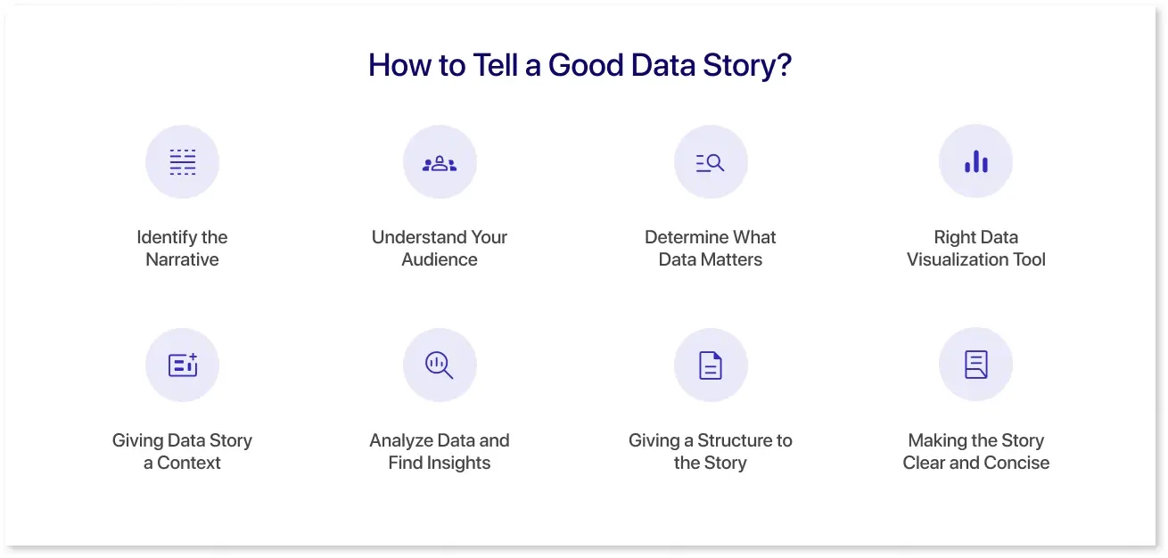
1. Identify the Narrative
Before you build a data story, it is important to know the starting point that needs to be conveyed to a broader audience. Look for different data storytelling examples to examine what the data is actually talking about. At this point, you can ask yourself questions like:
- What problem does my data solve?
- Why should a user care?
2. Understand Your Audience
A good data story is visioned toward the audience’s unique needs. It means understanding the specifics of the story as per the high-priority persona. For instance, a CEO might need high-level insight but an analyst needs a detailed report that assists in routine decision-making. Plus, the technical complexity of data storytelling techniques will impact comprehension when you are thinking of telling a story to a diverse audience.
3. Determine What Data Matters
Businesses with a broader narrative might get overwhelmed with a lot of data. It becomes paramount to identify the topics that add relevance to user needs. For instance, if you’re thinking of visualizing customer experience, then product usage data and customer feedback would be most relevant. This is one of the storytelling with data examples, preventing users from getting distracted from the topic.
4. Right Data Visualization Tool
Picking up the right data visualization tool is as crucial as identifying the data. It is because choosing the wrong one might mislead your audience. Each type comes with its strengths and weaknesses and knowing when and what type of visualization to be used is essential.
5. Giving Data Story a Context
Even when you use the correct data storytelling tools, it can be challenging to resonate with the audience. For that, you need to gain domain expertise around the topic to craft a relatable narrative that ultimately creates an impact. For instance, the performance comparison with the Finance Flow and Balance Dashboard by Mokkup.,ai gives a clear picture of how you were doing in a financial year.
6. Analyze Data and Find Insights
After you know what data needs to be analyzed, you begin to focus on the data analysis process to derive insights from the data. This happens when you dig deeper into the relationships and patterns through correlations. Correlations can provide a general theme of the data story that can be relevant for the end user.
7. Giving a Structure to the Story
Just like traditional storytelling, which includes a hook, rising action, building tension through problems, climax, and falling action that resolves a problem, the data story follows a similar flow. Leveraging this interactive structure is crucial to capturing attention and often develops a framework for information consumption.
8. Making the Story Clear and Concise
While writing a compelling data story, you need to ensure the story is clean and concise. For that, you need to continuously monitor and edit the story until the narrative is clear. Ensure your critical points are covered, and you are not distracted from the story's main idea.
What are Real-World Data Storytelling Examples?
Data storytelling transforms raw data into meaningful stories that help people understand complex information. It closes the gap between data and decision-making by combining narratives, insights, and visualizations.
Whether it’s highlighting trends, explaining performance metrics, or making predictions, data storytelling makes insights clear and actionable.
The following examples demonstrate how effective data storytelling can convey important messages, engage audiences, and drive meaningful outcomes.
1. MLB Division Performance 2024
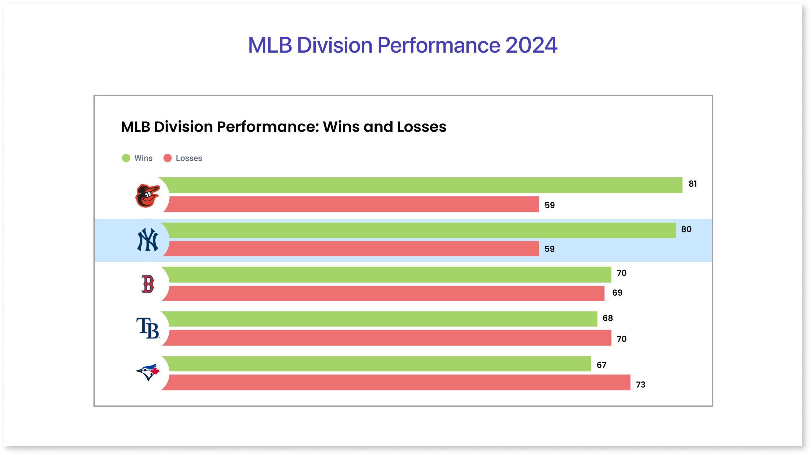
Mokkup's multi-bar chart gives a clear view of how teams in different divisions are performing. Each team’s wins and losses are displayed side by side, making it easy to compare their results.
The multi-bar format helps quickly spot which teams are leading and which are falling behind, giving a simple yet effective snapshot of the 2024 MLB season. This chart makes it easy to see division rankings and overall team progress.
2. Top 10 TV Shows Popular in U.S.A
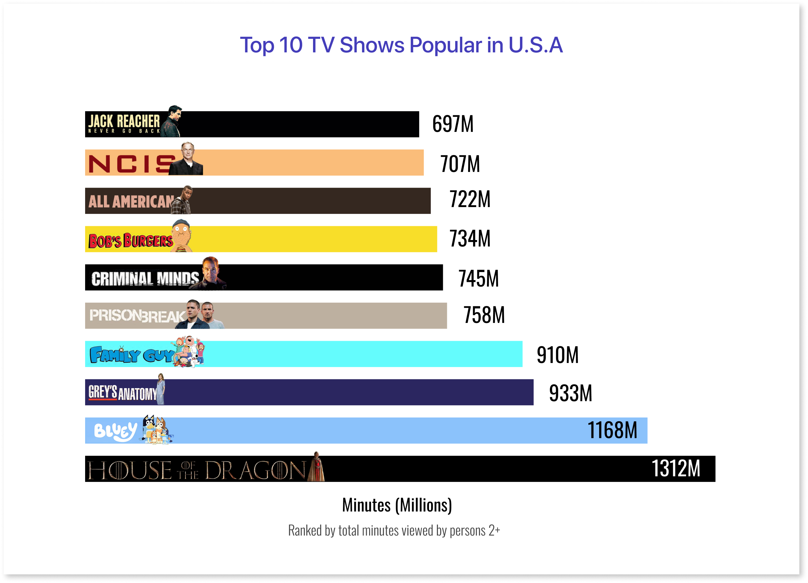
The horizontal bar chart highlights the most-watched TV shows based on total minutes viewed by persons aged 2 and older, measured in millions. From House of the Dragon leading with 1,312 million minutes to Jack Reacher at 697 million minutes, the chart visually ranks these shows by popularity. Shows like Bluey (1,168M) and Grey's Anatomy (933M) dominate the list, appealing to diverse audiences, while other fan favorites such as Family Guy, Prison Break, and NCIS also make a strong impact.
This chart provides a quick and easy comparison of viewers' time watching these popular shows in the U.S.
3. How Big is the Tech Industry in the U.S.? - Sector Value & Results
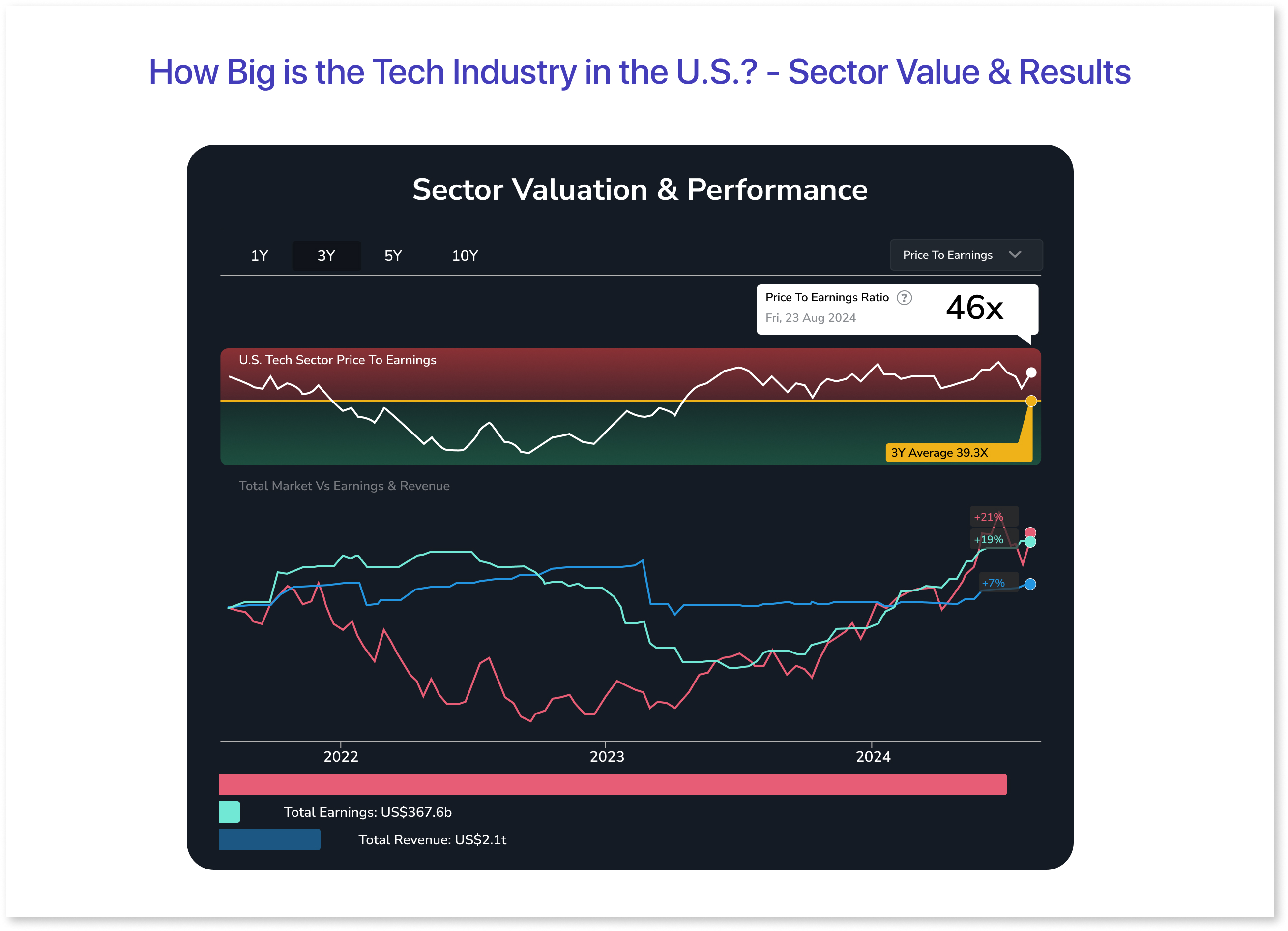
The visualization provides valuable insights into the U.S. tech sector's financial performance. The line chart displaying the tech sector’s price-to-earnings ratio gives a snapshot of how the market values tech companies compared to their earnings.
Meanwhile, the multi-line chart comparing total market value with earnings and revenue offers a broader view of the sector’s financial health. Together, these visualizations help highlight key trends in the tech industry’s growth, profitability, and market dynamics in the U.S.
Final Thoughts
Data storytelling is a powerful tool to disseminate complex data and have a greater impact on your audience. It transforms complex numbers into visually appealing format, making it more engaging and easy to understand. Indeed, there is no other format that can compare to the impact that words and images have on the audience's minds.
Finally, knowing your audience and their needs and keeping your presentation concise will help you make effective data storytelling presentations.
Frequently Asked Questions
To create compelling visualizations, a good data story must consider the four elements, including character, setting, conflict, and resolution.
Data visualization involves presenting complex information in a graphical structure, while storytelling concerns engagingly telling a narrative.
You can use relatable data storytelling examples, real-life scenarios, and compelling visuals to make the data story engaging and memorable for the audience.
With persuasive data storytelling, you can make your data easy for stakeholders to understand, thereby promoting data-driven decision-making.
Prompt it. Wireframe it with Mokkup.ai.
