Today, every industry struggles with data handling, as managing information has become as hard as managing people. If they get a visualizer to describe the essence of information, many decisions can be streamlined. Yes, we are talking about data dashboards, which are indeed the lifeblood of communicating crucial data.
Whether you are tracking sales budgets, consumer behavior, website traffic, or monitoring operations, dashboards are there to make their space in the daily routine of managers. They can transform the raw data into actionable insights that empower businesses to make high-level decisions. 70% of B2B leaders have found dashboards to be an essential tool to communicate ideas sophisticatedly, as Forester indicated.
Developing dashboards that deliver value requires selecting the right KPIs, charts, and visualization tools. This comprehensive guide provides best practices and real-world examples of data dashboards.
Read it ahead to get the most out of your data with well-designed dashboards.
Table of Contents
- What is a Data Dashboard?
- Types of Data Dashboards and When to Use Them
- How to Choose the Right Metrics and KPIs
- Dashboard Design Best Practices
- Dashboard Tools and Software Options
- Real-World Use Cases by Department and Industry
What is a Data Dashboard?
Data dashboards are analytical information management tools that consolidate complex data into an easily digestible format. This data visualization platform displays the important data points or key performance indicators (KPIs), giving an at-a-glance summary of financial performance, operational excellence, or business progress, enabling smart decisions for leaders.
Likewise, data dashboards can serve the specific needs of users, whether they are marketing managers who want to get the most out of their campaigns or financial analysts who wish to track budgets through sales trends. These can provide an accurate view of the business's overall health through up-to-date insights that immediately alert users to areas where improvements are needed.
Fact check: According to Aberdeen Group, organizations that use well-designed dashboards are 30% more likely to recognize opportunities for business growth and realize the potential to act on them.
Indeed, numerous data dashboard components work together harmoniously to create a dashboard that truly delivers value. Those components are:
- KPIs highlight the data figures boldly and clearly.
- Graphs, maps, heatmaps, and charts to visualize data to communicate complex insights.
- Filters and drill-downs for exploring information behind big numbers.
- Contextual elements like labels, tooltips, and benchmarks help users understand the meaning.
- Responsive and clutter-free layout.
With these crucial elements in place, you can create any type of dashboard for your business.
Types of Data Dashboards and When to Use Them
There are basically four types of dashboards, and each one fulfills a specific purpose, making it relevant for users to find what they are looking for.
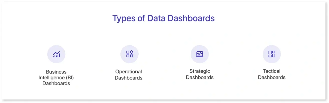
- Business Intelligence (BI) Dashboards: These tools are used by BI professionals to analyze the business's performance by understanding trends, unique patterns, and behaviours. They can uncover the cause and effect of the problem by giving a complete view of the overall financial health.
- Operational Dashboards: Such dashboards include reports on daily operations through real-time updates. They provide an overview of measurable goals specific to the project. Operational dashboards like stock management, inventory level dashboards, and procurement analysis are the daily newspaper reports you should be tracking.
- Strategic Dashboards: These dashboards are used at a high level, focusing on the organization's long-term initiatives. They can be used to track the progress of the project by analyzing the time required to complete a milestone and the resources needed to execute a project.
- Tactical Dashboards: These are mainly focused on a specific business unit or department. They are the middle ground between strategic decisions and operational initiatives, as they show the action plans of strategies implemented before and also specify the operational activities needed to take place.
How to Choose the Right Metrics and KPIs
While choosing KPIs for dashboards, you can ensure the following steps:
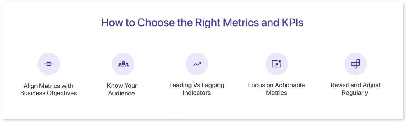
1. Align Metrics with Business Objectives:
You can start by asking: What are we trying to achieve?
- Is it increasing revenue?
- Improve patient progress?
- Track user journey
The above will require a different KPI card that includes the key metrics that ultimately influence a business decision.
2. Know Your Audience
Once the objective is sorted, you must tailor the metrics to the target audience. As questions:
- Are you making the dashboard for executives?
- Will marketing teams be using the dashboard?
- Do operations managers need the dashboard to track efficiency?
3. Leading Vs Lagging Indicators
It is recommended to use a mix of:
- Lagging indicators (like revenue, profit, or customer churn) to measure past performance.
- Leading indicators (like website engagement or pipeline growth) to predict future outcomes.
4. Focus on Actionable Metrics
A good KPI triggers an action. For example, ask yourself:
- Can this metric help us make a decision?
- Will a change in this number trigger a specific action?
If not, you should revisit the metrics and replace them with the relevant ones.
5. Revisit and Adjust Regularly
KPIs you set are not universally applicable; you can change them as your business evolves. For that, you can:
- Set regular check-ins to assess whether your metrics are still relevant.
- Sunset the ones that no longer serve a purpose, and introduce new ones as strategies shift.
Dashboard Design Best Practices
A great dashboard will communicate the information at a glance. Here are some data dashboard design best practices that you need to consider:
- Understanding Context: Knowing the data visualization context depends on the user persona research. Identify if they have technical knowledge and their direction while comprehending the information. Plus, it can help identify the kind of KPI that reflect the essence of the analysis.
- Data Storytelling is the Key: Effective dashboard design begins when you tell the story through the numbers. Data storytelling is crucial because it provides a clear message to the user. An engaging data story catches the attention of the audience and presents findings in the most digestible format.
- Layout Matters: A dashboard is not just about metrics; it's about a well-thought-out layout. Proper placement of charts and other visual elements makes users aware of what they are searching for. It also includes caring for things like consistent alignment, white space, and contrasting to enhance the design process.
- Choice of Colors: Colors in dashboard design are vital to interpret information as intended. You must choose specific colors and stick with them to avoid clutter. For instance, select contrasting colors to present the positive vs. negative outcomes.
- Adding Interactivity to Improve Exploration: Interactive elements like filters, drill-downs, and time interval widgets improve overall comprehension. They give a deep dive view of the data points and exclusivity to the dashboard design.
Dashboard Tools and Software Options
There are multiple data dashboard visualization tools that can streamline your dashboarding experience and empower you to make the right decisions. Here are a few of them:
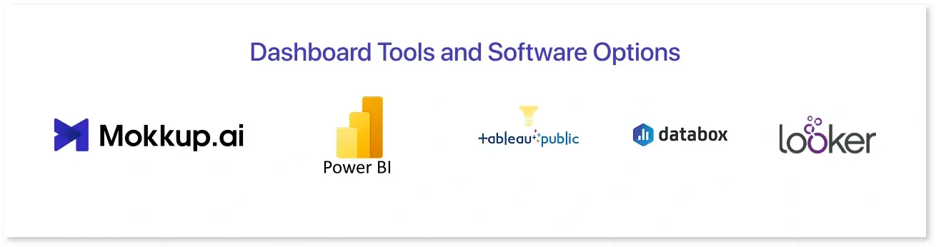
- Mokkup.ai: Mokkup.ai is a cloud-based dashboard development tool that can assist you create stunning dashboard wireframes that streamline the BI development with real-time collaboration and a BI export feature. It offers an array of ready-to-use templates, drag-and-drop charts, and other custom elements, allowing you to build a dashboard in just a few clicks.
- Microsoft Power BI: Power BI is a data visualization software designed for enterprises and business owners. It helps them track their critical business data. It can be connected with multiple data sources and develop real-time reports that can be integrated with other Microsoft platforms.
- Tableau Public: This tool is part of the Tableau software portfolio and offers a free package. It gives you on-demand access to premium features like data analysis, data storytelling, and real-time insights. It can also analyse consumer behavior and uncover data patterns.
- Looker: Formerly known as Google Data Studio, this dashboard software enables you to develop customizable dashboards by acting as a self-service BI solution. Non-designers and developers can use this tool to build meaningful dashboards and share them with the team for data analysis and interpretation.
- DataBox: This is a cloud-based data visualization tool used by businesses of all sizes. It has more than 71 clicks integrations for connecting data directly from Facebook Ads, Salesforce, and Google Analytics. It has readymade templates to avoid designing from scratch and a clean drag-and-drop editor to generate a dashboard tailored to business needs.
Real-World Use Cases by Department and Industry
Dashboards are decision-making tools that are used across multiple domains and industries. Here are some examples of real-world dashboard templates offered by Mokkup.ai:
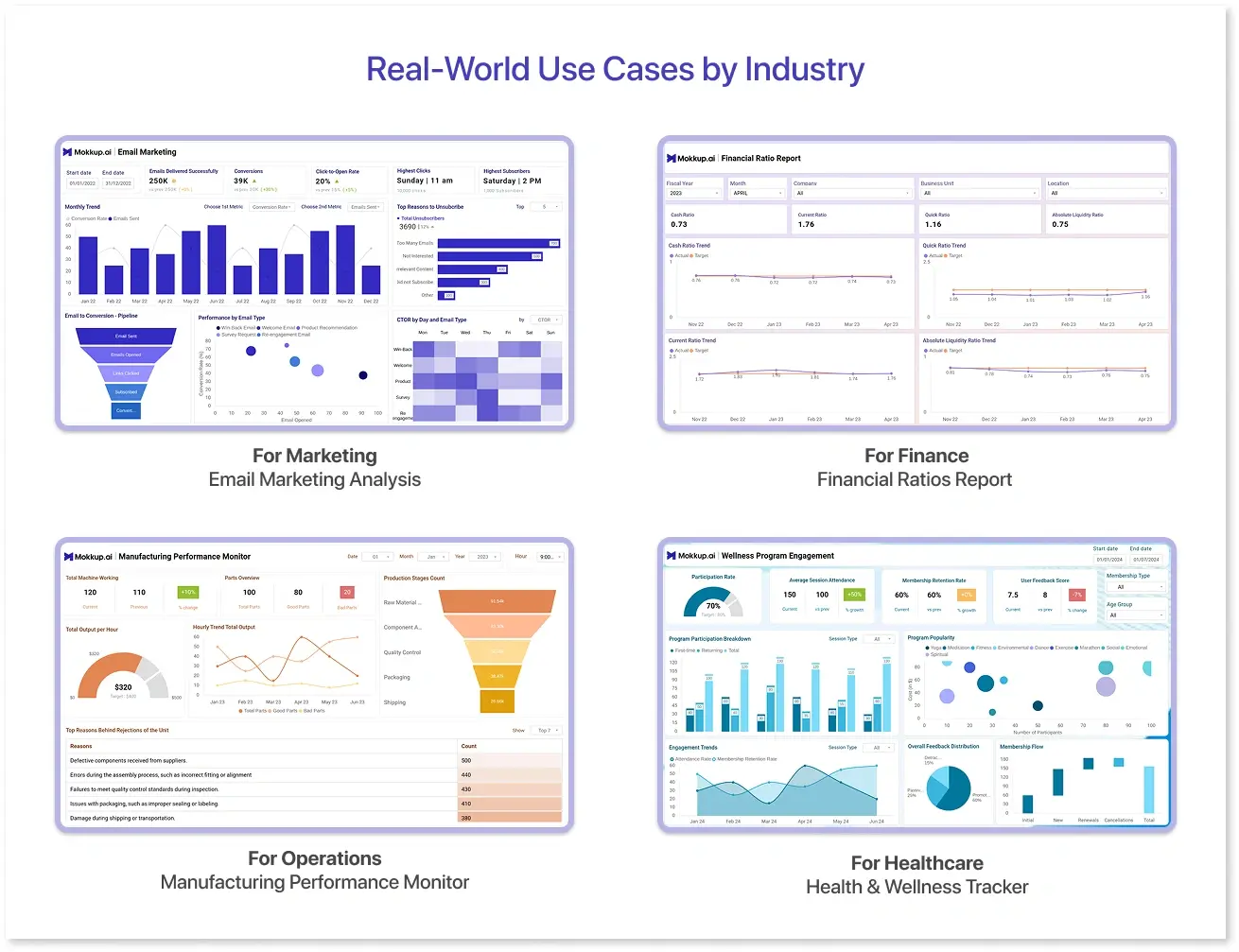
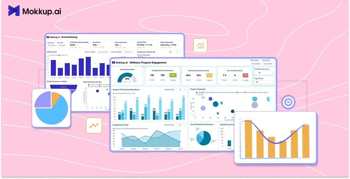
1. For Marketing: Email Marketing Analysis
An email marketing strategy is a tailored approach to reaching businesses that are highly interested in your product. The email marketing analysis dashboard wireframe is typically focused on evaluating the effectiveness of marketing campaigns. With metrics like bounce rate, MOM trend, CTOR, and cohort, you can check progress and take one step towards building long-term customer connections.
2. For Finance: Financial Ratios Report
Mokkup designed this dashboard for financial analysts to measure the organization's financial performance by tracking liquidity ratios over time and comparing them with target values. The financial ratios report can give an accurate snapshot of the organization's fiscal health and operational efficiency. It can also give insights into profitability ratios, risk factors, and working capital to support cash flow optimization and resource allocation.
3. For Operations: Manufacturing Performance Monitor
This dashboard clearly shows critical metrics, such as total machine working, production stage count, total output, and reasons behind rejections. The manufacturing performance monitor can evaluate the efficiency of production lines and optimize workflow accordingly. This template can serve as a catalyst for achieving manufacturing excellence, enabling you to make the right operational decisions.
4. For Healthcare: Health & Wellness Tracker
Measuring employee wellness programs is essential to building a healthy workplace culture and boosting productivity. Mokkup's health and wellness tracker fulfills that vision by allowing tracking of the engagement and participation rates in wellness programs. Managers can identify health issues early and take immediate action to reduce overall healthcare costs. Use this dashboard as a powerful health management companion to explore trends, track progress, and even get expert insights for consultations.
Conclusion
Data dashboards are not confined to a specific industry or department as they can be used by operational managers, marketing professionals, and financial analysts. You can visualize data without any technical exposure thanks to data visualization tools like Mokkup, Tableau, Power BI, Looker, QuickSight, and Looker. By following the best practices and understanding the importance of visuals, you can create a dashboard that delivers actionable insights for your business.
Frequently Asked Questions
Dashboards are dynamic tools that transform raw data into actionable insights using relevant KPIs. In contrast, a report summarizes periodic events and provides a detailed analysis of the situation.
Common mistakes when designing a dashboard include choosing the wrong colors, presenting poor data quality, creating a cluttered layout, and failing to provide context for the data.
A good data dashboard comprises interactive elements like charts and graphs that are arranged to display the data points through KPIs.
Prompt it. Wireframe it with Mokkup.ai.
