
How Does Data Visualization Make Complex Data Easier to Understand?
Data visualization converts complex facts into easy-to-understand visuals, transforming raw numbers into an organized narrative. It's more than just making charts; it's about presenting a story and discovering hidden insights in the data.
Today, where information can be overwhelming, data visualization tools are a guiding light. It enables decision-makers to cut through the noise, identify significant trends, make informed data-driven decisions, and explore new opportunities hidden in their data.
Table of Contents
- Why is Good Data Visualization Important?
- 6 Tips for Designing Clear and Impactful Data Visuals
- Common Data Visualization Mistakes You Can Avoid
Why is Good Data Visualization Important?
The human brain processes visuals about 60,000 times faster than text, taking just 13 milliseconds to process an image. Visual information accounts for 90% of what the brain receives. The picture superiority effect makes visuals more memorable than text. (Source: MedTech Intelligence)
The visual display of quantitative information simplifies complex data, converting raw information into an effective means of communication. Visualization transforms data into a compelling story, showing trends and leaving a lasting impression when done well.
How can you determine whether your data visualization is effective? The goal is to avoid common mistakes and focus on two primary principles:
- Identify and present relevant patterns in raw data that might otherwise be difficult to interpret.
- Present factual information clearly and concisely so that your audience may understand it.
6 Tips for Designing Clear and Impactful Data Visuals
Good data visualization not only makes your data look better but also improves interpretation by allowing your audience to see essential patterns and trends at a glance. Here are six crucial principles for creating data visuals that communicate effectively and leave a lasting impact.
1. Focus on Purpose and Audience:
For practical data analysis and visualization, it's important to have a clear purpose and a deep understanding of your audience. A clear objective helps you focus on the correct data, highlight key insights, and avoid getting stuck in unnecessary details.
Knowing your audience; whether for personal use, a team, or clients—guides your choices in data exploration, design, and presentation. This is especially vital for data analysts working with diverse audiences.
Always look into what your audience needs to know, what will be most helpful to them, and what questions they might want answered. This guarantees that your visualization conveys the right message and delivers actionable insights related to them.
2. Selecting the Right Type of Visualization:
Choosing the right chart is key to effective data storytelling. Use the best charts for comparing data, such as bar charts, line charts, or scatter plots, to match your audience’s needs and simplify complex ideas. Ensuring chart displays are clean and precise avoids misinterpretation.
For highly data-literate audiences, complex charts like chord diagrams may work, but for others, simpler charts such as bar charts or line charts are better for clarity.
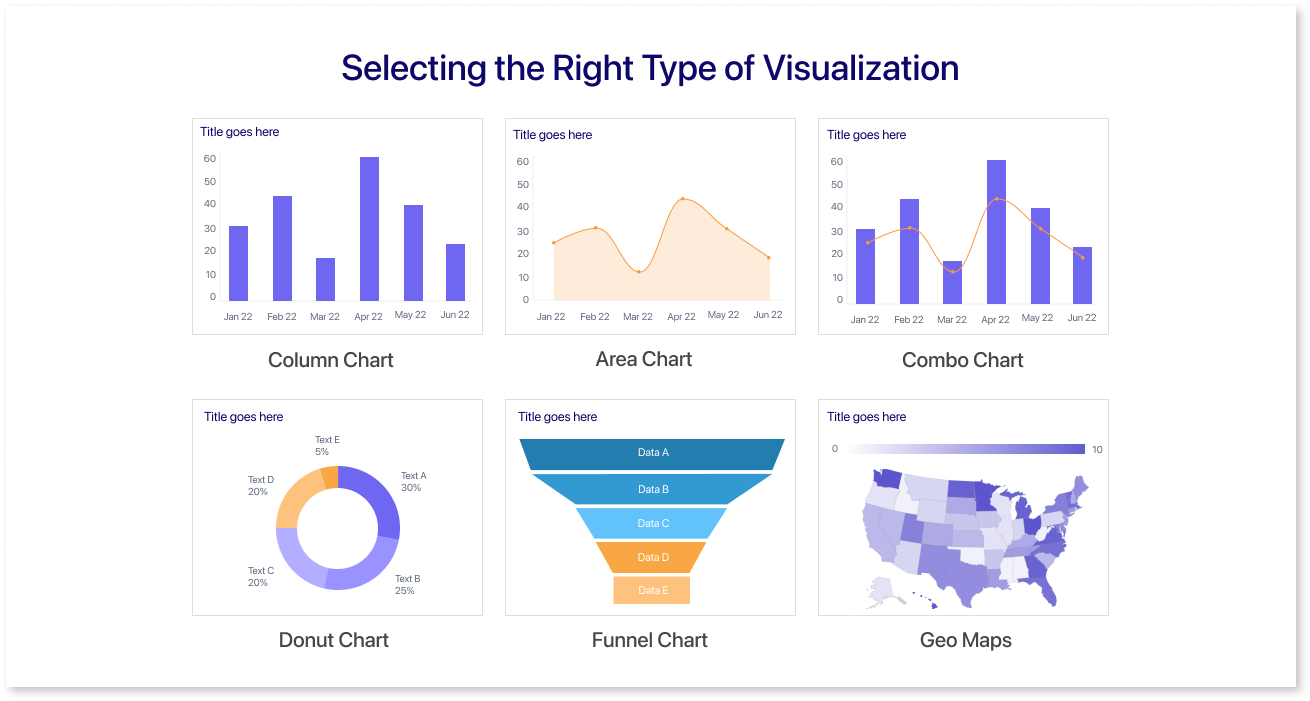
The goal is to choose a chart everyone can understand, focusing on impact rather than complexity. Avoid charts like pie charts, which are hard to read accurately. For more specific comparisons, you can use different types of charts, such as histograms, bubble charts, scatter plots, heat maps, donut charts, column charts, area charts, stacked bar charts, or funnel charts.
Each of these options can effectively show different aspects of your data, depending on whether you're focusing on distribution, trends, or proportions. Always select a chart that best delivers your main message, whether it's specific values, comparisons, or trends.
3. Use Text to Enhance, Not Distract:
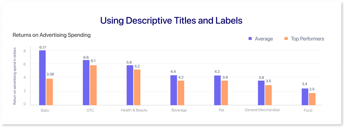
Text on data visualizations, such as titles, labels, legends, or summaries, should enhance understanding—and not clutter the view. Here’s how to make the text work for you:
- Label for Clarity: Maintain a balance with labels. Too many can overwhelm, while too few can be confusing. Take a step back and check whether the design is sensible and easy to follow.
- Keep Titles Clear and Direct: A title should clearly show the main idea right away. There is no need for fancy or complicated words.
- Limit Legends: If possible, avoid using legends; instead, place labels next to data points to save reading time and maintain focus on the data itself.
- Display Precise Values Only When Required: Label exact values only if they are necessary. If you're making a comparison, have the audience refer to the axis instead. Use specific labels sparingly to reduce clutter.
- Ensure Readability: Use a clear, readable font with enough spacing to prevent content from becoming distracting.
- Highlight Key Insights: Keep the text brief, use color or highlights for emphasis, and use arrows if necessary to guide attention to detail.
- Get Feedback: Ask for a review to identify areas for improvement in clarity and takeaways.
4. Customizing Visual Elements:
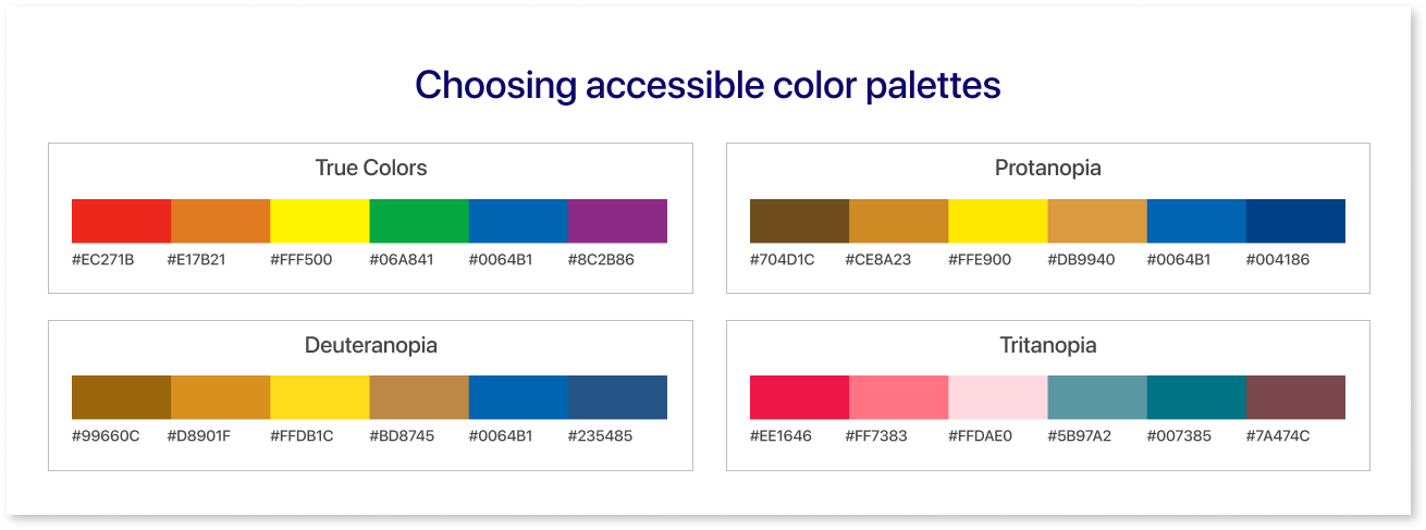
Color is a powerful tool and one of the main data visualization examples, but it’s easy to overdo it. Too much color can confuse or even lead to misinterpretation. Always use color to clarify your data’s purpose and highlight what's important.
If color doesn’t add meaning or improve understanding, it’s probably best left out. Here’s how to keep color purposeful:
- Highlight Key Data: Use color to draw attention to critical areas, allowing clients to understand the core idea easily.
- Differentiate Data Sets: Assign different colors for comparisons (e.g., one color for 2023, another for 2022) to avoid excessive labeling.
- Spot Outliers: Make patterns or unusual trends clear by using color to highlight anomalies.
- Choose Intuitive Colors: Match colors to context—like red for losses or blue for positive values. For general visuals, stick to brand colors for a consistent look.
- Avoid Extra Colors and Gradients: Extra colors can add clutter. Use gradients only to show actual changes in data intensity, keeping visuals clear and meaningful.
The use of data visualization techniques, such as highlighting outliers or trends, ensures better comprehension.
5. Creating Interactive Visualizations:
Encourage user participation by including elements that allow users to explore data depending on their interests. Interactive data visualizations, such as tooltips that display details on hover, clickable filters for specific categories, and zoom functions on maps and charts, enable users to explore trends, examine data points, and reach personalized conclusions. This method converts static visuals into interactive, hands-on experiences.
6. Leverage BI Tools for Seamless Design:
Using tools like Mokkup.ai, Microsoft Power BI, or Tableau helps ensure your visuals adhere to types of data visualization best practices. These tools are user-friendly and simplify the design process while enhancing collaboration, making them invaluable for platforms like social media dashboards.
Mokkup.ai helps you design clear, interactive wireframes easily, while Power BI and Tableau offer powerful features for creating dynamic, data-driven dashboards.
These solutions include templates, drag-and-drop features, and real-time collaboration, ensuring that your visualizations follow BI best practices while also allowing for deeper understanding and customization.
Common Data Visualization Mistakes You Can Avoid
Effective communication relies significantly on visual design elements and principles. However, it’s important to be aware of common mistakes that can weaken your visual aids. Recognizing these errors is key to improving how you communicate visually.
By avoiding these mistakes, you can make sure your visuals are not only eye-catching but also meaningful to your audience. Here are five common errors to watch out for, with examples to show what to avoid:
1. Selecting the Wrong Visualization Type:
There are many types of charts and graphs available to represent data visually, providing both variety and flexibility. However, choosing the right visualization can help one understand and lead to interpretation. Some charts work better for specific types of data than others.
For example, qualitative data (descriptive or categorical data) is best displayed using bar graphs or pie charts, whereas quantitative data (measurable data) is best displayed using line charts, histograms, or scatter plots. Choosing a visualization that isn't appropriate for the data can mislead your audience and conceal key insights.
2. Overcrowded Visuals :
The purpose of data visualization is to convey a straightforward narrative. To do this effectively, provide only the essential data and avoid irrelevant information. Overloading your visualization with too many variables can take away the main idea and confuse your audience.
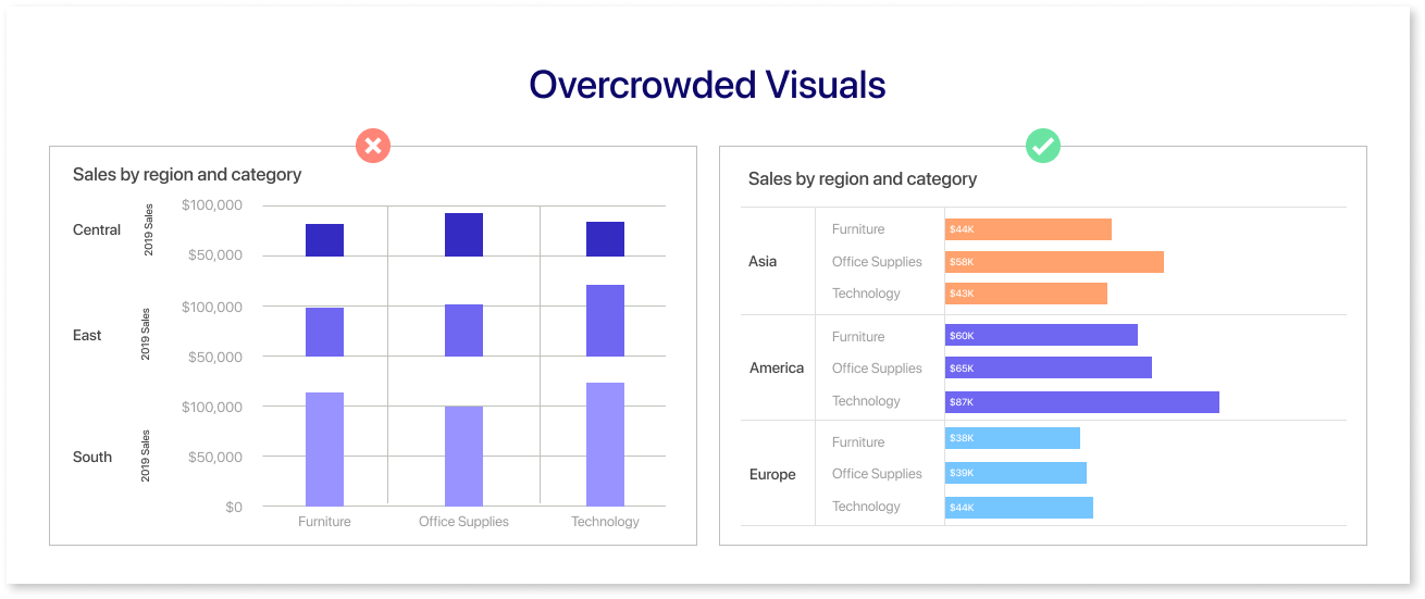
When planning your visualization, start by identifying the key elements you want to highlight. The amount of variables you select determines the format of your chart. For example, using a pie chart with too many sections can make it hard to see the data. This can distort the main message you want to share.
3. Using Inconsistent Scales:
When comparing data points, it is important to maintain a consistent scale. If your chart or graph has inconsistent scales, it can cause confusion and misinterpretation.
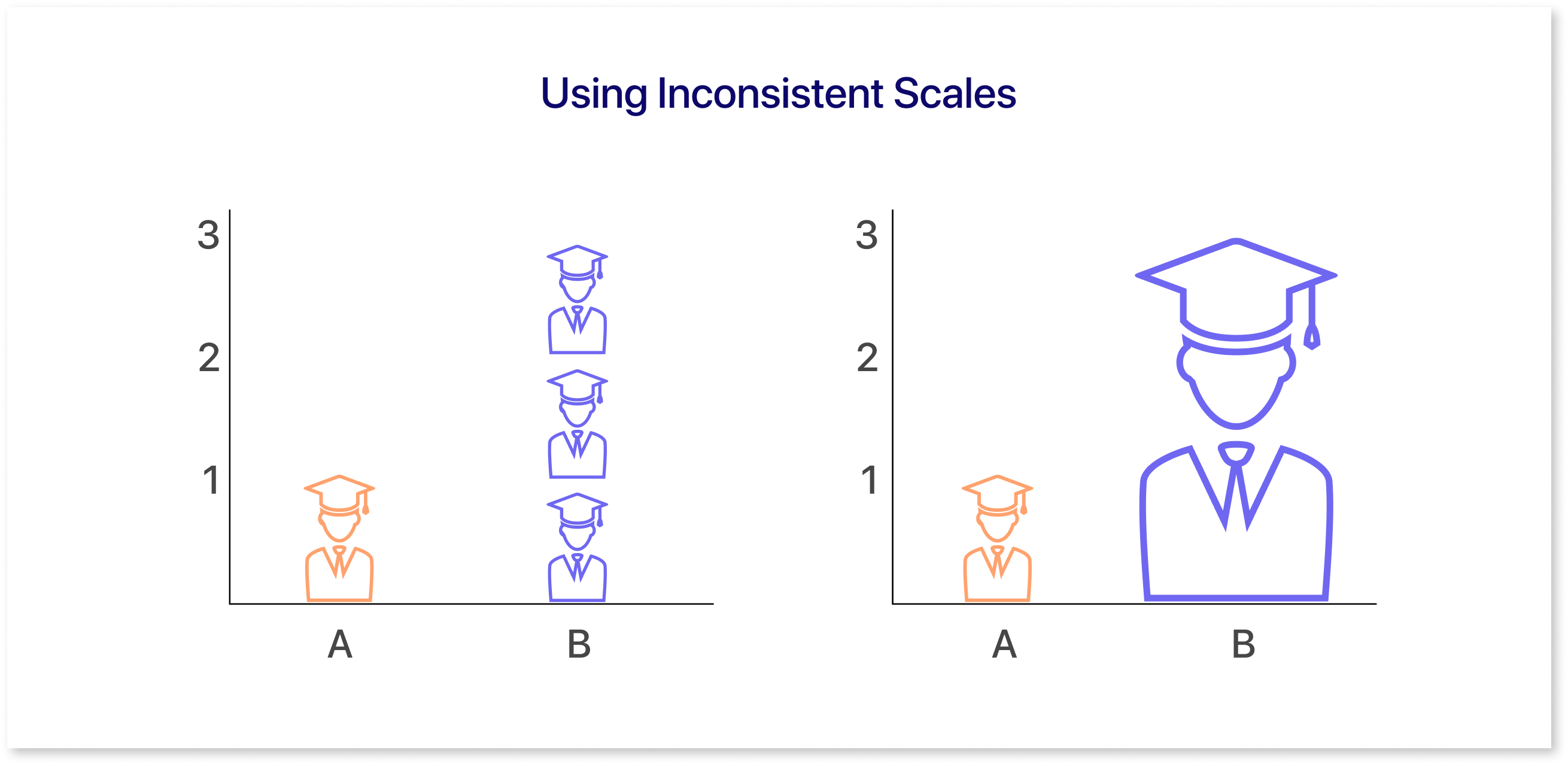
For example, in a line graph showing monthly sales, the intervals on the y-axis should be consistent. If one section of the axis is stretched out and another is compressed, it could mislead viewers into thinking there’s a greater difference between the data points than there actually is.
4. Confusing Linear & Logarithmic Scales:
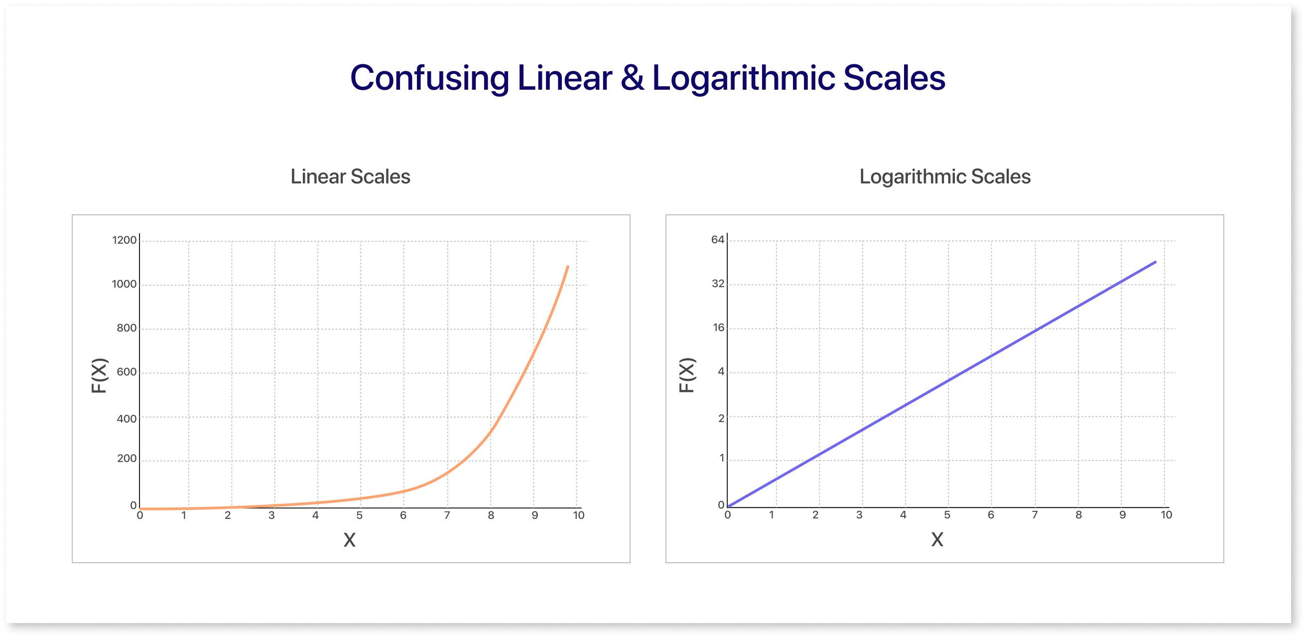
One common mistake in data visualization is misinterpreting or misusing linear and logarithmic scales. While both scales have useful uses, they serve different purposes, and mixing them up could contribute to incorrect conclusions.
Linear Scales:
In a linear scale, equal intervals correspond to equal values. For example, if a chart has a linear scale on the vertical axis, progressing by ten units gives the same difference regardless of the starting point. This scale works well dealing with data that increases in an absolute, straightforward manner, such as tracking temperature over time or measuring revenue growth in regular increments.
Logarithmic Scales:
In a logarithmic scale, each interval on the axis represents a multiplication factor, not an addition. For example, if the scale has a base of 10, moving up one interval means multiplying the value by 10. Logarithmic scales help us see data that grow quickly, like population growth or the spread of viruses. These types of data can increase by large amounts.
Choose linear for absolute changes and logarithmic for wide-ranging or exponential data to ensure clarity and accuracy in your visualizations.
Final thoughts
Data visualization is essential for transforming complex data into actionable insights. It helps decision-makers quickly identify patterns and make informed choices. To create impactful visuals, focus on clarity, purpose, and understanding your audience's needs. Avoid mistakes like overcrowding or inconsistent scales and instead prioritize clarity and relevance.
With tools like Mokkup.ai, Power BI, and Tableau, you can easily design clear, interactive, and insightful visuals that look great and drive meaningful, informed decisions. Good data visualization simplifies data and makes it work for you.
Prompt it. Wireframe it with Mokkup.ai.
