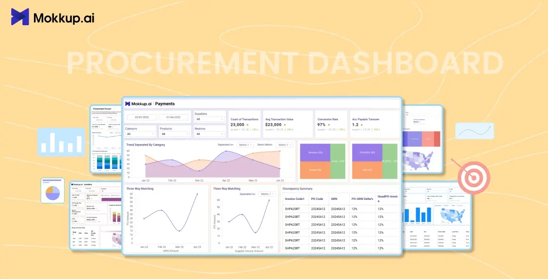
From conducting supply chain negotiations to identifying risks, many procurement companies feel immense pressure to evolve in a volatile market. The purpose is to deliver agility, provide strategic insight, and control costs. Relying on static spreadsheets can hinder their decision-making and often delay operations. Procurement dashboards are here to make a difference by providing real-time visibility into the supply chain operations.
This underscores the urgency of adopting procurement analytics. The market for procurement analytics is projected to grow from USD 5.13 billion in 2024 to USD 27.94 billion by 2032, registering a compound annual growth rate of 23.6%. The surges indicate that the procurement industry is rapidly adopting automation and moving toward dashboard-driven decision-making, regardless of peripheral tools.
Many organizations utilize interactive dashboards to display real-time KPIs for procurement, gaining immediate insights into their procurement functions and serving customers more effectively.
If you're unsure where to begin, this guide is for you. Learn about top procurement dashboard templates and KPIs that you can use to improve operational efficiency, and the best practices for designing dashboards to cut the mess.
Table of Contents
- Top Procurement Dashboard Templates for Modern Teams
- Key KPIs to Track in Your Procurement Dashboard (2025)
- How to Choose the Best Dashboard Template for Your Organization
- Best Practices for Effective Procurement Dashboard Design
Top Procurement Dashboard Templates for Modern Teams
Procurement dashboards provide real-time visibility into supply chain performance, spending, and risk factors. With the help of user-friendly dashboards and tools, you can ensure that procurement processes are appropriately streamlined. Here are a few examples of Mokkup.ai that you can consider:
1. Procurement Report Template
This is a procurement dashboard template that consolidates key metrics related to purchasing activities and supplier performance, presenting them in a clear and concise format. It enables organizations to optimize their procurement processes, reduce operational expenses, and enhance decision-making. Use this template to get instant insights into the purchase requests, pending POs, average approval time, total approved POs, and more. Ultimately, by using this dashboard wireframe, you can improve the supplier relationships by proactively solving issues.
2. Supplier Dashboard Template
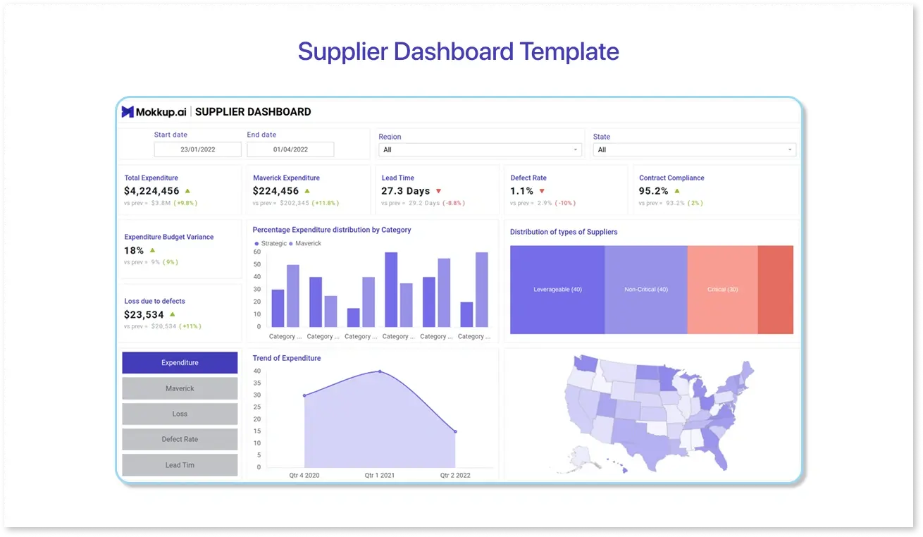
To focus on strategic procurement, organizations prioritize managing their supply chains. Here, the role of the supplier dashboard comes into play. This dashboard provides key metrics for monitoring supplier performance, identifying both the most efficient and underperforming suppliers. This template can help you identify maverick suppliers by comparing their performance trends over time. Therefore, it significantly contributes to improving the product's reliability and enhances the chances of staying competitive in the market.
3. Procurement Inventory Dashboard
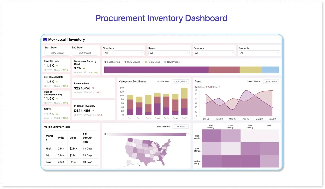
This dashboard provides a visual representation of key procurement and inventory-related metrics, enabling you to review purchase trends and inventory levels quickly. The procurement inventory dashboard wireframe allows you to streamline supplier management and enhance procurement efficiency, ultimately improving overall operational efficiency. By leveraging actionable data through this dashboard template, suppliers can proactively address the challenges and increase competitiveness in the market.
4. Procurement Negotiations Dashboard
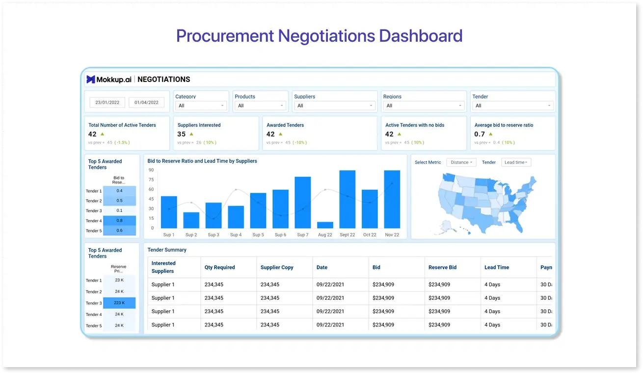
Good relationships with suppliers are vital for business growth. The procurement negotiations dashboard is designed to track the tendering process and contracts. It can elaborate on key aspects, such as the price of tenders, top-performing suppliers, total expenditure, and the distribution of long-term and short-term contracts. This dashboard wireframe can improve supplier relationships, enhance negotiation outcomes, and compliance to drive cost savings and long-term business growth.
5. Procurement Payment Summary Dashboard
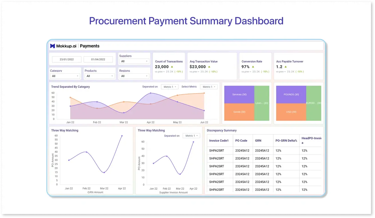
The procurement payment summary dashboard provides a concise overview of transactions made within the organization. This allows you to apply the three-way matching technique, which will enable you to pinpoint discrepancies before they arise. The dashboard can track the total amount paid, the number of payments, the average payment amount, and the payment methods used to identify payment trends and areas for improvement.

Key KPIs to Track in Your Procurement Dashboard (2025)
Procurement dashboards are only as effective as the procurement performance metrics or KPIs they display. In 2025, organizations should prioritize these metrics while building dashboard wireframes for their next project:
- Maverick Spend: Maverick spend, also known as off-contract spend, occurs when purchases are made outside approved procurement processes. A high percentage of maverick spend signals poor policy enforcement and lost opportunities for negotiated savings.
- Purchase Order (PO) Cycle Time: This KPI measures the average time taken to complete a purchase order—from requisition to approval and delivery. Shorter PO cycle times indicate streamlined workflows and efficient procurement operations. In 2025, automation and digital approvals are helping organizations cut down PO cycle times significantly.
- Contract Compliance: Contract compliance tracks how closely purchasing activities align with agreed contractual terms. It ensures that negotiated prices, service levels, and timelines are being followed. A strong compliance rate translates to improved supplier relationships and cost predictability.
- Supplier On-Time Delivery Rate: Timely delivery is crucial to maintaining uninterrupted operations. This KPI measures the percentage of orders delivered on or before the expected date. Consistent delays can indicate supply chain risks or poor vendor management.
- Number of Active Suppliers: While diversification can reduce dependency risks, managing too many suppliers can drive up administrative costs. Monitoring the number of active suppliers helps maintain the right balance between supplier diversity and operational efficiency.
How to Choose the Best Dashboard Template for Your Organization
Here are key factors to consider before making your choice:
- Align with Your Procurement Goals: Start by defining what you want to achieve. Are you optimizing supplier performance, reducing costs, or improving procurement cycle times? A dashboard designed for supplier analytics will differ from one focused on spend visibility or purchase order tracking. Ensure the template’s KPIs directly support your strategic goals.
- Prioritize Data Integration Capabilities: A dashboard is only as powerful as the data behind it. Look for templates that can easily integrate with your existing systems, such as ERP, finance, or inventory management tools. Seamless data connections minimize manual work and ensure real-time accuracy.
- Choose the Right Visualization Types: Different KPIs require different visualization methods. For example, spend breakdowns work best with pie or treemap charts, while supplier performance trends are better shown through line charts. The template should balance visual appeal with clarity and readability.
- Ensure Customization Flexibility: Every organization has unique reporting needs. A good dashboard template should allow you to customize filters, KPIs, and visuals without needing extensive technical expertise. Flexibility ensures your dashboard evolves as your procurement strategy matures.
- Check for User Experience and Accessibility: The most insightful dashboard is useless if it’s not easy to navigate. Look for templates with intuitive layouts, consistent color coding, and an accessible design that caters to all stakeholders, from procurement managers to finance teams.
Best Practices for Effective Procurement Dashboard Design
A well-designed dashboard helps procurement teams identify cost-saving opportunities, manage vendor performance, and forecast demand more accurately. Here are some best practices to follow:
- Align with Procurement Objectives: Start by defining what success means for your procurement function. Whether your focus is on reducing supplier risk, controlling spend, or improving purchase cycle efficiency, your KPIs and visuals should directly support these goals. Avoid cluttering the dashboard with generic metrics that don’t drive action.
- Focus on Actionable KPIs: Every chart or KPI card should answer a specific question, such as “Are we staying within our budget?” or “Which suppliers are causing delays?” Include procurement key performance indicators, such as Purchase Order Cycle Time, Supplier Lead Time, and Maverick Spend, but ensure they provide actionable insights to guide next steps.
- Maintain Data Accuracy and Consistency: Procurement dashboards extract data from multiple sources, including ERP, inventory, finance, and vendor management systems. Inconsistent data can distort insights. Regularly audit your data pipelines and standardize data definitions (e.g., “approved supplier” or “on-time delivery”) across systems.
- Prioritize Visual Hierarchy: Use color coding, layout, and typography to guide users’ attention. Display key KPIs at the top or in summary cards, accompanied by supporting visuals, such as trend lines or category breakdowns, below to maintain a clean, intuitive, and easy-to-interpret data visualization.
- Enable Drill-Down Capabilities: High-level metrics, such as “Total Spend” or “Supplier Performance,” are useful summaries, but users should be able to click through to see why a number has changed. Drill-downs into categories, suppliers, or regions help uncover root causes without overwhelming the main view.
Conclusion
A good procurement dashboard turns complex data into clear insights. By tracking the right KPIs like spend, supplier performance, and compliance, you can spot opportunities, make smarter decisions, and drive real savings. In 2025, staying ahead in procurement means seeing the whole picture, not just the numbers.
Frequently Asked Questions
Key procurement KPIs include cost savings, supplier performance, purchase order cycle time, compliance rate, procurement ROI, and spend under management.
Procurement dashboards consolidate data from multiple sources into visual, actionable insights. They enable teams to spot trends, monitor supplier performance, track costs, and make informed, timely decisions instead of relying on static reports or guesswork.
Yes. Dashboards can be tailored to specific industries, highlighting the KPIs and metrics most relevant to their procurement goals.
Some popular procurement dashboard templates include: Spend Analysis Dashboard, Supplier Performance Dashboard, Procurement Savings Dashboard, and Purchase Order Management Dashboard.
Dashboards should be updated in real time or at least daily/weekly, depending on business needs. Frequent updates ensure that procurement teams have accurate, actionable data for making timely decisions and managing suppliers effectively.
Prompt it. Wireframe it with Mokkup.ai.
