What is Data Visualization, and Why is it Important?
Data visualization helps turn raw data into valuable insights. Since data plays a significant role in decision-making today, making sense of large amounts of information is essential. Good visualizations turn complex data into clear and simple graphics, making identifying trends, patterns, and outliers easier.
Without visualization, data can be overwhelming and challenging to understand. A comprehensive guide to data visualization helps transform complex information into clear insights. Charts, graphs, and dashboards present data in an easy-to-understand format, leading to faster and better decisions.
This blog will cover various data visualization techniques, when to use them, and best practices for precise and accurate visuals. Whether you're new to data or an experienced analyst, these tips will help you present information better and make smarter decisions.
Table of Contents
- What Are the Various Types of Data Visualization Techniques & When to Use Them?
- Best Practices for Effective Data Visualization
- How to Choose the Right Data Visualization Technique
- Tools for Data Visualization
What Are the Various Types of Data Visualization Techniques & When to Use Them?
Different types of data visualization techniques help us understand data in various ways. Each method serves a specific purpose, depending on the type of data and the insights required. Below, we’ll explore examples of key data visualization techniques, their best use cases, and real-world applications.
Basic Chart Types
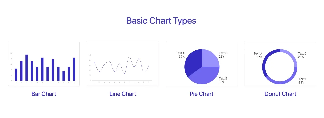
Basic charts or graphs are the core of data visualization, providing simple yet effective ways to compare, track, and analyze data patterns.
1. Bar Chart:
A bar chart uses rectangular bars to show data values. The length of each bar is proportional to the value it represents, allowing for simple comparison between categories. Bars can be presented vertically (column chart) or horizontally. The key difference between a bar chart and a column chart is that bar charts (horizontal) are better for comparing long category names, while column charts (vertical) are more effective for showing trends over time.
Best Use Cases:
- Comparing multiple categories or groups.
- Tracking trends over time (when used as a grouped or stacked bar chart).
Examples:
- Sales performance comparison across different products.
- Budget allocation across departments.
- Survey responses by category.
2. Line Chart:
A line chart connects data points with a continuous line to show patterns over time. It helps visualize changes and trends in sequential data.
Best Use Cases:
- Monitoring growth, trends, and seasonality over time.
- Identifying peaks, drops, and variations in data.
Examples:
- Stock market trends over months or years.
- Website traffic changes over time.
- Temperature variations across seasons.
3. Pie Chart & Donut Chart Chart:
These circular charts divide data into proportionate slices to show part-to-whole relationships. Donut charts are similar but are hollow in the center, making them visually distinct.
Best Use Cases:
- Representing percentages and proportions in data.
- Comparing different sections of a dataset.
Examples:
- Market share distribution among competitors.
- Budget breakdown by expense category.
- User demographics by age group.
Advanced Chart Types
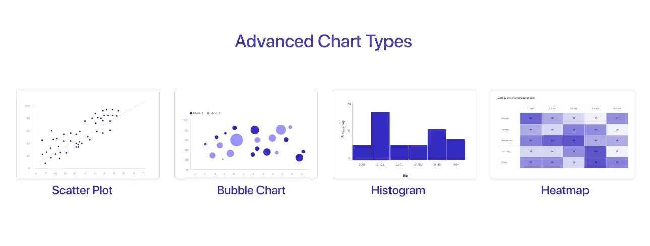
Advanced charts help uncover deeper insights by visualizing complex relationships, distributions, and multi-dimensional data. These methods are helpful when basic charts are insufficient for capturing intricate patterns or correlations.
1. Scatter Plot:
A scatter plot uses dots to represent individual data points, helping visualize relationships between two variables. Scatter plots help businesses identify trends, correlations, and outliers, helping in decision-making for sales forecasting, risk analysis, and customer segmentation.
Best Use Cases:
- Identifying correlations between variables.
- Analyzing data distribution and clustering.
Examples:
- Marketing spend vs. revenue to analyze ROI.
- Risk analysis in financial investments.
- Customer segmentation based on purchasing behavior.
2. Bubble Chart:
A bubble chart is a variation of a scatter plot where the size of each bubble represents an additional variable.
Best Use Cases:
- Comparing three variables in one visualization.
- Highlighting patterns and relationships in large datasets.
Examples:
- Economic indicators (e.g., GDP, population, and inflation).
- Business performance metrics (e.g., revenue, customer base, and market size).
3. Histogram:
A histogram shows the distribution of numerical data by grouping bars into intervals (bins). It shows how frequently data falls within specific ranges.
Best Use Cases:
- Analyzing the frequency and distribution of data points.
- Detecting patterns like skewness or normal distribution.
Examples:
- Exam score distribution among students.
- Income distribution across different demographics.
- Sales volume analysis by price range.
4. Heatmap:
A heatmap uses color gradients to represent values in a dataset, making it simple to discover patterns. Darker or more intense colors often represent higher values.
Best Use Cases:
- Identifying trends and patterns in huge data sets.
- Comparing values across different categories.
Examples:
- Website heat maps showing areas of high user activity.
- Sales performance by region using color-coded intensity.
- Correlation matrices in statistical analysis.
Specialized Visualization Techniques
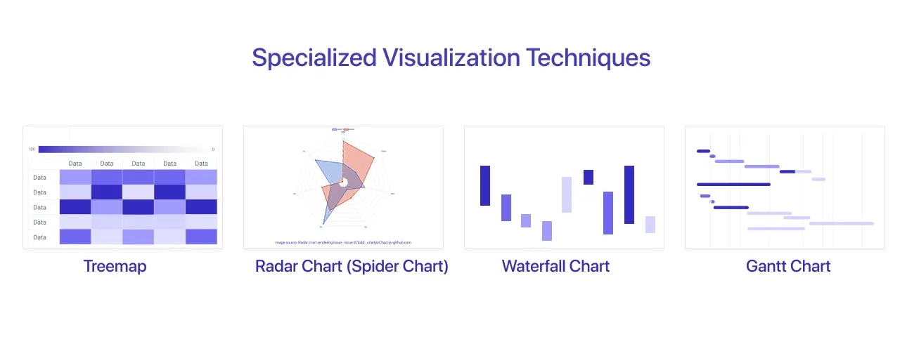
Specialized visualization techniques handle specific analytical requirements, making understanding hierarchical data, cumulative changes, and multivariable comparisons easier. These charts are useful for in-depth analysis, decision-making, and performance evaluation across multiple areas.
1. Treemap:
Treemaps use layered rectangles to represent hierarchical data. Each rectangle's size signifies a value, and categories are color-coded for easy identification.
Best Use Cases:
- Visualizing proportions within a hierarchy.
- Comparing different sections of a dataset.
Examples:
- File storage analysis (e.g., most extensive files using disk space).
- Budget distribution for various departments.
- Market share distribution across brands.
2. Radar Chart (Spider Chart):
A radar chart presents data along many axes, resulting in a web-like structure. It is handy for comparing multiple variables.
Best Use Cases:
- Analyzing performance across different dimensions.
- Comparing strengths and weaknesses between categories.
Examples:
- Employee skill assessment across various competencies.
- Competitor analysis in multiple business areas.
- Product feature comparisons.
3. Waterfall Chart:
A waterfall chart depicts incremental gains and losses, showing how a sequence of positive and negative changes affects an initial value.
Best Use Cases:
-
Understanding cumulative effects on financial or operational data.
Examples:
- Profit & loss statements.
- Revenue breakdown by different business units.
- Cash flow analysis over a period.
4. Gantt Chart:
A Gantt chart for project management displays tasks, timelines, and progress in a horizontal bar format.
Best Use Cases:
- Monitoring project schedules and task dependencies.
- Managing deadlines and resource allocation.
Examples:
- Software development roadmaps.
- Construction project timetables.
- Event planning and organizing.
Geospatial Data Visualization
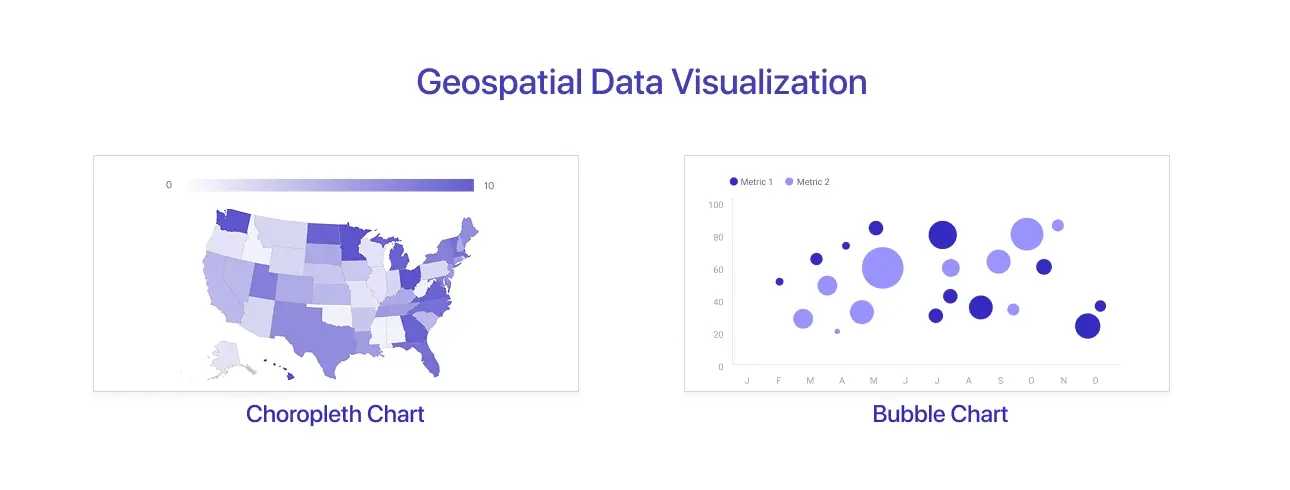
1. Choropleth Chart:
A choropleth map uses various color shades to represent data variations across geographic regions.
Best Use Cases:
- Visualizing geographical data distributions.
- Comparing regional patterns.
Examples:
- COVID-19 spread by country or state.
- Population density maps.
- Sales distribution by area.
2. Bubble Chart:
A bubble chart uses circles of different sizes to show data values on a geographic map. Larger bubbles represent higher values, while smaller bubbles indicate lower values, making it easy to compare data across locations. Bubble charts help businesses analyze market distribution, sales performance, and demographic trends in different regions.
Best Use Cases:
- Showing quantities at different locations.
- Comparing values across regions.
Examples:
- Store performance by city.
- Global business presence visualization.
- Crime rates by region.
The correct visualization depends on your data, objectives, and the story you want to convey, providing clarity, accuracy, and impact.
Best Practices for Effective Data Visualization
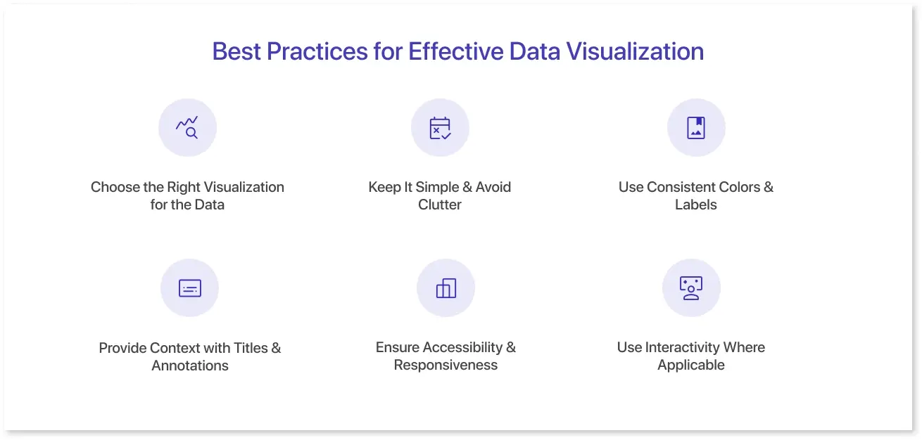
Creating impactful data visualizations requires more than just selecting a chart type. Following best practices ensures clarity, accuracy, and usability, helping audiences quickly understand and act on insights.
1. Choose the Right Visualization for the Data:
Choosing the right chart type is essential for effectively conveying insights. Bar charts are useful for comparing data, line charts for trend analysis, and scatter plots for correlations. Matching the visualization to the dataset avoids misinterpretation.
2. Keep It Simple & Avoid Clutter:
Overloading a chart with extra data points, colors, or labels can make it confusing. Focus on the most relevant information, remove unneeded elements, and maintain a clean, easy-to-read design.
3. Use Consistent Colors & Labels:
Color plays an important role in readability. Maintain logical color associations (e.g., red for negative, green for positive), use strong contrast for accessibility, and avoid employing too many colors, which may distract from crucial ideas.
4. Provide Context with Titles & Annotations:
A chart that lacks context can lead to misinterpretation. Use clear headings, labels, and annotations to direct viewers' attention and highlight key findings, ensuring they understand the story behind the data.
5. Ensure Accessibility & Responsiveness:
Choosing the right color is essential for clarity and accessibility. Data visualizations should be accessible to everyone, including people with visual impairments. Use colorblind-friendly palettes, readable fonts, and responsive designs that adjust to various screen sizes and devices.
6. Use Interactivity Where Applicable:
Filtering, tooltips, and drill-downs are interactive elements that increase user engagement and allow for more in-depth data analysis. This is especially valuable in dashboards, where consumers require flexibility in interpreting data.
Following these best practices will allow you to build visualizations that are not just aesthetically pleasing but also meaningful, informative, and actionable.
How to Choose the Right Data Visualization Technique
Selecting the appropriate techniques of data visualization is critical for effectively sharing insights. A well-chosen chart or graph improves understanding, whereas a bad one might cause confusion or misinterpretation. Here's how to make the right decision:
1. Understanding the Type of Data:
Before selecting a visualization, consider the nature of your data:
- Categorical vs. Numerical: Bar charts or pie charts are excellent for representing categorical data (e.g., product categories, regions), whereas line charts, histograms, and scatter plots are best for numerical data (e.g., sales income, temperature).
- Continuous vs. Discrete: Line charts or area charts are appropriate for continuous data (for example, stock prices over time), whereas bar charts or dot plots are appropriate for discrete data.
2. Defining the Purpose:
Each form of visualization serves a particular analytical purposes:
- Comparison: Compare categories using bar charts or column charts (for example, sales by product).
- Distribution: Histograms and box plots demonstrate how data is distributed (for example, income levels in a population).
- Relationships: Scatter plots and bubble charts are excellent for spotting correlations (for example, ad spend versus income).
- Trends Over Time: Line charts and area charts show changes over time (for example, website traffic boost).
- Hierarchy and Part-to-Whole: Treemaps and pie charts depict proportions within a dataset (such as budget allocation).
3. Considering the Audience:
Customize your visualization based on who will consume the information.
- Executives: Prefer high-level summaries that provide clear, actionable insights (such as dashboards with KPIs and simple visualizations).
- Analysts: Require more detailed, exploratory visuals (such as scatter plots and heatmaps).
- Customers and General Users: Charts that are simple to understand and visually appealing are required.
4. Evaluating Complexity:
Balance depth of insight and ease of understanding:
- Simple charts (bar, line, and pie) are best suited for large audiences and quick insights.
- Advanced charts (heatmaps, radar charts, and waterfall charts) allow more in-depth analysis but necessitate a solid understanding of data concepts.
- Interactivity (filters, drill-downs) improves dashboard efficiency by allowing users to explore data at several levels.
By carefully considering these factors, you can choose the most effective visualization technique to present your data clearly and compellingly.
Tools for Data Visualization
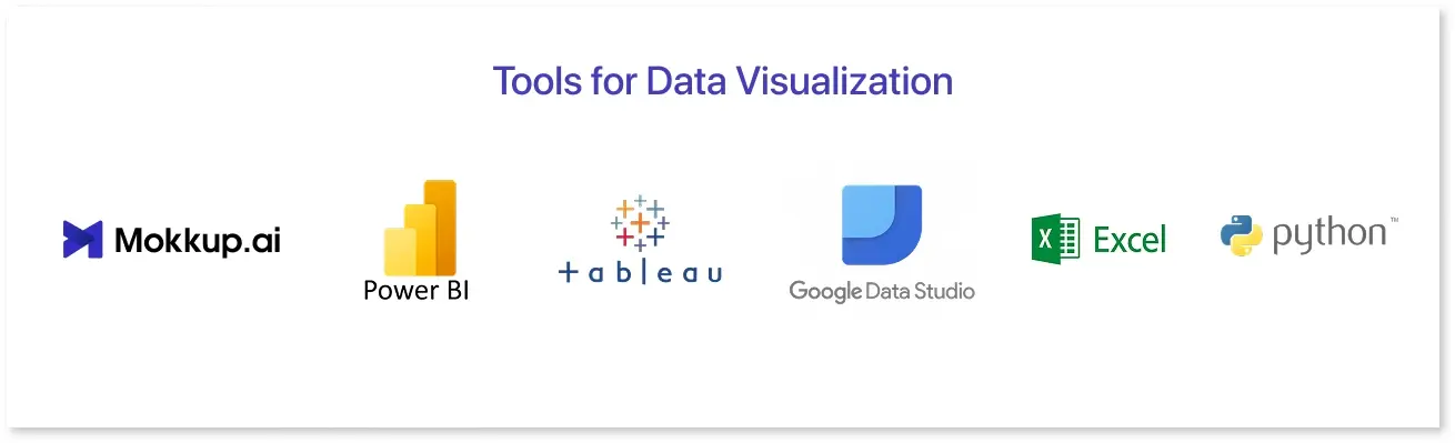
Choosing the best data visualization tools and techniques, such as wireframing dashboards, business intelligence reporting, or advanced data science analysis, depends on your needs. Here are a few of the top choices:
- Mokkup.ai: It is ideal for dashboard wireframing, allowing users to design and tweak layouts before production. It also supports direct export to Power BI and Tableau dashboards, simplifying the transition from prototype to production.
- Power BI: It is a sophisticated business intelligence solution for creating interactive dashboards and reports. Ideal for enterprise-level data analysis and integration with several data sources.
- Tableau: Is well-known for its user-friendly drag-and-drop interface and excels in interactive data visualization, making it excellent for deep research and data storytelling.
- Google Data Studio: It is a free application that lets you generate visually appealing reports with data from Google Analytics, Sheets, and other sources. Perfect for marketing and performance tracking.
- Excel: A popular tool for basic data visualization, including bar charts, line graphs, and pivot tables. While not as complex as dedicated BI tools, it performs quick analytics effectively.
- Python (Matplotlib, Seaborn, and Plotly): These libraries are ideal for data science and custom visualizations. They provide extensive flexibility for creating detailed and complex graphs commonly used in machine learning and statistical analysis.
Each tool has advantages, and the choice is based on considerations such as simplicity of use, required interactivity, and data complexity.
Conclusion
Data visualization is essential for translating raw data into actionable insights. From simple charts like bar and line graphs to more complex approaches like heat maps and scatter plots, selecting the proper visualization style guarantees clarity and impact.
Data type, purpose, audience, and complexity all play a role in determining the best technique. A well-designed visualization not only improves understanding but also encourages better decision-making.
By following best practices and using the appropriate technologies, you can create powerful, intelligent, and visually appealing data presentations.
Frequently Asked Questions
Data visualization techniques are methods for graphically representing data, making it easier to see patterns, trends, and correlations. Common techniques include bar charts for comparisons, line charts for trends over time, scatter plots for correlations, heatmaps for pattern recognition, and treemaps for hierarchical data. The type of data and insights you want to convey must be considered when selecting the appropriate technique.
Common mistakes include overloading charts with data, misleading scales, and inconsistent colors that confuse the audience. Avoid clutter, make sure labels are clear, and add context with titles or annotations to help people understand.
Depending on your needs, you can choose from a variety of tools. Mokkup.ai helps with dashboard wireframing and direct export to Power BI and Tableau. Power BI and Tableau are excellent for interactive reports, and Google Data Studio is a free choice for simple visualizations. Python libraries like Matplotlib and Seaborn allow advanced users to customize their data science applications.
Prompt it. Wireframe it with Mokkup.ai.
